Introduction
My start of year note was entitled, ‘It’s All Going to Be Okay’ . I still think that. I do not think there will be an NBER recession in 2023. Here’s the ‘but’. Equities are now up 7% YTD. From here I think the upside’s limited. Trains and pennies.
Here are 3 reasons:
1. The Disinflation Lemon Is Close to Dry
As I write, the US April headline inflation reading has just been released at 4.9%. At the start of the year, I expected this metric to be as low as 3.0% by this stage. I was too optimistic, but the direction is right. We are in a DISINFLATION* episode within the Fire & Ice framework, and my models suggest we are staying there until the end of July. In historic DISINFLATION periods we would expect a 14% real annualised return from US equities. At the start of the year the S&P 500 Index had delivered a real annualised return of less than 1% since the start of the DISINFLATION in June 2022. Now it is running at 11%, as is shown in Figure 1. So there’s still a bit of ground that equities can make up, but it’s no longer the Savannah.
There are other, juicier alternatives. For instance, per Figure 1, the DISINFLATION precedent for US 10 Year Treasuries is +4%, and we are still at -3%. And that’s not the only opportunity. Based on the required moves to return assets to their historic pattern, the portfolio you want through to the end of July looks something like this (bearing in mind this is not investment advice and blah blah blah):
- Less equity than you would traditionally have;
- Within this diminished equity allocation, a skew toward cheap large caps. Avoid Energy names. Favour Consumer Discretionary;
- More bonds than you would traditionally have;
- Within the bigger bond allocation: more sovereign issuance, less credit;
- Within alternatives: more Trend, less gold but more of the other commodities.
Figure 1. Performance in Current DISINFLATION Episode Versus Historic Average for This Episode
Problems loading this infographic? - Please click here
Source: Historic returns use data from The Best Strategies for Inflationary Times (Neville et al., 2021). Asset returns for the current DISINFLATION episode (starting end June 22) calculated as follows: overall and sector equities are S&P 500, factor L/S are Goldman Sachs US baskets (note Size is long large cap, short small cap), all bonds are the relevant Bloomberg Barclays index, commodities is the Bloomberg All Commodities Index (including roll), Gold is near end gold futures (inc. roll), Trend is the Soc. Gen. CTA index. Note that we apply a haircut (50% of the excess return) to the historic realised Trend figures.
2. Valuations Remain Expensive
The S&P 500 trades on 18x 12-month forward earnings. This puts it in the top quartile of historic valuations. Now the bull case, and the drum I myself have been banging, is that RoW multiples are far more reasonable. Indeed, the MSCI ACWI ex US trades at 13x, which puts it in the bottom quartile of historic valuations. But it has become increasingly apparent to me that, should we get a significant risk-off event, it will be a plague on all equity markets, expensive or otherwise.
I illustrate this in Figure 2. The chart shows, since the start of 1970, all months where US equities were down 2% or more (which amounts to circa -20% annualised, the classical bear market definition). In other words all significant risk-off US equity months. On the x axis I show the return of the US stock market, and on the y that of the rest of the world in aggregate. The size of each of the points is illustrative of how expensive the US was relative to the rest of the world going into that month.
For those getting bored, the TLDR is, (1) in risk-off months, most of the time, both the US and RoW are down by a similar amount, and (2) in risk-off months, valuation doesn’t really matter.
For those who want the detail:
- Of the 151 months in Figure 2, in only 33 (22%) were RoW equities positive.
- Now fair enough, in most instances (92 of 151 or 61%) RoW does outperform the US when the latter is selling off. But on average where the US is down 5% in the months shown in the chart, RoW is still down 4%. So not such an improvement that one could justify being overweight equities because one’s allocation was dominated by RoW stocks.
- In the instances where RoW is positive during US sell-offs, relative valuation going into the event has little impact. We can see this optically; in the two strongest RoW months in performance terms (February 1973 and April 1993, highlighted in yellow), the US was actually more attractive in terms of our valuation measure going into the move. The PE gap going into US sell-off months where RoW underperforms is virtually identical to those where it outperforms (in both instances the US trades 3.1 points more expensive).
Figure 2. US and RoW Equity Performance in Months Where US Is Down 2% or More (1970-Present)
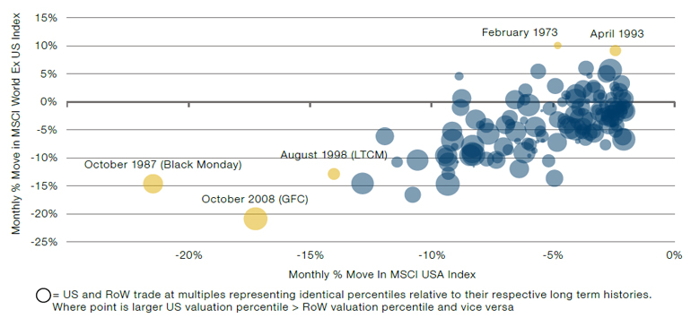
Source: Man Group. Relative valuations are based on trailing PEs. For RoW we take the average of UK and Europe.
3. Risk-Off Heuristics Are Flashing
Everyone likes a rule of thumb and finance is awash with them. Today many of people’s favourites look bad. When the Fed has done this many 25 basis point hikes, a recession has always followed in short order. Where the Conference Board’s Leading Economic Indicator (‘LEI’) has been this low, there has always been a recession. Where change in Temporary Help Services Payrolls has been this low, there has always been a recession. Where the 10-2 yield curve is this inverted…you guessed it. And there are others, but I’m getting bored.
Away from the data there are tail risks. The debt ceiling crisis. Banking contagion. And it’s not like the minor awkwardness of Russia’s invasion of Ukraine has gone away. One of the shocking revelations coming out of the Pentagon leaks was how close Russia came to shooting down a manned British aircraft over the Black Sea.1 The leak quoted a US defence official describing the incident as “really, really scary”. You don’t say.
My base case is that all three of these tail risks will end up being ok. I also think that the signalling power of many of the classic recessionary indicators has become blunted by wild seasonal distortions coming out of the violence of the pandemic rotations. But, blunt though they may be, they are coming on top of restricted liquidity and limited scope for earnings revisions upside. This means there is not the suspension that there would usually be to prevent a bump in the road becoming something more.
USD M2 is currently running at close to -6% YoY. Henry Allen at Deutsche Bank reckons that’s the biggest 12-month trailing contraction in just shy of 100 years. Now it is a fair counter that this historic contraction is coming after an historic expansion so, all told, perhaps it’s a score draw. But it doesn’t seem ridiculous to worry that such epochal gyrations will have an impact that is not entirely benign. Meanwhile, though earnings revisions have been moving up again recently, based on this historic relationship with the PMI the upside from here is limited. In Figure 3 I show, in orange, the 12-month forward earnings estimate for the S&P 500, with the dashed line showing our projection over the next 12 months. The blue line is price of the index, where the dashed portions of the line take that earnings pathway and project based on a forward PE at the 75th and 25th percentiles of historic valuations (17x and 13x respectively). This is indicative of an S&P level between 2,800 and 3,700. What those two numbers have in common is that they’re both lower than today.
Figure 3. S&P Forward Earnings Projection and Price Based on Projected Earnings and Multiples at the 75th and 25th Percentiles of Historic Readings
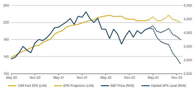
Source: Man Group. Our EPS projection model is based off the historic relationship between earnings revisions and the ISM PMI. Please contact your relationship manager for our Market Radar for further details.
Conclusion
The strongest argument for being bullish equities from here is that everyone is bearish. And we all know the shloka. The widely followed Fund Manager Survey from Bank of America last reported that respondents were as bearish today as they were in March 2020 or December 2008. 86% of those surveyed responded ‘stagflation’ when asked what the prevailing market environment would be over the next 12 months. Today the Atlanta Fed’s GDPNow measure is 2.7%. Headline inflation at 4.9%. So it’s not great, but stagflation seems a bit of a stretch.
I come back to what I said at the start. My base case for the rest of the year is that not much happens. Equities don’t do very much and everyone continues to mosey along in a state of ignored background worry. Given the now limited upside, I fear a fuller equity allocation risks sending one the way of Icarus.
*See Varying by Degrees: Fire & Ice 2.0 | Man Institute | Man Group.
1. www.independent.co.uk/news/world/europe/russia-british-plane-near-shoot-down-wallace-b2318895.html
All market data sourced from Bloomberg unless otherwise stated.
You are now leaving Man Group’s website
You are leaving Man Group’s website and entering a third-party website that is not controlled, maintained, or monitored by Man Group. Man Group is not responsible for the content or availability of the third-party website. By leaving Man Group’s website, you will be subject to the third-party website’s terms, policies and/or notices, including those related to privacy and security, as applicable.