Key takeaways:
- For the first time, peak rates in this cycle exceeded those in the prior cycle. This pattern may continue over the long term, with progressively higher peaks and troughs, driven by reduced global savings and massive investment needs
- While various economic indicators can signal regime change, market pricing measures can offer clearer timing cues
- Here are five metrics to keep an eye on
“Your old road is rapidly aging” – Bob Dylan
I’ve written about the regime change from secular stagnation to ‘secular reflation’ on multiple occasions. At least that’s what I’m calling it until someone comes up with a better title.1 To recap, secular stagnation was too much desired saving chasing too few investment opportunities, such that yields (of all stripes, including inflation as, in effect, the yield on stuff) consistently fell, cycle by cycle, from 1981 to 2020 (per Figure 1). This made saving less attractive, and investment more so. And thereby fulfilled the economic identity of realised saving equals realised investment.
Taylor Swift and I were both born in 1989. The current cycle is the first one we have ever seen where peak rates exceeded the top of the prior cycle (not that we watched them together, alas). I think the next 35 years will continue this pivot: increasingly higher peaks and troughs. This is partly because savings may become more restricted. Constraints in their magnitude could emerge as the world ages, and in their velocity, as financial repression becomes more acceptable in developed markets. But mainly, the world’s investment requirements are increasingly massive, as set out in my ‘Ten for Ten’ notes.2
Figure 1. Peak and trough US 10-year Treasury (UST10) yields by NBER cycle
Problems loading this infographic? - Please click here
Source: Bloomberg, NBER, Man Group. As of May 2025.
That sounds nice (I hope). But how can we know? What signals can we watch to confirm or rebut whether this thesis is real? Here are five I think are worth having on F9.
1) Stock-bond correlation
Secular stagnation was bad for economic growth. The average real GDP increase from World War Two to 1981 was 3.8%. From 1981 to 2019, 2.8%. That 100 basis points (bps) differential can be qualitatively explained: a declining-rates world where capital is abundant is one where the potential for both consumption and creative destruction falls, and that for malinvestment rises. It should therefore be one where the velocity of money falls, which is indeed what we saw. In 1981, the average M2 dollar changed hands 1.9x a year. By 2020, this had fallen to 1.1x and it has since risen to 1.4x.
Given that inflation kept falling (while remaining positive in the main) as real growth disappointed, at least relative to the decades that preceded it, the market mind kept growth data at the forefront, and pushed inflation to the back. Growth surprises can cause stocks and bonds to react in opposite directions. Unexpectedly positive news is welcomed by equities depressed by its lack, but not by fixed-income securities where growth is a component part of yield-to-maturity (which moves inversely to price).
That’s my explanation for the historical aberration that was the negative stock-bond correlation that spanned the first two decades of the 21st century, as shown in Figure 2. This metric turned positive in both the US and the UK in August 2022 for the first time in 20 years. Today the US statistic is at its highest since December 2000. Any reversion back below zero would likely push us back to secular stagnation.
Figure 2. US and UK long-term stock-bond correlation. Trailing 10 years, monthly periodicity
Problems loading this infographic? - Please click here
Source: GFD, Bloomberg, Man Group. As of May 2025.
2) Gold’s relationship with real rates
Gold yields nothing. In fact its yield is negative as you either have to pay someone to guard the physical, or pay the roll on the futures (on a curve almost always in contango). Therefore where real yields on other assets are rising, gold should be becoming relatively less attractive, due to an increasing opportunity cost of keeping capital tied up in it. This logic explains the close inverse relationship that can be seen in Figure 3 between 1997 and 2021.
Since 2022 this has broken down. First as real rates spiked while gold did little (2022-23), and then with real rates staying flat while gold rocketed (2024 to present). The inverse relation is, for now, broken.
The world of secular stagnation was also the world of globalisation, and the dollar was the key unit of account for that trade internationalisation. Gold has two other philosophical return drivers, other than real rates: crisis alpha and fiat alternative. In my view, the more disparate world that has come with the exit from secular stagnation is one where these latter two variables have come to the fore. A continued lack of explanatory power from real rates, per Figure 3, suggests to me they may be here to stay.
Figure 3. The relationship between gold and real yields (weekly data, 1997 to present)
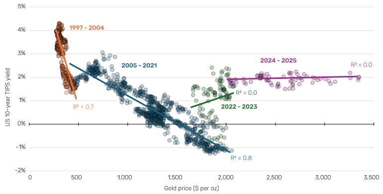
Source: Bloomberg, Man Group. As of May 2025.
3) Valuation of regime-change sectors
The two ‘Ten for Ten’ notes I referenced earlier set out the case for sectors that in my view benefit most from regime change out of secular stagnation. The valuations of these sectors can be indicators as well as potential profit centres. Figure 4 shows the five I am watching most closely. Go back to the original notes for the detail on how they fit into the regime change out of secular stagnation narrative, but the bottom line is they all relate to massive investment requirements (defence, oil and gas services, automation), supply chain friendshoring (Japan corporate governance), or de-dollarisation in a more multipolar world (gold miners). If it is a correct narrative rather than simply a good story, long duration earnings should be rewarded with a higher multiple.
Per Figure 4, the only one of these that has broken from its range is Defence. On average, the five trade on their 51st percentile multiple versus history. That’s not regime change, or anything close to it. It’s still in play. But when the facts change, etc.
Figure 4. 12-month forward PE multiple of five Man Group regime change baskets
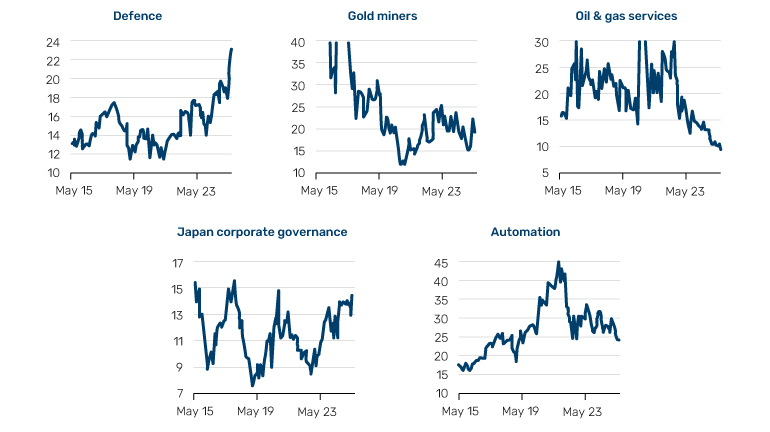
Source: Bloomberg, Man Group. As of May 2025.
4) UST10 yield discount/premium to theoretical fair value
Philosophically, the US Treasury yield is comprised of trend growth, inflation expectation and the term premium.3 Historically, the US has always been able to pay less than that which most reasonable models of these components would aggregate to. This is because, as the ground zero of global financial plumbing, US sovereign issuance is bought for many, non-economic, reasons. Dollar trade financing, maintaining currency pegs, non-US central banks providing liquidity for private banks, and so on. Figure 5 shows the difference between the two over the long term.
The average differential across the 2020s so far is 150 bps, the lowest decade spread since the 1960s. The average prior to the 2020s was 200 bps. The 15 straight months below 100 bps experienced between May 2023 and July 2024 was the longest ever consecutive run below that threshold. Regime change does not necessitate this metric going negative, instead persistent readings below 100 are for me the key tell that USD and USD assets may be losing their lustre.
Figure 5. US actual 10-year yield and theoretical fair value yield (top panel) and difference between the two (bottom panel)
Problems loading this infographic? - Please click here
Problems loading this infographic? - Please click here
Source: Bloomberg, Man Group. As of May 2025.
5) Relationship between the stock-bond correlation and inflation
I’ve already discussed the stock-bond correlation in isolation. A further related indicator is its relationship with inflation. You have seen Figure 6 before. You will see it again. Rule of thumb one: where inflation is above 3%, stock-bond correlation tends to be positive. Rule of thumb two: where inflation is above 5%, multiples tend to compress significantly.
Based on Figure 6, where inflation is below 3%, the stock-bond correlation is negative 71% of the time. When it is above 3%, correlation is negative 2% of the time. Where inflation is below 5%, the median multiple is 18x. When it is above 5%, it is 10x. In the 2020s so far, inflation has annualised at a little over 4%, the highest decade number since the 1980s. The stock-bond correlation has been +0.3 (calculated on a monthly basis), the highest since the 1990s. The median earnings multiple has been 24x, the highest since... ever (21x of the 1990s being the next closest).
What does regime change out of secular stagnation look like on this framework? Certainly inflation remaining above 3% on a smoothed basis. Certainly stock-bond correlation staying above +0.2 on a smoothed basis. Probably also semi-regular excursions above 5% inflation, with consequent multiple compression.
Figure 6. Relationship between US inflation and stock-bond correlation (size of circle = trailing P/E ratio, larger is more expensive)
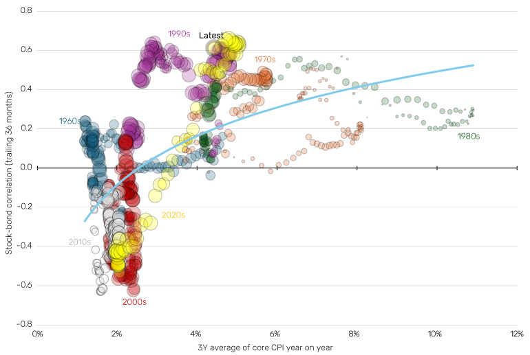
Source: Bloomberg, Man Group. As of May 2025.
There are various economic markers of regime change we could also choose from. Foreign Treasury holdings, dollar proportion of swift payments, debt-to-GDP ratios or US interest payments relative to defence spending (Ferguson’s Law) to name but a few. Clearly these are important as well, but as a first screen I prefer market pricing measures, such as the ones I have selected above, given that they are less speculative with regards to timing. When Seymour Durst put up the first real time debt clock on Sixth Avenue in 1989, it would have shown a debt-to-GDP ratio of 57%, and debt per taxpayer of US$35,000. Presumably he was concerned by those numbers. Today the clock reads 123% and US$323,000, respectively. The reckoning is surely coming, in my view, but as with everything in this ephemeral industry of ours, long and variable lags. When it does, I believe the metrics above will show early indication, as some already are. And then you better start swimming. Or you'll sink like a stone.
1. I don’t like ‘reflation’ because its connotations are too CPI-oriented, whereas the transition I envisage has as much to do with yields as with inflation. Ideas on a postcard, please.
2. www.man.com/insights/road-ahead-ten-themes and www.man.com/insights/road-ahead-10-for-10-part-2
3. See www.man.com/insights/road-ahead-five-reasons-to-buy-bonds and www.man.com/insights/road-ahead-term-premium for further detail on this framework.
You are now leaving Man Group’s website
You are leaving Man Group’s website and entering a third-party website that is not controlled, maintained, or monitored by Man Group. Man Group is not responsible for the content or availability of the third-party website. By leaving Man Group’s website, you will be subject to the third-party website’s terms, policies and/or notices, including those related to privacy and security, as applicable.