Monday 16 January 2023, or Blue Monday, is said to be the most depressing day of the year. For investors licking their wounds after a chastening 2022, it can seem like there’s a lot to be glum about. Near total consensus there’s going to be a US recession, inflation still three times the Fed’s target, potential for further multiple compression (at least in the US), potential for further downward earnings revisions, ISM below 50, still elevated geopolitical risk, a consumer ravaged by energy bills and housing costs, and so on and so on…
We’re more sanguine. For three reasons.
1. Stagflation Is Very Unusual
Ok so it depends how you define it. But it’s reasonable to assume it must include all of the following:
a. An economic recession as defined by the NBER
b. A high level of price rises through the recession
c. A rate of inflation which is accelerating or stable through the recession
Figure 1 shows the 30 US NBER recessions back to 1873, with some data on how inflation moved through them. If we say that, to be stagflationary, we have to get 5% price rises through the recession (item b in the above list), and a year-on-year rate of inflation which at least stays the same (item c), then only 2 out of 30 would qualify (1973-74 and 1990-91). We indicate this with the grey shading in the final three columns. Qualitatively, you’d probably want to include 1980 as well, but still, it ain’t much.
We think the base case for 2023 can justifiably be recession. And can justifiably be more inflation. But not both.
Figure 1. What Happens to Inflation During NBER Recessions
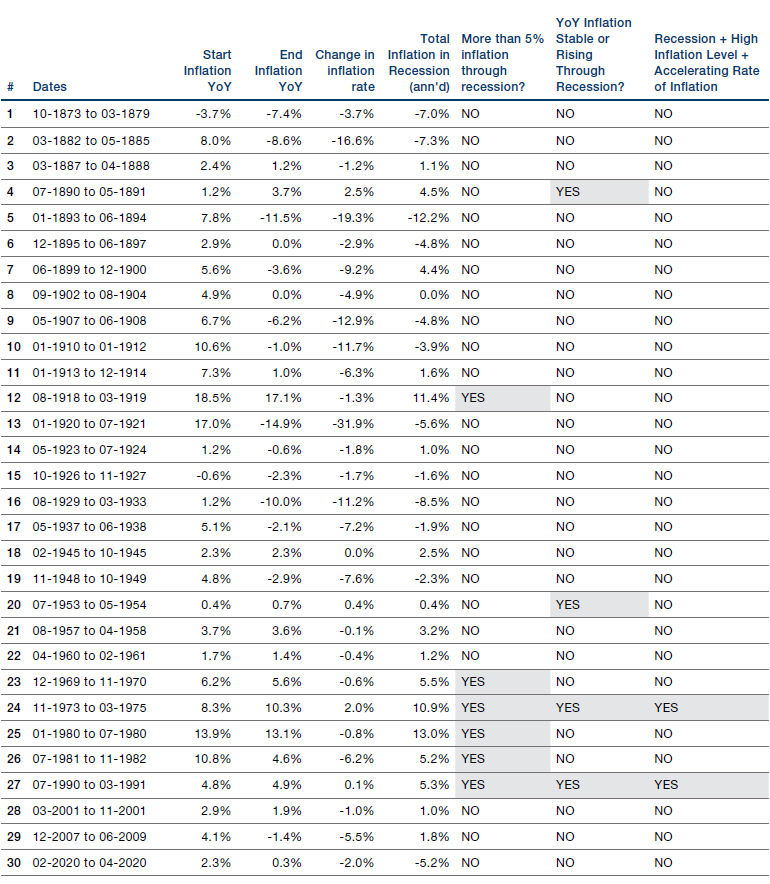
Source: Bloomberg; 31 December 2022.
2. Disinflation Is Great For Risk Assets
We think the rollover in inflation, particularly in the US, is going to be faster than the market expects. In Figure 2 we show our model which seeks to predict US headline inflation 12 months forward, by forecasting how various of the individual components of the basket will move. As is illustrated, we would not be surprised to see headline inflation starting with a 2 in 2023. This is well below even the most optimistic of Wall Street’s forecasters, and we think would likely generate risk-positive headlines.
Figure 2. What Will US Inflation Do Over the Next 12 Months1
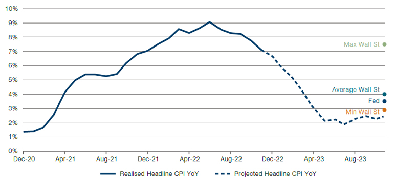
Source: Bloomberg; 31 December 2022.
If the forecast of Figure 2 is even vaguely right it means we have been in the DISINFLATION quadrant of our Fire&Ice framework since the end of June.2 DISINFLATION describes episodes where inflation is high and falling. There have been 19 such episodes over the past 100 years. The plot in Figure 3 shows the real annualised return to US equities in each of these episodes.
In only 1 instance (5% of observations) do equities give you a negative real return in a DISINFLATION episode. In 13 instances (68% of time) the real return is double-digit or more. On average across all 19 episodes the real annualised return is +14%. As already alluded to, we believe the current episode of DISINFLATION began at the end of June 2022. From then to the end of December, US equities have returned 2.5% real annualised. Per Figure 3, this is below 80% of historical readings. We think there’s room for equities to catch up with their historical precedent in this DISINFLATION episode.
Figure 3. Real Annualised Returns for US Equities in Historic DISINFLATION Episodes3
Problems loading this infographic? - Please click here
Source: Bloomberg; 31 December 2022.
3. Peak Rates For This Cycle Will Be This Year
If the inflation forecast of Figure 2 proves prescient, the Fed will stop raising rates, and we might even see some cuts this year. The market is currently pricing in the peak Fed Funds rate in June. We think it could come even sooner. While there is admittedly quite a bit of variability, on average equities tend to like the period in and around peak rates.
In Figure 4 we show the effective Fed Funds rate, divided into periods where the FOMC were in a pattern of raising rates (shaded red), and those where they were cutting them (shaded green). On this basis, and excluding the most recent hikes, we have 14 complete cycles of hike-and-cut. In Figure 5 we show the nominal total return of US equities preceding and following peak rates in each of these 14 cycles.
Figure 4. Fed Funds Rate Since WW2. Red = FOMC Hiking Rates, Green = FOMC Cutting Rates
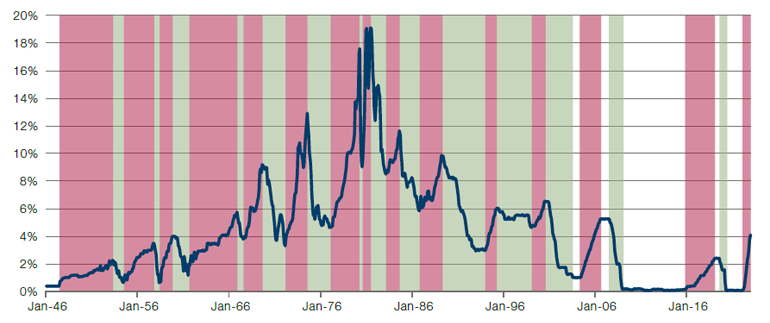
Source: Bloomberg; 31 December 2022.
Figure 5. Nominal Performance of US Equities Before and After Peak Rates
Problems loading this infographic? - Please click here
Source: Bloomberg; 31 December 2022.
Figure 5 does admittedly show quite a bit of variability. But, taken in aggregate, we can see that in the 6 months prior to peak rates, equities are broadly flat, and then in the 12 months afterwards they skew upward. In just three of the 14 instances are equities significantly negative a year after peak rates with an average increase of 14%.
Clearly there are very real challenges to a risk-constructive view. US equities trading on 17x forward earnings are not cheap (indeed this would put them at the 70th percentile through history), especially in the context of a probable recession. Moreover our models suggest US earnings could be revised down at least a further 10%. But we are cognisant that adding to risk never feels comfortable. Everyone says ‘I’ll add when the S&P hits 3,000.’ But Mr. Market is rarely so acquiescent. We’ve been through 12 months where inflation and the Fed reaction function have been the dominant return drivers. We think there’s every chance they continue to dominate, albeit with better news for investors.
1. Sources: Bureau of Labor Statistics, Bloomberg and Man DNA calculations. Energy is proxied with a basket of of gasoline, natural gas and coal futures, in approximate proportion to their estimated weight within the Energy CPI component, projected forward using futures curve. We model rents using historic relationships with property prices. We model food using an equal weight index of wheat, lean hogs, live cattle, milk, orange juice, coffee, sugar, cocoa and soybean oil, lagged by 12 months. We proxy car prices using the Manheim used vehicle auction index, lagged by 6 months.
2. Those interested in the precise definitions should see: www.man.com/maninstitute/varyingby-degrees-fire-and-ice
3. Source: Man DNA team. In the interests of legibility, the x axis labels are not exact and cover the years in which the DISINFLATION occurred, rather than the exact dates. The specific definitions can be found in the link included in footnote 2.
You are now leaving Man Group’s website
You are leaving Man Group’s website and entering a third-party website that is not controlled, maintained, or monitored by Man Group. Man Group is not responsible for the content or availability of the third-party website. By leaving Man Group’s website, you will be subject to the third-party website’s terms, policies and/or notices, including those related to privacy and security, as applicable.