Introduction
For decades, our guiding principle has been that the level and direction of general price rises are, together, the key determinants of asset allocation.
For decades, our guiding principle has been that the level and direction of general price rises are, together, the key determinants of asset allocation. In March 2017, we published Fire, Then Ice, our first explicit introduction to this framework at Man Group. The genesis of the process is much older though, back to the 1990s when Ben Funnell and Teun Draaisma were analysts in Morgan Stanley’s research department, under Barton Biggs and Steve Roach, the two much-feted – and in the case of Barton, muchmissed – luminaries of financial market strategy.
Up until recently we had always defined these regimes qualitatively for major asset classes, making a judgement on what constituted high or low inflation, and on what counted as falling or rising in terms of direction. Over the last year, we have sought to add robustness by following a quantitative regime identification process for a much wider range of assets. Thus, we studied 95 investment strategies over 98 years (and 150 years in some cases). In doing this, we have found results which support our original findings.
Lessons From FIRE
In Figure 1, we show a 150-year history of US inflation, overlaid with these new regimes. Inflation – or FIRE as we term it – was the original impetus of the project, it being the subject of a paper we wrote with Otto van Hemert, our colleague at Man AHL, and Professor Campbell R. Harvey, finance professor at Duke University. Entitled The Best Strategies for Inflationary Times, the study systematically defined periods of high and rising inflation from 1926 to present day, and observed how various passive and active investment strategies had historically moved through them. In Figure 1, we show these FIRE regimes as the dark red shaded areas. The lighter red areas prior to 1926 are also FIRE, but are based on new data which we did not have previously.
Figure 1. Fire & Ice Quantitatively Defined Regimes for US
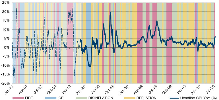
Source: Inflation data from Professor Shiller’s database, regimes defined by Man DNA team.
The full specification of the algorithm is beyond the scope of this paper, but in summary we can say the following: FIRE is where YoY inflation moves up through 2%, breaches 5%, and then peaks, with the observation window for the peak ending where inflation drops below its trailing 24 month maximum. ICE is where YoY inflation moves down through 1%, and then breaches -1%, with the end of the regime being where it moves back up through -4% (or the trough if it never gets to -4%). REFLATION is any regime which is not FIRE or ICE, and where CPI YoY has increased over the trailing 12 months. However, it is assumed that REFLATION cannot follow FIRE, and so in the rare occasions where it does, it is subsumed within the next available regime. DISINFLATION is the mirror image of REFLATION. For both DISINFLATION and REFLATION, any interruption of three months or less is subsumed within the prevailing regime. For a full specification please reach out to the Man DNA team.
From a multi-asset perspective, FIRE is the most dangerous regime.
Next, in Figure 2, we show performance results in each of these regimes in aggregate. Non-positive numbers are coloured red. Thus, at a simple glance we can see that, from a multi-asset perspective, FIRE is the most dangerous regime. ICE, the other dangerous environment for risk, at least has the advantage of solid returns to all segments of fixed income, the key equity diversifier in most multi-asset portfolios.
The FIRE Escape Plan
Thus, in Figure 3, we rehearse a ‘FIRE escape plan’ – 10 steps investors can take to rapidly re-shape their portfolios if they perceive an inflationary regime to be emerging.
Figure 2. Real Annualised Returns in Regimes Defined in Figure 1
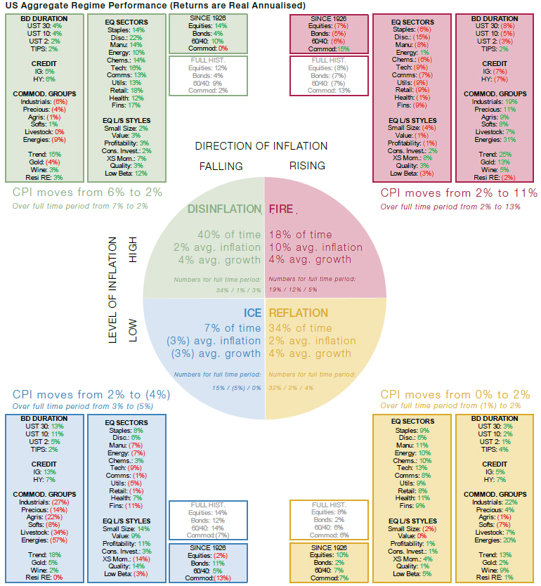
Sources: Equities are the S&P 500 using Professor Shiller’s data. Bonds are UST10 from GFD. 60/40 is the monthly rebalanced 60% equity, 40% bonds portfolio. Commodities are proxied by an equal weight portfolio of all futures contracts as they appear through history. From 1877 to 1946, this is based off work done by AQR. From 1946, we use returns data from the Man AHL database. Sectors are the based off the 12 Fama-French industry portfolios. Similarly, styles are the Fama-French portfolios (SMB, HML, RMW, CMA and Mom., respectively), apart from Quality and Low Beta which are AQR (QMJ and BAB). Duration returns from GFD. TIPS prior to 1997 based off a backcast by William Marshall at Goldman Sachs, otherwise Bloomberg. Credit portfolios constructed by the DNA team from data provided by Morgan Stanley. Wine returns from Credit Suisse to 2001, and then the Liv-Ex 100 Fine Wine benchmark. Residential RE is based on the Case-Shiller index. All returns are total return. For further details on regimes and asset returns, please see our paper, The Best Strategies for Inflationary Times, available here.
Figure 3. FIRE Escape Plan
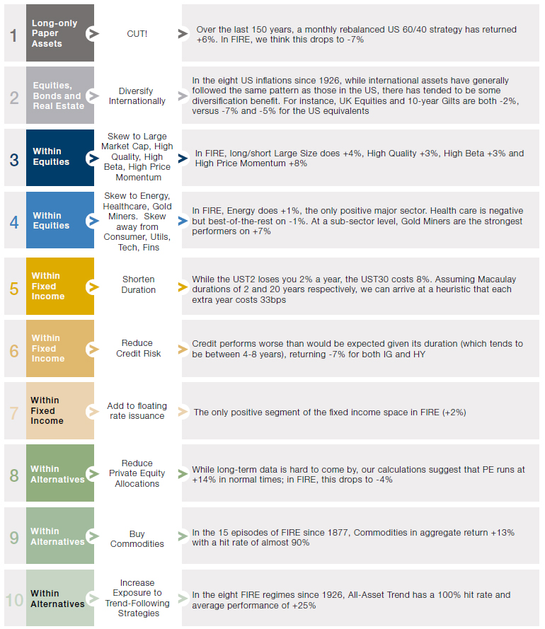
Source: Unless otherwise stated, all returns refer back to that shown in Figure 2, see source note there for details. All returns are TR Real CAGR. Regarding international diversification, these numbers are taken from Exhibit 16 in The Best Strategies for Inflationary Times,. Similarly, the number for gold miners comes from Exhibit C1 of the same report. For PE, we take data from Cambridge Associates PE index post 1986 and before that a proxy portfolio which takes US stocks, screens on size, profitability and value, then applies two turns of leverage. Illustrative example – for information only. The above example is intended as an illustration of typical investment considerations and strategy implementation. It should not be construed as indicative of potential performance of a fund or strategy or of any investment made by a fund or strategy
Preparing for FIRE in price rises is a bit like preparing for reallife fire; you make sure you have alarms and extinguishers, but it’s a fairly infrequent occurrence, barring pyromaniac tendencies. DISINFLATION and REFLATION are the norm.
Preparing for FIRE in price rises is a bit like preparing for real-life fire; you make sure you have alarms and extinguishers, but it’s a fairly infrequent occurrence, barring pyromaniac tendencies. DISINFLATION and REFLATION are the norm, accounting for 74% of the time in the main sample period, per Figure 2. So, while it’s important to prepare thoroughly for the tail risk, it is also right to make sure we are correctly calibrated for the usual market poise. Thus, to complement the FIRE Escape Plan, in Figure 4, we give our observations for how portfolios should be calibrated within these two regimes.
It should be noted this is purely empirical – we’re just looking at Figure 2 and writing down what we observe. While we can see a clear rationalisation for some – it makes sense, for instance, that commodities should start to perform in REFLATION, as the market looks forward to possible FIRE ahead – others are more mysterious to us. Why does Value seem to do better in falling as opposed to rising rate environments? Why are financials not stronger in FIRE, where rising rates should allow banks to inflate their net interest margins? Further work is required to ascertain the answers to these questions, but we include where we are now anyway. We fit our priors to the data, and not the other way around.
Gold and trend both share a similar characteristic of being much stronger in FIRE and ICE, than they are in DISINFLATION and REFLATION.
It’s worth also saying a word on gold and trend which, per Figure 2, both share a similar characteristic of being much stronger in FIRE and ICE, than they are in DISINFLATION and REFLATION. Both display evidence of exhibiting ‘crisis alpha’, given that FIRE and ICE tend to be times of elevated market stress. This finding was made separately by Man Group colleagues a couple of years ago in a 2019 paper entitled The Best of Strategies for the Worst of Times. So, within DISINFLATION and REFLATION, it might make sense to have a position in trend and gold, as a hedge against moving unexpectedly into one of the two extreme environments. In that context, trend could be the better option given that it has positive ‘cost of carry’ within both the moderate regimes. However, in REFLATION, it may be right to shift some of that exposure to gold, given that it moves into positive territory, and allows for diversification of inflation alpha sources.
Figure 4. Empirical Guidelines for Navigating DISINFLATION and REFLATION
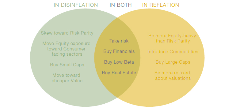
Source: Man Solutions. Illustrative example – for information only.
Moving to ICE
Finally, we study the ICE quadrant. It may seem unnecessary to give thought to deflation with price rises running over 6%, but there is a vocal minority – spearheaded by ARK Invest’s Cathie Wood – which says that ICE is a realistic threat, driven by an innovation-catalysed productivity boom. To be clear this isn’t our base case, but one we do think is worthy of consideration.
One thing that is immediately clear about ICE is that it is much less predictable than FIRE. This is particularly pertinent as regards equity performance. Looking at the boxes entitled ‘Since 1926’ and ‘Full Hist.’ in the ICE quadrant of Figure 2, we see a stark difference between returns to the asset class. While in the former – which as discussed is the sample we have traditionally used in our backtesting work – equities return -2% real annualised, or -5% in nominal space. In the latter, the equivalent numbers are +14% and +9%.
Our intuition has always been that in ICE equities should be weak, as the Money Illusion makes it harder for firms to cut their input costs (which will often have a significant labour component) than their output prices. The result will be margin erosion which should feed through into declining share prices.
Having been presented with these new empirical findings, we have nuanced our view in two ways. First, we observe that there is often a difference between ICE that is led by productivity gains, and that which is precipitated by slumping demand. It is the former that dominate the pre-1926 period in our sample. We note that in the 10 ICE regimes prior to 1926, real GDP growth averaged at +2% per annum. In the five that have happened since, the average has been -3%.
We illustrate the point with the two most extreme examples. The ICE regime which ran from October 1900 to April 1901 saw:
- Inflation annualising at -6%;
- Real growth at +8%;
- Real equity CAGR of +99%.
This episode came off the back of a decade of heady innovation and workforce expansion: the incorporation of General Electric and US Steel, Henry Ford’s first car, the Wright Brothers’ first flight, the first major oil discovery in Texas, and a 21% increase in the population from 63 million to 76 million as waves of immigration hit the new promised land.1 Ever industrious, the Gilded Generation even found time to annexe Hawaii, Samoa, the Philippines and Alaska.
This is in sharp contrast to the ICE regime which ran between September 1929 and June 1933; this saw:
- Inflation annualising at -8%;
- Real growth at -8%;
- Real equity CAGR of -12%.
While the reasons behind the Great Depression are hotly debated to this day, there is general agreement that it was led by demand turning in on itself, with emigration increasing for the first time in US history and numerous bank defaults as solvency was strangled, first for the farmers and then for corporate America more broadly.
Although ICE does not always have negative equity ramifications in the regime itself; immediately before and after the episode can be treacherous times as well.
The second observation we make is that although ICE does not always have negative equity ramifications in the regime itself; immediately before and after the episode can be treacherous times as well.
In Figure 5, we show the maximum real equity drawdown through the 15 ICE regimes (shaded blue), and for each the 12 prior and subsequent months. This means that some of the episodes become meshed together (due to their occurring within 12 months of one another), and we are left with 11 broader time periods, as indicated by the dates in the blue boxes at the top of the chart.
From this we can see that in all but one of these 11, equities experienced at least one real drawdown of 10% or more. This was sometimes before, sometimes after and sometimes in-between ICE regimes, but to us it illustrates that where there is ICE there is danger. The Titanic sailed through clear water, but the fact that it was travelling through the vicinity of ice was ultimately to its peril.
Figure 5. ICE Regimes Combined with 12 Months Before and Afterwards
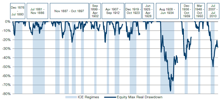
Source: Man Group.
ICE and FIRE are both damaging, but ICE is less predictable, and thus a time where it pays to be particularly humble about your known knowns.
In summary, we would synthesise the lessons of ICE as:
- ICE and FIRE are both damaging, but ICE is less predictable, and thus a time where it pays to be particularly humble about your known knowns. This is further illustrated in the Sharpe of US equities in the different regimes. For FIRE, DISINFLATION, REFLATION and ICE, these are, respectively, -0.5, +0.8, +1.2 and -0.1.2 The ICE number being closest to zero in absolute terms is indicative of greater uncertainty of returns during these environments;
- In ICE, you should think especially carefully about productivity and real growth. These are particularly important in distinguishing between ‘good’ and ‘bad’ ICE;
- The pain of ICE may not actually come in the freeze itself. Be fearful in the 12-month build-up and aftermath as well.
1. Source: US Census Office.
2. As per Figure 2.
You are now leaving Man Group’s website
You are leaving Man Group’s website and entering a third-party website that is not controlled, maintained, or monitored by Man Group. Man Group is not responsible for the content or availability of the third-party website. By leaving Man Group’s website, you will be subject to the third-party website’s terms, policies and/or notices, including those related to privacy and security, as applicable.