“In that direction,” the Cat said, waving its right paw round, “lives a Hatter: and in that direction,” waving the other paw, “lives a March Hare. Visit either you like: they’re both mad.”
But I don’t want to go among mad people,” Alice remarked.
“Oh, you can’t help that,” said the Cat: “we’re all mad here. I’m mad. You’re mad.”
“How do you know I’m mad?” said Alice.
“You must be,” said the Cat, “or you wouldn’t have come here.”
Alice in Wonderland – Lewis Carroll (1865)
Parish notice: this edition of The Road Ahead is co-authored with Graham Robertson, Head of Client Portfolio Management at Man AHL, deeply knowledgeable in all things Trend and portfolio construction, and a stand-up fellow to boot. And now onward.
Long-only investors at an unappealing crossroads
Long-only beta investors are at an unappealing crossroads. Stocks expensive. Bonds admittedly cheaper, but neither expected to generate enough return, on a 10-year view, to meet most institutional requirements. As an asset allocator, it’s enough to make yourself ask why you bother getting up in the morning. Perhaps even to empathise with the Cheshire Cat. You must be mad, or you wouldn’t have come here.
In one direction live equities. The US forward price/earnings ratio (PE) at the time of writing is 19x. That’s 89th percentile versus history. The Street expects US companies to deliver an operating margin of 16%. That’s 75th percentile versus history. Stocks are expensive, with room to disappoint on fundamentals.
In Figure 1 we show a scatter of equity regions (blue) and sectors (yellow), plotting their forward PE against the Street’s expectation for operating margin over the next 12 months. The size of each of the points denotes valuation and profitability expectations for each segment relative to its own history. Thus the US, given the 89th and 75th percentiles discussed above, averages at 82/100. 50th percentile would be the same size as the ‘Historic Median’ denoted in the legend at the top of the chart. While the Technology sector stands out, the plot shows that it is not alone. Indeed, the only areas of good value left (i.e. where the circle is the same size or smaller than the historic median) are the UK and Emerging Markets from a geographic perspective, and Energy and Healthcare in terms of sectors.
Figure 1: Equity Forward Multiples and Forward Margins
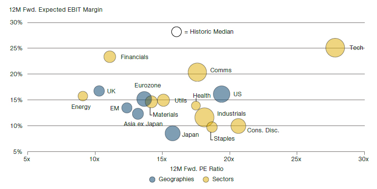
Source: Bloomberg, Man Group calculations as at 31 May 2023. All indices are from MSCI, sectors are for MSCI World.
It is true that, as was the case in 1998/99 or 2020/21, a market’s valuation can go from very expensive to very, very expensive. That is a possibility, with AI being the mooted touchpaper, but in our view, and as discussed in the last Road Ahead, the probabilistic risk/reward skew is slanted in one direction, and it ain’t up. And we don’t think you have to have a particularly bearish economic outlook to think this. We don’t.
In the other directions live bonds. Here the short-term picture is more nuanced. At the time of writing the yield on the 10-year US Treasury is 3.8%. The theoretical fair-value yield for the same is 4.4% (calculated by trend real growth + inflation expectations + the 10-year term premium). That spread of 60 basis points (bps) is the lowest in over 20 years (joint with the spread in September 2022, to be precise). Given that, we don’t think an overweight bond position is indefensible in the short term. But, given a bond’s yield is a good proxy for its expected return, and 4% is going to be shy of the return many investors require, it is still not a wildly appealing option.
Three simple solutions
Here are three solutions for anyone who feels themselves facing a similar Hobson’s choice. These are by no means rocket science, but the simple things often bear reemphasis, including to ourselves.
First, we recognise that, as the most liquid asset classes in the world, public equities and bonds are always going to represent the majority of any portfolio of serious size. The trick is not to kick against these goads, but instead to think of better ways of combining them. Perhaps most rudimentary is to amalgamate not on any fixed weighting, but to equalise volatility. Given bonds are less volatile this is going to lead to structurally higher weights than would be the case for the classic 60/40 split. This is of particular benefit today given the relative valuation story already discussed, but has structural advantages over much longer periods.
In Figure 2 we plot two portfolios. In yellow is a 60/40 equity/bond portfolio with static percentage allocations, rebalanced monthly. In blue is a risk parity combination of the same. The weight of each element is determined monthly, based on scaling to 10% volatility on a 3-year lookback. For each we show the relationship between the valuation (defined according to the Shiller PE and the US 10-year Treasury yield, see source note for details) and the subsequent 10-year compound annual growth rate (CAGR) that each portfolio generates.
For both we see a similar pattern; where valuation is richer forward returns are lower, and the relationship is convex. For both, current valuations are higher than average over history. For 60/40 the current valuation, as indicated by the black circle, is 76th percentile, consistent with a 5.5% nominal CAGR over the next decade. For risk parity, the current valuation is 61th percentile, consistent with a 4.4% return. While the return from the former is greater in the absolute sense, the explanatory power of the latter is superior. As indicated, the r-squared of the risk parity trend line is 0.73, versus 0.41 for 60/40. At similar valuation points in the past, forward returns for 60/40 have been as low as 2% and as high as 10%. The equivalent range for risk parity is between 2.5% and 7%. This greater level of certainty, we believe, will be helpful to many allocators.
Figure 2: Valuation And Forward Return For Equity/Bond 60/40 And Risk Parity
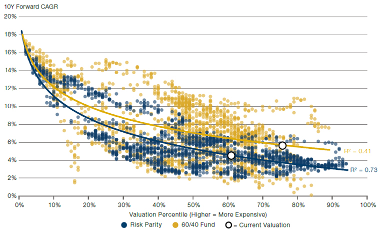
Source: US equity returns from Shiller, bond returns from GFD. Valuation calculated as a percentile of the US 10-year yield and the Shiller CAPE ratio. Weighting for 60/40 is static (i.e. 60% x Shiller Cyclically Adjusted PE Ratio percentile + 40% x US 10-year Treasury yield percentile). Weightings for risk parity are determined using the volatility equalising weights based on a 3-year lookback, monthly periodicity.
But let’s not beat around the bush. Neither 4.4% nor 5.5% is likely to be enough for many institutional entities. Take the classic endowment target of inflation + 5%. Average US inflation in the last cycle, call it 2009-19, was 1.5%. Through the 1970s it was 7%. The next decade, in the context of the capex super-cycle we have discussed in previous notes (see for instance), we think it could be 4%. That would mean a required return target of 9% nominal, leaving either of the approaches in Figure 2 well short.
In this context, a second solution is leverage. A dirty word for many, and often rightly so. But in the right hands – with the appropriate infrastructure and risk controls in place – we believe it is part of the answer. This is particularly powerful in the risk-parity context. In Figure 3 we show the 10-year trailing volatility of the same portfolios we showed in Figure 2, in the same colours. The grey bars on the second vertical axis show the multiple of the volatility of the former, relative to the latter. On average the ratio is a little over 2x, suggesting that we could double the risk-parity returns in Figure 2, while maintaining a similar experience of volatility relative to 60/40. We get it, leverage feels scary. But the reality is more nuanced. As this recent article from our colleague Tarek Abou Zeid pointed out, leverage and risk are different things.
Figure 3. Trailing 10-year Volatility of 60/40 and Risk Parity
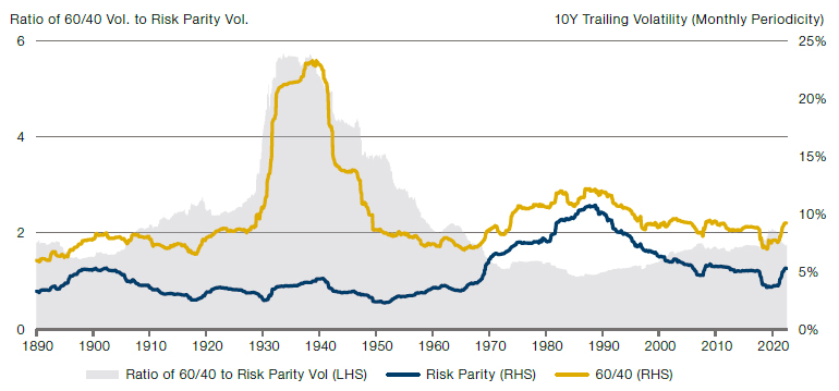
Source: Portfolios defined as per Figure 2.
Our third and final solution is to remind you that while long equities and bonds will form the majority of the portfolio, there are many options for the side orders, so to speak. In Figure 4 we show the Tetlockian base rate for the character of various asset classes. Take Trend, for instance. To the man with a hammer, etc. But humour us a moment. On the framework of Figure 4 it would seem to have much to recommend it. Over the very long term it has delivered a Sharpe ratio of just under 1. Its maximum drawdown is smaller (indicated by the smaller bubble) than other assets in a similar position on the chart, and its persistence of drawdown is also moderate (per the bubble’s colour).
Figure 4. Performance Statistics for Major Asset Classes Since 1900.
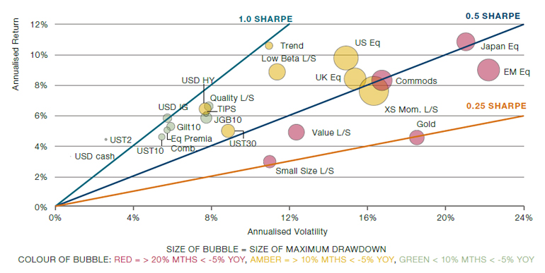
Source: All asset returns are from 1900 or earliest available. US, UK and Japanese equities all from GFD with data starting respectively in 1900, 1900 and 1921. EM equities data from MSCI, starting in 1988. US Treasury data from Shiller stating in 1900 for 10 year, 1941 for 2 year and 1919 for 30 year. US Dollar cash also from Shiller, starting in 1900. Gilts data from Bank of England, starting in 1900. JGBs from GFD, starting in 1900. Investment grade and high yield indices start in 1925 and are constructed by Man Group using data from Morgan Stanley. TIPS data from Bloomberg back to 1997, prior to which we rely on a backcast model from Goldman Sachs. Size and Value Long/Short from Eugene Fama, starting in 1926. XS Mom L/S from the same source starting in 1927. Quality and Low Beta from AQR starting in 1957 and 1930 respectively. Eq. Premia Comb. is a volatility-scaled portfolio of the equity L/S factors as they appear, thus starting in 1926. We then apply a haircut worth 50% of the average excess return. Trend is a proprietary historic backcast built by Man AHL going back to 1900 – again we have applied a performance haircut of 50% of the average excess return. Gold uses Man AHL’s historic futures database and is a result of rolling the front-end contract, data back to 1975. For Commodities we are rolling an equal-weight basket of front-end futures contracts from across the commodity spectrum (albeit in the early part of the series this is purely agricultural). Data is from Man AHL back to 1946, and from AQR before that, through to 1900.
None of this is a surprise, of course. Trend-following’s properties, particularly relative to equities, are well known. Figure 4 shows that the strategy is attractive on a standalone basis, but we ignore its correlation properties here. Because trend-following trades multiple asset classes, from both the long and short side, there is an intuitive low correlation to pretty much everything else in the long term. In the short term, however, this correlation is highly dynamic and offers the additional (highly attractive) feature of being negatively correlated to risk assets in crisis periods. The tech bubble bust of 2000-3 and Global Financial Crisis (GFC) in 2008-9 were the poster children for this characteristic, but nothing hammers things home more than recent events. 2022’s inflationary burst, with corresponding falls in both equities and bonds, revealed the Achilles’ heels of both 60/40 and risk parity portfolios. Trend-following got short both asset classes in 2022 and, broadly, profited as much as traditional portfolios lost – see, for example.
As a further illustration of this dynamic, in Figure 5 we plot the trailing 10-year correlation between the risk-parity portfolio of Figures 2 and 3, and an all-asset Trend strategy, the details for which can be found in the source note. The light blue dashed line shows the average correlation across the whole period, slightly negative and of small magnitude, as mentioned. As discussed, we also see sharp falls in the correlation going into the DotCom bust, the GFC and 2022. Moreover, we see a sharp fall in the correlation in the late 1960s, with the level staying negative throughout the 1970s. This was the last inflationary decade and a relatively poor environment for risk parity. We believe the 2020s will end up having echoes of this even if not to the same extremes. Some will disagree with this economic outlook, but most would admit that the probability has risen somewhat given the last 18 months. In that context, we think a permanent Trend allocation makes sense at the current juncture.
Figure 5: Trailing 10-year Correlation Between Equity-Bond Risk Parity and All-Asset Trend
Problems loading this infographic? - Please click here
Source: Risk-parity defined per source note for Figure 2. All-asset Trend defined per source note of Figure 4. Correlation is calculated using monthly periodicity.
Conclusion
It is said that the definition of insanity is doing the same thing over and over and expecting different results. Alice was faced with two choices, each of which felt insane. The current crossroads for equities and bonds is not that extreme – the former are expensive but not yet DotCom expensive and the latter, arguably, cheap – but it remains a junction where you’d say, like the apocryphal Irishman, ‘I probably wouldn’t want to start from here.’ At least in terms of reaching your targeted return end point. New solutions are needed. This is the voice of one crying in the wilderness. Change is coming.
You are now leaving Man Group’s website
You are leaving Man Group’s website and entering a third-party website that is not controlled, maintained, or monitored by Man Group. Man Group is not responsible for the content or availability of the third-party website. By leaving Man Group’s website, you will be subject to the third-party website’s terms, policies and/or notices, including those related to privacy and security, as applicable.