Was it transitory after all? The year-on-year rate of headline CPI has fallen by 610 basis points (bps) over the past 12 months. To see that kind of decline without outright deflation, one has to go back to the early 1950s. Oppenheimer was about to go on trial for fraternising with the reds. Barbie wasn’t invented yet. The Fed’s more contrived measures are saying the same thing. The quarter-on-quarter annualised CPI ex energy, ex food, ex shelter (allegedly Jay Powell’s favoured metric) has fallen from 8.6% to 1.4% over the same time. Of course in one sense all things this side of the Last Judgement are transitory. As a wise man once said, this too shall pass. But let’s not get hung up on semantics. Where next?
My start-of-year note – It’s All Going To Be Okay – anticipated inflation starting with a 2-point-something in 2023. Now technically the June reading was 2.97%. Buy that man a pint. But the reality is that 100bps is a long way, and provides the cover of ambiguity. I was expecting the lower end. In Figure 1 I show, in yellow, what my inflation projection model was forecasting at the time. And in blue where it is today. Dots are what is implied by markets and commentators.
Figure 1. US Headline Inflation Forecast Overlaid With Fire & Ice Episodes
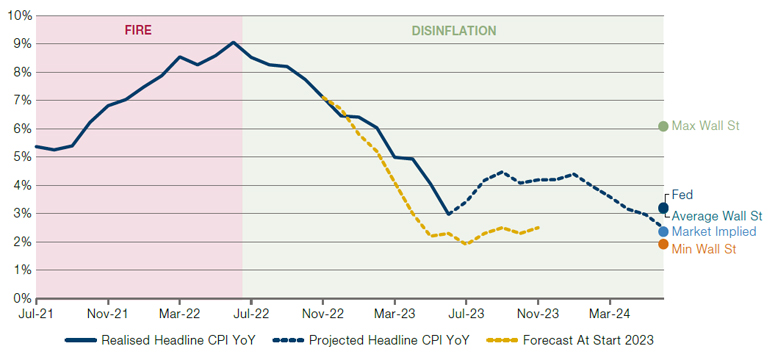
Source: Bloomberg, Man Group, as at end June 2023.
I am deep within the camp that says we will have multiple FIRE episodes – periods where inflation is above 5% and rising – through this decade. Make no mistake, that’s bad for risk assets. But as with comedy, so with making money: timing is everything. Figure 1 suggests DISINFLATION continues through the next 12 months. That is longer than I was originally expecting, and would be good for risk assets, as we will come to shortly.
But first let me regale you with some key model input highlights:
- Pertinent energy futures contracts, weighted according to consumption, are down 42% year-on-year, with futures curves implying they will remain negative on a YoY basis until February next year. Data from the American Automobile Association shows the actual price being paid at the pump is down 27% YoY.
- Hard commodities (copper, lumber and steel) – key inputs for both housing and manufacturing – are down 18% YoY on an equal-weight basis, with the curve saying we don’t get above +2% through the next 12 months.
- Having surprised higher in the early part of the year, used car prices have reverted to decline. The Manheim auction index as at the end of June was at -10% on both a YoY and QoQ basis. CarGurus, a higher-frequency alternative data provider, shows that, at the start of the year the average used car was changing hands for $ 28,875. By early June this had risen 3% to $ 29,747, but has now fallen back 1% to $29,419. This represents a 6% YoY decline.
- The 12-month forward sales estimate for publicly listed semiconductor manufacturers is -7% YoY. Shipping costs (Baltic Dry) are -51%. Cotton is -20%. According to Zillow data, rental cost growth has fallen from 15% YoY to 4%, and should keep falling, following house price growth which is now negative on a YoY basis.
- The only fly in the ointment is food, where the relevant futures are still at +9%, with forward curves implying this stays robustly positive for the next 12 months. The politicians will be honing their soundbites. But I don’t think it tips the scales on the numbers, given all the above.
Wages are the rhino in the room. But too many words and numbers. Time for a picture.
Figure 2. US Job Openings Rate vs Wage Growth (L) and Wage Growth vs Inflation (R)
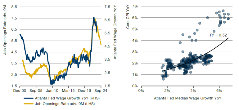
Source: Bloomberg, Man Group.
In the left panel I show that that the job openings rate leads wage growth by 9 months, as highlighted by numerous commentators. The job openings rate (i.e. the number of job openings divided by total filled and unfilled positions) today is 5.9%. Alternative data that we look at from recruitment websites such as Indeed and Linkup is indicative of this falling to 5.1% (the dashed portion of the line). You’ll need to take my word for that because we don’t have room for another chart. That would be consistent with wage growth dropping around 100bps to 4.5%. Per the right panel this would equate to about 2.5% inflation based on historical precedent. Arise, Sir Jay.
What does continued DISINFLATION mean for investors? Time to dust off this old badger.
Figure 3. Implied Asset Returns Assuming Continued DISINFLATION
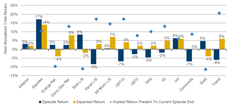
Source: Bloomberg, Man Group analysis. Expected Return depicts the current period from end June 2022 to end July 2023. The Episode Return shows longer-term historical periods for each asset type. For more detail on these historical periods and indices and factors used, please see paper linked below, Varying by Degrees: Fire & Ice 2.0.
Many of you will have seen this chart before. Excuse the self-conceit. But all of which is to say, if that’s you, skip this paragraph. Blue bars are the real annualised returns you would expect for a DISINFLATION episode based on a century of historic data (see Varying By Degrees: Fire & Ice 2.0 ). Yellow are that which has been realised in this DISINFLATION episode so far (which began at the end of June 22).
Now, new detail, the blue diamonds are, assuming the DISINFLATION episode continues according to the projection of Figure 1, what NOMINAL (ignore the y axis title for this variable) return would you need for each asset to equalise the blue and the yellow bars.
Takeaways. Duration, Trend, Value and Cross-Sectional Momentum the clear winners. Broad Equities, Consumer Discretionary names and IG Credit will all be decent. Energy names, Large vs Small, and Gold will all be poor, on this framework.
Hold on, I hear you say, both Figures 1 and 2 say inflation won’t go below 2.5% over the next 12 months. Figure 1 also shows it trundling along around 4% for a good while. Surely the Fed would react hawkish and, with essentially no further hikes priced in for the rest of the year, there is further duration downside?
I think not. I believe this decade will see the Fed move to a greater focus on the ‘maximum employment’ side of the dual mandate, and away from ‘stable prices’. Now clearly this is bad for duration in the long term, but again, timing is key. Don’t expect to wake up one morning to a Fed spokesperson saying, ‘alright lads, just to clarify, we really meant 3.’ This realisation will come gradually and unannounced. In the meantime the next 12 months will, in my view, be a duration sweet spot as inflation moderates. But the monetary landscape is clearly changing. 2% has been with us for a long time. This too shall pass.
Unless otherwise stated, the source of market data is Bloomberg.
You are now leaving Man Group’s website
You are leaving Man Group’s website and entering a third-party website that is not controlled, maintained, or monitored by Man Group. Man Group is not responsible for the content or availability of the third-party website. By leaving Man Group’s website, you will be subject to the third-party website’s terms, policies and/or notices, including those related to privacy and security, as applicable.