Please note that the opinions discussed below are those of the individual authors and do not reflect a Man Group house view. All market data referenced below sourced from Bloomberg unless otherwise specified.
“‘Of course you don’t!’ the Hatter said, tossing his head contemptuously. ‘I dare say you never even spoke to Time!’
‘Perhaps not,’ Alice cautiously replied: ‘but I know I have to beat time when I learn music.’
‘Ah! That accounts for it,’ said the Hatter. ‘He won’t stand beating.’”
Alice in Wonderland – Lewis Carroll (1865)
Concept
Many investment strategies revolve around some concept of dividing time. Trend strategies, at their simplest, express the view that the shape of returns in the current time period will be similar to that which was experienced in the one before it. Seasonality, at its core, is the idea that returns are similar at particular points in the calendar.
Yet another way of beating time, in investment if not in music, is to divide it between regimes. A regime is different from a season. Whereas the latter moves between states in a predictable manner, a regime can be one thing, then another, and there’s no telling how long each manifestation will last.
This edition of The Road Ahead is somewhat experimental, scratching an itch that has been nagging me a while. These are my first thoughts, hopefully a conversation starter, do get in touch if you’d like to continue it.
This is longer than usual in terms of its page count, but shorter in number of words. We’ll run through seven regime definitions. For each we’ll suggest how the states might be broken down, and track how six key assets and strategies (Equities, Bonds, Commodities, Long-Short (L/S) Equity Value, L/S Equity Cross-sectional Momentum and Trend) performed through these states.
Inflation
In March 2021, some colleagues and I published The Best Strategies for Inflationary Times1, which defined historic episodes of general price growth acceleration as those where yearon-year (YoY) inflation rose through 2%, then 5%, then peaked (a state we labelled FIRE). A year later we broadened this definition out2 to include DISINFLATION (high and falling inflation), ICE (low and falling) and REFLATION (low and rising). A homage to Robert Frost or George R.R. Martin, depending on your literary tastes. Figure 1 shows the history of these states according to our definitions (which you can read up on in the footnote, as well as the two pieces referenced).
Figure 1. US CPI YoY Overlaid with Inflation Regimes3
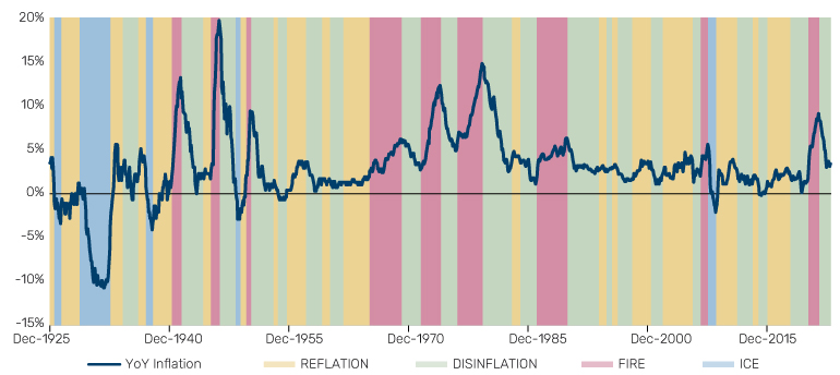
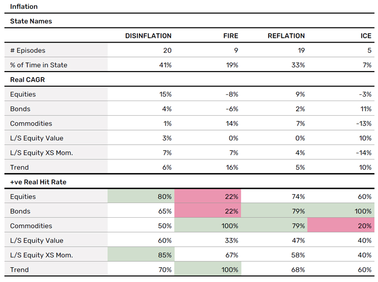
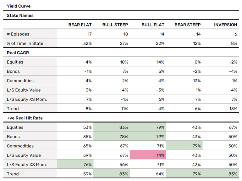
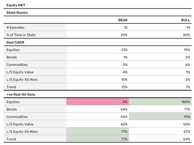
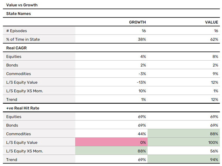
Figure 2 shows some statistics across these regimes. A litany of others we could show, but for the time being let’s keep it simple. The top half of the table shows real annualised return (strength of state signal), the bottom shows hit rate (persistence of signal – red or green cells denote those where performance is consistently positive or negative, defined as in more than 75% of episodes).
Peruse these at your leisure. But given that momentum applies to more areas than just finance, I’ll now rattle through the other proposed regime variables, with charts and tables in the same format. Flick ahead to the conclusion for a few overarching observations I’ve pulled out.
Figure 2. Inflation Regimes Summary Statistics4
Real Growth
Figure 3 shows regimes defined according to the state of real growth. Here we take the National Bureau of Economic Research (NBER) defined recessions as a baseline. On top of that, we use the same percentage thresholds as we did for inflation to define the other three episodes, which correspond as you would expect. But just to spell it out, BOOM is high and rising growth, SLUMP is high and falling, RECOVERY is low and rising.
Figure 3. US Real GDP YoY Overlaid with Growth Regimes5
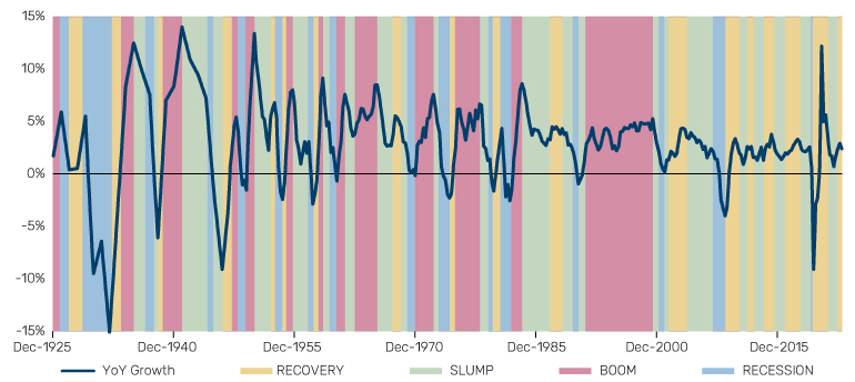
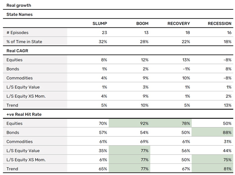
Figure 4. Growth Regimes Summary Statistics6
Yield Curve
The shape of the yield curve, and in particular whether its gradient is positive or negative, is a source of enduring fascination for the Street. And it has support in academia also, or so our man on the inside tells us.7 In Figure 5 we split the history of the 10Y-3M curve according to a 2x2 matrix: whether the curve in general is rising or falling (bear and bull, respectively), and whether its gradient is steepening or flattening. Given the interest in the inverted curve, we add this as a fifth regime state. Again, precise definition in the footnote.
Figure 5. US 10Y-3M (in bps) Overlaid with Yield Curve Regimes8
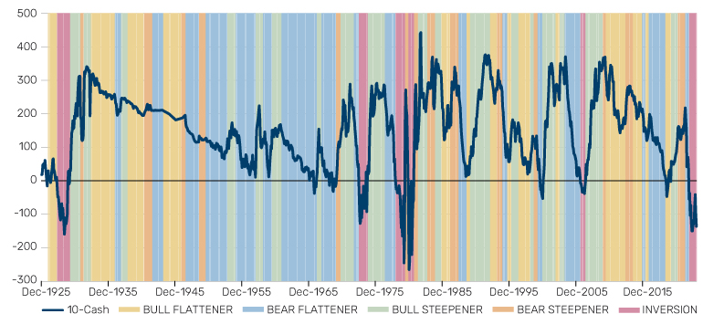
Figure 6. Yield Curve Regimes Summary Statistics
Equity Market
This is now getting somewhat reflexive, but the question of whether we are in a bull or a bear market environment is oft chattered on. Many will remember the wisdom of Old Partridge.9 Regimes defined in Figure 7. With apologies to the purists, I’ve defined this one by eye. Done is better than perfect.
Figure 7. S&P 500 (log scale) Overlaid with Bull and Bear Market Regimes
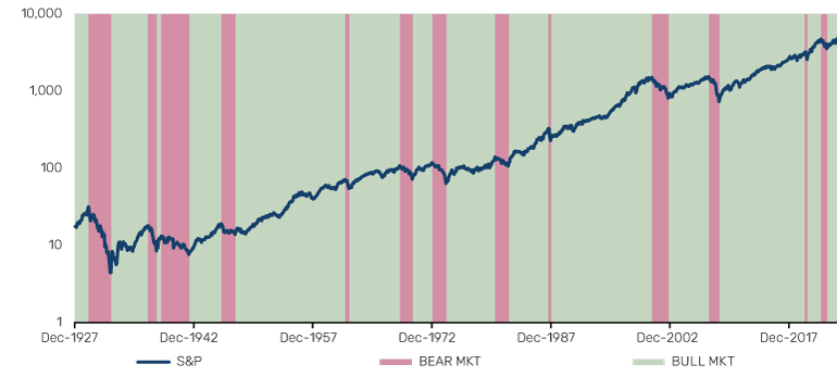
Figure 8. Equity Market Regimes Summary Statistics
Monetary Policy
Figure 9 shows the actual Fed Funds rate in blue, and the San Francisco proxy rate (which seeks to account for the impact of forward guidance and quantitative easing/tightening) in yellow. Over this we’ve defined tightening and loosening cycles. Once again we’ve done this optically.
Figure 9. Actual and San Francisco Fed Proxy Fed Funds Rate Overlaid with Policy Cycles
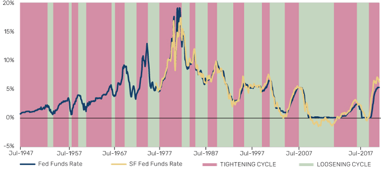
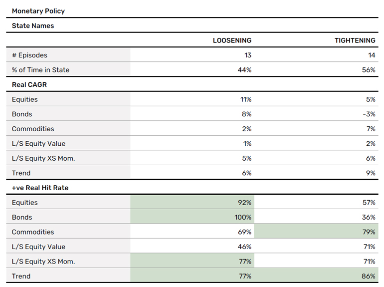
Figure 10. Monetary Policy Regimes Summary Statistics
Commodity Curve
Getting a bit more esoteric now. Never shy to praise great work from our competitors, we’d point readers to this excellent paper on the long-term history of commodity performance from AQR10. As part of this, they have defined whether the futures curve in aggregate is in backwardation or contango. We’ve taken this data, subsumed any episode where the contango or backwardation was shorter than six months within the prior state, and thus created the regimes shown in Figure 11.
Figure 11. Commodity Curve Regimes
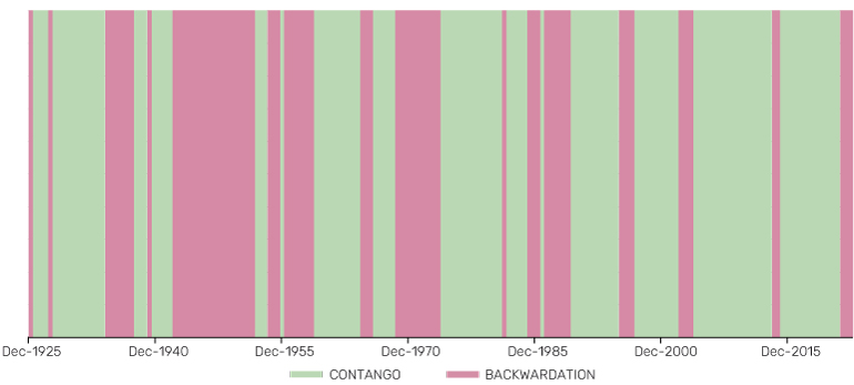
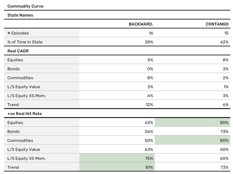
Figure 12. Commodity Curve Regime Summary Statistics
Value Versus Growth
Are investors more concerned with the promise or the payment? Figure 13 shows the long-term performance of the Fama-French HML factor (as a proxy for a strategy that buys cheap and sells expensive stocks), with time split into Value (yellow) and Growth (blue) states.
Figure 13. FF HML Performance (rebased to 100, log scale) Overlaid with Value and Growth Regimes
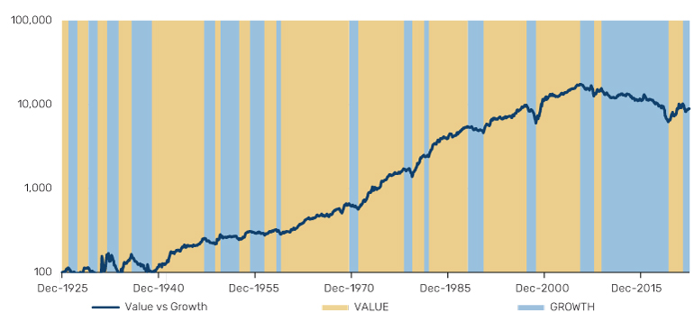
Figure 14. Value and Growth Regime Summary Statistics
In Summary
Here are nine immediate observations from the data. I know, it should be 10, but I’d be forcing it.
- Inflation is probably the most predictable of the regime frameworks, in terms of the magnitude of returns and the persistence of direction. If you are only allowed to use one economic datapoint to guide your decisions, US headline CPI should be it.
- On my definition, there has not been a real growth boom since the 1990s. Fingers crossed for the AI productivity miracle.
- L/S Equity Value is consistently one of the hardest investment strategies to fit into a regime framework. It is a myth, for example, that it consistently benefits from high and rising inflation, even if it did so in the recent episode. Indeed, the only heuristic I think you can take from the above is don’t touch it when the yield curve is bull flattening.
- Equity bull markets are 80% of history. Don’t forget the simple lessons…
- Bonds are positive (in real terms) in little more than half of equity bear markets. Historically there have been better defensive diversifiers than the traditional equity foil.
- Equities have ALMOST ALWAYS worked when real growth is booming and when monetary policy is being loosened. Trend has ALMOST ALWAYS worked when Value is in the ascendant. These are fat pitches.
- Trend and Commodities have ALWAYS worked in states of high and rising inflation. Bonds have ALWAYS worked in deflationary environments, as well as when monetary policy is being loosened. These are obese pitches.
- L/S Equity XS Mom. has historically done 10% real in states where Value is underperforming, versus 1% in the opposite. There’s a reason you often see these two as bedfellows.
- The consistency of momentum, both time series and cross-sectional. In almost all frameworks, L/S Equity XS Mom. and Trend are positive more than half the time in all states. This is partly by design, given that for many of our regime definitions we include the constraint that a regime cannot be shorter than six months. But it also hints that, if you can hold through initial reversals, patterns often reassert.
Actually, I thought of a tenth. There’s no magic bullet. All regime frameworks – at least all those we’ve investigated here – are messy. Things kind of work, but not definitively, not to the extent that you can relax. Nature of the job. Sigh. We fight on. The beatings will continue until morale improves.
1. https://papers.ssrn.com/sol3/papers.cfm?abstract_id=3813202
2. https://www.man.com/maninstitute/varying-by-degrees-fire-and-ice
3. Inflation regimes defined by the DNA team at Man Group according to the following rules. FIRE: where CPI YoY moves above 2%, through 5% and peaks. ICE: where CPI moves below 1%, then below -1%, ending either at the trough, or where it goes back through -4%. DISINFLATION: where CPI is falling on a trailing 12-month basis, and is not either FIRE or ICE. Also assume that DISINFLATION cannot follow ICE. REFLATION: where CPI is rising on a trailing 12-month basis, and is not either FIRE or ICE. Also assume that REFLATION cannot follow FIRE.
4. For equities we use the Kenneth French data. Bonds use the Bloomberg Barclays 7-10 Year Treasury Aggregate Bond Index where it becomes available and before that a variety of archive sources. Commodities uses AQR’s equal weight commodity future index and then the Bloomberg Commodity Equal-Weighted Sector TR Index. L/S Equity Value and SX Mom. are the Fama-French HML and Mom. factors, respectively, with cash rate added back and net of 2% costs. Trend is a proprietary historic backcast built by Man AHL going back to 1900 – net of a performance haircut of 50% of the average excess return over that period. That splices into the Société Générale Trend peer group where that becomes available.
5. RECESSION episodes defined by NBER. BOOM: where growth moves above 2%, through 5% and peaks. SLUMP: growth is falling on a trailing 12-month basis, and is not either BOOM or RECESSION. RECOVERY: where growth is rising on a trailing 12-month basis, and is not BOOM or RECESSION or ICE.
6. All asset data the same as for Figure 2. This is the same for all summary statistics tables that follow.
7. Professor Campbell R. Harvey, an advisor to Man Group, was the first to comment on the link between inverted yield curves and recessions: 1988, “The real term structure and consumption growth”, Journal of Financial Economics, Vol. 22, No. 2, pp.305-333
8. Yield curve data from Bloomberg. States defined as follows: we first observe whether the curve is flattening or steepening, defined as the change in the shape of the curve over the prior 12 months – we then observe whether the average of the 10Y and 3M rates has been rising or falling over the prior 12 months (bear and bull, respectively) – we then observe whether the curve is inverted or not. Curve inversions take priority over all other states. We exclude states which are less than six months, and in such instances extend the states on either side, hence some of the shorter inversions do not show up as such.
9. And those who don’t should urgently read Edwin Lefèvre’s Reminiscences of a Stock Operator.
10. See: https://www.aqr.com/Insights/Research/Journal-Article/Commodities-for-the-Long-Run
Index definitions
Bloomberg Barclays 7-10 Year Treasury Aggregate Bond Index
The Index measures the performance of the U.S. Government bond market and includes public obligations of the U.S. Treasury with a maturity of between seven and up to (but not including) ten years. Certain special issues, such as state and local government series bonds (SLGs), TIPS and STRIPS are excluded.
Bloomberg Commodity Equal-Weighted Sector TR Index
The Index is designed to be a highly liquid and diversified benchmark for commodity investments, providing equal-weighted broad-based exposure to commodities; no single commodity or sector dominates the Index.
Société Générale Trend Index
This is an index of CTA funds that is equal weighted and calculates the daily rate of return for a pool of CTAs selected from the larger managers in the universe.
AQR’s equal weight commodity future index
An index of the performance of an equal-weighted portfolio of commodity futures using monthly data.
You are now leaving Man Group’s website
You are leaving Man Group’s website and entering a third-party website that is not controlled, maintained, or monitored by Man Group. Man Group is not responsible for the content or availability of the third-party website. By leaving Man Group’s website, you will be subject to the third-party website’s terms, policies and/or notices, including those related to privacy and security, as applicable.