All data as of 13 May 2022 unless specified otherwise.
1. The Forgotten Rule
Thought about the Taylor rule recently? You are not alone in having forgotten it! The rules-based metric that indicates where policy rates should be, given the state of the economy, has been discredited since the Global Financial Crisis, because it stopped describing reality. It currently suggests policy rates should be 10% in the US, 12% in the UK, 7% in the Eurozone, versus actual rates of 1%, 1% and -0.5% respectively, according to Bloomberg.
It isn’t the first time that old models are discarded as markets divorce from reality. “Revised models justify stretching” is a key behavioural tenet of market bubbles. Price-to-eyeballs in 2000, sale-and-leaseback models in 2007, valuation ratios adjusted for intangibles -- or simply ignored! -- in 2020 spring to mind. We would posit that the fact that rates have been well below the Taylor rule estimate has contributed to the current inflation problem, rather than demonstrating its irrelevance.
Paul Volcker tamed the inflationary mindset in the 1970s by moving rates above what the Taylor rule implied –albeit the rule was devised in 1993 (Figure 1). We have a lot of sympathy for the idea that the current inflationary mindset will only be tamed if the same thing happens. Central bankers will not get there in a hurry. Some talk a tough game currently, but we think they will likely blink once or twice to support the economy and/or markets, thus contributing to multiple waves of inflation in the years to come. We may be at a local peak of a first inflationary wave at the moment, a la January 1970, but our base case is that a short-term rollover is a chance to prepare for the next wave, not the end of the inflationary era. The era may only end when policy rates exceed the Taylor rule again. A scary thought, indeed.
Figure 1: What Would John Taylor Make of This? Taylor Rule-Implied Fed Policy Rates Versus Actual Policy Rates
Problems loading this infographic? - Please click here
Source: Bloomberg; as of 30 April 2022.
2. UK Equities: Risk Rising
Less good news for those holding UK assets is that the FTSE 100 index is starting to look like it has got over its skis, according to our models. Britain’s outperformance this year has been impressive; the FTSE 100 index is up 0.5%, some 16 percentage points ahead of the S&P 500 Index, in local currency terms. Our base case is for consolidation in this relative performance over the next 6-12 months.
Figure 3 shows the cornerstone of our valuation framework, the Composite Valuation Indicator (‘CVI’), which we built over two decades ago. For those readers not part of our adoring fanbase (who will have heard this spiel before), the model is comparing various flavours of equity yield with bond yields, cash rates and inflation. A higher number indicates that equity yields are relatively low against these comparators, so stocks are expensive. A lower number indicates the opposite.
Figure 3 illustrates the metric for the UK (light blue line, right y axis), MSCI ACWI index (navy blue line, right y axis), and the difference between the two (yellow bars, left y axis). Two things jump out. First, UK equities have never been this expensive in absolute terms. Secondly, UK equities have not been this expensive relative to the rest of the world for 15 years. The gap is coming from both sides of the equation. Since the start of 2021, the UK’s forward book value yield has stayed roughly constant, at a little over 60%. In the US, the same metric has increased, from 25% to 27%. At the same time, the 10-year gilt yield has risen from 0.2% to 1.9%, compared with a move from 0.9% to 2.9% for the equivalent Treasury. While this is a bigger move in absolute basis point terms, once adjusted for convexity (in other words gilt yields moving off a lower base), the UK effect is the more powerful.
So, what’s a patriotic Brit who wants to keep his money onshore to do? One option is investment grade corporate credit, which is beginning to look attractive. The credit default spread on JP Morgan’s GBP IG index is 114 basis points. Assuming a 40% recovery rate, that implies a cumulative 5-year default rate of 0.7%, versus a long-term historical average of 0.5%. In other words, the market is pricing for a worse credit environment than that which has prevailed over the long term.
Figure 2: UK and MSCI ACWI Composite Valuation Indicators
Problems loading this infographic? - Please click here
Source: Bloomberg, MSCI, Man DNA team calculations.
3. US Pension Required Returns: Alpha Bet
Lean times for easy wins. Since 1925, a portfolio comprised of 60% US equities and 40% US 10-year government bonds has returned about 9% a year. That’s a return that many pension funds would give their eyeteeth for today, but they’re unlikely to get it, at least not the easy way.
Figure 4 shows the Shiller cyclically adjusted price to earnings ratio (‘CAPE’) for the US stock market (high left). Bottom line, it’s expensive. So expensive, in fact, that at comparable levels through history, the average compound annual growth rate over the subsequent 10 years has been just 1% (low left). If we assume that the yield on a 10-year US Treasury is a decent enough proxy for what it will return over the next decade (3.1% currently) and do the same for investment grade corporate credits (4.4%), then we get an implied 60/40 return over the next 10 years of between 2.1% and 2.6%, depending on whether you put credit risk in the 40 (right, blue bar).
There’s probably an interaction effect at play here, and maybe it’s positive (although as we never tire of telling people, a negative stock/bond correlation is not at all a given, certainly by the precedent of history). So perhaps it’s a bit more than that, but it’s still likely to be nowhere near what the big US pension funds require. The yellow bar in Figure 4 (right panel) shows these requirements, as reported by the National Association of State Retirement Administrators, for the top 130 plans. Let’s not labour the point, it’s a big gap whichever way you cut it, possibly as much as 5.6% a year.
The application of this observation is twofold. First, beware companies with large pension fund deficits. True higher rates reduce the NPV of liabilities; however, we think upside for the US 10-year yield is limited from here, at least in the short term. Secondly, if your required return is much above 3%, be prepared to pay for alpha. Conflict of interest flag, granted.
Figure 3: Potential Pension Funding Shortfall Implied by Relying on Beta Only
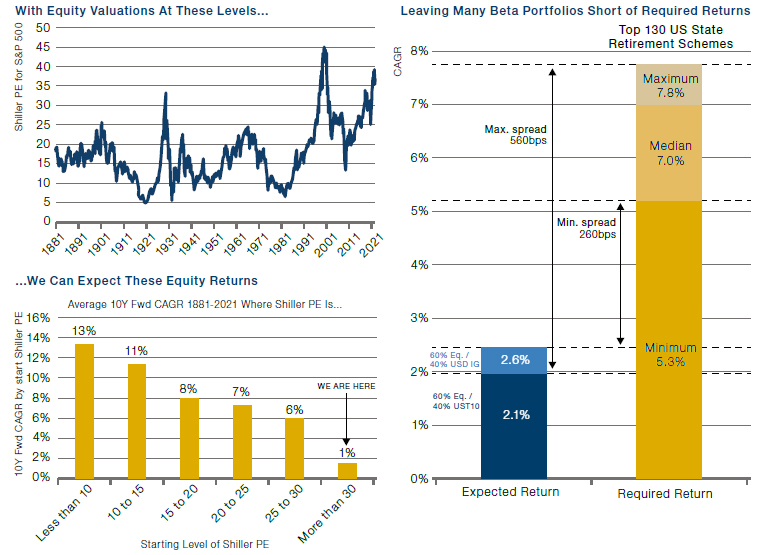
Sources: (TOP LEFT) Shiller PE from Professor Shiller’s online database. (BOTTOM LEFT) We calculate the average 10Y CAGR for the S&P 500 (Total Return) split by starting level of the Shiller PE. (RIGHT) ‘Expected Return’ refers to the10Y fwd. expectation for a portfolio comprised of 60% US equity (using the projection implied by BOTTOM LEFT), and 40% either UST10s (where we proxy fwd. return with the current yield) or USD IG (where we proxy fwd. return with the YTW on the Bloomberg Barclays US Corporate Investment Grade Index). ‘Required Return’ refers to the investment return assumptions of the top 130 US State Retirement Schemes, as reported by the National Association of State Retirement Administrators.
You are now leaving Man Group’s website
You are leaving Man Group’s website and entering a third-party website that is not controlled, maintained, or monitored by Man Group. Man Group is not responsible for the content or availability of the third-party website. By leaving Man Group’s website, you will be subject to the third-party website’s terms, policies and/or notices, including those related to privacy and security, as applicable.