Let’s begin with a mea culpa. In my note of 18 May 2023, I wrote that the risk/reward for equities versus bonds was in favour of the latter. Since then US equities are up 8%. US long-end government bonds are down 8%.1 There used to be a word for that. Ah yes. Wrong.
‘The horse is dead, man’, I hear you say. ‘Stop it!’ I’m sorry, but this rider’s warming up his whip hand for some more flogging. No hard feelings if you want to stop reading here. Still with me? Then forward.
Reason #1: Bonds are Cheap Compared with Equities
Bond yields are high. Equity yields are low. Base case when this happens is that bonds outperform. Consider Figure 1.
Figure 1. Historic relationship between relative equity-bond valuations and forward risk-adjusted returns
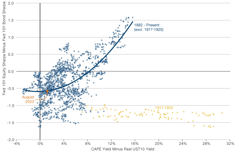
Source: CAPE yield from Professor Shiller’s online database. Real UST10 Yield is the US 10-year yield minus the Cleveland Fed 10 year expected inflation. Prior to 1982, when the Cleveland series begins, we take 5-year trailing average CPI as a proxy for expected inflation. Returns data from Bloomberg and GFD. Monthly periodicity January 1882 to August 2023.
The further left you move on the chart, the more bonds are comparatively cheap, relative to equities. The further downward you move on the chart, the higher the risk-adjusted bond return compared to equities.
Per the orange circle, today the gap between the CAPE yield and the real bond yield is 130bps. Of the 1,701 months since January 1882, that is the 368th smallest value. Or 22nd percentile, if you prefer to think in those terms.
The long-term trend line would suggest that over the next 10- years the Sharpe ratio of the 10-year US Treasury (UST10) will be more than 0.5 turns greater than that of the S&P 500 Index. Historically, in 150-odd years, we have never had a 10-year period where the relative valuation is this low and equities go on to outperform bonds.
‘Only my granny cares about 10 years!’ The cry goes up. ‘What about now?’ Read on.
Reason #2: Bond Valuation Relative to Economic Fundamentals is Extreme
Figure 1 showed that bonds were quite cheap relative to equities. Figure 2 shows that bonds are mad-crazy cheap relative to economic fundamentals.
Figure 2. US 10 Year theoretical fair value and actual yield (top panel) and spread between the two (bottom panel)
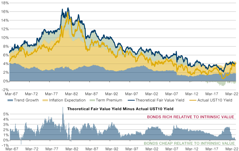
Source: Our measure of Trend Growth combines the Laubach-Williams and Richmond Fed estimates, along with the 5-year trailing average of real GDP growth, and Wall Street’s projection of growth two years out. Inflation Expectation combines the University of Michigan and Cleveland Fed estimates, with the 5Y5Y, the 10Y breakeven, the trailing 5-year average of CPI and Wall Street’s projected CPI 2 years out. All data from Bloomberg. March 1967 to August 2023, monthly periodicity.
So here’s the intuition. Where an investor buys a 10-year US Treasury, or another bond issued by a sovereign that can print its own currency, they should be compensated for three things.
First, in lending their capital to the government rather than investing it in the private sector, they are forgoing equity upside in the wider economy. You signed up to receive fixed, contractual cashflows from the state, but you could have bought shares in a farm, or a shoe factory, or a hot-dog cart. While these different projects will have differing returns on capital, on average what you will miss out on is the trend rate of growth in the economy.
Secondly, given that the payments an investor will receive are fixed, while the costs that those payments will ultimately go to defray are not, he or she will want to be compensated for the extent to which they expect prices to rise.
Thirdly, the yield available on a bond is only realised if the buyer holds the instrument to maturity. Given that there is uncertainty inherent in time, and the more time, the more uncertainty, the bondholder will need some compensation for the maturity of the instrument relative to cash, which has a zero maturity. This component is known as the term premium.
In the top panel of Figure 2 we show these three components (the shaded areas), their sum (the blue line) and the actual US 10-year yield (the yellow line). In the bottom panel we show one minus the other.
As at the end of August, the difference between the actual yield and what the above theory would dictate was… zero. In fact, it’s only happened four times before in 678 months of data.The last time was June 1982. Take a sneak peek down to Figure 3. Not the worst time to hold Treasuries.
Reason #3: Recent Negative Performance has been Historically Rare
Okay so this one’s not for the purists, but let me indulge my inner fintwit for a second. Multi-year consecutive real bond declines are rare. We are in one. It is large. Here’s a picture.
Figure 3. Real calendar year returns to the US 10 Year Treasury (1877 to 2023 YTD)
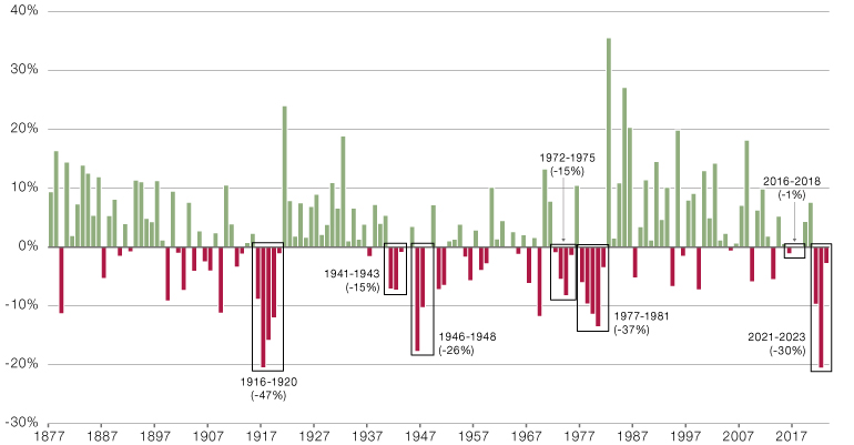
Source: Data from Bloomberg, Shiller and GFD. 1877 to 2023. 2023 bar is the YTD value to end of August.
Prior to now there have only been five instances of three consecutive years or more of negative performance (I refuse to count 2016-18). The total drawdown in this one is already greater than any of the others bar 1916-20 and 1977-81. This one’s for the mean-reverters. Nota bene.
Reason #4: Stock-Bond Correlations are too High and May Fall
Not relevant for everyone. But for those it does concern, super-relevant. Now, context. Sign me up for the club that says next 10 years, inflation structurally higher, stock-bond correlations structurally higher (and positive, unlike the last 20 years). But… nothing moves in straight lines. And we’ve had quite the move.
Figure 4 is one of my all-time favourite charts. I love it so much I even got Man Group to frame it and stick it up on the wall in Riverbank House. Bit like my mum used to do with my finger paintings. Plus ça change.
Figure 4. Relationship between US inflation and the stock-bond correlation (1960-2023)
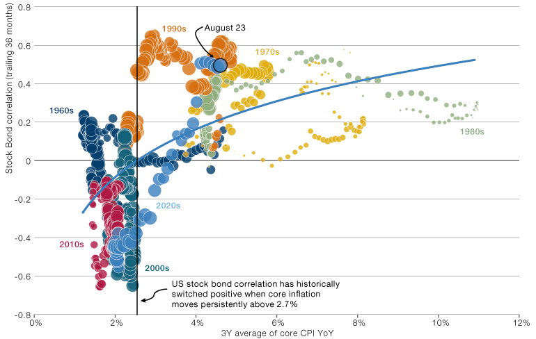
Source: Stock-bond correlation is between the S&P 500 Total Return and the Bloomberg Barclays US Treasury Aggregate Total Return indices. Valuation calculated as the percentile monthly P/E from January 1960 to October 2022. Core CPI from the Bureau of Labor Statistics As at end August 2023.
Quite the move from the -0.6 levels, where the decade began, to +0.5 today. In three short years. What a ride. And from the looks of the chart, we’ve gone a bit far. Reversion to the trend line has us dropping back down to +0.2. This will mean that bonds will have added value as a diversifier again. At least more so than that which they have now.
Reason #5: Outside Chance of Stuff Blowing up
To be clear, this is not the base case. I’m actually pretty sanguine on the US economy, and the point of this note has been that even if you take that line, there’s a pretty strong case to be made for bonds over equities.
But… there’s still a war on in Europe. Meanwhile, despite one of the most rapid increases in mortgage rates ever, US house prices are off their peak by… Oh wait. They’re not.2 I could go on. Point is that there’s a bunch of stuff that could explode. Probably more so than usual. And if that happened people would rapidly re-discover the flight-to-safety properties of US Treasuries.
Figure 5 is your melodramatic reminder that these things can creep up on you. With head fakes along the way.
Figure 5. How the UST10 yield travelled through the GFC (2007-08)
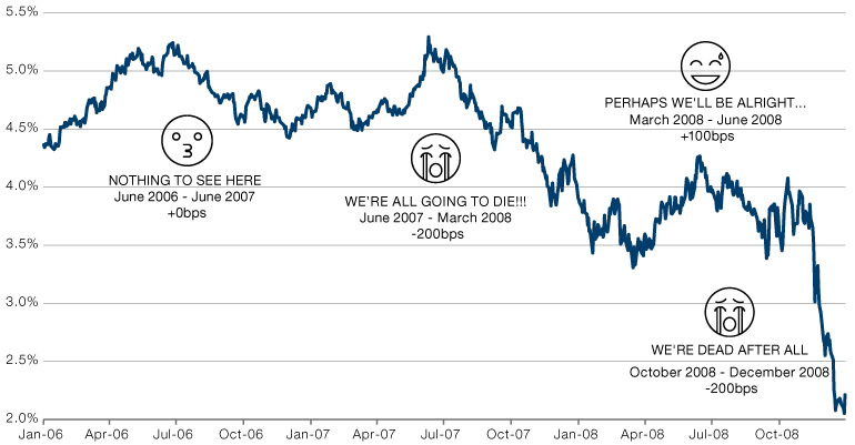
Source: Data from Bloomberg.
In Conclusion…
To be clear, long term I’m a bond bear. The new world where investment needs are going to be large (green transition, defence spending, ‘levelling up’ (or whatever political slogan you want to use), supply chain resilience) and savings growth less (because people are getting older), will mean yields rise. Perhaps even mirroring the 30-year bond bull market that started in 1982.
But, I’ll say it again. Nothing moves in straight lines and on a 12-month view, bonds look more attractive to me than equities.
Oh, and a final word on the ‘wall of supply’ argument which is doing the rounds at the moment. Those naughty politicians spending hand over fist. Causing a glut of UST issuance which is going to spike yields in the short term. Sure, there’s a certain logic to it. Only problem is, empirically, it doesn’t work. As shown in Figure 6.
Figure 6. Relationship between US debt issuance and change in yields. By calendar year 1882-2022
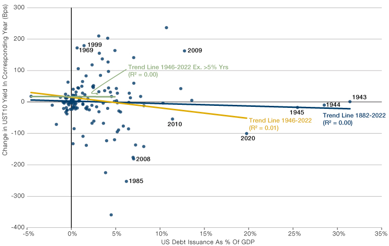
Source: UST issuance data from the US Treasury online database. Long term GDP from Our World In Data. 10 Year yields from Shiller.
When you’re the elephant in the room the laws of market physics don’t apply to you. Those rare instances where there’s some truth to the old mantra, ‘quantity has a quality all of its own’.
Through the last four Fed hiking cycles the UST10 yield has fallen by a median of 80bps in the 12 months following the last hike (ranging from -17 to -98). We are at least close to the last hike. More likely beyond it, in my view. The duration of the Bloomberg Barclays US Treasury 7-10 Year Index is currently 8. So if we get the median historic scenario from here you get 6% return on the yield move. Plus 4% carry. Equals a decent base case of 10% return.
Or you go for US equities at 19x on a hope and a prayer of an AI productivity revolution. Soon. I know what I’d choose.
1. As proxied by the S&P 500 Total Return and Bloomberg Barclays US Treasury 7-10 Year Total Return, respectively, as at the time of writing.
2. At least on the Case-Shiller Index, which has now returned to its June 2022 highs.

You are now leaving Man Group’s website
You are leaving Man Group’s website and entering a third-party website that is not controlled, maintained, or monitored by Man Group. Man Group is not responsible for the content or availability of the third-party website. By leaving Man Group’s website, you will be subject to the third-party website’s terms, policies and/or notices, including those related to privacy and security, as applicable.