‘This thing all things devours: birds, beasts, trees, flowers; gnaws iron, bites steel; grinds hard stones to meal; slays king, ruins town, and beats high mountain down.’ Gollum
Time, the answer to Gollum’s riddle, is to us a vaunted teacher. The first half of 2022 has been a turbulent one. In analysing ‘The Road Ahead’ from this point, our first port is the precedent of history, and of much of it as possible. In doing this we aim to establish a Tetlockian base rate from which to anchor our forecasts. In this edition we apply this process to three subjects: the performance of a 60/40 portfolio, the anatomy of a typical bear market and the indicators that best predict economic recessions. We hope this will be of use to our readers and, like Bilbo, they might escape riddles in the dark, and come to a place of greater clarity. For each section we will show two pictures, with a brief description of what they represent, and give three observations.
What Happens To 60/40 After It Is Down This Much?
Description
In Figure 1, we have ferreted out 222 years of monthly data for a US 60/40 portfolio, and use this to analyse returns in the first half of the year (‘H1’). The text on the left side of the chart gives the frequency of different H1 return brackets. The lines with square markers are the five best first halves, and the lines with the circular markers are the five worst.
Three Observations
Most of the big absolute 60/40 moves (up and down) happened a long time ago. Prior to 2022, there had not been a +20% or -10% year since 1975. A clear marker, we think, of a return to a more volatile market environment (Figure 1).
Figure 2 uses the same dataset, and shows the H2 performance for the 10 years with the worst H1s.
- H1 2022 was the second worst first half performance for 60/40 in more than two centuries: In 79% of years a 60/40 portfolio was positive through to June. Not this time (Figure 1);
- BUT, when we have had big historic falls, there has tended to be a sharp H2 bounce: In the ten worst H1s (excluding 2022), average performance was -12%. For the corresponding H2s the average was 10%, and the positive hit rate was 90% (Figure 2);
- Most of the big absolute 60/40 moves (up and down) happened a long time ago. Prior to 2022, there had not been a +20% or -10% year since 1975. A clear marker, we think, of a return to a more volatile market environment (Figure 1).
Figure 1. Top and Bottom Five years of US 60/40 Portfolio Returns from 1800 to Present
Problems loading this infographic? - Please click here
Source: Shiller database, GFD, Bloomberg, Man DNA. As of June 2022.
Figure 2. H2 Returns of US 60/40 Portfolio After the 10 Worst H1s Since 1800
Problems loading this infographic? - Please click here
Source: Shiller database, GFD, Bloomberg, Man DNA. As of June 2022.
How Does The Current Sell-Off Compare With The Great Bears Of History?
Description
In Figure 3, we list the 20 +20% US market falls since the 1920s, as well as the current one. For each we give some information that we think relevant, as well as summary statistics at the bottom of the table.
In Figure 4 we show the same 21 episodes in graphical format. The numbers at the bottom of the chart correspond with the numbers in the left-most column of the table.
Three Observations
Many of the historic bears have contained vertiginous rallies which turned out to be head-fakes.
- If 16 June was the trough then, relative to history, this bear market has been brief, tame and orderly. Putting numbers on these three attributes, respectively: it has taken 5 months (25th percentile), is down 24% (also bottom quartile), while hitting -10% slower than average, and -20% much slower than average (bottom quartile) (Figure 3);
- Many of the historic bears have contained vertiginous rallies which turned out to be head-fakes. In episode #1 for instance, the market fell 45% in the first 40 days, before rallying 47% over the next 100. Those that chased it regretted it. Stocks fell 83% over the following two years (Figure 4);
- On the other hand the recoveries after the genuine troughs are also huge. The first quartile reading for the quarter following the low is +11%, or +52% annualised. We appreciate that the mental balancing act between point (2) and point (3) is a fine one. Market timing is hard. (Figure 3).
Figure 3. Summary Statistics on the 21 20% US Market Declines, 1929 to Present
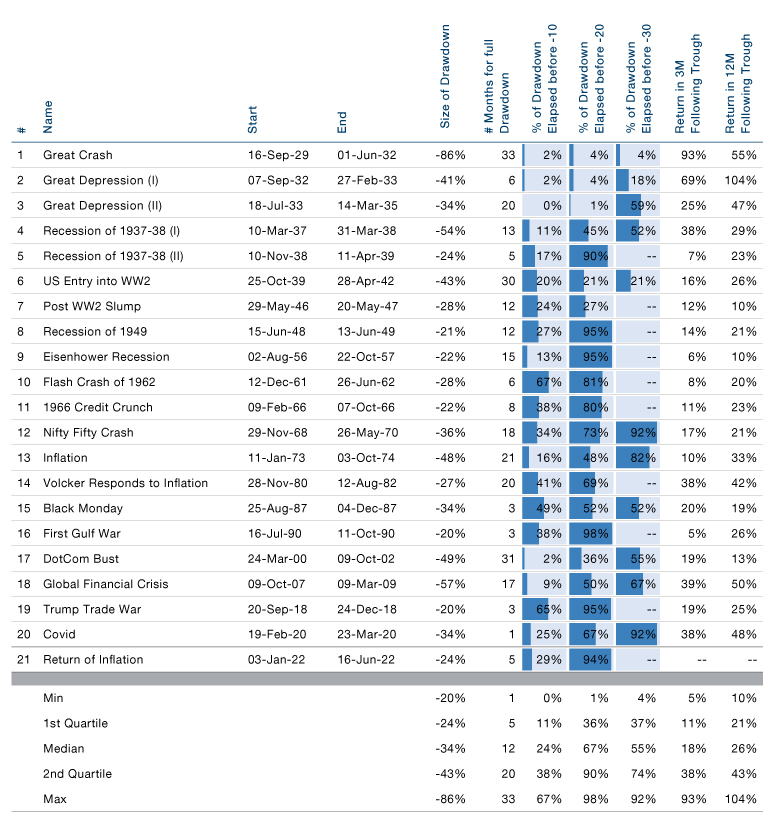
Source: Morgan Stanley, Bloomberg, Man DNA team. As of June 2022.
Figure 4. Graphical Illustration of the 21 Bear Markets Detailed in Figure 3
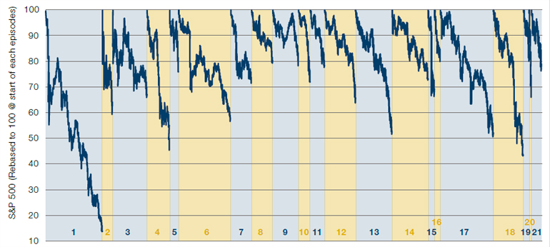
Source: Morgan Stanley, Bloomberg, Man DNA team. As of June 2022.
Which Indicators Have Historically Best Predicted Us Recessions?
Description
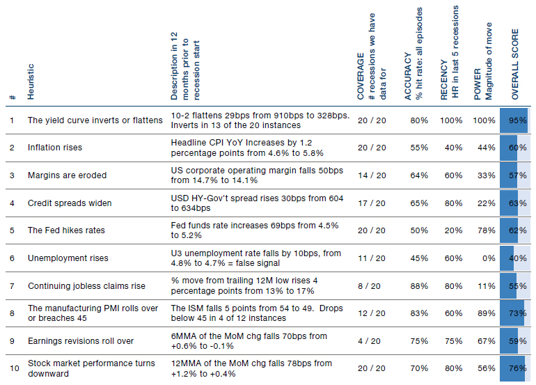
Figure 5 covers 10 recession indicator ‘rules of thumb’ with which the financial cognoscenti often regale us. We then score each based on COVERAGE (the longer the data goes back the better), ACCURACY (the higher the hit rate the better), RECENCY (the higher the hit rate over the most recent 5 recessions the better) and POWER (the bigger the magnitude of the move in the 12 months prior to a recession, the better). We combine these to create an overall score, the higher the better.
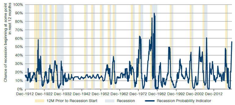
Then in Figure 6, we take our five favourites (influenced by Figure 5 but not dogmatically so), being the yield curve, inflation, the Fed Funds rate, the ISM manufacturing PMI and EPS revisions, and run a logistic regression model to give us a percent likelihood that a recession will start in the next 12 months. Our colleagues in AHL will surely laugh at our statistical naivety, but a cat can look upon a king, and this mog’s got the bit between its teeth.
Three Observations
Labour market data are lagging indicators, even the most timely ones. Unemployment is the only metric which does not perform consistent with priors, on average falling in the 12 months prior to a recession.
- Labour market data are lagging indicators, even the most timely ones. Unemployment is the only metric which does not perform consistent with priors, on average falling in the 12 months prior to a recession. Continuing claims, while pointing the right way, is the next worst scoring metric;
- Everyone loves the 10-2 inversion rule, first observed by our very own Professor Cam Harvey (albeit his formulation used the 5-year minus the 3-month T-Bill yield). Our analysis supports that, with the metric coming in as top dog. This inverted on the 1 April this year, and again on the 5 July. As seems to occur every time the yield curve inverts, everyone discussed the many reasons why this particular inversion didn’t count;
- Looking at the track record in Figure 6, we’d tentatively suggest this goes into the George Box ‘all models are wrong, but some are useful’ category. By no means perfect, but spikes in the navy blue line above 50% have generally been good times to start worrying. Today the metric has jumped to 56%, up from 2% in September 2021.
Figure 5. Ten ‘Rules of Thumb’ for Predicting US Recessions, and Success Thereof Historically
Source: NBER, FRED online database, BLS, Bloomberg, IBES, Man DNA team. As of June 2022.
Figure 6. Logistic Regression Using 5 of the Indicators in Figure 5 to Predict Recession Danger Zones
Source: NBER, FRED online database, BLS, Bloomberg, IBES, Man DNA team. As of June 2022.
You are now leaving Man Group’s website
You are leaving Man Group’s website and entering a third-party website that is not controlled, maintained, or monitored by Man Group. Man Group is not responsible for the content or availability of the third-party website. By leaving Man Group’s website, you will be subject to the third-party website’s terms, policies and/or notices, including those related to privacy and security, as applicable.