No-one likes getting dumped. But it can be the right call – the relationship has structurally broken and you’re in a new regime. But, as the song goes, love don’t come easy. Sometimes, after a hiatus, an old relationship is rekindled with, dare I say, newfound passion. This is not autobiographical, I hasten to add. Anyway, enough of the agony aunt, this tortured analogy is ready to confess. In today’s markets there are three glaring relationship breakdowns which have been widely commented on. Whether the final destination is the scrapheap or a steamy reunion remains to be seen, but will be pivotal for markets over the next 12 months. In the below I’ll give some potted views (because I like the sound of my own voice), but also try to put some parameters around what it means in performance terms if old associations renew (because that’s likely more useful to you).
Relationship #1: The 10-year inverse link between the PE and the real yield
What is it?
Figure 1 shows this graphically.1 For the last decade as real yields have risen, the price-to-earnings multiple has fallen, and vice versa. And this makes sense philosophically and mathematically. If real yields are rising, so is cost of capital. If cost of capital is rising then the present value of future cashflows is lower, and you should pay less for them, hence a lower multiple.
Figure 1. The Inverse Relationship Between the US PE and the 10-Year Real Yield
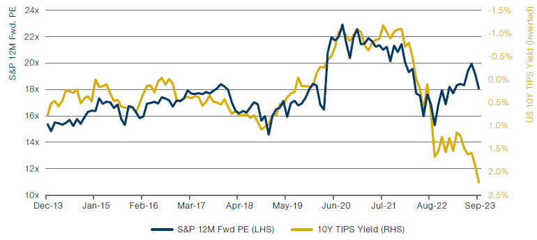
Source: Bloomberg, Man Group calculations. Original inspiration from Peter Oppenheimer at Goldman Sachs. The data runs from December 2013 to September 2023.
What it means for markets
Since September 2022 an anomalous rift has opened. Here’s a flow of logic.
- EITHER the relationship is broken, OR it’s not.
- IF it’s not, THEN EITHER the multiple needs to fall seven points from 18x to 11x, OR the real yield needs to fall 200bps from 2.2% to 0.2%, OR some combination of the two.
- IF the driver is the multiple falling, THEN EITHER the price needs to fall to 2,607 (a 39% decline from the current level of 4,246), OR expected earnings need to rise to $388 (a 63% rise from current levels of $238), OR some combination of the two.
- IF the driver is the real yield falling, THEN EITHER the nominal yield needs to fall 200bps (which, as at the end of September, would have meant a decline from 4.6% to 2.6%), OR inflation expectations need to rise 200bps (which, as at the end of September, would have meant the 10-year breakeven rising from 2.3% to 4.3%), OR some combination of the two.
Why might it be broken?
Go back much before the time period I show in the chart and you’ll see no relationship. Likely this is to do with the aftermath of two emblematic crises. In the wake of both the DotCom bust and the GFC, despite fast falls in real yields, multiples also derated. This was because, in both instances, long-term growth expectations were slain. In the former because utopian dreams of what the Internet would mean were dashed (of course arguably these were realised, just on a longer timeframe than had been expected), and in the latter because mortgage Armageddon presented the risk that Western financial systems would go neolithic.
What I think
It may be the case that something similar is happening today. The market pricing in a new regime of more inflation, more volatility, more geopolitics and so forth, a future less benign for global growth prospects than was enjoyed through the 2010s. I have some sympathy for this view. My sense is that the relationship is somewhat broken, but that some reversion is probable through the next 12 months. Running through the flow of logic above, re (2) I’d go for an equal contribution for multiple derating and real yield decline. (3) I think this comes more from prices falling than earnings rising. (4) I don’t see inflation expectations rising much, and more likely falling, so for me it all comes from nominal yields going south.
Relationship #2: The 15-year inverse link between the gold price and the real yield
What is it?
See Figure 2. Again, there’s a strong economic rationale. I’m not just committing chart crime with my axes. Gold yields nothing. So if real yields are rising then so is the opportunity cost of having capital tied up in a hunk of the shiny stuff. And thus we would expect investors to sell the asset as it becomes less attractive on this basis.
Figure 2. The Inverse Relationship Between the Gold Price and the 10-Year Real Yield
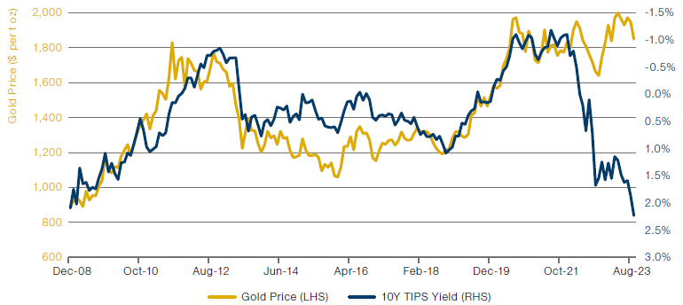
Source: Bloomberg, Man Group calculations. Original inspiration from Jo Kalish at Ned Davies Research. The data runs from December 2008 to September 2023.
What it means for markets
This relationship has been on a stable footing for the last 15 years, until early in 2022. Here’s another flow of logic (hopefully you’re picking up the pattern here…):
- EITHER the relationship is broken, OR it’s not.
- IF it’s not, THEN EITHER the gold price needs to fall to, call it $840 (a 57% decline from current levels of $1,971), OR the real yield needs to fall 320bps from 2.2% to -1%, OR some combination of the two.
- IF the driver is the real yield falling, THEN EITHER the nominal yield needs to fall 320bps (which, as at the end of September, would have meant a decline from 4.6% to 1.4%), OR inflation expectations need to rise 320bps (which, as at the end of September, would have meant the 10-year breakeven rising from 2.3% to 5.5%), OR some combination of the two.
Why might it be broken?
One thing to remember is that gold has two return drivers (possibly more, but these are two that seem obvious to me). The first, as already discussed and illustrated in the chart, is the inverse correlation with real rates. The second is crisis alpha, the perception that gold is a safe haven, a very present help in times of trouble. In case you’ve been asleep for the last 18 months, hate to break it to you, but the world’s got a bit sketchy. So perhaps the crisis alpha component is dominating the inverse real rate correlation.
Another contender to explain the dislocation is the multi-polar world argument. Data from the World Gold Council suggests that between July 2022 and March 2023, global central banks bought net 1,100 tonnes of the yellow metal. In a world where America’s enemies worry that the dollar is being weaponised against them, and some of America’s fringe-friends worry that it may in future be used in the same way, there could be an additional bid for the oldest of currencies.
What I think
Again, I think there is legitimacy to both arguments. Undoubtedly, the signal-tonoise ratio here is now lower than it was two years ago. This being said, as with the first relationship, neither do I think it is completely broken. Re (2), I think both move (so gold and real rates both down). (3) I’ve already discussed as part of Relationship #1 so I’ll save the repetition, suffice to say that what my views for both #1 and #2 have in common is the implication of lower nominal yields if the links reassert themselves. I made the case for bonds over equities two notes ago. I still think that.
Relationship #3: The 30-year link between the SLOOS lending survey and real GDP
What is it?
This one has a bit more noise than the others but, as Figure 3 shows, over the last three decades there has been a broad relationship between the Senior Loan Officer Opinion Survey (SLOOS) measure of credit conditions and overall economic growth. Again there is an economic justification. Where lenders are tightening conditions and/or people don’t want to borrow, there is likely less activity (assuming organic growth is not surging). Less activity = worse GDP prints.
Figure 3. The Relationship Between US Credit Conditions and Economic Growth
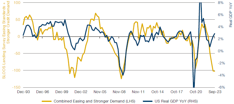
Source: Bloomberg, Man Group calculations. Original inspiration from Chris Wood at Jefferies. The data runs from December 1993 to September 2023.
What it means for markets
Recent history, since end of last year in this case, big gap. I won’t bother with the same detail for this one because it’s obvious. EITHER lending conditions improve dramatically, OR growth moves from 2.4% to -3.1% (and, spelling it out, that’s a recession) OR some combination of the two.
Why might it be broken?
I’ve touched on it, but in an environment where organic growth was exploding (in the good sense), it wouldn’t matter if credit conditions were a bit patchy, recession would likely be averted. Maybe AI is that.
Equally, it could be that tightening credit conditions just aren’t having the same (painful) impact on the consumer that prior cycles have seen. Various theories have been advanced. One is the volume of excess savings built up during the pandemic days has blunted the impact of higher monthly borrowing costs. There’s a bigger piggy to dip into. Another is that, if I’m sitting on a 30-year mortgage at 3%, I can look on at current rates of 8% with self-satisfied disinterest, thank you very much.
What I think
Of all the three broken relationships, here I find the arguments for permanent break least convincing. One of the most ubiquitous pieces of financial collateral out there is down by a fifth. It is curious to me that this can happen without some arcane piece of financial plumbing (which turns out to be really important) going twang.2 Sure Credit Suisse went bust. But I would have expected a bit more. Or at least for it to be a bit harder to clear up. Geopolitical risk is…err…higher. House prices in the US are still at highs despite the rise in mortgage rates. A lot of corporates are on the verge of refinancing at (way) higher cost. Massive yield curve inversion. Cyclical sectors of the labour market (e.g. temporary vacancies) rolling. I could go on. It ain’t a great look.
In conclusion…
If you take my line, then the immediate conclusion is bearish. With the twist that it will be gold and not Treasuries that surprise by not fulfilling their traditional risk-off price action. But there’s perhaps a more nuanced take which is the return of volatility and dispersion. Because either these patterns revert, in which case expect some pretty violent moves, as outlined, or the investment landscape is very different to what we’ve been used to over the last 1-3 decades. And who knows what that really means but the gut says it’s not strawberries and cream on a midsummer’s afternoon.
In either eventuality, expect turbulence. In the words of Colonel Kilgore, someday this war’s going to end. Don’t expect the transition to be smooth.
1. I have seen each of these charts from at least three different commentators. In each instance I’m going to credit the person who showed it to me first. Anyone else who gets offended has an overly attenuated sense of their own originality.
2. For instance, the Bloomberg Barclays 7-10 Year UST TR Index is down 23% from its peaks.
You are now leaving Man Group’s website
You are leaving Man Group’s website and entering a third-party website that is not controlled, maintained, or monitored by Man Group. Man Group is not responsible for the content or availability of the third-party website. By leaving Man Group’s website, you will be subject to the third-party website’s terms, policies and/or notices, including those related to privacy and security, as applicable.