Introduction
And the Book says that the wages of sin are death.
Today many corporates and investors are wondering whether recent spikes in pecuniary wages are indicative of death to their margins and returns, respectively. Many individuals are working out how to negotiate their next pay rise in this same frenetic environment.
Here I try to bring clarity to all parties.
A History Lesson
Taking the long view, as regular readers will know I like to do, in Figure 1 I show the average UK weekly wage in 2022 pounds sterling, from 1209 till today. I observe the following:
- In 1209, King John (of Robin Hood fame) sat on the English throne. The British labourer made a little over £50 a week in today’s money. Six hundred years later the British labourer earned… a little over £50 a week. Six centuries had done zilch for average earning power;
- The first major breakout coincided with the First and Second Industrial Revolutions. From 1832 through to the eve of The Great War, workers saw their real wages more than double, to £102. A comforting thought, perhaps, for those looking at the white heat of AI advancements today, and fretting over their livelihoods;
- Following a pause for breath, the second major breakout occurred from the mid-1920s through to the GFC, where wages rose six-fold, to over £600. Perhaps the impact of universal suffrage. The franchise was extended to all men, irrespective of property ownership in 1918. And to women in 1928. Harder to play the evil fat cat industrialist when your workers have votes, one would imagine;
- Since the Global Financial Crisis, real wages have moved around a bit but, all told, not done very much. You’re probably heard about this from every politician going, so I’ll spare the detail;
- Thus, here are some base rates. Over the very long term (the whole data series), real wage growth has been a little over +0.3% a year. Through the Industrial Revolutions (per item (2)), it was 0.9%. From the mid-1920s to the GFC (3), it was over +2%. Since the GFC, it has been only fractionally above 0%.
Figure 1. UK Average Weekly Wage in 2022 Pounds Sterling
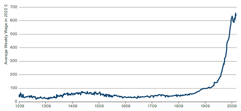
Source: From 1209 to 2016, I use the Bank of England’s average weekly earnings per head deflated by their measure of CPI, all from the Millennium of Macroeconomic Data source. From 2016 till 2022, I substitute for the ONS wage growth and inflation data.
Periodicity is annual.
What About Today?
History lesson over, what about today? Economics 101 says that the more joblessness rises, the more the economy enjoys an abundance of potential labour and thus the lower wage growth will be. The much-debated Phillips Curve. And much as I enjoy being contrarian, in this instance, I think the token answer is the right one. In the period between the GFC and Covid, many argued that the relationship was broken. Indeed, such was the animus of one celebrated strategist that he even commissioned a line of hats with slogans such as ‘Phillip S. Curve 1958-2018 RIP’.
Figure 2. US Phillips Curve
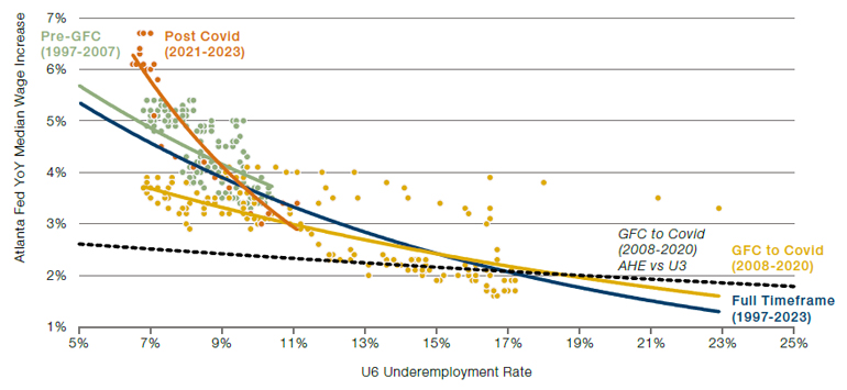
Source: Bloomberg; Man Group; as of 31 March 2023.
Periodicity is monthly. Trend lines are best fit exponential.
It is wise counsel not to wear clothes emblazoned with political statements. Hard to know how they’re going to age. I would suggest that the same is true for economic statements. You don’t know how they’re going to age either and, in the meantime, they’re more boring. I give some empirics behind this advice in Figure 2. It’s a busy chart, so proffer me your hand and I’ll guide you through:
- Start with the black dashed line. This shows the shape of the Phillips Curve if you take the average hourly earnings data from the Bureau of Labor Statistics for wage growth and U31 for unemployment between the GFC and Covid (for visual ease I don’t show the individual points). Now while the line is sloping the right way, it is not doing so particularly aggressively. To look at that alone, you can understand how one might say Phillips Curve RIP, even if you didn’t put it on a hat;
- But I think this misses two important nuances. First, an average covers a multitude of sins, so they say, particularly in a period like 2008-20 where there were some significant changes in workforce composition. Secondly, I think U3 was not capturing true labour slack through this timeframe. This was the age of zero-hours contracts, in-work poverty and the like. In short, a time when underemployment was a more important metric than unemployment (and probably still is). Thus, the other lines in the chart show the relationship between the Atlanta Fed’s median wage series (to better take account of labour force mix effects) and the U6 unemployment rate (to take account of those in work but who would like to be doing more);
- The yellow points and line show the period between the GFC and Covid, the equivalent to the black dashed line described in (1) above. Once I make these adjustments, the line is clearly much steeper. For me this was the right way of looking at it, and should have made you less inclined to dismiss half a century of economic orthodoxy;
- The green points and line show, on the same basis as (3) the period from 1997 up until the GFC, while orange is the period from Covid to now. Optically, it is clear that the GFC to Covid period, while not flat, was flatter than that which came before it. Moreover, at the current juncture, the relationship is steeper than at any point in the past.
Implications for Investors
What does this mean for us as investors? Well rejoice, for I bring glad tidings of great joy. Given the steepness of the current Phillips Curve, wage inflation can decline without too much jobless pain. In Figure 3, I show a relationship pointed out to me by my old friend Gerard Minack. The Quits Rate (the proportion of the labour force voluntarily leaving their jobs) leads wage growth quite reliably by nine months.2
Figure 3. US Quits Rate and Wage Growth
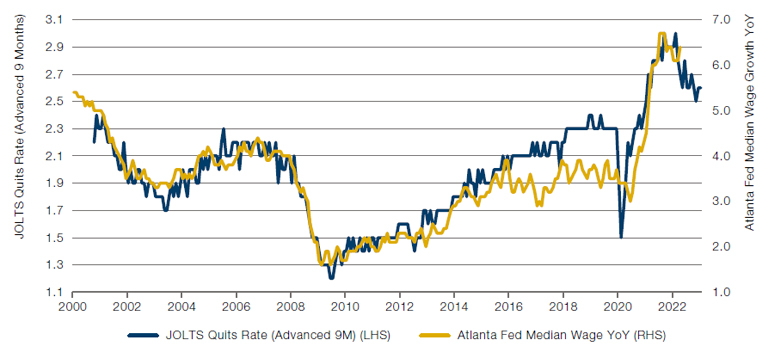
Source: Bloomberg, Man Group; as of 31 March 2023.
Now, clearly the quits rate could start decelerating more rapidly, and the labour market with it. But currently the above relationship would suggest wage growth will decline from 6.4% where it is today, to 5.4% by the end of the year. If I take the orange line in Figure 2 as the current shape of the Phillips Curve, this would be consistent with U6 unemployment rising to 7.6%. For sure that is an increase from current levels (6.7%), but by the standards of recent history, it’s hardly electrifying. Over the past 30 years, U6 has averaged 10.3% and has been above 7.6% in 82% of months. My base case is a moderation in wage inflation through the rest of 2023, but not by so much that it tips the economy into recession, at least not one driven by the consumer. That might sound like Goldilocks, but I think it’s supported in the data.
1. The number of people who are jobless but actively seeking employment.
2. Worth saying that Gerard disagrees with our more benign interpretation of the current juncture, for a variety of well thought through reasons. That’s what makes a market, etc.
You are now leaving Man Group’s website
You are leaving Man Group’s website and entering a third-party website that is not controlled, maintained, or monitored by Man Group. Man Group is not responsible for the content or availability of the third-party website. By leaving Man Group’s website, you will be subject to the third-party website’s terms, policies and/or notices, including those related to privacy and security, as applicable.