Key takeaways:
- Academic research generally favours risk parity over 60/40, but investors have been slower to embrace it
- Historical analysis also shows that risk parity has been the better option. Anomalies are few but notable: risk parity has experienced seven periods of sustained risk-adjusted underperformance versus 60/40 over the past 220 years, and we are currently in the eighth such period
- Investors outside the top-performing US market would have seen different results, but global risk parity portfolios have historically performed better than one might expect
They had come to a stream which twisted and tumbled between high rocky banks, and Christopher Robin saw at once how dangerous it was.
“It’s just the place,” he explained, “for an Ambush.”
Winnie-the-Pooh, A.A. Milne (1926)
Surprises can be unpleasant. Even the good ones. Who really enjoys a surprise birthday party? Recently I’ve been doing some work on capital markets assumptions. Investors will use these in different ways, but for me one of the benefits is to strengthen my asset allocation baseline. That way, when we are next ambushed by a pandemic, a war, a financial plumbing debacle etc., I won’t lose my head. I wrote a long paper on the topic. Here are the most important bits.
60/40 or risk parity?
Despite risk parity being agreed upon as the ‘right’ answer in academic ivory towers, actual investors haven’t yet got the memo. Estimates for total global assets managed according to equity/bond risk parity range between US$1 trillion and US$2 trillion. The equivalent number for a static 60/40 capital allocation on the same assets is at least three times larger, somewhere in the US$7 trillion to US$15 trillion ballpark. These numbers capture commingled funds only. Including self-administered capital pools might show greater adoption of risk parity strategies. Even so, I think it likely the transition from 60/40 to risk parity is still in its infancy.
And this is not hugely surprising. 60/40 is more intuitive, does not depend on leverage and has a good track record. The numbers may well have been written down in a dusty spreadsheet many moons ago, and then stuck, but if you only have public equities and bonds to choose from, it’s not the worst approach. Over the 225 years of monthly data we have for the US, 60/40 gives you 86% of the pure equity return (7.5% versus 8.7% annualised), but just 64% of the volatility (9.8% versus 15.2%). Moreover, coincidentally or not, it is the highest equity allocation which has never been negative on a 10-year trailing basis (Figure 1).
Figure 1: Worst 10-year period for different US allocations (January 1800 to July 2025)
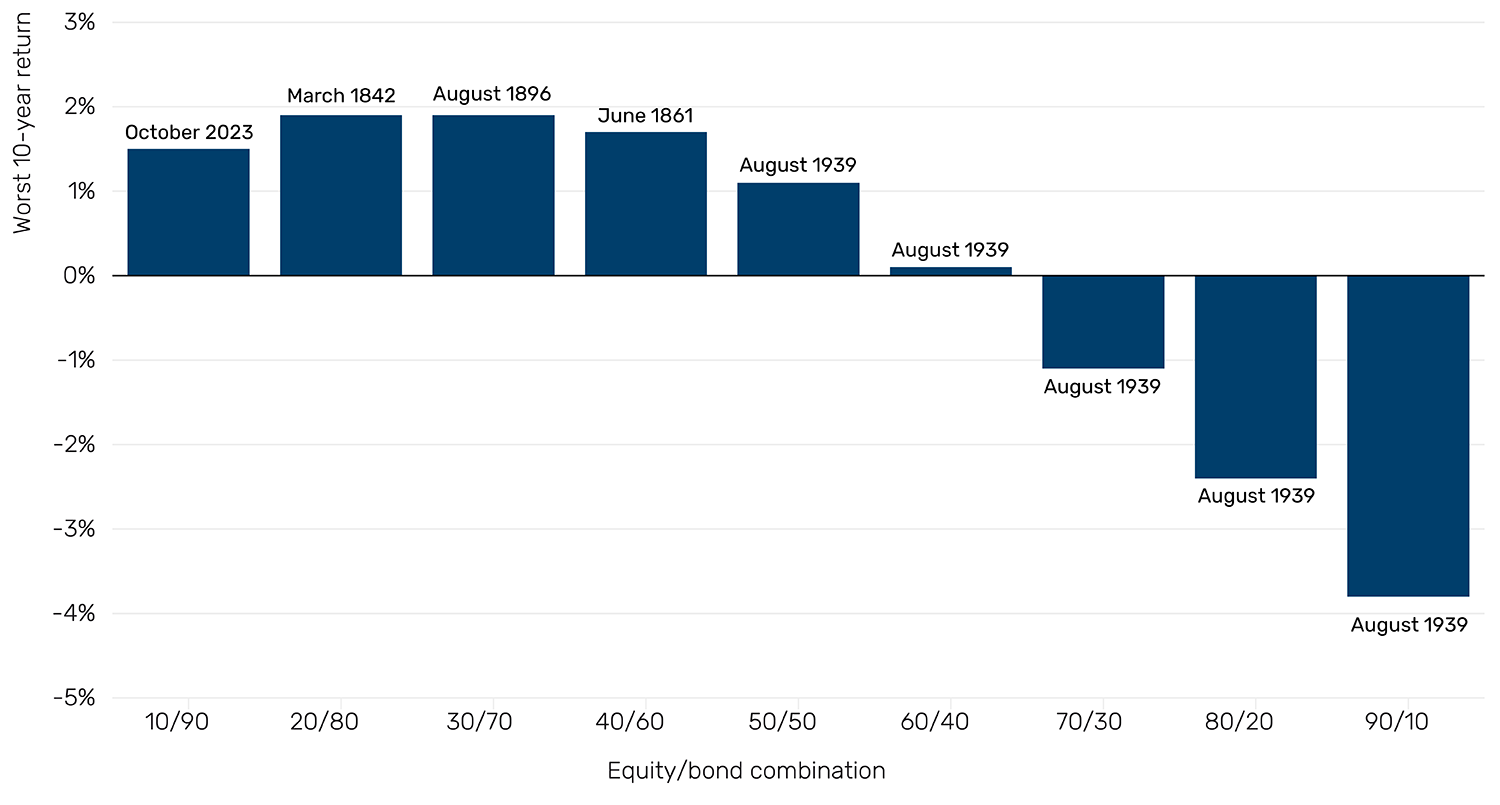
Source: GFD, Man Group calculations. 10-20-30…etc. refers to US equity. 90-80-70…etc. refers to US 10-year Treasuries. The data is total return, nominal, annualised and monthly periodicity. Data as of 31 July 2025.
When does risk parity NOT work?
Still, if you want to be purist about it, history shows that risk parity has been the better option. Figure 2 shows the Sharpe differential on a trailing five-year basis, unlevered risk parity minus 60/40. The former has outperformed on this basis 75% of the time, and by an average increment of 0.3.
However, the historic anomalies, while few, are worth noting. In the last 220 years, there have been seven periods of sustained risk-adjusted underperformance for risk parity versus 60/40, and today we are in the eighth. In Figure 2, I show these, with mooted explanations for each. These eight episodes all entail at least one of:
- Inflation accelerating ahead of expectations
- Geopolitical volatility
- Monetary tightening
Given bond volatility is (almost) always lower than equity, the key assumption in opting for risk parity is that duration will outperform. Generally, the first and third of these are DV01 negative. The second is perhaps more debatable, but it often leads to the first.1
Figure 2: Five-year trailing Sharpe differential between US risk parity and 60/40
Problems loading this infographic? - Please click here
Source: GFD, Man Group calculations. Risk parity is unlevered and based on three-year trailing volatility, rebalanced monthly. Episodes defined qualitatively. Data as of 31 July 2025.
The difference in regional lived experiences
The other risk parity limitation to be aware of is, for the purposes of long-term historic analysis, we generally default to the US, owing to its status as the world’s dominant market. It also keeps some of the best data records. In reality, your ‘lived experience’ as an investor would have been different if you were outside the States and biased toward your home market, or if you were a global allocator seeking a more regionally balanced approach.
Figure 3 shows performance statistics of equity-bond risk parity for Japan, Europe and the UK, back to 1889.2 If, as a US investor, you had focused your risk parity efforts on Japan, you would have lost almost all your capital in the aftermath of World War Two. If you had a skew to mainland Europe, you would have lost three quarters of it on two separate occasions: the Weimar Republic hyperinflation and the fall of Nazi Germany.
Figure 3: Performance statistics, 1889 to present
Problems loading this infographic? - Please click here
Problems loading this infographic? - Please click here
Source: GFD, Man Group calculations. Risk parity is unlevered and based on three-year trailing volatility, rebalanced monthly. Europe is proxied by Germany and France, equal weight. Note that Germany equity data only begins in 1959, and so prior to that, the equity portion is France only. This likely means that, in reality, the max drawdown figures for Europe would have been even worse. Data as of 31 July 2025.
The case for regional diversification
Despite the significant degradation in non-US risk-adjusted returns shown in Figure 3 (and it is worth noting that, even for the UK, the next best performing after the US, the US dollar return per unit of risk was half that of the US), when put together into an overall global risk parity portfolio the results are less detrimental than might have been intuitively expected. There is the question of how one would have approached geographic weighting through the years. For the sake of simplicity, we allocate based on size of USD real GDP.3 Some performance statistics for this portfolio are shown in Figure 4.
The survivorship bias of picking the 20th (and indeed 21st, so far) century winner is noticeable, but perhaps of less magnitude than instinct might suggest. Per the top panel, over the full 137 years, the US Sharpe ratio has been just 0.06 points higher (0.45 versus 0.39 for Global). On a five-year trailing basis, the US has been ahead of Global just 54% of the time. The max drawdown picture is perhaps starker, with Global in 10% or more troughs 7% of the time, versus 2% for US-only, and a max nadir of 22% for Global as opposed to 17% for the US (both of which occurred in 2022, by the way). Still, given the kind of numbers exhibited in the bottom panel of Figure 3, these differentials are quite mild. In part this is down to the global portfolio still being US heavy, given the size of US GDP (see footnote 3). In part too, it speaks to the diversification benefits of combining multiple regions and multiple currency effects.
Figure 4: US versus global risk parity, performance 1889 to present
Problems loading this infographic? - Please click here
Problems loading this infographic? - Please click here
Source: GFD, Man Group calculations. Calculated on same basis as Figure 3. For Global we are using USD returns for each of the regions. Each geographic segment of risk parity weighted by real USD GDP % representation in global. To calculate Sharpe ratios we use the US Treasury bill three-month rate as a proxy for cash. Data as of 31 July 2025.
What does valuation tell you about risk parity forward returns?
Is there any reliable way to time those environments less propitious for risk parity (such as the eight episodes seen in Figure 2) and to pivot to a higher alternatives segment, or an allocation that is more equity heavy (like 60/40)? Not really. Valuation gives us some steer on long-term expected returns, but it is a blunt instrument. Figure 5 shows, for the global risk parity portfolio constructed in Figure 4, the relationship between the strategy’s yield, and the 10-year forward return. There is some relationship – and in the way we would expect: higher yield = cheaper valuation = higher forward return – but at an r-squared of 0.3, it is hardly open and shut.
Today the yield is 3.7% which, based on historical patterns, suggests a 1.75% annualised excess return over the next 10 years, around 65 basis points (bps) lower than the long-term average (2.4%). However, the range of returns at this level of valuation is between -1.5% and +6.0%. Broad, to say the least.
Figure 5: Global risk parity portfolio blended yield and 10-year forward return (1889 to present, monthly data)
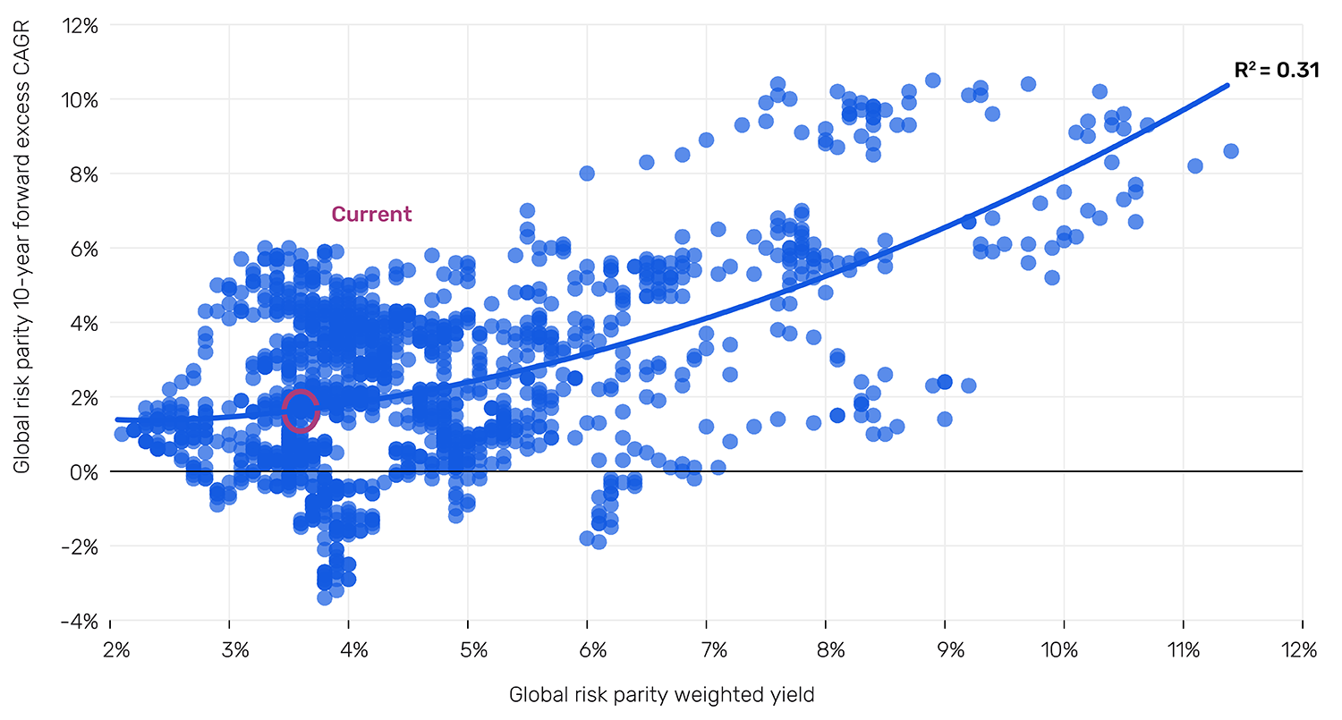
Source: GFD, Man Group calculations. Equity yield uses the average of the earnings and dividend yield where both available, prior to which just the dividend yield is used. Bond yield proxied by the 10-year for the relevant country. Data as of 31 July 2025.
So what does this grand sweep of history tell us? If you can’t use leverage (either emotionally or actually) and have a long-term view, risk parity has been the wrong answer, at least relative to 60/40, which has not been a bad approach historically. The full period annualised total return for the latter is 7.8%, versus 5.8% for the former. If you can use leverage, risk parity has been the winner. Except in periods of war, inflation or monetary tightening. Beyond this, diversify regionally. Don’t get too hung up on valuations. The end.
1. And, in the case of the US Civil War, would have called into question the fundamentals of US repayment.
2. While some regions have data going back much further, and indeed to a scarcely believable 1692 in the case of the UK, 1889 is the earliest cut-off for overlapping data series.
3. Over the full period this gives average allocations as follows: US = 56%, Japan = 12%, Europe = 19%, UK = 13%.
You are now leaving Man Group’s website
You are leaving Man Group’s website and entering a third-party website that is not controlled, maintained, or monitored by Man Group. Man Group is not responsible for the content or availability of the third-party website. By leaving Man Group’s website, you will be subject to the third-party website’s terms, policies and/or notices, including those related to privacy and security, as applicable.