Plotting isn’t always easy. Even as an experienced developer or researcher you find yourself googling "python line chart", looking for an example, and then picking between matplotlib, plotly or many other options.
This state of affairs leaves a lot to be desired. In contrast, we wanted to make it so easy that a plot would appear before you even knew you needed it! To do this, we created Autoplot for JupyterLab, a way of easily creating visualisations on the fly and made it open source via GitHub - so it's available for anyone to try out!
What is JupyterLab?
JupyterLab is a web-based user interface for writing and running Python code. It's great for developers, researchers and data scientists to quickly explore ideas, try out code, and dig into data. We use JupyterHub, which provides a multiuser environment on top of JupyterLab. JupyterHub makes it easy to share code between users, and hence increases the ease of collaboration.
JupyterLab is widely used across the Python speaking world. It is distinguished by its usefulness for rapidly testing new concepts or "playing with data". It will probably never replace a fully integrated developer environment ('IDE'), but it significantly lowers the barrier of entry to writing Python code. This has helped us on our path toward data science democratisation, by putting the power of Python into many more peoples' hands. Compared to many other ways of working, having JupyterLab in our workflow vastly reduces the time between having an idea to testing that idea with Python code. We have an internal JupyterHub site that we simply refer to as "https:// python". Visiting that site will let you write and run Python code in seconds. The code can then be shared to other users by sending a link, and seconds later they can be running the same code, seeing the same results, and building upon what you started. In short, JupyterLab has paved our path towards true collaboration and innovation.
One of the main benefits of JupterLab is that it reduces the cognitive load required to just get going. Before using JupyterLab, a typical workflow might involve:
- logging in to the Linux environment;
- creating a Python virtual environment;
- installing the packages you think you might need;
- launching the IDE of choice;
- integrating with Git;
- finally write some Python code;
- publish your code to Git so that you can collaborate with others.
Each of the above steps require cognitive input. JupyterLab, on the other hand, hides these complexities as far as possible, allowing you to focus on what you are really trying to achieve. This lets beginners focus on learning Python skills without confusing distractions. The JupyterLab workflow of minimal distraction was our inspiration when we created a drastically improved chart reaction workflow.
JupyterLab Autoplot
Jupyter Autoplot is a charting plugin, an extension for JupyterLab. It aims to make charting "come for free". Instead of a user saying, "here is my data, please plot it", Autoplot will automatically:
- Look at all the data the user has loaded;
- Analyse it to see if it's plottable;
- Draw the data in a chart.
Autoplot even responds in real time too, so when the user loads more data, it is Autoplot-ed live!
Once a chart has been created, the user can begin interacting with it, by zooming, panning, turning lines on and off, and finally saving it back to the JupterLab notebook, where it can be shared or copied to an email or Slack message.
Autoplot is quick and easy to setup. Installation instructions are in the README, and as mentioned, it's open source so do try it out!
Figure 1. JupyterLab Autoplot in action
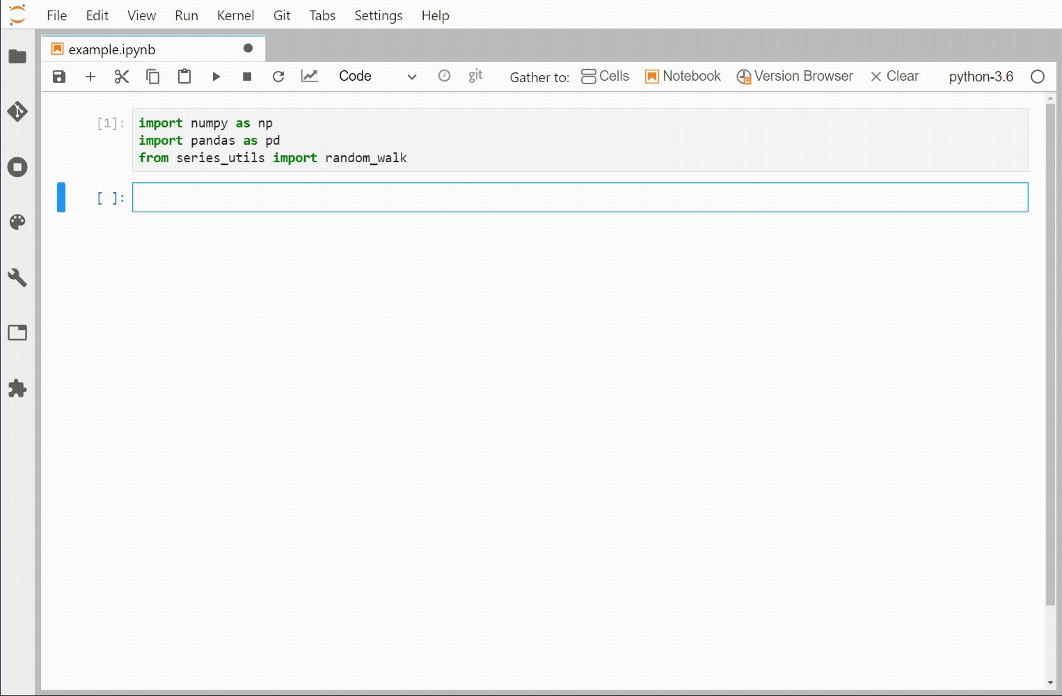
Source: Man Group.
Autoplot is helpful for anyone who likes to explore and learn quickly, anyone who requires a quick feedback loop between making a change and seeing the result, and anyone with interesting data to inspect!
If you are already using JupyterLab or JupyterHub we hope this will be an easy to use add-on which will help your workflow, and if you're not already using them then hopefully this article has inspired you to explore the great collaborative power of JupyterLab and JupyterHub.
Final thoughts
Towards the end of 2020 we open sourced another tool for JupyterLab called Man Notebooker. Man Notebooker took the concept of a sharable piece of code and turned it into a publishable and schedulable report, and we've seen great uptake of Man Notebooker both internally and externally since its creation. Having made easily sharable and publishable reports, we wanted to go back and improve the initial analysis process, which is what lead us to create Autoplot. We hope this trend of safely hiding complexity in such a way that the user can focus on their key task will continue such that many more users can get value out of Python.
As with all code and open source projects there is always more to do. Thus far our focus has been timeseries plotting (as this is our bread and butter at Man Group) but we'd love to support more chart types. We'd also like to make the interaction bi-directional - we'd like for interactions with our charts to feed back directly into the code and analysis. It's over to the open source community now to see what other ideas, use cases and improvements people dream up and contribute - happy coding!
You are now leaving Man Group’s website
You are leaving Man Group’s website and entering a third-party website that is not controlled, maintained, or monitored by Man Group. Man Group is not responsible for the content or availability of the third-party website. By leaving Man Group’s website, you will be subject to the third-party website’s terms, policies and/or notices, including those related to privacy and security, as applicable.