Watching Private Equity’s Distress Cycle with Interest
Much attention has focused on the divergence between reported valuations in private and public markets. But, setting aside the question of where those marks eventually land, what about the prospective performance of private assets?
One challenge we see in this space for existing investments is the higher cost of debt. Leveraged buyouts are, by definition, financed with loans, typically on floating rates; these rates have not so much floated higher recently as soared (Figure 1). Paying interest on this debt has accordingly become significantly more expensive. This burden is likely to be aggravated by slowing earnings if the economic environment deteriorates further, raising the possibility of private equity entering a distress cycle.
Private-equity managers, facing the prospect of underwriting deals with debt that costs twice as much as it did a year ago, have several choices for new investments. They could keep going as before and simply accept lower prospective returns. They could use less debt. Or they could pay lower valuations. The first option seems improbable to us, so we expect managers to proceed with some combination of the latter two approaches.
We remain focused on strategies where leverage is not critical to achieve returns and on idiosyncratic areas of growth such as decarbonisation. Should a distress cycle emerge, we may explore opportunities to provide companies capital solutions or participate in restructurings.
Figure 1. Credit Suisse Leveraged Loan Index - Three-Year Yield
Problems loading this infographic? - Please click here
Source: Bloomberg; as of 27 January 2023.
Redux in a Row
Investors are given to invoking historical parallels. Rallies can be anything from a repeat of the dotcom bubble to tulip mania redux. Recessionary reference points range from the Great Depression to the Global Financial Crisis via 1970s stagflation.
We acknowledge that macro regimes tend to feature similar and recurring patterns, and the currently elevated macro uncertainties have some historical precedents. Commentators tend to have their own biases, though, so is there a quantitative way to compare market environments through time?
We built a model that measures the similarity between the current regime and historical periods so that we can try to learn from history (Figure 2). Our inputs include US and emerging-market equities, Treasury yields and various spreads across the yield curve, the oil prices, US dollar strength and volatility.
Based on this analysis, we believe the current macro backdrop is most reminiscent of 2018 and 2000, just prior to the tech bubble. These years were characterised by rising interest rates, inverted yield curves, and an appreciating US dollar. The parallels suggest to us that we are in a fragile macroeconomic environment; among our models’ favoured assets in this scenario are the precious metal and gold industry, and the earnings-yield factor.
Figure 2. Calendar Year Macro Comparison Model
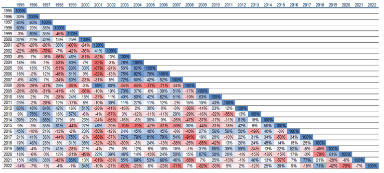
Source: Man Numeric; as of 31 December 2022. The percentages in the matrix measure the similarity in macro environments between the two years, as determined by our model. The similarity measure is bounded between 0% and 100%, with a higher reading pointing to higher similarity between the two years.
Tech Investors – Sticky or Stuck?
Retail investors were, in our view , instrumental in the meteoric rise of many buzzy tech stocks through 2020-2021. A Nasdaq ETF that contains most of the large-cap US tech names (QQQ), for example, soared 111% from April 2020 to the end of 2021 following a steady stream of inflows during the period (Figure 3).
Yet, despite this basket’s 33% loss in 2021, the steady number of shares outstanding indicates that investors are holding onto their positions. We believe this presents a large risk of further downside for these volatile pandemic darlings: dwindling household savings could add strong downward pressure if increasingly savings-poor retail investors are forced to liquidate assets to pay bills (Figure 4).
Figure 3. QQQ Shares Outstanding and Price
Problems loading this infographic? - Please click here
Source: Bloomberg; as of 31 December 2022. The organisations and/or financial instruments mentioned are for reference purposes only. The content of this material should not be construed as a recommendation for their purchase or sale.
Figure 4. US Personal Savings Rate
Problems loading this infographic? - Please click here
Source: Bloomberg and seasonally adjusted personal savings rate from FRED; as of 1 November 2022.
With contributions from: Craig Dessen (Man FRM – Senior Investment Manager, Private Markets); Valerie Xiang (Man Numeric – Associate Portfolio Manager), Ziang Fang (Man Numeric – Portfolio Manager), Chao Xia (Man Numeric – Senior Quantitative Researcher) and Eric Wu (Man Numeric – Principal, Quantitative Alpha Integration and Strategy)
You are now leaving Man Group’s website
You are leaving Man Group’s website and entering a third-party website that is not controlled, maintained, or monitored by Man Group. Man Group is not responsible for the content or availability of the third-party website. By leaving Man Group’s website, you will be subject to the third-party website’s terms, policies and/or notices, including those related to privacy and security, as applicable.