Tapering Doesn’t Matter
It might sound counter-intuitive, given the amount of attention tapering gets. But is it possible that tapering just doesn’t matter in terms of asset prices?
Figure 1 shows the size of the Federal Reserve’s balance sheet since 2009, highlighting the periods when the Fed was engaged in tapering (the first period occurring in 2010). Ben Bernanke explained the portfolio balance channel at Jackson Hole in 2010, in which the Fed’s purchases of Treasuries impact financial conditions by changing the quantity and mix of household holdings of financial assets. With fewer purchases at the margin, or with outright balance sheet normalisation, you might expect this mix effect to shift – i.e., fewer purchases of risky assets, or even outright sales.
This hasn’t happened in practice. On average, asset prices went up during tapering periods (Figure 2). This most notable in equities, where 6-month forward returns to the S&P 500 index averaged 6.2% during tapering. Even US Treasuries, which one would expect to be worst affected by tapering, still saw average returns of 1.5%. Conversely, if we take tapering as the first step on the road to rate hikes, one might expect the US dollar to strengthen. Instead, history shows that it stayed largely flat during tapering, with 6-month forward returns of only 0.6%.
Figure 1. Fed Balance Sheet and Periods of Tapering
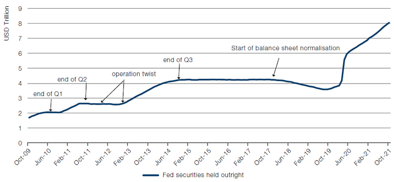
Source: Federal Reserve, Bloomberg; as of 9 November 2021.
Figure 2. Six-Month Forward Returns During Periods of Tapering
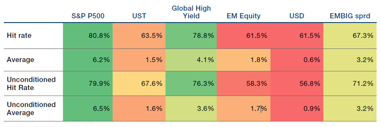
Source: Man GLG, Bloomberg; Between 2010 and 9 November 2021.
Do We Have Labour Market Slack or Not?
As we wrote last week, the US jobs market is as hot as it has been since well… ever. Vacancies outstrip the unemployed, wages are on the up, jobs are hard to fill and employees are quitting at record rates (Figure 3).
But what is puzzling is the participation rate and the U3, or official, unemployment rate. If demand for employees is this high, we would expect to see the participation rate increasing and unemployment falling, as previously inactive or discouraged workers were enticed back into labour market by higher wages.
This doesn’t appear to be happening. The participation rate is less than 62%, a full percentage point lower than the pre-pandemic figure (Figure 4). The same is true for the unemployment rate, which is roughly one percentage point higher (Figure 5). Both of these would indicate that there is still some slack in the labour market, in direct contrast to other labour market metrics.
So, which one is correct? Do we have slack or not? One possible explanation is that the wage and vacancy metrics are correct, and that slack is overreported. Postpandemic, an entire cohort of workers seem to have chosen not to return to work. Why remains a mystery. But if these workers aren’t seeking employment – and they appear not to be – then despite the Fed’s indicators, there is no slack in the labour market.
Figure 3. US Vacancy to Unemployment Rate
Source: Bureau of Labor Statistics, Man GLG; as of 9 November 2021.
Problems loading this infographic? - Please click here
Source: Federal Reserve Bank of St Louis; as of 10 November 2021.
Problems loading this infographic? - Please click here
Source: Federal Reserve Bank of St Louis; as of 10 November 2021.
With contributions from: Ed Cole (Man GLG, Managing Director – Discretionary Investments) and Henry Neville (Man Solutions, Analyst)
You are now leaving Man Group’s website
You are leaving Man Group’s website and entering a third-party website that is not controlled, maintained, or monitored by Man Group. Man Group is not responsible for the content or availability of the third-party website. By leaving Man Group’s website, you will be subject to the third-party website’s terms, policies and/or notices, including those related to privacy and security, as applicable.