Giving It Some (Fiscal) Thrust
Fiscal policy is an important factor to consider when we think about inflation. Broadly speaking, a budget deficit is positive for the growth in the short term, but bad for growth in the long term. This is because the borrowing used to fund the deficit essentially drags growth forward in time: consumption is increased in the short term, but must be reduced over the long term to pay back the debt.
Figure 1 shows the budget balances for the US, Japan, China and Europe (including UK). Each individual year is represented by a blue bar, which shows the level of the budget surplus (denoted by a positive number) or deficit (negative number) as a percentage of nominal GDP.
The yellow lines denote the level of fiscal thrust in each region, which is simply the year-on-year difference between the level of fiscal deficit or surplus. For instance, in 2020, the US has a fiscal thrust of -10 percentage points, as it has moved from a budget deficit of -5% in 2019 to a budget deficit of -15% in 2020. A negative fiscal thrust should be positive for growth in the current period, all things being equal, hence why we inverted the right-hand vertical axis.
The first thing to note is the steadiness of the fiscal thrust in Japan, which barely moves. This provides a counter argument against the hypothesis that Japan is a leading inflation indicator for the rest of the world: while Japan’s monetary policy has been consistently expansionary, it has barely moved the dial when it comes to fiscal expansion to support growth, in contrast to other regions.
The second point worth monitoring is how the deficit is forecast to move over the next 12 months (shown in the blended 12-month forecasts, the dashed line in the smaller charts in the right column). Apart from Europe, all regions are showing forecasts for reduced deficits over 2021-22. If these lines start to steepen further, it could well indicate a return to the post-Global Financial Crisis political narrative of austerity – likely to reduce growth in the short term, but with a more benign inflationary outcome.
Finally, for the first time in generations we see the possibility for increasing divergence in fiscal policy between the UK and the Eurozone. No longer bound by EU rules on fiscal deficits, the UK has increased its budget deficit much more sharply than its continental counterparts – again, a trend worth monitoring.
Figure 1. Cyclically Adjusted Budget Balances Versus Fiscal Thrust
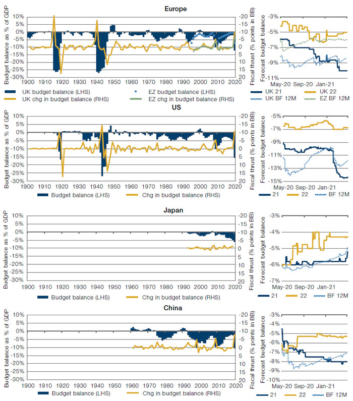
Source: Man Solutions, ONS, US Treasury, Bureau of Economic Analysis, Eurostat, OECD, Bloomberg; as of 7 May 2021.
Value: Just How Bad Did It Get?
We all know that the last few years have been painful for global Value. But exactly how bad did things get for Value when compared with previous periods?
In terms of negative returns, the 2017-20 drawdown was the second-worst this millennium. At -34%, this was not as deep as the dotcom bubble (-41%), but deeper than the Global Financial Crisis (-26%) (Figure 2). The pain was mostly concentrated within the last year, with Value down -27% in 2020.
Lasting 46 months, the 2017-20 drawdown was by some margin the worst of our three, 16 months longer than the Value drawdown before the GFC (30 months) and two years longer than the dotcom bubble (22 months) (Figure 3).
Figure 2. Value Drawdown
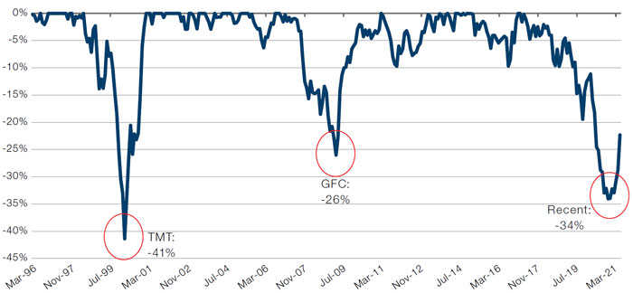
Source: Man Numeric; as of 31 March 2021.
Global top 1,500 stocks.
Figure 3. Value Drawdown Durations
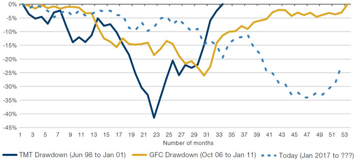
Source: Man Numeric; as of 31 March 2021.
Global top 1,500 stocks.
There Is Still a Lot of Air in the Bubble
The first quarter let a little air out of the Growth bubble. But you wouldn’t know it, based on the number of stocks still trading at absurdly expensive levels.
The number of companies in the Russell 1000 Index trading at an enterprise value to sales (EV/sales) ratio of more than 20x remains at its highest level for 20 years, although it remains around half the level seen at the height of the dotcom bubble (Figure 4).
This trend is even worse when examined on a global basis – more than 80 stocks in the MSCI World have EV/sales of above 20x, surpassing the dotcom peak (Figure 5). It is worth noting, however, that most of these companies are based in the US.
Figure 4. Number of Stocks with Over 20x EV/Sales – Russell 1000 Index
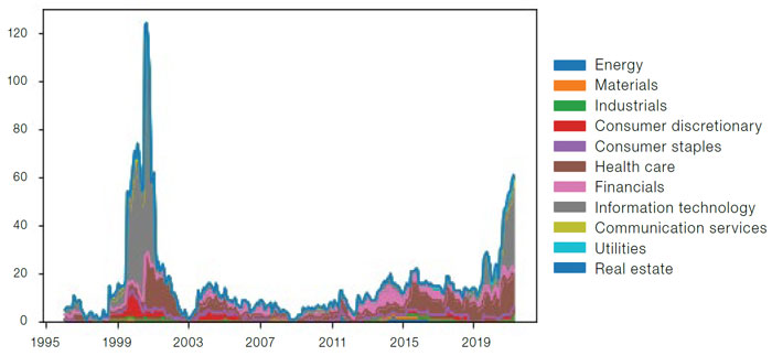
Source: Man Numeric, as of 31 March 2021.
Figure 5. Number of Stocks with Over 20x EV/Sales – MSCI World
Source: Man Numeric, as of 31 March 2021.
With contribution from: Henry Neville (Man Solutions, Analyst), Jeremy Wee (Man Numeric, Senior Portfolio Manager), Dan Taylor (Man Numeric, CIO) and Ben Zhao (Man Numeric, Quantitative Researcher).
You are now leaving Man Group’s website
You are leaving Man Group’s website and entering a third-party website that is not controlled, maintained, or monitored by Man Group. Man Group is not responsible for the content or availability of the third-party website. By leaving Man Group’s website, you will be subject to the third-party website’s terms, policies and/or notices, including those related to privacy and security, as applicable.