Quote of the Week:
"I am hard pressed to identify any significant Trump decision during my tenure that wasn’t driven by re-election calculations."
Some for the Bears, Some for the Bulls
The forward price-to-earnings for the S&P500 Index is currently at about 23x, in its 98th percentile, according to Goldman Sachs. In fact, when you look at the ‘traditional’ metrics – market cap/GDP, EV/Sales, EV/Ebitda, price/book, etc, the index appears to be fully valued, even stretched (Figure 1).
However, on a free cash flow yield basis, we’re at median free cash flow, which suggests that the market is not totally unreasonably valued. And taking a step further, when you look at the equity risk premium, the market actually looks undervalued!
Figure 1. US Equities – Valuation Metrics
| Valuation Metric | Current | Historical Percentile |
|---|---|---|
| US market cap / GDP | 207% | 99% |
| Forward P/E | 23.2x | 98% |
| EV / Sales | 2.5x | 98% |
| EV / Ebitda | 13.1x | 95% |
| Price / Book | 3.4x | 87% |
| Cyclically adjusted P/E (CAPE) | 26.7x | 87% |
| Cash flow yield | 7.20% | 84% |
| Free cash flow yield | 4.20% | 50% |
| Yield gap versus 10-year US Treasuries | 367 bp | 26% |
| Median | 87% | |
Source: Man Group, Goldman Sachs; as of 12 June 2020.
Calling a Bluff
One market indicator that appears to be gaining popularity with the sell-side is the put-call ratio. But does the ratio tell us anything about the risk/reward going forward?
The yellow dots in Figure 2 depicts when the put-call ratio for the S&P500 Index has hit 0.75 (or about two standard deviations). Figure 3 shows what the S&P500 has historically returned every time the ratio hit 0.75. The risk-reward looks poor, with an average return of 1.6% over 12 weeks (or -3.3% if negative).
However, Figure 3 does include the January 2020 data point, which gave a near- perfect result: when the ratio hit 0.75 in January, the market collapsed. Figure 4 shows the returns of the S&P500 after excluding the January 2020 datapoint. Even with that exclusion, the put-call ratio doesn’t really give a signal about the risk- reward.
Figure 2. Instance of Put/Call Ratios Hitting 0.75 for the S&P500 Index
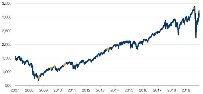
Source: Bloomberg, Man GLG; as of 15 June 2020.
Figure 3. Risk-Reward With January 2020 Datapoint Included
| Trigger | 0.75 | 0.75 | 0.75 | 0.75 | 0.75 | 0.75 |
|---|---|---|---|---|---|---|
| Return window | 1W | 2W | 4W | 12W | 16W | 26W |
| Hit rate | 41% | 38% | 33% | 35% | 62% | 49% |
| Average | -0.1% | -0.3% | -0.5% | 1.6% | -1.1% | 1.2% |
| Average if negative | -1.6% | -3.3% | -8.1% | -3.3% | -6.0% | -4.4% |
Source: Man GLG; as of 15 June 2020.
Figure 4. Risk-Reward Excluding the January 2020 Datapoint
| Trigger | 0.75 | 0.75 | 0.75 | 0.75 | 0.75 | 0.75 |
|---|---|---|---|---|---|---|
| Return window | 1W | 2W | 4W | 12W | 16W | 26W |
| Hit rate | 41% | 36% | 26% | 34% | 62% | 49% |
| Average | 0.1% | 0.3% | 1.7% | 1.9% | -1.1% | 1.2% |
| Average if negative | -1.1% | -1.8% | -2.9% | -2.6% | -6.0% | -4.4% |
| Average unconditioned | 0.30% | 0.32% | 0.63% | 1.96% | 2.40% | 4.40% |
Source: Man GLG; as of 15 June 2020.
The European Recovery Fund
On 19 June, European leaders held their first detailed discussions about the European Recovery Fund (‘ERF’). Even by EU standards, the leaders were woefully divided.
The ERF is a EUR750-billion fund – EUR500 billion of which would be distributed as grants and EUR250 billion as loans – to be spent between 2021 and 2027. The ‘grant’ part of the loan would be a joint liability, while the liability for the ‘loan’ part would lie with the individual states.
In an attempt to improve cohesion and lower borrowing costs, the money is expected to be distributed between states based on the country’s population, GDP-per-capita and unemployment figures between 2015 and 2019. Leading beneficiaries would include Italy, Spain and Poland (Figure 5).
The fund will be repaid from 2028 onwards, using a combination of:
- An extension of the Emissions Trading System to the maritime and aviation sectors;
- Carbon border adjustment mechanism;
- Own resources based on operations of large enterprises;
- A digital tax.
However, critics of the plan on 19 June argue that “outdated” measures of unemployment were being used to determine how much each member state will receive. There were also differences of opinions on the size of the recovery fund, the balance between grants and loans, and the fate of so-called rebates that some countries get based on the budget contributions. The plan is also not getting any love from economists, with little optimism evident in EUR forecasts (Figure 6).
Still, there is Franco-German policy weight behind the plan, with German chancellor Angela Merkel urging member states to strike a “swift agreement” as she warned that the EU was facing its biggest ever economic challenge, triggered by the pandemic. While EU leaders are braced for weeks of tough negotiations, we believe sentiment may surprise on the upside if progress was to be made on the fund.
Figure 5. Where the ERF Money Will Go
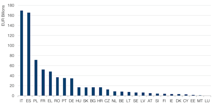
Source: Morgan Stanley; as of 15 June 2020.
Figure 6. EUR
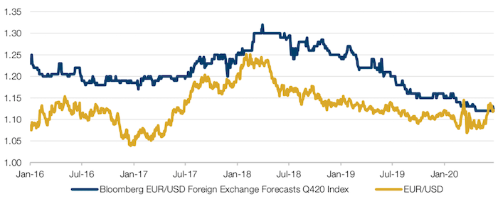
Source: Bloomberg; as of 22 June 2020.
Chance of Inflation: You’ve Never Had It So Good?
Last week1, the Office for National Statistics confirmed that the UK’s national debt exceeded the size of its GDP for the first time since 1963, after heavy borrowing in April and May.
It is ironic that the last time the UK’s debt-to-GDP ratio was this large, Harold Macmillan was in office. Macmillan is probably best known for his 1957 ‘[You’ve] Never Had It So Good’ speech in which he warned against the dangers of inflation, whilst simultaneously claiming the UK’s population enjoyed unprecedented standards of living.
We’ve previously written about coronavirus as a trigger for inflation , but it is telling that Macmillan was correct. The period from 1966-1982 was dominated by a global inflationary regime, in part triggered by policymakers holding interest rates low to reduce the crushing burden of post-World War II debt.
In our view, this superficial connection could well herald a deeper link: as government debt rises, we are more likely to see policymakers re-create the conditions for inflation, in the hope of inflating their debt away.
Figure 7. UK Debt Exceeds GDP for the First Time Since 1963
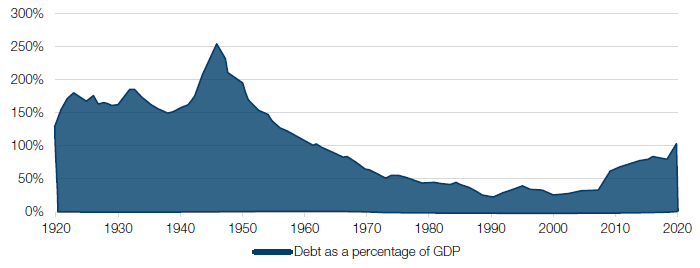
Source: Office for National Statistics, Office for Budget Responsibility; as of June 2020.
With contribution from: Dan Taylor (Man Numeric, CIO), Ed Cole (Man GLG, Managing Director – Equities) and Teun Draaisma (Man Solutions – Portfolio Manager).
1. As of 19 June 2020.
You are now leaving Man Group’s website
You are leaving Man Group’s website and entering a third-party website that is not controlled, maintained, or monitored by Man Group. Man Group is not responsible for the content or availability of the third-party website. By leaving Man Group’s website, you will be subject to the third-party website’s terms, policies and/or notices, including those related to privacy and security, as applicable.