Executive Summary
This report has three parts.
- Part One ‘Inflation Regimes’ explains why we think that now, after four decades of disinflation / deflation, policy change may create an inflationary regime for the coming decade
- Part Two ‘The Roadmap’ shows how we will monitor progress (or lack of it) towards this new regime
- Part Three ‘New Investment Strategies’ lays out the investment strategy implications
We review the history of inflationary periods, and conclude that prevailing economic regimes reach their apotheosis, and then change, when the extreme conditions they have created lead to permanent policy change. We believe current extremes in deflation, inequality, debt levels and globalisation may lead to four major transitions in the next decade: from monetary to fiscal; from capital to labour; from globalisation to localisation; and from deflation to inflation. Yes, some disinflationary forces such as technology, debt and demographics are still present, but we conclude policy is the dominant driver of economic outcomes.
The current recession is deeply deflationary for the next few quarters, but our analysis points to higher and more volatile inflation in the long-run, and we think the market is not priced for it. The market has so far priced only the deflationary impact, as witnessed by the relative performance and valuations of value stocks and 5Y5Y inflation break-evens, for instance. We expect this new regime to be characterised by higher average inflation, say 4%; higher inflation volatility; and financial repression leading to negative real rates, say 2% nominal 10Y rate, and well behaved credit spreads.
The level and direction of inflation is the most critical element in our asset allocation choices, as per our Fire & Ice framework. We have written extensively about the theory and practice of this concept. Now, after four decades of disinflationary policies, we believe there is a strong likelihood that the policy winds will create a new Inflationary regime going forward.
We provide a checklist to monitor progress towards this new Inflationary regime. While we do expect this all-important change, the transition will likely be messy and lengthy, and it is contingent on policy. We provide a detailed list through which we will monitor the progress towards the new regime, including stock-bond correlations; monetary and fiscal policies; and metrics of inflationary pressure.
New investment strategies needed. Winners and losers would change dramatically in an inflationary regime, prompting shifts from growth to value; from paper to real assets; and from traditional to alternative assets. In particular, some of the big investment winners in recent years and decades, such as the quality-growth style in equities as well as products relying on traditional long-only risk premia in 60/40 or risk parity proportions, could struggle unless they adapt. We provide a list of strategies that could be the new winners.
Recorded on 1 July 2020
Part One – Inflation Regimes
1.1 Inflation Past
Inflation regimes tend to last longer than you’d think. In his magisterial review of inflation in Europe, ‘The Great Wave’, David Hackett Fischer identifies four great price revolutions, when prices rose consistently for a century or more, since 1200. These episodes occurred in the 1200s, 1500s, 1744-1813, and 1896-date. The rest of the time prices have been largely unchanged or have gently deflated. On average over the whole period, prices rose by an average of 1% annually.
Exhibit 1. The Price of Consumables in England (1200-Present, Indexed at 100,000 in 2015)
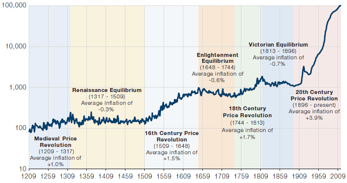
Data first collated in David Hackett Fischer – The Great Wave: Price Revolutions and the Rhythm of History – November 1996 – Figure 0.01. We re-create from Bank of England data.
As to what causes price revolutions, Fischer quotes French historian Fernand Braudel in declaring the task of tracing their genesis accurately ‘impossible to solve’, before offering seven causal explanations for inflation which he labels thus:
- Monetarist – changes in the quantity and velocity of money cause inflation;
- Malthusian – imbalances between demographic and economic growth cause supply-demand imbalance for commodities;
- Marxist – changing terms within social systems alter labour’s bargaining power;
- Neoclassical – changes in supply-demand balance after supply or demand-side events, changes in industry structure;
- Agrarian – links prices to harvest conditions;
- Environmental – imbalances between human activity and the natural environment;
- Historicist – each price revolution is a unique event with its own ad hoc explanation.
So there’s plenty to choose from here and all seven are useful to hold in mind when thinking about inflation. For our part, we think an acceleration in inflation could now be driven by a combination of the following – the first two being critical to our case:
- Monetarism – expecting persistent deficit financing causing the money stock (M2) to rise relative to GDP. Some would classify this as demand-pull inflation;
- Marxism – believing that it will be impossible to re-impose austerity after the Coronavirus is over and that voters will demand rising real wages to control income inequality. Some would classify this as cost-push inflation;
- Neoclassical effects – the just in time, Asia-dominated global supply chain is likely to morph into a just in case, home-grown supply chain, causing a large-scale supply-side disruption;
- Environmental effects – on the basis the one should never let a good crisis go to waste, it’s likely that G7 governments now use their new-found balance sheet room to accelerate the capital investment required to make their economies ecologically sustainable, which will have the side effect of raising fixed capital costs for private sector firms.
Five Regime Changes in History
We’ll come later to look in a lot more detail at why inflation might now accelerate. But first we want to look at more recent history to consider when and how inflation regimes have changed over the last century. We have identified just five significant regime changes.
Hoover’s Depression and Roosevelt’s New Deal (Deflation to Reflation). In what immediately became the text-book case study of how not to fend off a debt deflation, US Treasury Secretary Andrew Mellon insisted in 1929 that the state stand aside as the private sector liquidated assets, urging President Hoover to “liquidate labor, liquidate stocks, liquidate the farmers, liquidate real estate. Purge the rottenness out of the system”. The Depression got worse and Hoover was unceremoniously dumped in the 1932 election in favour of Franklin Roosevelt, who was elected by a landslide and wasted no time in instituting a huge and combined monetary and fiscal stimulus. Within a month of being sworn in he had abandoned the gold standard, devaluing the dollar against gold and causing the CPI to immediately accelerate from -10% to +5% in less than a year. He also instituted his New Deal, which comprised public works programmes on a grand scale, and set up the National Recovery Administration to provide relief to the unemployed. This quickly became the text-book case of how to successfully fend off deflation, and what is most striking is it involved the combination of monetary stimulus (devaluation, in this case) and fiscal stimulus at the same time. (This marks it out as very different from the Japan experience of the last three decades, where when the monetary taps were opened, the fiscal taps were closed and vice versa, but very rarely were the two tried together). Separately it is just worth noting, in passing, that the marginal income tax rate on the USD100,000th dollar of income rose under Roosevelt from 25% in 1931 to 92% by 1944; and it was still 89% as late as 1954. While real incomes may rise in a reflation for the vast majority of the income distribution, those at the top end are likely to be subjected to much higher taxes if history is a guide.
WW2-1951 Debt Work-down (Inflation to Disinflation). The Depression of 1929-32 then the war spending in the early 1940s caused US government debt to balloon from 28% of GDP in 1929 to 117% by 1945. (It was 107% of GDP as of end Q4 and is forecast by many to be 125% by end Q2).
To deal with the debt overhang Roosevelt ordered the Federal Reserve to fix the price of government bonds so that bills yielded not more than 3/8ths (0.375%), 10-year bonds less than 2.00% and long bonds less than 2.50%. At the same time, between Pearl Harbour and the Fed-Treasury Accord of 1951 inflation averaged 5.5%. So real interest rates were sharply negative, by several hundred basis points. In looking for the lesson today in this we need look no further than the New York Fed’s recent publication on its Liberty Street blog of a short (and instructive!) history of yield curve control in the post war period. It is a veritable “how to” manual of financial repression, and it is very unlikely that it was posted without a broader subliminal message being published with it: “Treasury Department, we at the Fed have got your back”.
Exhibit 2. US Domestic Non-Financial Debt / GDP (1920-2019)
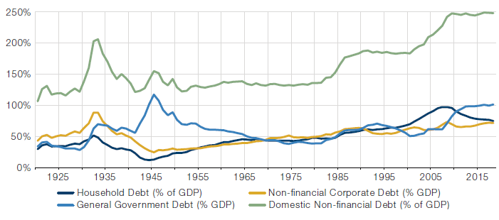
GDP data are 4Q, seasonally adjusted at annual rate from 1947 onwards. Data before from 1929 to 1947 are annual GDP released by the BEA. Debt data from 1920 to 1945 are Morgan Stanley estimates using data released by the Historical Statistics of the United States. Source: Haver Analytics, Bureau of Economic Analysis, Federal Reserve Board, Historical Statistics of the United States, Morgan Stanley Research.
The Twin Oil Shocks of the 1970s (Inflation). Oil prices went from USD2 to USD12 in 1973 and then from USD12 to USD35 in 1978-9 in the text-book example of a cost-push inflation. CPI soon followed, rising from under 3% in 1972 to 12% in 1974 and peaking at 15% in 1980. The policy response to the inflation threat was underwhelming, to say the least. Under Chairman Arthur Burns, whom history has not treated kindly, the Federal Reserve kept interest rates at or below inflation – with real rates as low as -3.5% in December 1974, for example, and still zero at the end of 1976. Similarly fiscal policy was set loose, with ever growing Federal budget deficits in the second half of the 1970s. Loose fiscal, loose money and as a result nothing to slow down an admittedly cost-push inflation. This led to a bonfire of paper assets, with the PE ratio on the S&P500 reaching 7.3x and on the FTSE100 index a miserly 2.9x in December 1974.
Paul Volcker (Disinflation). This was the situation inherited by Paul Volcker on his appointment as Fed Chairman in August 1979. There was much disbelief that monetary policy could be deployed to overcome a cost push inflation driven by constrained supply in several key commodities but especially oil. Volcker disregarded this, maintaining that if you could contain inflation expectations by a combination of tight money (positive real interest rates) allied with incomes policies that de-indexed wages from inflation, then inflation itself could be contained. And so it came to pass, as inflation responded to 8% real interest rates and a determined Fed Chairman, falling from nearly 15% to below 3% by 1983. The key lesson for central bankers from this episode was that you could control inflation if you are determined enough. (As a side note, the unemployment penalty from high real interest rates is stiff – there were riots outside the Marriner S. Eccles building during Volcker’s tenure.)
This later led to Ben Bernanke’s observation of the asymmetry of risks between inflation and deflation – the idea that inflation can be contained (following the Volcker playbook) but deflation is a trap with much more severe consequences – which is another reason to believe that policymakers are more likely to over-react to deflation risk as we reach the endgame in this long battle against deflation today. They will attempt to be “responsibly irresponsible” now in order to shock inflation expectations higher.
The Global Financial Crisis (Deflation to Reflation and back again). The GFC was another tipping point for inflation – lower. From inflation’s peak at 15% in 1980 it had been on a long, happy deceleration until in 2008 for the first time there were real deflation fears in the US. From pricing OUT inflation (good), markets had started to price IN deflation (very bad!). Breakeven inflation (the gap between nominal bond yields and TIPS yields) turned negative for the first time in October 2008, just after Lehman’s bankruptcy. This is where having Ben Bernanke – student of the Depression and fan of FDR – as Fed Chairman was so a propos. He immediately deployed his toolkit for how to avoid deflation by cutting interest rates (from 5% to 0.25% in 18 months), and started buying up assets on the Fed’s balance sheet to push investors off the risk-free curve in the first of three Quantitative Easing programmes.
This worked very well in shoring up financial asset prices on traded markets, but while this prevented an endogenous financial system failure it exacerbated another equally worrying trend, that of wealth inequality. And it really did nothing for the real economy, which is why we still find ourselves in a world where breakeven inflation hovers around 1%, far lower than the Fed’s symmetrical 2% target and even lower than any inflation catch-up target that may eventually be announced. Inflation expectations are stuck in low gear.
The difference between financial QE and fiscal QE. The question is, why has financial QE not worked on the real economy? Our answer is that there has been no money creation. Key to understand is that in financial QE – where the central bank buys assets from the financial sector, swapping cash for a financial instrument, no actual money is created. The central bank ‘pays’ for the bonds it buys by crediting the reserve balance of the commercial banking system, which raises M0 (or high powered money, the monetary base). But unless the commercial banks then lend against those reserves, no deposit will be created (M2). And because the private sector has been in a major deleveraging process, especially households, there has been no lending not because banks couldn’t lend, but because there was no demand for credit.
The transition we now expect, from financial QE to fiscal QE, solves this problem by cutting out the middle-man (the commercial banks). Under fiscal QE, the central bank still buys bonds directly from the treasury in what is termed monetary financing. The T-accounts are thus: CB gains an asset (Treasury bond) and gains a liability (the US Treasury General Account). The TGA is an asset of the government, which it can spend at its own discretion. Typically these will be works programmes, infrastructure plans etc – all of which end up paying money into the accounts of people very likely to spend it. Now we should see the money stock rising rather sharply and maintaining velocity. Unless there is a corresponding increase in productivity, inflation should follow.
Conclusions from history – go in all guns blazing (monetary and fiscal). So the lessons for today from past inflation regimes seem to be ... First, the correct response to a deflation shock is to combine very loose monetary policy with very loose fiscal policy. Second, err on the side of doing too much rather than doing too little. You can always raise interest rates extraordinarily high to control inflation but deflation is much harder to escape once it’s entrenched. Third, high debt and deficits are affordable only by financial repression where you keep real interest rates negative. There will need to be new rules to enforce purchase of negative real yield bonds by the general public and commercial banks. Capital controls are likely. Definitions of what constitutes high quality liquid assets may change, favouring the purchase of government bonds. But the key to remember is deflation shocks can be defeated with determined and clear reflation policies – it’s just getting the political agreement that is the tricky bit (see the German Constitutional Court proceedings, to name a live example).
1.2 Inflation Present
Why are we in a deflationary world? This is territory that has been much covered over the years including by ourselves (see for example A Japanese Roadmap for European Equities, 14 April, 2003), but in our view it boils down to:
- Debt – high debt loads discourage private sector consumption via Ricardian equivalence;
- Demographics – a rising share of old people who consume less and save more;
- Offshoring – replacing expensive home-grown supply chains with less expensive EM supply chains;
- Digitisation – substituting capital for labour by digitising previously human processes;
- Monopsony – few employers in any given urban centre, with employers dominating the labour supply. Hence wages are depressed and sticky. See Jonathan Tepper’s ‘The Myth of Capitalism’.
Do we see any of these deflationary forces changing? Well obviously you can’t wish away a pile of debt (many have tried) and you aren’t going to be able to influence the aging of the population on any reasonable time frame, so both of these must be taken as givens. It’s also unlikely you could or would want to reverse the digitisation of the G7 economies.
However, you can warehouse the debt on the balance sheet of the central banks and promise – or expect the markets to realise the possibility – never to run those assets back off into the broader investor base – effectively writing the debt off even if it still exists. So you can change the public’s attitude to the debt overhang. You can insist that companies re-build supply chains in their own countries of operation (see the US Entity List). You can penalise companies that persist in using foreign labour (take a bow, Donald J Trump). You can partially ban foreign suppliers from your own supply chains (see the Huawei debate globally). You can direct incomes policies in a reversal of the 1970s, mandating minimum wages or set ratios between workers’ and bosses’ pay. There’s actually a lot you can do as a policymaker if you put your mind to it.
The bottom line is that many of the deflationary forces currently in operation are not going away soon. But there are changes occurring in these processes. They are likely on balance to be less deflationary in coming years, when subjected to increasing political scrutiny, than they have been over the last two decades when left to grow unchecked. And, as previously stated, one of the lessons from history is that active economic policy – such as permanently high government budget deficits and central banks allowing an inflation overshoot – can dominate other economic forces such as demographics, if applied forcefully enough.
Why is the deflationary status quo unsustainable? Basically, two reasons. First, we suppose it must be the case that high debt loads risk financial instability, discourage risk taking by capitalists and therefore impede capital formation. Many emerging economies, especially China, have long passed the point where adding units of investment capital to the economy creates progressively less and less incremental output – the rise of the so-called Incremental Capital Output Ratio (ICOR). In other words, they are saturated with manufacturing capacity and saturated with debt. And this is the case globally. Debt/GDP has never been so high in the US – even at the end of the war US Government debt/GDP at 117% was lower than it will be by the end of the quarter at 125% on our expectation. People debate whether Reinhart and Rogoff’s empirical study of debt thresholds restraining economic growth is correct – see “This Time is Different”. Logically, it has to be. If it’s not, then just borrow enough to make everyone a millionaire. (Why wouldn’t that work?) So action needs to be taken to bring down the real value of debt in the world.
It’s the second reason the status quo is unsustainable that is the real key to our thinking, though: inequality. We have been thinking and writing about the political time-bomb that is income and wealth inequality for a long time, from before Piketty’s famous book on the subject “Capital in the 21st Century” 2013 – see for instance “Debt is Capitalism’s Dirty Little Secret”, June 2009, Financial Times Opinion piece. Google Trends tell us that the word inequality is searched for more than twice as frequently today as it was a decade ago. “Levelling up”, a “Green New Deal”, the “people’s QE”, call it what you will, but the notion that policymakers should attempt to redress the imbalance that has built up over 40 years and get real wage growth after decades of stasis has entered the political mainstream. This process will only be accelerated by the Corona crisis, but it’s not going away, we think, and will not even be dependent on left wing governments to put it in motion. It’s becoming a political consensus.
How might it end? Essentially we believe there is one good way out of a debt overhang and three bad ways out. The good way out is via growth. For this to work you need, ideally 1) an under-levered consumer with lots of pent-up consumption demand; 2) a demographic dividend with rapid growth in the working age population; 3) a productivity boom so that higher inflation does not result in high unit labour cost growth, which in turn could kill the recovery; 4) political control of the central bank, so that borrowing costs are not forced higher by bond market vigilantes. All of these things were in place in the 1942-51 debt work-down, with returning soldiers hungry to consume and start families, with no debt as it’s hard to get credit when you’re fighting a war. None of the first three are in place today in most advanced economies. But the fourth element, political control of central banks, arguably is or can be made to be quite quickly. Certainly, central bankers generally are keen to emphasise that fiscal solutions must now be deployed given we are running out of monetary solutions.
So that leaves the three unpalatable solutions to the debt overhang. What are they? Well, you can either choose to default on your debt; or you can devalue it either by allowing inflation to accelerate or by letting your currency depreciate; or you can take the “Austrian cleanse” approach favoured by our old friend Andrew Mellon, and deflate your economy, purging the system. And we know that’s out, just by watching the revealed preference of the Authorities around the globe – no-one has an appetite for a depression. (We are reminded of Jean-Claude Juncker’s marvellous line at the time of the GFC, when austerity was being advocated: “we all know what we’re supposed to do – we’re just trying to work out how to get re-elected when we’ve done it!”)
Which leaves us with default or devaluation – neither at all palatable but both essentially the same, devaluation being default by another name. How do you default gracefully? Well, there are good ways to do it and bad ways to do it. The bad way is an abrupt, one-off, cliff-face default / devaluation, which causes a sudden stop to all finance and causes the economy to completely seize up. This can be deflationary if no other policy action is taken, which is why what usually follows is an attempt to print money to pay government workers and pensioners, which can be and usually is extraordinarily inflationary. All very difficult. So what’s the way out?
1.3 Inflation Future
We dare to assume that politicians choose what is in our opinion the best way out of this mess. A new austerity is politically impossible and societally undesirable to an increasing majority of the electorate, as witness the many political upsets and the rise of extremist parties of both hues. Policymakers must hear the complaint and deal with it. The precise nature of the complaint is that the majority of the population has endured stagnant or falling real incomes for more than two decades, made all the more galling by the glittering ascent of “the 1%”, whose real incomes have doubled over that time period. The imbalance must be redressed not just by raising real wage growth in the lower 60% of the population, but also by constraining growth in the level of real income of the top 40% and especially the top 1%. This can be achieved by a combination of higher fiscal spending, higher tax take and higher public borrowing, the latter all financed by the central bank. Fiscal plans would need to be flexible, reining in fiscal spending when inflation was accelerating in a threatening way, and turning it back on when the opposite happened. But above all, governments must be prepared to embark on a policy of potentially large fiscal deficits, semi-structurally.
For all of this to happen, the following would also be likely:
- Financial repression and negative real interest rates. The government must be able to issue paper with yields below inflation, to reduce the real stock of debt over time. To the extent possible the private sector should be encouraged to buy this paper. Beyond that, the central bank commits to buy the remainder while keeping the yield curve at set levels. The private sector may have to be coerced to buy the paper, either by regulation or by law. At the same time the government should put in place capital controls to stop a flood of money leaving the country. Safe assets in liberal democracies with strong institutions and the rule of law will revalue sharply higher.
- Debt monetisation and MMT. The central bank’s balance sheet will grow exponentially. The watchword for how much money to print will be Stephanie Kelton’s dictum (we paraphrase): “to the extent the United States has an unemployment problem, there’s too little money in the world; to the extent it has an inflation problem, there’s too much money in the world.” Either way there’s going to be a lot more money in the world. Watch M2 / GDP.
- Inflation make up. Central bankers are likely to complete the framework reviews many already had in place before Coronavirus struck by changing the inflation targeting procedures. This could include the concept of inflation make-up, where they would ignore inflation running hot, above central targets, in order to allow the general level of prices to catch up with where it should have been had CPI hit its 2% target every year (taking the US as an example).
- Building redundancy into the supply chain. In strategic sectors expect a move to “just in case” from “just in time” – and we should also see re-on-shoring of manufacturing in certain sectors – a reversal of globalisation.
There are of course many risks to this direction of policy travel. Is there a limit to the balance sheet of a central bank, or to the amount of debt a government requires? We believe in theory there is no limit, while in practice it is asset markets – currencies, bonds, equities – that will determine the limit of these policies. But if the combination of policies succeeds in reducing the debt-to-GDP ratio over time, while debt service remains manageable these limits are not likely to be reached. Won’t elevated private savings offset higher fiscal deficits thus nullifying their impact via a process of Ricardian equivalence? Well, not if the fiscal stimulus finds its way into the pockets of those with a very high marginal propensity to consume and not if the investment programmes are sufficiently well-designed to raise total factor productivity over the medium term. (See for example Jason Furman, ‘The New View of Fiscal Policy and its Application’, October 20161). How will Emerging Markets cope with an inflationary regime? Our answer is that they will have to adapt, probably by running tighter fiscal and monetary policies than Developed Markets, which should support their currencies and make dollar borrowings easier to finance but could delay their recovery from the current crisis.
So this is our vision of what we would have thought a dystopian future only a dozen or so years ago, but which has become our central scenario.
In Part Two we look at what to watch to identify which regime we’re in (our Roadmap), and in Part Three we look at what portfolio managers can do to potentially mitigate or benefit from a change in inflation regime.
Part Two – The Roadmap
What we are watching to confirm or rule out the transition. The beleaguered reader who wishes to skip this section may just peruse the table in Exhibit 3.
Exhibit 3. Summary of Man DNA Team’s Inflation Regime Change Checklist (Red Demarcates Greater Risk)
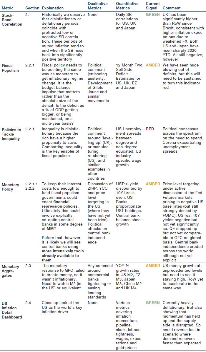
For illustrative purposes only. Forward looking statements should not be relied upon when making investment decisions.
2.1 The Stock-Bond Correlation
Exhibit 4 shows that stock-bond correlations are generally positive, despite the significant negative readings of the past two decades. Apart from the present, we count three episodes in the UK and five in the US where the relationship was significantly low for a sustained time. As we outline in our annotations, of these eight chapters, we think seven have an explicitly disinflationary or deflationary reason.2
Our previous work has focused on the reasons for this interaction between the stock-bond correlation and inflation3 so we won’t rehearse the whole argument here. In brief, as Keynes observed, the co-movement of prices and interest rates is ‘one of the most completely established empirical facts in the whole field of quantitative economics.’4 Interest rates are inversely correlated with bond prices and positively correlated with inflation. Thus if inflation falls, or if inflation expectations are suppressed, then rates will fall, and stock-bond correlations with them.
Now admittedly, inflation has not been particularly low in this current negative stock-bond regime. Since the turn of the millennium headline inflation has averaged 2.0% in the UK and 2.2% in the US, but the psychology of the environment has been disinflationary. That has been reflected quantitatively in the collapse of inflation expectations, which we discuss further in Part 2.4.
Exhibit 4. Annotated UK and US Stock-Bond Correlations (1763-2020)
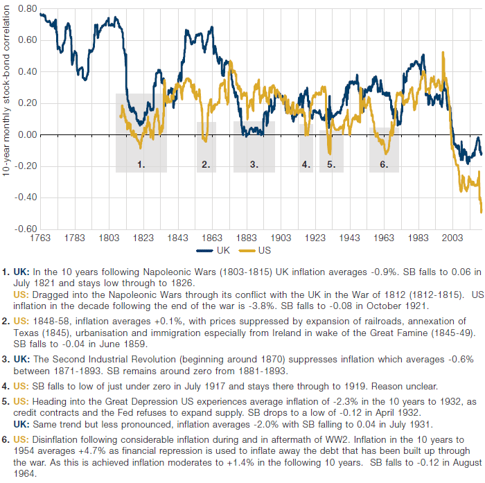
Data collated from Bank of England, Professor Robert Shiller, Officer & Williamson database, Man DNA team.
Exhibit 5. Fast Developed Market Stock-Bond Correlation Measures (Last Ten Years)
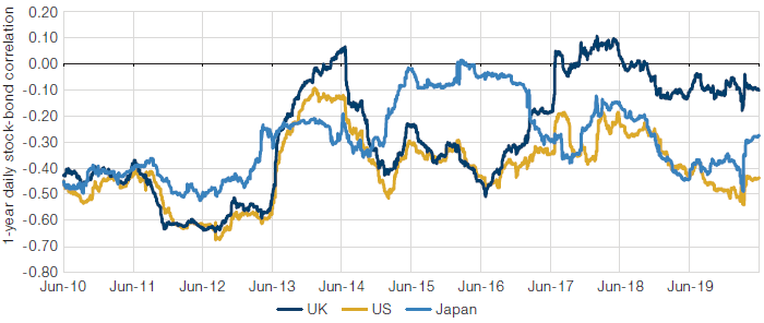
We use TR indices for S&P, FTSE and Topix, and TR indices for 7-10 year government maturities. Data collated from Bloomberg, JP Morgan, Man DNA. As at 2nd June 2020.
Whilst Exhibit 4 gives us a good view of the arc of history, clearly it is not suitable as a real-time indicator given the periodicity of the data. For this we use daily speed annual correlations across DM, as shown in Exhibit 5, which contains US, Europe (proxied by UK5) and Japan.
On the fast stock-bond correlation measure, an inflationary turning point would be signalled by persistent move above zero, across geographies. In Exhibit 5 we can see that there was a glimmer of such a move in 2013, following the Eurozone Crisis and the Taper Tantrum. There were also idiosyncratic jumps in Japan in 2014 as the market digested the implications of Abenomics, and in the UK in 2017, following the fallout from the Brexit referendum. But currently this indicator shows us no sign of a shift to an inflationary regime.
2.2 The Policy Checklist
As discussed in Part One, Monetarism is one of two critical inflation risk sources. If monetarist inflation is to take root it will be caused by policy decisions by governments and central banks.
2.2.1 Governments
Fiscal Populism
Fiscal expansion is the government’s lever to generate inflation. The Corona crisis has elicited sizeable spending commitments across the world. Current forecasts for 2020 budget deficits as a percentage of nominal GDP are 15.0% in the US (4.6% in 2019), 9.5% in the Eurozone (2019 – 0.6%), 10.6% in the UK (2019 – 2.0%) and 8.0% in Japan (2019 – 2.6%)6.
Whether expanded fiscal policy becomes inflationary will be determined by the depth of the deficit and the duration of its expansion. Exhibit 6 shows annual budget deficits for the US and UK from 1790 and 1700 respectively. Up until WW2, we see a pattern of balanced budgets, with deficits used proactively to wage war7. Since then, we see deficits used reactively in response to recessions, with increasingly unsuccessful attempts at their eradication in the aftermath (as reflected in the general pattern of progressively lower peaks and troughs).
Exhibit 6 shows current deficit spending ticking the ‘depth’ box, with the size of the expansion exceeding everything since WW2. The question now is whether it will be sustained. In the aftermath of the GFC, the US deficit expanded for two consecutive years, from 1.1% in 2007 to 9.8% in 2009. Such largesse did not last long, however. As the Tea Party movement gained traction in the wake of the crisis, fiscal policy quickly began travelling in the opposite direction, with six consecutive years of tightening, leaving the deficit at 2.4% in 2015. This fiscal tightening dominated the monetary loosening and inflation went nowhere.
In the Great Depression the budget balance was cut from a 0.8% surplus in 1930 to a deficit of -4.6% in 1932, in contrast to the GFC it then remained at a similar level through to 1936 when it registered -5.1%. So for six years fiscal policy was either easing or neutral, a complement to the abrupt monetary easing that coming off the gold standard entailed.
Today it seems likely that the 15% US deficit forecast for 2020 will not be maintained through 2021, especially if an effective treatment is found for the virus. But what will be a crucial signal in our checklist is whether the pattern is more similar to the Great Depression or the GFC. Everyone’s got a different letter for the shape of the economic recovery, but we are more interested in the alphabetic implications for the budget balance: will it be a Great Depression U or a GFC V. Any sign of the former is to us indicative of an inflationary regime change.
In the US this process is already underway. The Corona Crisis is different from the Great Financial Crisis in that the US went into it already expanding its deficit. Between 2015 and 2019 the deficit went from 2.4% of nominal GDP to 4.6%, increasing every year. This was in contrast to much of the rest of the developed world; in the UK for instance the trend was the opposite, from 4.2% to 2.0% and shrinking every year. This means that as at the end of 2020 the US will have expanded its deficit for five years in succession. President Trump is reported to have answered a question about fiscal prudence thus: “Who the hell cares about the budget? We’re going to have a country.”8
Exhibit 6. Budget Deficits for US and UK 1700-2020
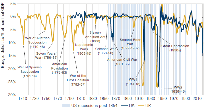
Data collated from Bank of England, US Treasury, Man DNA team. 2020 is current consensus estimate collated by Bloomberg as at 22 February 2020.
So the deficit depth is there, and it seems like the appetite to sustain duration is also present, but we are closely watching for confirmatory evidence. Exhibit 7 is one way of watching this at an aggregate level. Here we see the sell-side’s 12 month blended forward estimate for the budget deficits of the four major DM geographies. We haven’t mentioned Japan and the Eurozone for the sake of brevity, but we can see a similar pattern to the US and UK, being pronounced tightening quickly after the initial GFC response, albeit with a bit of a lag in the case of Japan.
Inequality
If fiscal stays loose what will be the justification? There are myriad options. It is easy to see how infrastructure investment to combat climate change could enable deficit spending at massive scale and duration. Equally likely will be policies to combat inequality, as described in Part One.
Inequality was already gaining momentum as a political touchpoint prior to Corona. The phrase ‘level(ling) up’ occurred eleven times in the 2019 UK Conservative party manifesto. And the trend was perhaps even more pronounced in the US where a swathe of the population, whose manufacturing heartlands had been decimated by a dislocated globalisation, who had been derided as ‘deplorables’ by Hilary Clinton and a technocratic elite, were addressed directly in President Trump’s inaugural address: “The forgotten men and women of our country will be forgotten no longer.”9
Exhibit 7. Daily 12 Month Forward Budget Deficit Estimates (Last Ten Years)
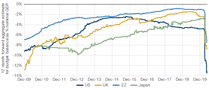
Data aggregated by the Man DNA team, from Bloomberg.
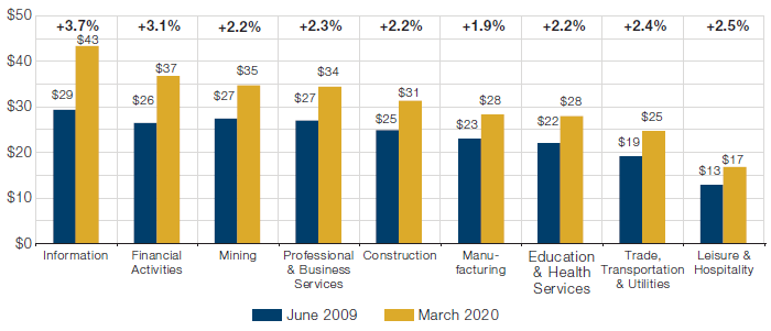
Exhibit 8 shows the US gap in unemployment rates between those with and without bachelor’s degrees is at its most extreme since the data begins. The US non-degree educated segment is 62% of the adult population. Arguably this cohort was discriminated against in the 2008 cycle by predatory lending practices and dodgy securitisation, and they’re being discriminated against today by the lockdown. The response will have to make them good.
Exhibit 8. US Unemployment Rate – No Degree Minus Degree Educated (Recessions Shaded)
Man DNA calculations based off US Bureau of Labour Statistics data table A-4. No degree is aggregation of ‘Less than High School Diploma’, ‘High School, no College’ and ‘Some College or Associate Degree’ segments.
The other datapoint we watch is the industry segmental earnings from the BLS’s B-3 table. In Exhibit 9 we show the change in these data, from the GFC trough to the present. This further reflects the unfairness of the GFC to Corona cycle.
We continue to watch both, but on our checklist they are clearly flashing red for regime change.
Exhibit 9. US Average Hourly Earnings from GFC Trough to Present (CAGRs at top)
Man DNA calculations based off Bureau of Labour Statistics data table B-3. We exclude the April datapoint due to distortions coming from the mix effect given the magnitude of the unemployment increase.
Financial Repression
In Part One we discussed some of the historical precedents for when governments are pushed to make significant fiscal expansions. Often, and in particular in the case of FDR tackling the debt overhang from the New Deal and WW2, financial repression was used. It seems likely that the covering fire thus far provided by central banks has ensured that the bond markets have not revolted at the fiscal bonanza implied in Exhibit 7. Ten year yields for USTs, Gilts and Bunds are all down since the end of January, the last month of comparative normality. But what happens if the government decides it wants to push the fiscal envelope further than central bank acquiescence will allow? We think some form of fiscal repression would be likely. Here follows a checklist of measures to look out for.
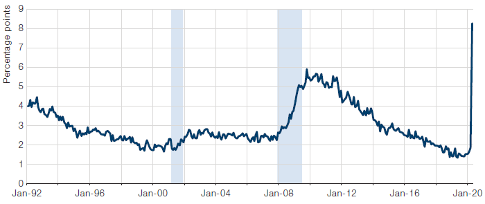
Real rates might be kept negative to reduce the debt stock. Exhibit 10 shows an indicator of the extent to which this is happening. From this we see real yields moving negative in January for the first time since the aftermath of the Eurozone Crisis in 2011-12.
President Trump has exerted public pressure on the Federal Reserve more than any other recent POTUS. A count by Bloomberg found over 60 instances where Trump had publically rebuked Chairman Powell.10 You would be hard pressed to find even one instance of Presidents Obama or Bush taking to the airwaves in such a manner. The flack is certainly coming both ways. Most notably, in August 2019 former New York Fed President Bill Dudley explicitly suggested that the Fed should make decisions consistent with stopping Trump’s 2020 re-election. If it becomes widely accepted that the Fed is a political institution, we will have reached a milestone in financial repression.
Exhibit 10. US Real 10 Year Yields
Calculated from Bloomberg data by Man DNA team. As at 2nd June 2020.
The government might also try to exert pressure on commercial banks and other financial institutions. Of course this is unlikely to be superficially visible, but imagine a fireside chat between the Treasury Secretary and a beleaguered bank CEO. “That’s a nice banking license you’ve got there – shame if anything were to happen to it.”
We monitor this through the Fed’s Flow of Funds accounts, to create the metric shown in Exhibit 11. This details how US domestic financial institutions’ proportionate holdings of Treasury securities have been increasing from 30% in Q3 2010, to 45% at the end of 2019 (USD10trn of USD22trn outstanding). Financial institutions are already buying, and could do considerably more, at least by the standard of history.
Extreme financial repression would involve capital controls and confiscation of real assets such as gold. There is ample historical and, in the emerging world, current precedent for this. FDR’s Executive Order 6102 of April 1933 made ‘the hoarding of gold coin, gold bullion, and gold certificates within the continental United States’ illegal11, under pains of six months imprisonment and the seizure of the offending bullion. We think any potential for this today is a long way down the line, however, and if it happens the inflation regime will have long since changed.
Exhibit 11. US Domestic Financial Institutions Treasury Holdings as % of Total Outstanding
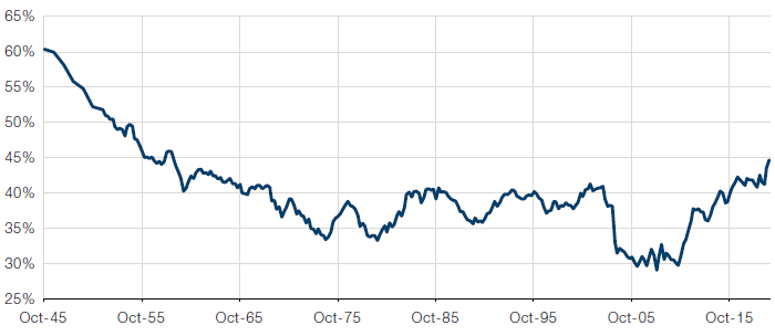
Man DNA calculations from Fed’s Flow of Funds data, tables L.105 and L.108. Historical readings from Federal Reserve Bank of St. Louis.
2.2.2 Central Banks
We think it is clear that for governments to pull the levers we have described, they will need central bank acquiescence, whether willing or otherwise. But how can we know how far down that road we have travelled? Fortunately we don’t have to guess. In November 2002 Ben Bernanke, then on the Board of Governors of the Federal Reserve and soon to be its Chairman, made a speech in which he outlined the checklist the Fed would follow to create inflation.
In Exhibit 12 we detail the measures Bernanke outlined, the names by which they have since become known, and where they first happened. We shade green all measures which have been enacted in a meaningful way somewhere in the world. The point to us is clear: central bankers may talk extensively of their toolboxes, but in reality there’s not much left before they get effectively taken over by governments.
That doesn’t necessarily mean this will happen imminently in time terms, however. Absent from Bernanke’s list is NIRP (Negative Interest Rate Policy) and Price Level Targeting (an extreme form of forward guidance where the monetary authority targets an absolute level of prices rather than a growth rate). The Fed denies it is considering the former but the futures market wasn’t buying it and on the 7th May began to price a negative rate by the end of 2021.
Meanwhile Price Level Targeting is under active discussion. Since the Fed introduced their 2% target in January 2012, the core PCE deflator has risen 14%, whereas it should be up 18% had it been consistent with the initial goal. That could mean inflation running at a little over 3% for the next three years.
In reality, if we do get MMT, it will creep up on us. In the 1933 ‘Chicago Plan’ Irving Fisher noted that: ‘irredeemable government-issued money represents equity in the commonwealth rather than debt.’12 If the government securities held by the Fed and other central banks became perceived as equity in the commonwealth it would be tantamount to their cancellation and thereby MMT in practice.
One way in which this could happen is that the sheer quantum of central bank holdings becomes so large that its redemption is no longer accepted as a practical outcome. We are therefore watching very closely the acquisitions through the crisis of the world’s leading monetary authorities. Exhibit 13 shows the 2020 YTD absolute and percentage growth in the world’s four major central banks.
Whilst this is a live risk we are monitoring, we are not currently at the ‘equity in the commonwealth’ tipping point.
2.3 Monetary Aggregates
As discussed in Part One, financial QE did not create money, but fiscal QE could. The metrics described in 2.2 are a forward-looking framework for analysing the upcoming likelihood of fiscal QE. In addition to this we also watch backward looking metrics of money growth, as detailed in Exhibit 14.
This shows the US money supply growing at an unprecedented rate. In other regions, however, we are not yet seeing the same level of expansion as characterised the aftermath of the GFC.
Exhibit 12. The Road to MMT
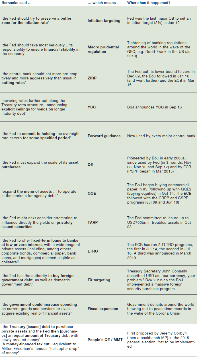
Ben Bernanke – Deflation: Making Sure “It” Doesn’t Happen Here (speech to the National Economists Club, Washington DC – 21st November 2002.
Exhibit 13. YTD Growth in Major Central Bank Balance Sheets
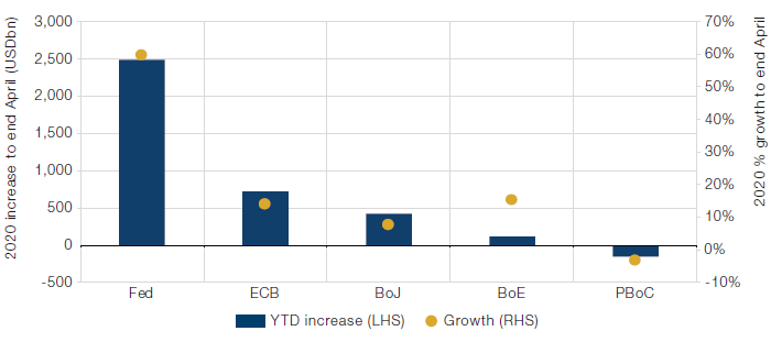
Central bank balance sheet reports. FX conversions are a static three year average. YTD is four months to end April 2020.
Exhibit 14. YOY Growth in Selected Monetary Aggregates
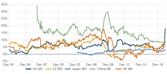
Bloomberg. As at end April 2020.
2.4 Other Inflationary Indicators
Exhibit 15 shows our dashboard for monitoring US inflation by component parts. Each chart contains the indicator (blue line) and our calculation of the normal range (yellow dashed lines). If the indicator exceeds the upper bound the chart turns red to denote inflationary pressure, and vice versa if it drops below the lower bound. If it is within the range the chart is grey and inflationary pressure is seen to be neutral.
What is our dashboard telling us about inflation today? We comment on each row in turn.
- Momentum (baskets stripped of extreme price movers) is broadly neutral
- Pipeline is heavily deflationary. Supplier Deliveries is very high but this reflects supplier disruption rather than intensifying demand. This does suggest that pressure could reverse quite quickly if demand recovers
- Economic slack large, and heavily deflationary
- Labour tightness is loose, and heavily deflationary
- Wage inflation is neutral to inflationary. There will be some mix effect here as the recent job losses have been skewed towards lower paid segments of the labour force (as per Exhibit 8)
- Inflation expectations are inflationary for the consumer (likely a result of stockpiling and other supply constraints on basic necessities), but deflationary for the market and the sell side
- We are careful with how we interpret the real gold price move. Our dashboard shows it as inflationary. Given that gold benefits from geopolitical uncertainty, usually present in both inflation and deflation, this in reality could be pointing to either. Our interpretation is that the gold price was pointing to inflation through 2019 due to increased perception of the abandonment of fiscal restraint (per 2.2.1). Through 2020 it has been supported by the uncertainty of deflationary forces
In sum, the dashboard currently feels a lot more deflationary than inflationary. That being said, the fact that momentum is holding up, and the supply side is disrupted, makes us think the picture could change quite rapidly if demand picks up faster than expected.
Exhibit 15. Man DNA US Inflation Dashboard
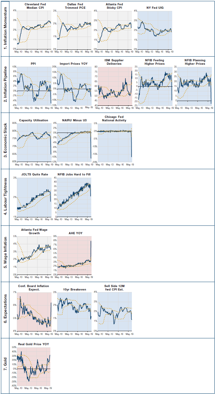
Source: Bloomberg, Man DNA calculations. We are indebted to Ian Harwood of Redburn Economics for helping us to think about these categories.
Part Three – New Investment Strategies
For the reader in a hurry, Exhibit 16 provides a summary.
Exhibit 16. Investment Strategies for Inflationary Times – Summary Table
What new regime? Let’s agree terms. In what follows, we assume that, after the transition period, this new regime will be a period with higher average inflation, say 4%; higher inflation volatility; negative real rates through financial repression, say 2% nominal 10Y rate; less reliance on global supply chains; and policies that favour labour over capital. A combination of the Monetarist and Marxist drivers of inflation.
Our Fire & Ice framework demonstrates that “Inflation” is the most challenging of regimes for all traditional long-only assets. The level and direction of inflation is the most critical element in our asset allocation choices, as per our Fire & Ice framework. We have written extensively about the theory and practice of this concept. Exhibit 17 illustrates that the Inflationary regime is the most difficult of the four regimes for all asset classes, with all long-only asset classes included in our studies delivering negative real returns on average during such periods, measured since 1926.
Reflation first, Inflation later. The French cult movie La Haine opens with the telling of the story of a man who falls from a 50 storey building. “So far, so good” the man tells himself reassuringly while passing each floor. “But”, so the story goes, “it’s the landing that matters, not the fall”. The landing, in our story, is Inflation, and our story continues even after the landing. Most investors are not prepared for it. On the way to Inflation it will feel like Reflation for a good while, and all will seem fine. Perhaps markets have left the Deflation regime associated with this recession for good already, since 23 March 2020. Everyone knows what to do in the Reflation regime. It is the Inflation regime that provides a major challenge to investors.
Exhibit 17. Man DNA Fire & Ice Framework
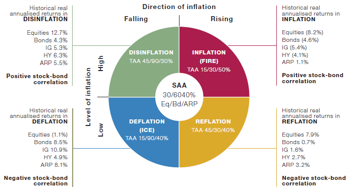
Source: Man DNA team using data from Professor Shiller, Fama-French and Morgan Stanley. Equities refer to the S&P 500, Bonds refer to 7-10 year US Treasuries, IG refers to corporate issuance with BBB rating or higher, HY corporate issuance below BBB, ARP is equal risk contribution long/short portfolios of Value, Size, Momentum, Quality and Low Beta. For a fuller explanation please visit our website:
www.man.com/dna and click the Fire & Ice dropdown box.
Lack of data for inflationary times. Designing investment strategies for inflationary times requires a large degree of judgment based on an understanding of fundamentals, because data availability is very limited. Inflationary times occur just 13% of the time in our empirical studies of performance during the various Fire & Ice regimes since 1926. And these inflationary times were not all equal: for instance the 1940s were controlled demand-pull inflationary times starting from depressed levels of economic activity, facilitated by financial repression, while the 1970s were out-of-control cost-push inflationary times through oil price shocks and inadequate policies such as wage-price spirals and negative real interest rates.
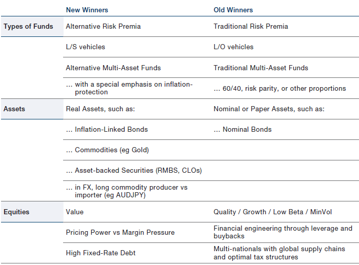
A wide range of investment strategies have flourished in the prevailing investment regime of the last few decades, which we believe is now coming to its end. Some strategies have been beneficiaries in very explicit ways, while other types of successful strategies’ reliance on the regime is up for debate. Here is the list of key beneficiaries that are at risk of this regime change, in our judgment – see also Exhibit 18:
- Long-only strategies – traditional risk premia – as equities and bonds delivered excellent performance during this stable pro-capital period;
- Traditional multi-asset strategies relying on these long-only strategies – like 60/40, risk parity, or combinations in any other proportions – as equities and bonds offered each other excellent diversification benefits (see stock-bond correlation charts in Part Two). This is because when inflation is so low that deflation is the main threat, as has been the case for 20 years, a lower inflation print is bullish for bonds and bearish for equities; while when inflation is the main threat, as has been the case throughout prior centuries, a lower/higher inflation print is bullish/bearish for both asset classes;
- Within equities, the Quality / Growth-style
- Quality / Growth-type strategies performed much better than usual, as in a world of ever lower rates and low nominal growth these types of characteristics were more desirable than usual.
- Stocks of companies that used financial engineering with financial leverage combined with buybacks performed strongly.
- Multi-nationals that focus on global supply chains; outsourced and just-in-time type production processes; optimal global tax structures.
Exhibit 18. Asset Class Performance in Different Timeframes
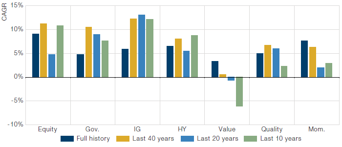
Calculated by the Man DNA team from the following data sources: Professor Shiller’s long term equity returns, GFD, Morgan Stanley and Fama-French. We term FF factors as follows: HML = Value, RMW = Quality and Momentum = Mom. The series start in the following years (corresponding to the ‘Full history’): Equity = 1871, Gov. = 1871, IG = 1921, HY = 1921, Value =1926, Quality = 1963, Mom. =1927. FF factors are vol. scaled to 10% on 3 year lookback.
Exhibit 19. Asset Class Performance in Selected Inflationary Regimes
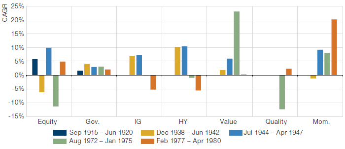
Assets defined in same way as previous exhibit. Inflationary regimes are Man DNA team’s qualitatively defined regimes as per the Fire & Ice framework.
New investment strategies needed. Fundamental judgment, combined with our empirical studies of the Fire & Ice regimes, dictates that winners and losers would change dramatically in an inflationary regime, prompting shifts away from the list just mentioned. In what follows we describe broad thoughts about what may work well in Inflationary times. See also Exhibit 19. Work is on-going to design specific strategies – please contact your sales person if you are interested to explore this further.
- Alternative risk premia and long-short assets instead of traditional risk premia and long-only assets. If indeed long-only strategies deliver negative real return, long-short strategies will be required.
- Real assets instead of paper assets, or derivatives of this concept, such as:
- Inflation-linked bonds through their direct link with higher inflation
- Precious Metals (eg Gold, Silver) as the key alternative to currencies with limited supply, ie not devalued through money printing policies
- Crypto currencies would fall in the same category by their design albeit their drivers are perhaps more speculative given a much shorter history as stores of value
- Industrial Commodities (eg GCSI)
- Real Estate (albeit Commercial Real Estate and City Centre Residential Real Estate quite obviously stand to lose from a more permanent working-from-home culture)
- Asset-backed securities such as RMBs and CLOs
- Currency pairs of commodity-producing nations vs commodity importers such as AUDJPY
- Within equities: Value style instead of a Quality / Growth style:
- Styles: Momentum and Long-Term Return Reversal are chameleon-like factors grounded in behavioural finance that should be very robust to this regime change, over time
- Ability of the business to adjust to higher inflation: Pricing Power versus Margin Pressure, measured for instance by
- Average profit margins (high is good)
- Labour share of costs (low is good)
- Herfindahl index (a commonly accepted measure of market concentration)
- Commodity producer vs commodity buyers
- Balance sheet: nominal debt levels can be inflated away by higher inflation, therefore businesses with High Fixed-Rate Debt / Equity Ratio could stand to benefit, but only if they can service their debt, measured for instance by High Interest Cover. The short leg of this strategy could be represented by businesses that have trouble servicing their debt, measured for instance by low profitability and low interest cover
- Sectors: very much related to the aforementioned points, Cyclicals vs Defensives is expected to be a winning strategy in inflationary times
A wide variety of pitfalls amongst each of these new strategies. Each of these aforementioned individual approaches has its pitfalls, such as:
- manager selection challenges for long-short strategies;
- lack of liquid instruments for instance amongst inflation-linked bonds;
- many of these strategies or instruments are less than perfectly correlated with inflation, for instance each commodity has its own supply-demand dynamics which means its correlation with inflation is imperfect;
- the impact of duration changes on inflation-linked bonds may overwhelm its link with inflation;
- the roll costs in the futures curve of commodities;
- FX will have drivers other than commodity production or consumption;
- the Equity Value style is particularly challenged by technological disruption;
- negative real rates will continue to support growth stocks that are valued on DCF type methods.
An additional important pitfall is represented by the fact that these strategies have different pay-off structures. Some of these investment strategies are akin to risk factors, in the sense that they will only make money in inflationary times – the more inflation the better – and will lose money in disinflationary times – the lower inflation the worse. Value versus Growth within equities, or long-short assets versus long-only assets, are such strategies than in all likelihood will only pay off well in inflationary times.
Other strategies are expected to make some money in all types of regimes, including inflationary times, such as the Momentum style within equities.
Finally, other strategies tend to be best during times of higher inflation volatility. This is the case for dynamic strategies that aim to time periods of higher and lower inflation, thus benefitting from the higher opportunity set due to the higher volatility of inflation. This can only be done through instruments with sufficient liquidity, which is a challenge in many markets – some futures markets and large cap equities lend themselves best to these timing strategies.
A final pitfall worth mentioning is sequencing and basis risk. This is most obviously prevalent for strategies that are linked with specific countries, such as inflation-linked bonds, where many investors wonder whether the more liquid US TIPS market can be used to hedge inflation risks in other countries. We believe this is a possibility worth considering, but dangerous. In the 1930s, for instance, there was a full five years between Britain abandoning the gold standard in 1931, and France in 1936. Whoever adopts helicopter-money type strategies fully first, will be the country that devalues its currency and increases its inflation first.
For all these reasons, we recommend a broad portfolio approach to inflationary strategies in order to address these pitfalls as well as to increase capacity of the combined strategy. Such a diversified portfolio approach should have the best chance to provide high liquidity and a superior Sharpe ratio.
Concretely, what should a responsible and sensible investor do now? We believe investors still have some time to prepare for this regime shift, in all likelihood, but one cannot be sure. Because the impact of the changes we anticipate would be so large, now is the time to make preparations. “By failing to prepare, you are preparing to fail” in the famous words of Benjamin Franklin.
First, any responsible asset manager needs to assess existing signals and strategies for their robustness to the new inflationary regime. Aim to understand how robust existing strategies and signals are to this new regime, for instance through a simple scoring system. This could quite naturally translate into an action plan by allocating more capital to the more robust signals when the time comes.
Second, a blank-sheet-of-paper approach. As a second step one should aim to seek out new strategies that could thrive in the new investment environment. This is more complex, and not all investment professionals will have the resources or capabilities to perform this exercise, in part because backtest work is of very limited availability.
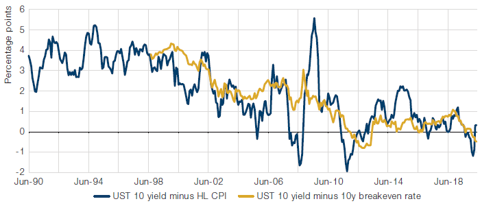
Markets are not currently priced for higher inflation at all, in our view. This is illustrated by the stock-bond correlations still being negative (see Part Two), by inflation rates implied by breakevens (see Exhibit 20), as well as the relative performance and valuation of value stocks within equities. We have also computed the implied inflation rate in the US, year by year, and even in year 10 from now inflation is not priced to be over the central bank target of 2% (see Exhibit 21).
The timing of these regime transitions is uncertain. At what point would markets behave as if inflation is the main threat? The timing is uncertain – from Deflation to Reflation to Inflation. A lasting period of much higher inflation is unlikely to start with the current high levels of unemployment.
Exhibit 20. 5Y5Y Breakevens
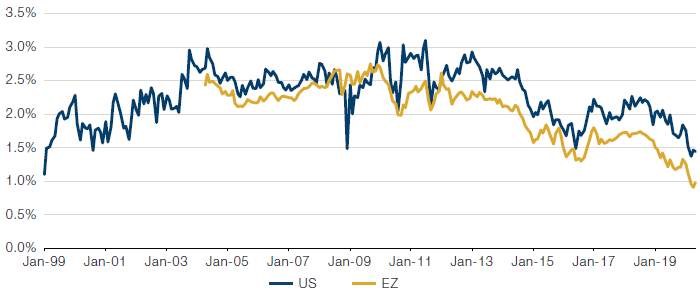
Source: Bloomberg.
Exhibit 21. An Illustrative US Inflation Scenario
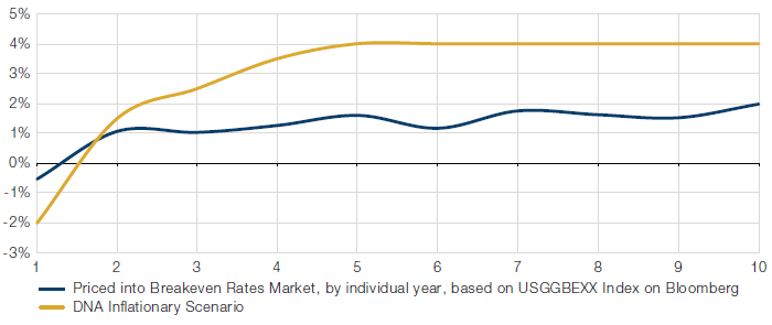
Illustrative scenario – for information only. There can be no guarantee that the scenario will occur or that any scenario identified will provide similar results. Bloomberg, Man DNA team calculations. As at April 2020.
The need for preparation, however, is not uncertain: now is the time! We believe now is the time to make the necessary preparations for a variety of reasons. First, the likelihood of an inflationary regime is much higher than it has been in recent times; second, the investment implications of this new regime would be so large that all the things that have worked are at risk of stopping to work; and third, given that markets are not priced for higher inflation at all, the market inflationary regime may well start well before inflation actually kicks in, given the starting point. We explained in Part Two that we monitor a wide range of factors to judge this transition. The stock-bond correlation is quite possibly the most important of these, as it will reveal whether inflation is the markets’ key concern or not.
For now markets are not yet behaving as in an inflationary regime, but we are watching this closely, and we stand ready with a plan for when it occurs.
Are you ready?
1. Speech at Global Implications of Europe’s Redesign conference, New York, October 2016.
2. The only one that didn’t was US in 1917-19 which was an inflationary period. The most likely explanation was pronounced US equity volatility caused by uncertainty around US involvement in WW1, volatility which was not replicated in US bond markets. Between July 1914, when the war began with the US firmly committed to non-intervention, and January 1917, when the Zimmerman Telegram led to the US declaration of war, US equities were up 42% (UK was down 11%). As the scale of their commitment became clear, US equities then fell 24% through 1917 (UK was up 9%).
3. Ben Funnell – Fire, Then Ice – Man GLG – 2017.
4. John Maynard Keynes – A Treatise on Money – 1930. P.198.
5. Whilst we are cognisant of the irony of representing Europe with the UK, we find this to be the most efficient way of accounting for the FX effect, and the measure fits closely with a more complex, FX-adjusted approach in our backtests. Should the UK and European economies diverge significantly post Brexit, we will need to re-visit this measure.
6. Sell side economist aggregates from Bloomberg as at 22/5/20.
7. There are exceptions. The compensation payments the British government made in order to secure the abolition of slavery in 1833 and FDR’s New Deal in the wake of the Great Depression can both be seen as proto-examples of deficit funded ‘levelling up’.
8. As reported by the Washington Post on 18th January 2020.
9. President Trump inaugural address, 20th January 2017.
10. Source: Bloomberg; Key Trump Quotes on Powell as Fed Remains in the Firing Line; 17 December 2019.
11. Source: The American Presidency Project; Executive Order 6102—Requiring Gold Coin, Gold Bullion and Gold Certificates to Be Delivered to the Government; 5 April 1933.
12. See for instance Jaromir Benes and Michael Kumhof – The Chicago Plan Revisited – IMF working paper August 2012 – p.4.
The DNA team are indebted to a number of people in thinking about these topics. Most notably Gerard Minack for his work on the drivers of deflation, Jamil Baz on the exit routes from a debt overhang, and Russell Napier on what the new regime might look like.
References
Ahamed, Liaquat , Lords of Finance: The Bankers who Broke the World. Penguin 2009
Bernanke, Ben, Deflation: Making Sure “It” Doesn’t Happen Here, speech to the National Economists Club, Washington DC November 2002
Buffett, Warren, How Inflation Swindles the Equity Investor, Fortune 1977.
Dalio, Ray, The Mechanics of the War Economy, March 2020.
Dalio, Ray, Paradigm Shifts, July 2019.
Doblin, Alfred, Berlin Alexanderplatz. S. Fischer Verlag 1929
Draaisma, Teun and Ben Funnell, A Japanese Roadmap for European Equities. Morgan Stanley 2003
Fergusson, Adam, When Money Dies: The Nightmare of the Weimar Hyperinflation. William Kimber & Co. Ltd. 1975
Furman, Jason et al, The New View of Fiscal Policy and its Application, October 2016.
Funnell, Ben, Debt is Capitalism’s Dirty Little Secret, Opinion Piece, Financial Times, June 2009
Funnell, Ben, Fire, Then Ice, Man GLG 2017
Garbade, Kenneth, How the Fed Managed the Treasury Yield Curve in the 1940s, FRBNY Liberty Street Economics April 2020.
Garrett, Garet, A Bubble that Broke the World. Little, Brown and Company 1932
Hackett Fischer, David, The Great Wave, Price Revolutions and the Rhythm of History. Oxford University Press 1996
McCulley, Paul speech at the Minsky Institute 2019 on changing fiscal-monetary doctrine during his professional career.
Piketty, Thomas, Capital in the Twenty-First Century. Editions du Seuil, Harvard University Press 2013
Reinhart, Carmen M. & Kenneth Rogoff, This Time Is Different, Eight Centuries of Financial Folly. Princeton University Press 2009
Tepper, Jonathan, The Myth of Capitalism: Monopolies and the Death of Capitalism. Wiley 2018
Tudor Jones, Paul and Lorenzo Giorgianni, The Great Monetary Inflation, May 2020 Market Outlook
You are now leaving Man Group’s website
You are leaving Man Group’s website and entering a third-party website that is not controlled, maintained, or monitored by Man Group. Man Group is not responsible for the content or availability of the third-party website. By leaving Man Group’s website, you will be subject to the third-party website’s terms, policies and/or notices, including those related to privacy and security, as applicable.