Introduction
“Donatello: The perimeter’s quiet.
Leonardo: Yeah, a little too quiet”
- Teenage Mutant Ninja Turtles II: The Secret of the Ooze (1991)
Although geopolitical uncertainty persists and economies are unstable, markets are strangely calm. Which is a worry.
You can never please a risk manager.
When markets are turbulent, we worry about the effects of that high volatility and instability. Right now though, although geopolitical uncertainty persists and economies are unstable, markets are strangely calm. Which is a worry.
Why exactly are we worried?
It’s not just that we’re glass half (three-quarters?) empty kind of people. Or just that equity volatility seems disconnected to rates volatility, as shown in Figure 1. Indeed, there are a number of reasons to be concerned - geopolitics, a re-emergence of inflation, central bank policy mistakes, pockets of credit distress and upcoming elections to name a few.
Figure 1. US equity volatility (VIX Index) versus US rates volatility (MOVE Index)
Problems loading this infographic? - Please click here
Source: Bloomberg, as at 31 December 2023.
What we’re going to focus on here though is the following question: if there is a market shock, what will it look like?
Market shocks, by their very nature, come as a surprise to markets, and a hallmark of the market reaction is a significant spike in the volatility of stock prices.
In this paper, we will examine instances when equity volatility spiked, and look at what happened across different asset classes.
A brief history of volatility spikes
Many a market panic is characterised by a spike in the VIX level.
The most well-known measure of equity volatility is the VIX Index, which is also known as “the fear index”.
Many a market panic is characterised by a spike in the VIX level, as shown in Figure 2. Scroll below for a reminder of what was spooking markets at the time of each spike.
Figure 2. VIX spikes: What was spooking markets at the time?
Problems loading this infographic? - Please click here
Source: Bloomberg, as at 31 December 2023.
We shall use movements in the VIX index to highlight periods in history that we’ll examine further.
Which VIX spikes to analyse?
Let’s start by looking at rolling returns of the VIX to identify some periods of interest. We will use daily data going back to 2006, and we have chosen to look at five-day returns. This generates the following chart:
Figure 3. VIX five-day returns
Problems loading this infographic? - Please click here
Source: Bloomberg, as at September 2023.
We see a handful of big spikes – but this is a bit unsatisfactory. Ideally, we would like to have a few more data points to work with.
So, we’ll make two adjustments. Firstly, we’ll look at the size of spikes in terms of standard deviation, and second, we’ll measure the standard deviation using a rolling six-month lookback window. The rationale for the latter point is that when funds calculate their own measures of risk taking (such as value at risk (VaR) or ex-ante volatility) they use a lookback period. This lookback period could be a year, but it could also apply a weighting to use the most recent data (e.g. the most recent month might matter most). So six months is somewhere in between.
With these tweaks, we have a more interesting chart. We’ve drawn a line at two standard deviations to highlight the most significant volatility spikes. This now gives us 27 five-day periods to examine. Much better.
Figure 4. Five-day VIX moves at two standard deviations
Problems loading this infographic? - Please click here
Source: Bloomberg, as at September 2023.
How did markets react when the VIX spiked?
Next; during each of these 27 VIX spikes, we want to examine how other assets reacted. We want to look across equities, credit, currencies, commodities and rates.
We will make one more adjustment before showing the data. Because some volatility spikes are much bigger than others, we decided to normalise all the moves to a +10 point shock to the VIX.
The subsequent charts illustrate the five-day price (and yield) changes of different assets, during each of the 27 VIX spikes we identified.
Let’s dive into the detail.
Equities
Figure 5: Equities
Problems loading this infographic? - Please click here
Source: Bloomberg, Man FRM.
The relationship between equity volatility and equity prices is a negative one – although it is interesting that this relationship has become less strong over time.
- It’s no surprise that equity indices were mostly negative when the VIX spiked. The relationship between equity volatility and equity prices is a negative one – although it is interesting that this relationship has become less strong over time.
- The median Russell 2000 and Nasdaq move compares unfavourably to the median S&P 500 move.
- We can see some benefit to geographical diversification.
- The Nikkei had the most instances of positive returns.
Credit
Figure 6. Credit
Problems loading this infographic? - Please click here
Source: Bloomberg, Man FRM.
The median widening in US investment grade (+10.9%) is actually larger than US high yield (+8.8%).
- As one would expect, credit spreads widened, and US credit spreads widened more than Europe.
- Expressed as a percentage spread widening, it’s interesting to note that the median widening in US investment grade (+10.9%) is actually larger than US high yield (+8.8%), i.e. the spreads in higher quality credits moved more (in percentage terms).
Currencies
Figure 7. Currencies
Problems loading this infographic? - Please click here
Source: Bloomberg, Man FRM.
The strongest relationship appears to be the Mexican peso, which sold off in all but one instance.
- The chart above seems to confirm the common view that the yen usually rises in a risk-off event.
- Other “funding currencies” (the Swiss franc and the Euro) are more mixed but show instances of similar behaviour.
- The strongest relationship on the chart appears to be the Mexican peso (smallest shaded area), which sold off in all but one instance.
- Of the developed market currencies, the Canadian dollar seems to fare the worst on average.
Commodities
Figure 8. Commodities
Problems loading this infographic? - Please click here
Source: Bloomberg, Man FRM.
Gold is often considered a safe haven, but we’re sceptical.
- The main point of interest on this chart will most likely be gold; which has a slightly positive median return of +1.2%, but also loses one-third of the time. Gold is often considered a safe haven, but we’re sceptical.
- There is large variation in the US natural gas returns.
- Other commodity markets tend to sell off, behaving as “risky assets”.
Rates
Figure 9. Rates
Problems loading this infographic? - Please click here
Source: Bloomberg, Man FRM.
- The “returns” on this chart are changes in yields, e.g. the median change in US 10-year yields in a VIX spike scenario is a 17bps decrease in yields, i.e. bond prices appreciating.
- Across the 27 historical data points, there are just two where US 10-year yields increased (September 2016 and February 2018).
- This demonstrates well the “flight to quality” effect and why market participants tend to expect a rally in developed market sovereign bond prices in a risk-off event.
What about hedge funds?
There are other strategies that may or may not do well in a short sharp shock, but perform well in longer market sell-offs, such as trend-following strategies.
Most hedge fund strategy types struggle in these sharp risk off events. But not all. There are some strategies that are specifically designed to have a long volatility profile, and these do best.
There are other strategies that may or may not do well in a short sharp shock, but perform well in longer market sell-offs, such as trend-following strategies.
Finally, there are some strategies that are genuinely uncorrelated to markets.
We can think of these buckets as first, second, and third responders in a crisis. Some managers choose to blend all three in hedge fund portfolios that are designed to perform in crisis periods.
Figure 10. Hedge fund performance during last VIX spike (November 2021)
Problems loading this infographic? - Please click here
Source: SG Prime Services & Clearing Nelson Report. Compiled based on the performance of approximately 800 hedge funds across strategy types during November 2021.
Final word
This analysis of history should serve as a useful guide, but is not intended as any kind of prediction. Not least because there is one important missing factor from the bulk of the historical period: inflation. The below chart illustrates the relationship between the equity/bond correlation and the level of inflation. Above 2.7% inflation, we expect equity and bond prices to move together.
Figure 11. Relationship between US inflation and the stock-bond correlation (1960-2023)
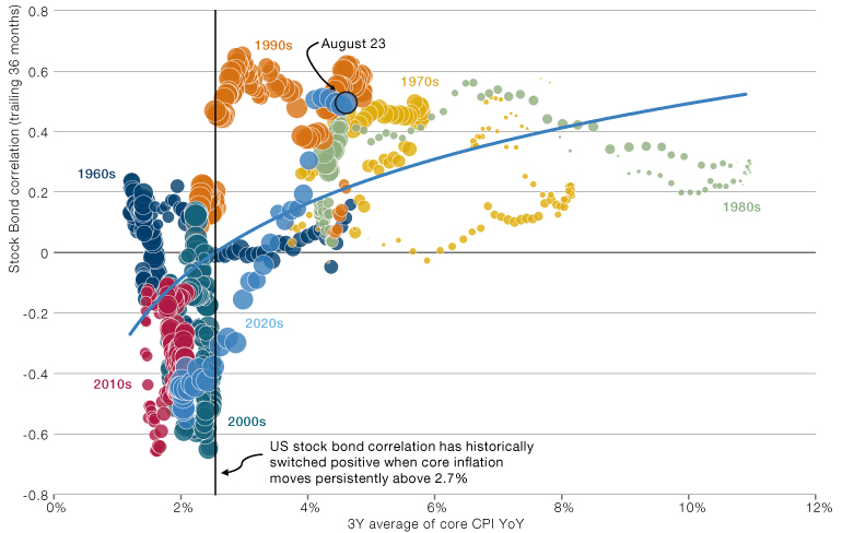
Source: Stock-bond correlation is between the S&P 500 Total Return and the Bloomberg Barclays US Treasury Aggregate Total Return indices. Valuation calculated as the percentile monthly P/E from January 1960 to October 2022. Core CPI from the Bureau of Labor Statistics as at end August 2023.
In the data we’ve examined, the longest period between spikes was 580 days. It has been approximately two years and counting since the last one.
We are right around that inflation pivot point at present so one could make a persuasive case that bonds might sell-off rather than rally in a shock. Especially if that shock was inflationary.
We’ll leave you with one final data point. In the data we’ve examined, the longest period between spikes was 580 days. It has been approximately two years and counting since the last one. Sleep tight.
You are now leaving Man Group’s website
You are leaving Man Group’s website and entering a third-party website that is not controlled, maintained, or monitored by Man Group. Man Group is not responsible for the content or availability of the third-party website. By leaving Man Group’s website, you will be subject to the third-party website’s terms, policies and/or notices, including those related to privacy and security, as applicable.