Introduction
Since the Global Financial Crisis response package in 2008, only 17 of the 162 months that have elapsed have seen the US 10-year yield surpass that of nominal GDP growth (on a 5-year trailing average basis).
In the old world, nominal government bond yields were seen as fair value if they equalled trend nominal GDP growth. This seems intuitive to us: at the simplest level, if you invest your capital in ‘the economy’, you would expect to receive the growth rate of ‘the economy’. Hence fixed income needs to compete with that, risk premium considerations aside.
In the new world, rates have been distorted by quantitative easing, among other forces. Since the Global Financial Crisis response package in 2008, only 17 of the 162 months that have elapsed have seen the US 10-year yield surpass that of nominal GDP growth (on a 5-year trailing average basis).1 Since September 2013, a year that saw another leg higher in the pace of the Federal Reserve’s bond buying programme, there has not been a single month where the 10-year has exceeded this theoretical threshold.
Long term, we expect there to be a reversion to this proxy. Given that we are more inflationistas than transitionistas, this means our secular expectation is a distinct trend higher in yields.2 But that is on a multi-year timeframe. In the meantime, we must play the ball as we find it, which means looking for tools that will give us a steer on the likely path for rates on a quarter-by-quarter basis. This piece represents an introduction to some of the methods that we use.
And so to work.
1. CVI Framework: Valuing Duration Risk Relative to Equity Risk
For investment decisions, we believe investors should consider Valuations, Fundamentals and Sentiment, across a myriad of indicators3. Let’s now start with the Composite Valuation Indicators (‘CVI’). These were developed by your authors Teun Draaisma and Ben Funnell in 1998 while they were at Morgan Stanley. For each geography, four flavours of equity yield (being book, cash, earnings and dividend) are monitored, and how they relate to three comparator yields being government bonds, cash rates and inflation. Where the ratio of equity yields to the comparators is high relative to recent history, the model gives a ‘buy’ signal for equity risk and ‘sell’ signal for bond risk. Conversely where this ratio is lower, the model gives a ‘sell’ signal for equity risk and a ‘buy’ signal for bond risk. Put simply, when equities are not yielding much more than bonds, the model pre-supposes that an investor is better off in the latter given their seniority within the capital structure.
The CVI gives a good gauge of when bond yields are too low, but not when they are too high. For this, we turn to other lenses.
Figure 1 shows the US CVI since 1998. The model is expressed as a z score, with a higher number indicating that the ratio of equity yield to the comparator yields is low, and therefore bond risk is cheap relative to equity.
The model has historically had a good record at identifying points where bonds are expensive. Since the start of 1998, there have been 52 months where the model breached -1.0 (the ‘sell bonds’ threshold indicated in Figure 1). In the subsequent year, bonds underperformed equities 65% of the time and by an average of 8%.4
However, the model is weaker at identifying points where bonds are cheap. Taking the opposite level, there have been 55 months where +1.0 was breached (the ‘buy bonds’ threshold indicated in Figure 1). In the subsequent 12 months, bonds only outperformed 31% of the time, and on average were down 1% relative. It is true that where the CVI reaches extreme positive levels (above +2.0) the results are much better, with a 71% hit rate for bond outperformance and an average relative of +11%, but these instances are rare.
So in summary, the CVI gives a good gauge of when bond yields are too low, but not when they are too high. For this, we turn to other lenses.
Figure 1. US CVI
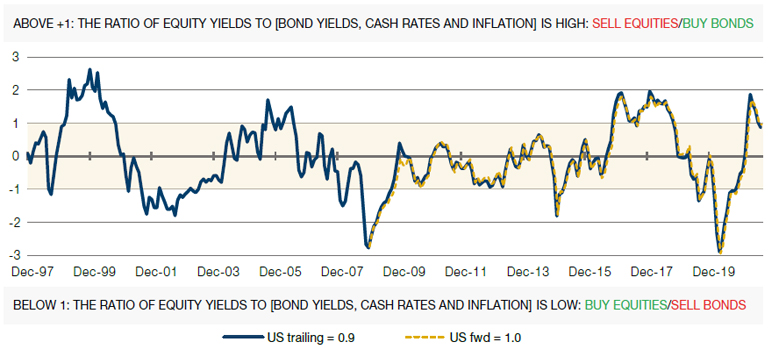
Source: Man Solutions; as of 30 September 2021.
2. Theoretical Fair Value Framework: Valuing Yields by Component Parts5
Where an investor buys a 10-year US Treasuries, or other bond issued by a sovereign that can print its own currency, they should be compensated for three things.
First, in lending their capital to the government rather than investing it in the private sector, they are forgoing equity upside in the wider economy. You signed up to receive fixed, contractual cashflows from the state, but you could have bought shares in a farm, or a shoe factory, or a hot-dog cart. While these different projects will have differing returns on capital, on average what you will miss out on is the trend rate of growth in the economy.
Secondly, given that the payments an investor will receive are fixed, while the costs that those payments will ultimately go to defray are not, he or she will want to be compensated for the extent to which they expect prices to rise.
Thirdly, the yield available on a bond is only realised if the buyer holds the instrument to maturity. Given that there is uncertainty inherent in time, and the more time, the more uncertainty, the bondholder will need some compensation for the maturity of the instrument relative to cash, which has a zero maturity. This component is known as the term premium.
There exists considerable variation as to how these components should be proxied. In Figure 2, we show different measures for each, pertinent to the US 10-year. In the interests of brevity, we will not go into the rationale behind each individual indicator (do contact us if you would like a more in-depth discussion), suffice to say that while there is correlation between the different measures of each component, there are times when they diverge significantly.
To get some scope of where the US 10-year yield should be trading, we take the minimum and the maximum possible values of each component, and plot these in Figure 3 (light blue solid and dashed lines). The navy blue solid line shows where the US 10-year yield has actually traded, and the yellow bars (on the right hand y axis) show the deviation (in basis points) between the actual and minimum theoretical yields.
The model has a good recent history of identifying that, despite historically low yields, bond valuations are actually cheaper than one might suggest. Between the end of 2015 and peak Covid crisis (call it March 2020), the model persistently suggested bonds were attractive. On average, the US 10-year yield was 2.2% through this period, whereas the minimum fair value yield was 1.6%. In risk-adjusted terms, holding bonds (as opposed to equities) was the better option across this time, with the Bloomberg Barclays US Treasury TR registering a Sharpe of 1.0 (4% CAGR on 4% vol.) versus 0.5 for the MSCI US TR (7% CAGR on 14% vol.). Today, the model suggests bonds are expensive but not massively so: at time of writing, the actual is about 1.5%, compared with 1.7% for the theoretical yield. At current durations, a convergence would imply performance of about -1.8% - painful, but hardly terminal.
Figure 2. Proxies for Trend GDP (Top), Inflation Expectations (Middle) and the Term Premium (Bottom)
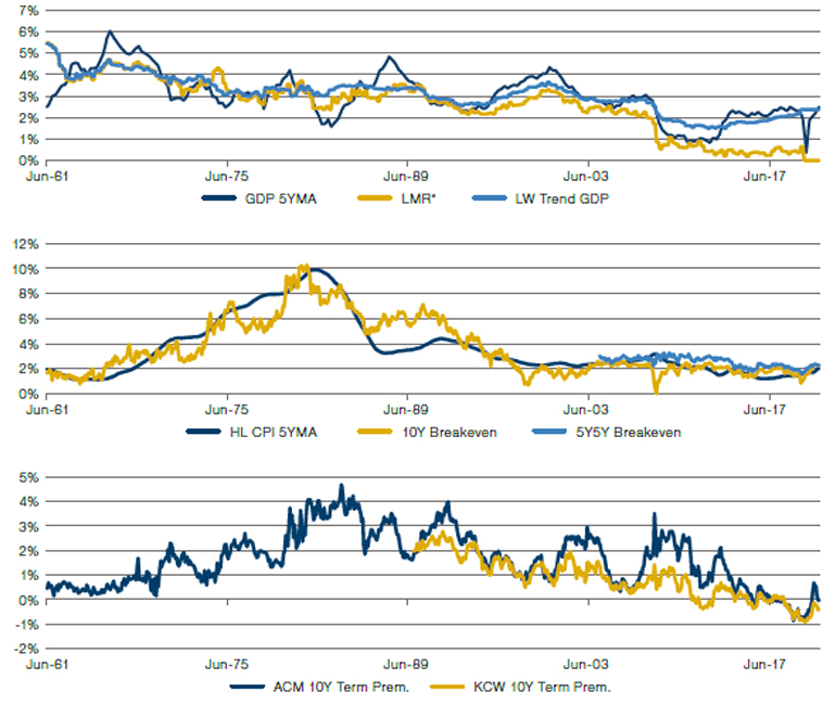
Source: Bloomberg. Long-term history of the 10-year breakeven is based on a backcast by William Marshall and team and Goldman Sachs. LW = Laubach-Williams estimates, ACM = Adrian, Crump & Moench estimates, KW = Kim-Wright estimates, R* is the theoretical equilibrium rate of interest in the economy, HL = headline (as opposed to Core).
Figure 3. Combinations of UST 10-Year Component Parts, as Identified in Figure 2
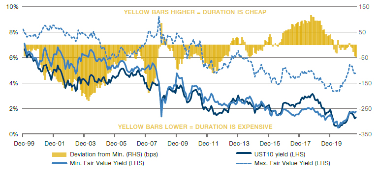
Source: Man Solutions, Bloomberg; as of 30 September 2021.
As a side note, you might wonder why the minimum fair value yield is the (much) better comparator than the maximum. We believe this is likely due to an effect that is not captured in the three component parts of Figure 2. That is the US dollar’s “exorbitant privilege”, to quote Valery Giscard d’Estaing, as the world’s reserve currency. Because global entities have to hold a disproportionate number of dollars (for international trade flows, for instance), and because US government bonds are an obvious repository for those dollars, the Treasury will always (or at least until it stops being the global reserve currency) have demand for its issuance disproportionate to what theory alone would suggest.
3. Fundamental Framework: Regressing the US 10-Year Against Pertinent Factors6
Thus far, we have spoken largely in valuation terms, but there are also fundamental factors which are likely to influence yields. The exorbitant privilege issue we have already highlighted is one example, although this is hard to measure quantitatively.
There are three factors which we believe have a significant impact on US bond yields over and above pure valuation. The percentage of global debt by market value that trades at a negative yield, CFTC net speculative positioning in rate futures and 12-month forward real growth expectations.
There are three factors which we believe have a significant impact on US bond yields over and above pure valuation. These are shown in the bottom three charts of Figure 4. The first of these is the percentage of global debt by market value that trades at a negative yield, currently just above 22%. The higher this number is, the lower US yields should be. If more of the world’s debt offers zero or less in nominal return, then even the very low, but positive, nominal returns on offer in the US will seem more attractive, and therefore the more cheaply the US Treasury should be able to borrow. Secondly, we look at CFTC net speculative positioning in rate futures. Currently, speculators are net short USD635 billion.7 Clearly, a bigger short position would be associated with falling bond prices, hence higher yields, and vice versa. Finally, we track 12-month forward real growth expectations (in other words, the average of sellside estimates reported by Bloomberg), currently about 5%. More optimistic sentiment here, if realised, will translate into higher tax receipts and thus a reduced borrowing requirement, itself a trigger for reduced supply of paper and therefore higher prices – and lower yields – for the issuance that remains.
In Figure 5, we use these three inputs as independent variables in a multivariate regression against the realised US 10-year yield, shown in the chart as the navy blue line. We give the model some valuation flavour by also including the 3M3M OIS (the left-hand chart in Figure 4) and the 5Y5Y (shown in the middle chart of Figure 2). The modelled yield is then shown as the light blue line, dashed until 2019 to denote the insample period. In the same vein as Figure 3, the yellow bars show the deviation of the actual yield from where the model suggests it should be.
Figure 4. Fundamental Regression Inputs
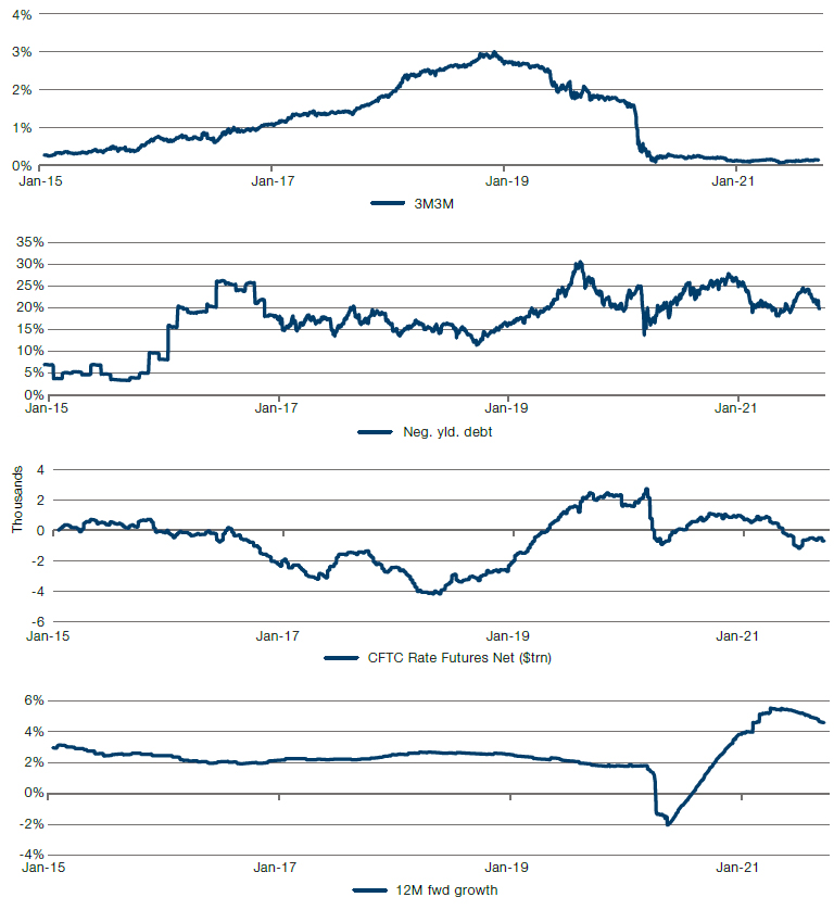
Source: Bloomberg; as of 30 September 2021.
Figure 5. Fundamental Regression Outputs
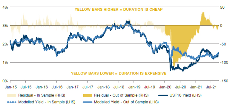
Source: Bloomberg; as of 30 September 2021. The team is indebted to work done by Jay Barry and team at JP Morgan.
The model has a decent track record over shorter time periods. Where the residual differential is less than zero, over the subsequent three months, UST returns have been just about flat, and negative 57% of the time. On the other hand, where the residual has been more than zero, performance has been 1.3%, and positive 76% of the time.
The model was particularly helpful in the aftermath of the initial covid panic. Throughout April 2020, it was suggesting that 10-year yields had fallen 100bps below where they should have been (0.6% versus 1.6%). Over the following 12 months, bonds fell 4% while equities were up 46%. Today, however, the model is suggesting yields are almost exactly neutral.
4. Credit Framework: Comparing Implied and Historic Default Rates8
The first three steps in our fixed income framework have focused on duration risk. The final step turns to credit risk. In Figure 6, we show different parts of the credit universe segmented by currency and rating and, for each segment, what the current spread is in basis points. The next two columns take this spread and decompose it into that which is compensating for defaults – in other words, the risk that the company might go bankrupt, and that which is compensating for downgrades – the company remains solvent but its credits are viewed less favourably by ratings agencies, with consequent adverse price implications. The method for making this split is complicated and beyond the scope of this short article.9
In the following columns we convert the portion of the spread that compensates for default risk into an implied default rate based on assumed recovery rates of 20% and 40%. Historically, investors in developed market credits that went bankrupt have managed to recoup around 40% of their investment, and this is therefore the column we focus on. We compare the numbers here to that which has been realised on average, and in the worst-case scenarios, for each of these segments (the final two columns). If the default rate implied by the spread is below that which has been realised on average through history, then we can infer that one is not being properly compensated for taking on the credit risk, the space is expensive, and we colour the cell red to reflect this. If the implied rate is greater than the historic worst-case scenario then the opposite is true and the cell turns green (with a spectrum running between the two colours).
Figure 6. Implied Default Rates and Historic Realised Defaults
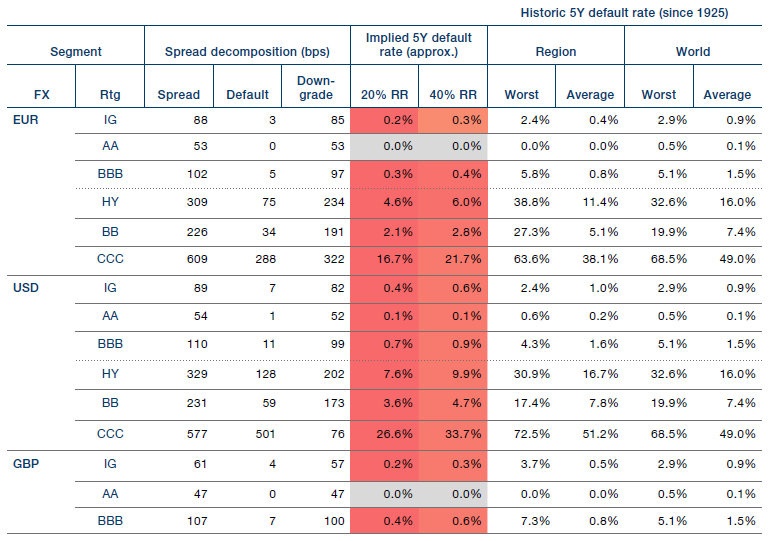
Source: Bloomberg; as of 30 September 2021. All indices are from the Bloomberg Barclays universe. The team is indebted to former colleague Chris Huggins for insights in how to decompose credit spreads.
Currently this framework is suggesting credit looks expensive. US-dollar Investment Grade credits are implying 5-year cumulative default rates of 0.6%, compared with 1.0% experienced on average over the past century. And the same is true further down the rating spectrum. US dollar High Yield paper is implying a 10.4% default rate, versus 16.7%. In summary we can say that credit prices today are suggesting the default environment is only about 60% of its normal level, which is getting towards the punchy end of optimistic, in our view.
Where Does This Leave Us?
In summary we can say that credit prices today are suggesting the default environment is only about 60% of its normal level, which is getting towards the punchy end of optimistic, in our view.
First, we reiterate the point made in our introduction. Over the long term, we consider it likely that US 10-year sovereigns will lose buyers’ money in real terms. We therefore do not think them a good investment in isolation if you have a decade-long horizon.
However, over the shorter term, models are suggesting that rates could stay low for longer, albeit they may move slightly higher from here. This is especially true in a world of financial repression in which authorities ensure rates stay low and real rates stay negative.
To rehearse the particulars, the cross-asset approach (step 1) says bonds are a bit cheap (but has a worse track record calling buys than sells), the valuation approach (step 2) says they are a little bit expensive, the fundamentals approach (step 3) says they are almost perfect and default rates (step 4) says credit is expensive.
1. Source: Bloomberg
2. Please get in touch with your Sales representative for more information in how we view fixed income within our secular framework. We are also planning a further in-depth exposition soon. Watch this space.
3. A cross-section of which can be found in our Market Radar data pack.
4. Equities are defined as the S&P500 TR index and bonds are the Bloomberg Barclays US Treasury TR index. Both in local currency.
5. The financial instruments mentioned are for reference purposes only. The content of this material should not be construed as a recommendation for their purchase or sale.
6. The financial instruments mentioned are for reference purposes only. The content of this material should not be construed as a recommendation for their purchase or sale.
7. Source: CFTC and Bloomberg.
8. The financial instruments mentioned are for reference purposes only. The content of this material should not be construed as a recommendation for their purchase or sale.
9. For those interested, please contact your sales representative and we would be happy to take you through a full description of the methodology.
You are now leaving Man Group’s website
You are leaving Man Group’s website and entering a third-party website that is not controlled, maintained, or monitored by Man Group. Man Group is not responsible for the content or availability of the third-party website. By leaving Man Group’s website, you will be subject to the third-party website’s terms, policies and/or notices, including those related to privacy and security, as applicable.