Introduction
Does population and/or labour force growth drive inflation? In our reading, we find a broad chorus of support for the notion that demographics influence inflation dynamics, but we are not convinced that it should dominate the debate. Instead, we believe other drivers carry more importance, and policy in particular.
In what follows, we detail three devil’s advocations against the demographics-is-disinflation argument.
1. Demographics Is a Matter of Decades; Inflation Is a Matter of Years
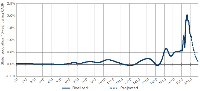
A price is the clearing mechanism for human want. So more people = more wants = prices moving more (and upward assuming there is some frictional cost to onboarding new workers). If you take this view, then the lesson of Figure 1 looks very obvious: no significant inflation for a long time.
Figure 1. Global Population Growth From Anno Domini to 2100

Source: Data prior to 1900 taken from The History Database of the Global Environment (‘HYDE’) and post 1900 from the United Nations.
But historically, over the course of an economic cycle (assume five years), there has been almost no relationship between population growth and inflation. In Figure 2, we illustrate this for the UK.
Figure 2. English Population Growth Versus Inflation (1219-2016)

Source: Bank of England’s Millennium of Macroeconomic Data resource; as of 31 December 2020.
We think that demographic trends assert themselves over time periods which are too long for investors to practically profit from. Per Figure 1, the UN projects the global population growth rate will fall 100 basis points over the next 80 years. And maybe that means we don’t see any acceleration in inflation on average over that period. But an average unchanged at the current rate of global inflation (2.2%) could still equate to 10 years of 10% inflation, followed by 70 years of 1.1%. In that eventuality, the short-term investment implications of relying on the long-term demographics would be painful.
2. The Link Between Labour Force Growth and Inflation Is Messy at Best
Others who make the demographics-is-deflation argument say that it’s not about total population, but rather the dependency ratio (or the sum of the population under the age of 15 or over 64, as a percent of the population between those ages). Globally, this peaked at just under 76% in 1967, then fell consistently to a trough 52% in 2014. The UN projects a similarly consistent rise to 67% by the end of the century.1
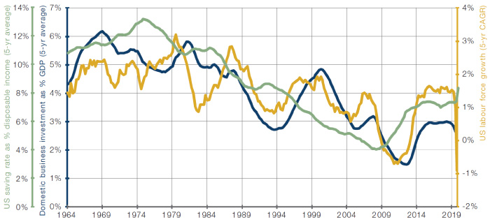
The logic behind the relationship is as follows: as the pool of available workers grows, firms have to invest more to build the office space, factories, machinery, etc, that is required to put them to gainful employment. As this process reverses, less investment is required, meaning that the economy can run with spare capacity, taking the heat out of any inflationary pressure. We think the relationship is unlikely to be this simple. While working-age citizens may drive an economy’s investment, they also drive its savings. Figure 3 shows that corporate capex has declined with labour force growth. Fair enough. But it also suggests that this same shrinking labour force has driven down savings across the aggregate population. What if there is not enough savings to fund even this lesser level of investment? In other words, which effect dominates: the decline in corporate investment or the decline in personal savings? Honestly, we don’t know. But it doesn’t feel open-and-shut either way.
Figure 3. US Net Business Capex, Labour Force Growth and Savings Over the Last 60 Years

Source: Man Solutions; as of 31 December 2020.
We would also point out that, even if slowing labour force growth does mean disinflationary pressure, it is not certain that the former will happen. The heuristic that a worker is aged between 16-65 is arbitrary and working lives could be elongated.
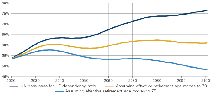
Figure 4 shows the UN’s base case for the US dependency ratio, alongside the pathway if the effective retirement age moved to 70 or 75 in a linear fashion, over the next eight decades. In the latter scenario, the dependency ratio actually falls. This trend has, in fact, already begun. The official US retirement age is rising, slated for 67 by 2023.2 Plus the delayed retirement bonus means that a worker can increase payouts by 8% for every extra year worked up to 70. When Otto von Bismarck implemented the world’s first universal pension system in 1889, he set the retirement age at 70, when average life expectancy was 72. Today US life expectancy is just under 79, and in an economy which is far less oriented around physically strenuous manual labour, it does feel like the retirement ceiling is ripe for rising.
Figure 4. US Projected Dependency Ratio Under Different Retirement Scenarios

Source: United Nations; as of 31 December 2020.
3. Population Forecasts Are Not Necessarily Gospel
On this point, it is interesting to us that such a high degree of confidence is placed in population modelling, far more so than with other branches of forecasting. One thing the Covid-19 experience has taught us is that human beings are simply not very good at estimating how an exponentially replicating pathogen will develop, and surely the same could be true if the pathogen was us.
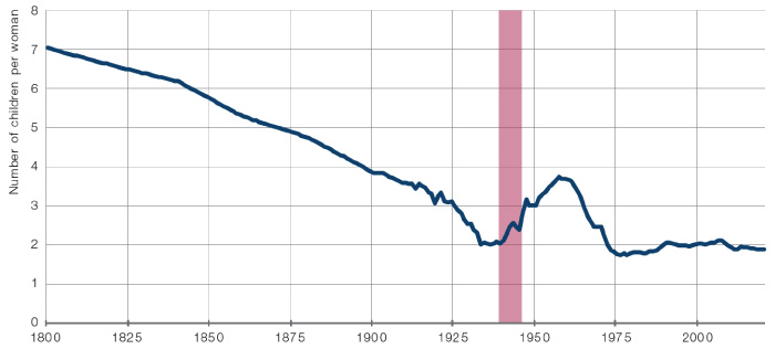
We know that global shock events can have material unforeseen effects on fertility rates. Figure 5 shows the impact of World War II on the US fertility rate. We doubt it would have been in any forecast model but, quite understandably given the horror that was experienced, Americans took a more joyful attitude to family planning. Could Covid-19 be a similar event? Probably not, in our view. But the lesson remains, population projections are like investment, part art, part science, not an inexorable word on tablets of stone.
Figure 5. US Fertility Rate

Source: United Nations; as of 31 December 2020.
World War II shaded red.
The UN is currently projecting annual population growth to fall from about 1.1% (trailing 10-year growth rate as at 2020) to 0.1% by the end of the century. But what if population growth stayed constant? Consider this thought experiment. Excluding mountains and desert, Planet Earth contains 25 million square miles of solid ground. The world’s population is 7.8 billion. So that means that, divided totally equitably, every man, woman and child could take home the equivalent of 31 tennis courts in land area. If we maintain our current population growth, staying at the historic levels shown in Figure 1, that would mean we’d all get just over 17 tennis courts in 2100.
How much land does a man need? Again, we’re not sure. And of course, the real estate dedicated to the infrastructure, agriculture and manufacturing capacity that sustains a modern man is going to be significant. Even so, instinctively, 17 tennis courts doesn’t feel that pinched, particularly if technological advances are made such that infrastructure becomes more space efficient. A lot of people assume that population growth must slow because we are approaching the limits of what the earth can physically sustain. We think this is unlikely to be true. Instead, the projections are based off assumptions that fertility rates in developing markets will converge with those of developed, which will themselves remain static. That’s very likely a good assumption, but it is just that, an assumption.
Conclusion
Depending on who you ask, you’ll be told that the reason for muted inflation has to do with either debt, demographics, inequality, technology, globalisation or oligopolisation. Our contention is that these other drivers are simply of far greater import to inflationary dynamics over a realistic investment timeframe.
Across the three months to end May 2020, the Federal Reserve put USD2.6 trillion of liquidity into the US economy. That’s 13 points of GDP in a quarter. Will this monetary fire be backed up with persistent fiscal expansion even after Covid-19 has died down? It’s an important debate and, in our view, a better one to be having than a demographic argument. The effect of demographics is simply felt far slower. To be fair, in our experience, even proponents of ‘demographics is destiny’ admit that there are policy choices that could create inflation in any demographic environment.
Our base case is that we will enter a period of higher and more volatile inflation than that which was experienced in the last few decades, driven by sustained fiscal policy facilitated by central banks. Now that could well be wrong, but if it is we don’t think it will be because of demographics. Drawing a multi-decade chart showing labour force growth and inflation moving in roughly the same way misses the point. Real investors don’t get 50 years to prove their point. Right but really, really early equals wrong.
1. Unless otherwise stated all population figures in this section are taken from the UN population database.
2. Bureau of Labour Statistics.

You are now leaving Man Group’s website
You are leaving Man Group’s website and entering a third-party website that is not controlled, maintained, or monitored by Man Group. Man Group is not responsible for the content or availability of the third-party website. By leaving Man Group’s website, you will be subject to the third-party website’s terms, policies and/or notices, including those related to privacy and security, as applicable.