The Default Risk is Overblown
Continued high yield selloffs throughout September and October have put increasing pressure on credit investors. Spreads have blown out to around to 650 bps, which gives an implied default rate 8.6% at the time of writing (Figure 1), approaching the 10% level seen during the Global Financial Crisis.
However, there are good reasons why the selloff may not translate into a default event of a similar magnitude to the GFC. Taking advantage of unprecedentedly low interest rates, corporates have termed out their debt, increasing the length of maturities at the same time as borrowing more. Very little is therefore due to be refinanced in the next few years, meaning that interest costs will remain reflective of the pre-inflationary environment and stay low.
In the medium term, if we are in a new inflationary regime, we might expect a sharp decrease in coverage ratios from 2027 on, by which more than 50% of the ICE BAML Global High Yield Index will need to refinance. But for now, the chaotic default rate implied by spreads is just the latest casualty in a credit market profoundly distorted by more than a decade of unorthodox monetary policy and unprecedentedly low rates.
Figure 1. Markit iTraxx Europe Crossover Index
Problems loading this infographic? - Please click here
Source: Bloomberg; as of 12 October 2022.
Figure 2. ICE BAML Global High Yield Index – Years to Maturity
Problems loading this infographic? - Please click here
Source: Bloomberg; as of 12 October 2022.
All Shook Up: Vol Turns Options Markets on Their Heads
For the past month, implied volatility has been rising across multiple markets. Indeed, implied vol is towards the extremes of cumulative density function for US equities, European equities and oil futures, and is in the 99th percentile for rate volatility and currency volatility (Figure 3).
Such high levels of volatility have challenged the volatility risk premium. Sellers of short-dated options have traditionally collected a risk premium, since implied vol tends to be higher than realised vol. By selling options and delta-hedging them, market makers can harvest the spread between the two. However, this effectively makes them short gamma (the rate of change for an option’s delta based on a single point delta price move. Delta itself is how much an option’s price moves for every USD1 change in the price of the underlying security). More simply, the market contains an inherent bias which is short volatility – when implied vol exceeds realised vol, it is normally profitable to be in the green half of the charts in Figure 4.
However, with 2022 realised volatility often higher than implied, markets have been bent out of their normal shape for an extended period of time. In equities, bonds and especially FX, long gamma strategies have made money. The corollary is that downside protection is more active than ever. Record put selling has been matched by record put buying in ETF options, with a near net positive quantity bought during the week of the Jackson-Hole conference.
Figure 3. Index Quartiles - Volatility
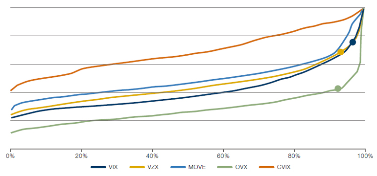
Source: Bloomberg; as of 11 October 2022.
Figure 4. Average Implied Volatility versus Average Realised Volatility
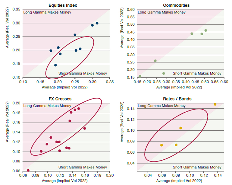
Source: Bloomberg; as of 11 October 2022.
Figure 5. Put Flows – Buying Versus Selling
Problems loading this infographic? - Please click here
Source: OCC data; reproduced from Barclays Equity Research’s “The Volatility Pulse - Options activity hints bottom is not in yet,” Pascale et al; 27 September 2022.
MSCI World: What’s in a Name?
Does the name of an index matter? Simplicity and clarity are often the best approach. The Euro Stoxx 50, for example, is an index of the 50 largest European stocks. So too the S&P 500 Growth Index, which unsurprisingly shows the performance of Growth factor stocks in the wider S&P 500.
However, this is not quite as true for global developed market (’DM’) indices. As the world’s largest economy and most developed capital market, it is unsurprising that US stocks have always made up a large percentage of DM indices. Recently, however, their dominance has reached new heights. US stocks now comprise around 70% of the MSCI World Index, up from 50% in 2009 and only 35% in 1995.
This divergence is not because diverging growth rates (Figure 7). The UK, EU and Japan have lost only 4 percentage points to the US in terms of the size of their relative GDP since 2001. Instead, it is the companies that have come to market that have changed, with listed US companies far larger and faster growing than their British, European and Japanese counterparts. Since the MSCI World is constructed using market cap weightings, that as the price of US stocks rise relative to their peers, they become a larger proportion of the index.
Figure 6. MSCI World – US Versus Non-US Weight
Problems loading this infographic? - Please click here
Source: Bloomberg; as of 30 September 2022.
Figure 7. Relative GDP – By Region
Problems loading this infographic? - Please click here
Source: Bloomberg; as of 30 September 2022.
With contributions from: Alex Stephansen (Man GLG – Portfolio Manager), Guillaume Andrieux (Man AHL – Head of Volatility) and Dan Taylor (Man Numeric – CIO).
You are now leaving Man Group’s website
You are leaving Man Group’s website and entering a third-party website that is not controlled, maintained, or monitored by Man Group. Man Group is not responsible for the content or availability of the third-party website. By leaving Man Group’s website, you will be subject to the third-party website’s terms, policies and/or notices, including those related to privacy and security, as applicable.