Is Energy the New Tobacco? Big Oil and the Green Discount
Energy stocks are poised for something of a recovery – at least on paper. At the end of January, the earnings revision ratio was more positive than at any time since January 2018, and as positive as for the tech sector (Figure 1).
Furthermore, sector earnings have an exceptionally strong beta to economic growth (Figure 2). At a time when a record number of investors are expecting a stronger recovery, a sector exposed to that, with positive earnings revisions should be in hot demand.
Yet energy stock prices stubbornly lag the oil price itself. And apart from banks (which haven’t been popular since 2008), big oil stocks are one of the cheapest sectors compared to earnings revisions (Figure 3).
Our view is that we are seeing something of a green discount. As more and more assets are invested in responsible mandates, high-polluting stocks such as the oil majors are finding fewer and fewer buyers, capping any positive momentum generated by earnings revisions. Indeed, we may be seeing energy follow a similar path to tobacco stocks, which have now been consigned by exclusion lists to a low-multiple outer darkness. Of course, tobacco and energy are not entirely similar – energy is far more important to the global economy than tobacco. And it is clear that one of the most important drivers of change towards a low carbon future will come from the energy companies themselves: the strategically astute are investing now to decarbonise, and to mitigate the risks of negative NPVs from stranded carbon energy assets.
Applying the tobacco green discount indiscriminately to energy will create some glaring pricing inefficiencies for those with the patience to position for the long term.
Figure 1. Positive Earnings Revision Ratio for Energy
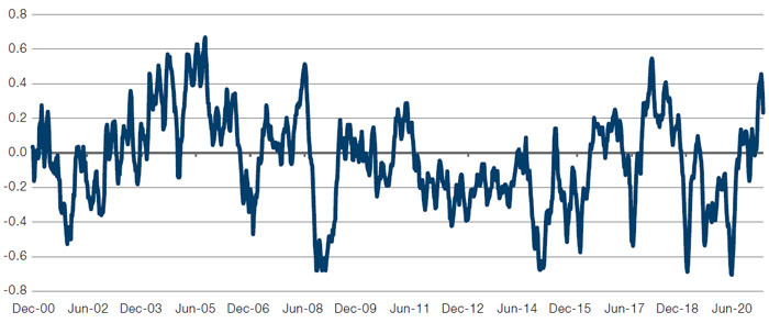
Source: Bloomberg, Citi, Man GLG; as of 19 February 2021.
Problems loading this infographic? - Please click here
Source: Goldman Sachs Investment Research; as of February 2021.
Figure 3. Z-Score of Sectors Versus Earnings Revisions – Big Oil Is Cheap
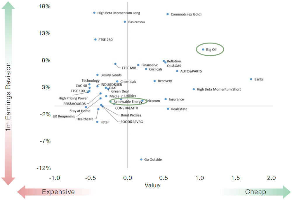
Source: Goldman Sachs, Marquee; as of February 2021.
Note: low value score means expensive, high value score means cheap.
What Should the 10-Year Treasury Yield Be?
For several months, equities and commodities have been signalling a more robust reflation than is currently suggested by the simple level of 10-year Treasury yields. With almost USD1.1 trillion of Treasury securities maturing in over 10 years on the Fed balance sheet, it is clear that there is a degree of repression in the Treasury market. Untangling how much is not straightforward, and we’re cognisant that regressing anything versus 10-yearTreasuries runs the risk of some circularity. But with bond vigilantes silenced, parsing the signals from other assets is important, notwithstanding the difficulties. Figure 4, using long-short equity factors and commodities suggests the inference from other markets is that yields should be much higher.
A 150-basis point spike in three months would be something comparable to the taper tantrum of 2013, or the spike in yields which occurred after the US election in 2016. The former was deeply uncomfortable for markets to digest; the latter, a boon to markets as it represented a positive growth shock. Fortunately, our view is that we are a long way from the conditions that could accompany a taper tantrum: the Federal Reserve remains highly accommodative, and labour market conditions are very loose. There is little risk of a taper.
But with material fiscal expansion on the cards, and the economy likely to recovery as activity normalises through 2021, might we have to worry about tapering? However distant, we’re inclined to keep any eye on 30-year real yields. Before the 2013 taper tantrum, they were making higher lows while 5-year yields were making lower lows. The picture looks eerily similar today, which we hope is a coincidence: as taper tantrums amid QE are vanishingly rare, there’s little history against which to judge whether this is a coincidence or something more sinister.
Figure 4. 10-Year Nominal Yield Versus 10-Year Yield Implied from Equity Factors and Commodities
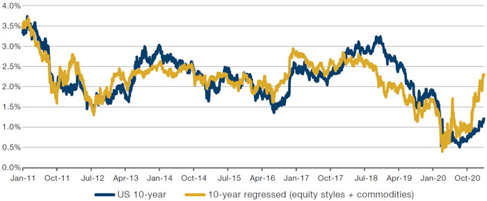
Source: Man Group; as of 16 February 2021.
Problems loading this infographic? - Please click here
Source: Man Group; as of 22 February 2021.
With contribution from: Ed Cole (Man GLG, Managing Director – Discretionary Investments).
You are now leaving Man Group’s website
You are leaving Man Group’s website and entering a third-party website that is not controlled, maintained, or monitored by Man Group. Man Group is not responsible for the content or availability of the third-party website. By leaving Man Group’s website, you will be subject to the third-party website’s terms, policies and/or notices, including those related to privacy and security, as applicable.