Welcome to the Brave New Cycle
Before the pandemic, a regular focus of our discussions was precisely where we were in the economic cycle. Whilst the pandemic has largely quashed the main focus of these discussions (it’s hard to pretend that the cycle hasn’t re-started when you see unprecedented quarter-on-quarter GDP contractions), its unconventionality does require us to give consideration of whether the coronavirus recession is unique, or follows a similar pattern to conventional cycles.
We think of conventional cycles as being comprised of six stages. In the immediate aftermath of a recession, people hunker down and don’t wish to spend money, which certainly corresponds to our current situation – the US aggregate savings rate is around 14%, compared with a historical average of around 8%. The first stage ends when the urge to hunker down ends: eventually the velocity of money increases, sparking inflation. This, in turn, increases the price of commodities and erodes corporate profits, as firms are unable to pass on the rising costs of raw inputs to the consumer. As corporate profitability diminishes, central banks raise interest rates in an attempt to encourage people to save more and slow down the rate of inflation. This action raises the cost of short-term funding and inverts the yield curve. In response, banks (which borrow short and lend long) stop lending as their business model becomes less profitable, reducing the credit available to the least creditworthy corporates – precisely those that are most likely to have short-dated maturities and regularly rollover their debt. The first thing these businesses do to make cost savings is to lay off staff. The cycle then ends with increasing joblessness claims, which tend to spike before recessions.
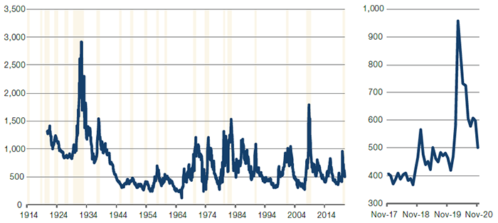
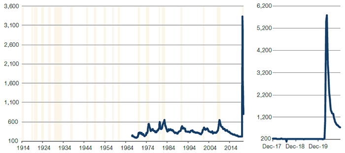
All of these indicators are looking benign in the US, suggesting that we are in the very early stages of a new economic cycle. Headline inflation is low, corporate profitability is accelerating, interest rates are low, the steepness of the US 10-2 year yield curve is increasing and the cost of debt funding is falling for high-yield borrowers (Figures 1-5). Elevated levels of initial joblessness claims remain the only fly in the ointment, and are clearly a hangover from the last recession (Figure 6).
Figure 1. US Headline CPI (YOY %)
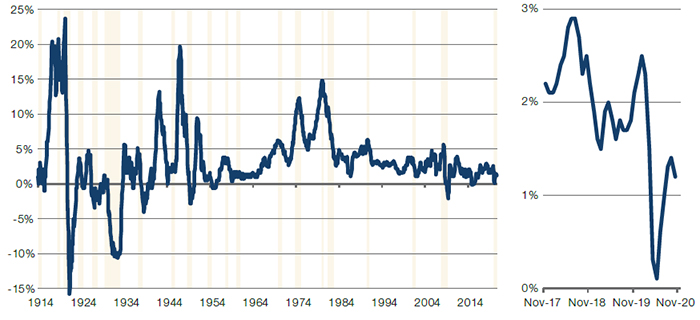
Source: Bloomberg, Man Solutions; as of 4 December 2020.
Figure 2. Profit Before Tax (Non-Financial Companies)
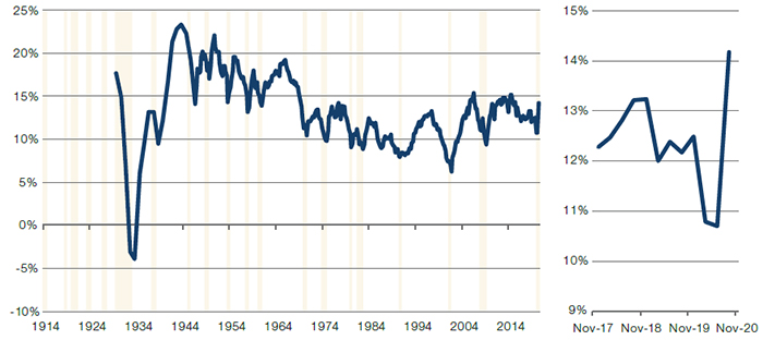
Source: Bloomberg, Federal Reserve, Man Solutions; as of 4 December 2020.
Figure 3. Fed Funds Rate (Upper Bound)
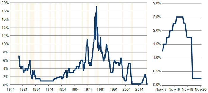
Source: Bloomberg, Federal Reserve, Man Solutions; as of 4 December 2020.
Figure 4. US Treasuries – 10-Year – 2-Year Yield Curve Spread
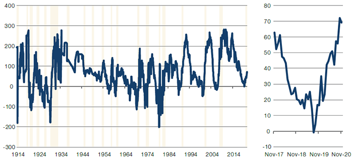
Source: Bloomberg, Man Solutions; as of 4 December 2020.
Figure 5. JP Morgan USD High Yield Spread to Worst
Source: Bloomberg, JP Morgan, Man Solutions; as of 4 December 2020.
Figure 6. US Initial Jobless Claims (Thousands)
Source: Bloomberg, Man Solutions; as of 4 December 2020.
This Time It’s Different?
Bull markets tend to trace the economic expansion. Using data from NBER since December 1854, we determine that on average, these economic expansions last three years, with US stocks returning 10% per annum during that time. In fact, there are only two instances where US equities have been negative through the economic expansion. So, if history is anything to go by, we’ve explained above why we think we are at the start of a new economic cycle and therefore we should be at the start of a bull market.
However, while we may be at the start of a long-term bull market, we believe there may be some short-term pain because we are at something of a unique starting point. Using June 2020 as the start of the current economic expansion, US equities have already returned 56% on an annualised basis, beating the previous record of 44% during the 1920s.
In addition, there are several other indicators that are starting to look quite frothy. First, the New Orders component of the European manufacturing PMI has been around 55 since June. This will inevitably moderate. Secondly, equity yields have fallen compared with bond yields. This has resulted in our Composite Market Timing Indicator (‘CMTI’) jumping across all regions over the same period (Figure 7). In fact, the CMTI has risen so much in Europe that it is now above our 0.5 ‘sell’ threshold, the first time since January 2018. Whilst the US is still in ‘neutral’, it has recorded an exceptionally swift move from -2.5 in June to 0.2 at the time of writing.
Figure 7. Composite Market Timing Indicator
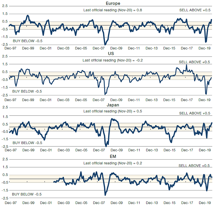
Source: Man Solutions; as of 4 December 2020.
Value Good, Risk Better
Value has captured a lot of headlines after an excellent November, fuelled by positive news regarding the coronavirus vaccine. Indeed, Value’s underperformance has been so prolonged and so profound that some form of rally has been long anticipated.
However, the unheralded success story of November was Risk. Indeed, while Value actually fell in Japan, and was basically flat in the US, Risk rose across all geographies, and outperformed Value in all of them as well.
Figure 8. Factor Performance
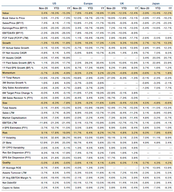
Source: Man Solutions; as of 4 December 2020.
With contribution from: Henry Neville (Man Solutions- Analyst).
You are now leaving Man Group’s website
You are leaving Man Group’s website and entering a third-party website that is not controlled, maintained, or monitored by Man Group. Man Group is not responsible for the content or availability of the third-party website. By leaving Man Group’s website, you will be subject to the third-party website’s terms, policies and/or notices, including those related to privacy and security, as applicable.