Introduction
Macro volatility is back with a bang.
Generally speaking, systematic quant managers focused on security selection have historically viewed macro factors as risk factors. In a recent article, we explored how asset managers could think about modeling macro risk . But could – or should – macro factors rather be viewed as investment opportunities for even those processes that are built upon bottom-up security selection?
We have approached this question by introducing a systematic macro regime modeling framework – that we call MacroScope – that capitalises on recurring patterns in the macroeconomy as an alpha opportunity. Taking December 2022 as a starting point, MacroScope looks at similar macroeconomic periods in history. It then translates the historical view into a forecast for future style factor performance. We take these forecasts for January 2023 and compare them to the real returns.
The results?
Keep reading to find out…
History Doesn’t Repeat Itself…But It Often Rhymes
As a new cycle starts, macro regimes we have seen in previous business cycles are likely to show up again.
The macroeconomy is typically characterised by business cycles, with traditional wisdom placing them into various stages: early cycle, expansion, slowdown and recession (Figure 1). While simplistic, macro variables have historically had many recurring patterns throughout these well-known cycles. As a new cycle starts, macro regimes we have seen in previous business cycles are likely to show up again. Driven by the cyclicality in the macro economy, the performance of risk factors and industries also carry recurring patterns. For example, cyclical industries (e.g., materials) tend to lead other industries early in the cycle, while defensive risk factors (e.g., Quality) tend to outperform late in the cycle during economic downturns. The question for us then becomes how we can utilise quantitative techniques to capture opportunities from such recurring patterns systematically.
Motivated by this observation, MacroScope is intended to be a systematic macro regime modelling framework that: (1) identifies historical regimes which are similar to the current period; and (2) takes dynamic positions on industries and style factors that have outperformed after similar macro environments.
Figure 1. Macroeconomy Characterised by Recurring Patterns
Source: Man Numeric. For illustrative purposes only.
Modelling Macro Regimes With a Quantitative Approach
There are two steps to modelling macro regimes systematically:
- Quantifying a macro regime; and
- Finding similar – and dissimilar – periods in history.
1. Quantifying Macro Regimes
The macro regime itself can be latent and difficult to define. However, what is easy is observing the status of the macro economy through various market-tradable instruments.
The first step in modelling macro regimes systematically is by quantifying a macro regime.
The macro regime itself can be latent and difficult to define. However, what is easy is observing the status of the macro economy through various market-tradable instruments which are forward-looking in nature and can capture macro information in a timely fashion e.g., equity prices, interest rates, etc.
The Macroscope framework takes a multi-variate approach to describe macro regimes through a set of market tradable instruments (an example is shown in Figure 2). Because these instruments span major asset classes, they capture different dimensions of the macro economy. Additionally, MacroScope only includes the most representative factors of each asset class to avoid redundancy. As such, it is able to represent the macro regime of any given day with a set of macro factors.
Figure 2. A Multi-Variant View of Macro Regimes
Source: Man Numeric. For illustrative purposes only.
2. Finding Similar and Dissimilar Periods in History
The key advantage of the continuous approach is that a very granular view can be taken in examining the difference and similarity between various macro environments.
Traditionally, investors have tended to specify a fixed number of regimes based on their own understanding of the economic cycle and then classify each period into one of the pre-specified regimes, where period-to-period similarity is either a perfect match (i.e. ‘1’) or no match at all (i.e. ‘0’) (Figure 3). However, this approach is very rigid and is not able to capture the nuanced differences between periods falling into the same prespecified category.
Instead, the MacroScope framework views macro regimes as continuous concepts. Instead of classifying them into hard categories, it measures the period-to-period similarity in a continuous manner. The heatmap in Figure 4 illustrates the pairwise similarity between any two given periods in the history. A lighter colour means the two periods are more similar while a deeper colour means the two periods are less similar. The key advantage of the continuous approach is that a very granular view can be taken in examining the difference and similarity between various macro environments.
Figure 3. Discrete Macro Regime Modeling (1994 – 2022)
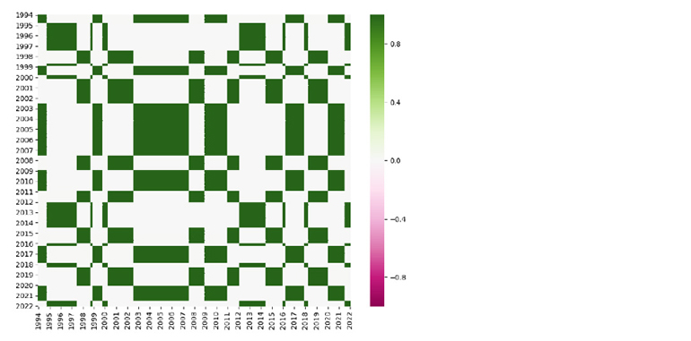
Source: Man Numeric. For illustrative purposes only.
Figure 4. Continuous Macro Regime Modeling (1994 – 2022)
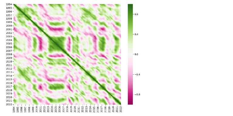
Source: Man Numeric. For illustrative purposes only.
Walking on Ice: A MacroScope Case Study
At the end of 2022, the global economy was at a crossroads: policymakers and economists disagreed about whether to raise rates to tame inflation. What they did agree on was that the market was in a very fragile state and an economic recession was looming. We’ll refer to this macroeconomic environment as ‘walking on ice’.
Could we rely on MacroScope to draw macro insights from history in a systematic way?
Human memory is a funny thing. It has never been able to accurately remember past events. Indeed, the human brain tends to rewrite ‘painful’ memories – such as ‘walking-on-ice’ periods that precede a recession.1 But, could we rely on MacroScope to draw macro insights from history in a systematic way?
We use December 2022 as a starting point for the analysis in this article. Figure 5 displays a quantitative representation of the macro environment as of December 2022, using a set of macro indicators ranging from equity, rates, FX and commodities to liquidity and risk considerations.
Specifically, during this period, equity markets across various regions trended downwards while rates increased meaningfully. The yield curve inverted, with its slope trending down. The US dollar, fueled by increasing interest rates, strengthened substantially. Commodity prices in general cooled down as recession fears grabbed the market. Credit spreads, measured by the difference between high yield and investment grade rates, widened. Market volatility moved slightly downwards as it came off the peak.
To better illustrate these trends, we utilise colour grids in the inner circle of the scope to represent the price trend of the respective macro indicator. Green indicates an upward trend, and red downwards. The darker the colour, the more significant the trend.
Figure 5. Macro Environment as of December 2022
Source: Man Numeric. For illustrative purposes only.
The first similar period captured by MacroScope is the burst of dotcom bubble in 2000 (Figure 6), during which the equity market experienced a brutal selloff. As seen by the colour alignment between the inner circle and the circle in the middle, December 2022 bears a high similarity to the aftermath of the dotcom era, according to almost all of the macro indicators. The table on the right provides a forward-looking view of style factor performance after the dotcom bubble burst: Growth stocks struggled, Value stocks rallied, Beta saw a negative payoff and Quality stocks were rewarded.
Figure 6. Similar Period – Tech Bubble
Source: Man Numeric. For illustrative purposes only.
MacroScope identified other similar periods, and those that were not so; the details of which are provided in Figure 7.
Figure 7. Comparing December 2022 to History
Source: Man Numeric. For illustrative purposes only.
By connecting all of these dots, MacroScope is able to create a score timeline that quantifies the degree of similarity between December 2022 and the prior macro history (Figure 8). A positive reading on the timeline means the historical period is similar to December 2022, and vice versa. Ultimately, while human memory or personal experience may be able to capture only some of the most extreme periods in the history, MacroScope provides a more comprehensive and continuous view.
Figure 8. Similarity Between December 2022 and Historical Periods
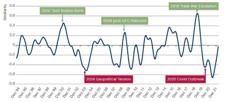
Source: Man Numeric. For illustrative purposes only.
How does the historical view translate into a forecast for future style factor performance?
In this case, MacroScope refers to the forward style factor returns of each historical period and aggregate them using the corresponding similarity score as the weight. As such, it bets on style factors that historically outperformed after similar periods while going against factors that have historically underperformed in the subsequent periods.
Figure 9 illustrates how this process works with December 2022 as an example. Three style factors are particularly interesting:
- Beta: MacroScope’s forecast for Beta is modestly positive, driven by Beta’s historical performance during 2004/2009/2016/2019;
- Value: MacroScope’s view for Value is meaningfully positive with three crisis periods (dotcom Bubble/GFC/Covid) being the main contributors;
- Momentum: MacroScope forms an extremely negative view towards Momentum, with all historical periods suggesting negative forward Momentum performance.
Figure 9. Multi-Variate View of Macro Regimes
Source: Man Numeric. For illustrative purposes only.
MacroScope in Reality
With any model, its effectiveness is determined by the accuracy of its forecasts.
Of course, with any model, its effectiveness is determined by the accuracy of its forecasts. So, using December 2022 as a starting point, we analysed how MacroScope’s style factor exposures fared against realised factor returns in January 2023 (Figure 10).
Overall, most of the forecasts were right: the model was correctly positioned on Momentum, which experienced a severe drawdown as an unexpected risk rally in the market buoyed by investors’ optimism on a potential soft landing. The only detractor was Beta, as MacroScope underestimated the market rally with a positive Beta bet that turned out to be too conservative.
Figure 10. Prediction Accuracy With January 2023
Problems loading this infographic? - Please click here
Source: Man Numeric; December 2022 – January 2023. Returns based on Man Numeric’s global universe.
For the skeptical readers among you, we’d like to assure you that the predictive power of MacroScope during the ‘walking-on-ice’ environment was not a cherry-picked example.
Figure 11 plots the performance of MacroScope’s style factor timing signal going back to June 2005. It also compares the cumulative return of the framework with a representative quant combo that combines five generic quant factors using a set of static allocation weights (40% Value, 30% Momentum, 10% Size, 10% capital efficiency and 10% earnings quality).
Over the long run, the style factor timing signal from MacroScope managed to outperform the static quant combo. More importantly, the signal demonstrated better drawdown control during market inflection points (like the post-GFC rebound) by betting against Momentum at an opportune time, when traditional quant process tended to suffer. In addition, driven by its dynamic nature, the MacroScope signal is highly orthogonal to generic quant factors, as evidenced by the low return correlations with various factors.
Figure 11. Long-Term Historical Performance.
Problems loading this infographic? - Please click here
Problems loading this infographic? - Please click here
Source: Man Numeric, S&P; between June 2005 and December 2022.
Please see the important information linked at the end of this document for additional information on hypothetical results
Conclusion
As macro volatility comes back to the fore, the key question investors need to ask is how to best make use of macro information when it comes to selecting stocks.
We approached this question by introducing a systematic macro regime modeling framework – that we call MacroScope – which capitalises on recurring patterns in the macroeconomy as an alpha opportunity.
Taking December 2022 as a starting point, MacroScope looked at similar macroeconomic periods in history. It then translated the historical view into a forecast for future style factor performance. The result? Over both a short- and long-term basis, the style factor timing signal from MacroScope managed to outperform the static quant combo.
1. Memory Is A Funny Thing | The Emporium of Lost Thoughts (bradfonseca.com).
You are now leaving Man Group’s website
You are leaving Man Group’s website and entering a third-party website that is not controlled, maintained, or monitored by Man Group. Man Group is not responsible for the content or availability of the third-party website. By leaving Man Group’s website, you will be subject to the third-party website’s terms, policies and/or notices, including those related to privacy and security, as applicable.