Introduction: Productivity Growth on a 200 Year Low
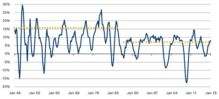
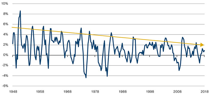
Current productivity growth is slow. Figure 1 shows productivity in the UK from the reign of Henry III to the present. It’s immediately clear that, whilst there have been greater troughs, we are at the low end of the range since the 1790’s. We show the UK data because it has the longest available history, but a similar pattern is prevalent in both the US and Europe1.
During the quarter the team have been debating, along with many others, whether we are at the start of a reversal or a protracted slump.
Taken to the extreme, if all human labour were to be replaced by robots, without changing economic output, productivity growth would be infinite. The stark contrast between all the talk about the new economy and the AI revolution on the one hand, and the 200-year low in productivity growth on the other, suggests that there is a good likelihood that productivity should improve from here.
We would argue that US productivity growth could move from its current level of 0.4% to 1.3%2. Not huge, but enough to keep a hold on inflation, lengthening the cycle and maintaining a longer equity bull market.
Figure 1. UK Productivity Growth from the Plantagenets to the Present
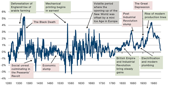
Source: Bank of England, Man GLG; as of 2 July 2018.
Productivity: Many Moving Parts
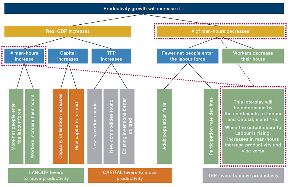
We can define productivity growth as the change in real GDP divided by the change in the number of man hours employed within the same economy. Real GDP growth can be further decomposed into total factor productivity (’TFP' growth, Capital growth and Labour growth, with the latter two terms scaled by their shares of output.
Therefore, we can divide the drivers of productivity into Labour, Capital and TFP within the numerator, and Labour within the denominator. We can then further sub-divide each of these broad categories as shown in Figure 2.
The following three sections discuss our outlook for the three broad categories, based on each one’s subdivisions. We then make quantitative projections for each and compare those estimates to historical precedent to gain an insight on how productivity growth might change.
Figure 2. Productivity – A Simple Decomposition
Labour’s Impact
Labour’s share of output in the US is today at post-World War Two (‘WW2’) lows and well below the long-run historical average, as shown in Figure 3. Optically it looks as if we may have found a resistance level since 2010 at around 59%.
Is there another leg down to come? Historically, when this ratio has been too suppressed, peoples have either been enslaved (in which case Labour’s share is close to zero), or heads have decorated the Bastille. What data we have for late 18th century France suggests that Labour was taking between 18-21% of national output on the eve of the Revolution3. Ancien Régime France is not really comparable to 21st century America of course, not least due to the advent of democracy, and it seems likely to us that the ‘revolution threshold’ in a social media enabled world is considerably higher. For us, therefore, the risk to the Labour coefficient is skewed to the upside. This means that increases in man hours will be a net positive for productivity, as they will have a proportionately greater impact on the real GDP numerator than the man-hours denominator.
This increase is unlikely, however. The US adult population growth rate is set to decline. The total US 15+ populace rose by 15% over the last decade and 81% over the last half century. The UN projections suggest this will fall to 8% and 30% respectively over the next 10 and 50 years.
The UN also projects an aging population. Out to 2100 it suggests that the male 55+ bracket will grow by 97%, and female 55+ by 77%. This compares to 17% for the aggregate 15-55 segment. All else equal this will have a negative impact on the participation rate. We can see this in Figure 4 (top panel), which shows the US participation rate with a projection based on age and gender segmental participation rates remaining constant at 2010-2018 levels, and assuming the UN’s forecasts for the growth of each of these segments. The result is steady decline, driven by the fact that 55+ brackets have inferior participation in the labour force (see Figure 4 bottom panel).
Figure 3. Labour’s Share of Output in the US
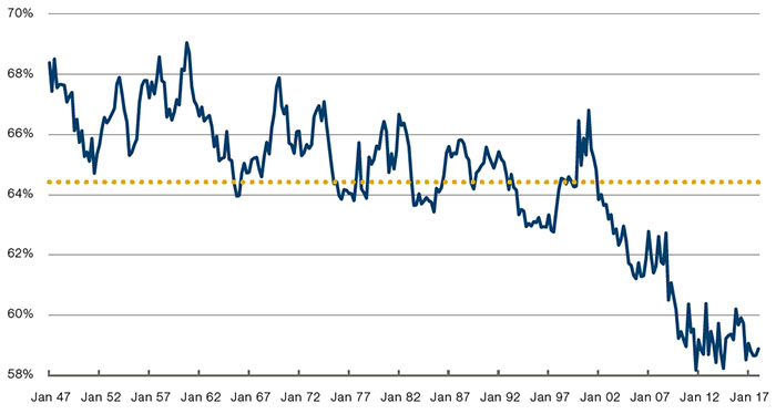
Source: Federal Reserve Bank of St Louis (FRED); as of June 2018.
The same chart shows that, prior to 2010, there were two multi-decade trends: women worked more and more, and older men worked less and less. On the latter we think there is scope for this trend to reverse: surveys tend to find that around 40% of US households have no savings whatsoever4, meaning the scope for retirement is inevitably going to become more limited.
In Figure 4 (top panel) we also show what would likely happen to the national participation rate if the male 55+ segment linearly reverted back to its 70% 1950 high between now and 2100. This takes the national ratio from downward sloping to flat and is a more realistic forecast in our view.
The final factor impacting quantity of labour will be working hours. The Bureau of Labour Statistics data, save for a Great Financial Crisis (‘GFC’) related trough, has the weekly total staying close to 34.4 hours. The data only goes back to 2006, however, so we can’t really extrapolate much. The OECD, however, has estimates back to 1979 which suggests a decline from just over 35. Meanwhile in the UK, the BoE has an ultra-long term series suggesting the metric has been consistently falling from a peak of 67 hours in 1828. This suggests to us that there is a trend for people to spend less of their time working. Whilst we don’t think we will return to Victorian-era highs, we do see the risk to the length of the working week as being skewed to the upside.
Despite this, we do not see this increase as being enough to offset falling population growth and a flat participation rate.
Figure 4. US Participation Rate
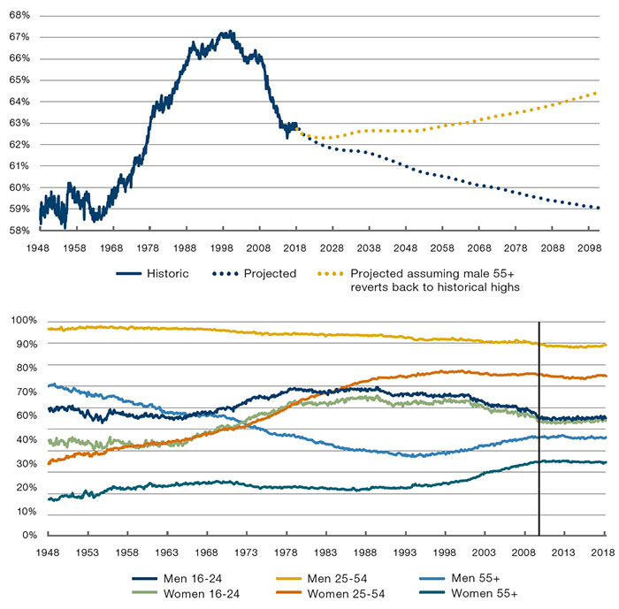
Source: Bureau of Labour Statistics, UN World Population database, Bloomberg and Man GLG.
Capital’s Impact
So if productivity gains are not going to come from Labour can Capital fill the gap? As per Figure 2 this could either take the form of new capital being formed or existing capital being used more intensively.
Figure 5 shows US capital investment. Here we see a distinct regime change from 1987 onwards, with 4Q average peaks falling from around 20% to 11%, whilst the average dropped from 9% to 5%.
Since the Trump administration initiated a broadly CAPEX-friendly economic policy, we have seen a sharp rise in fixed investment growth, up to 10.6% quarter-on-quarter annualised for Q1 2018. We do believe that Trump’s tax reform and drive to cut regulations are certainly net positives for fixed investment, but not to the extent that they will radically change the regime. Our analysis would indicate that the 4Q average could move up a bit further to the 11-12% level for a few years, although we can’t see it returning to the 20% highs.
Similarly, we could well foresee a mild uptick in capacity utilisation. Figure 6 shows the Fed’s estimates of capacity utilisation for the economy overall, as well as for certain key product groups. From this we can see that, despite much of the US survey data suggesting that businesses are beginning to hit capacity constraints, there is likely to be a bit more juice in the system, at least by historical standards.
TFP’s Impact
Figure 6 has one glaring outlier, however. High tech computing is currently estimated to be running at close to 95% capacity, vastly ahead of its historical average. This brings us on to the final driver of productivity: TFP. As per Figure 2, growth in this metric consists of new innovations, existing innovations achieving more widespread adoption, and new raw material discoveries.
The final element we assume to be constant as we see it as the ultimate known unknown and entirely unforecastable. For all intents and purposes, therefore, we view TFP as being about innovation, a subject which has provoked intense debate between numerous economic luminaries.
Figure 5. US Growth in Capital Investment
Source: Bureau of Economic Analysis, Man GLG; as of 2 July 2018.
Broadly speaking the two sides can be summarised as follows. On the optimistic side are organisations like McKinsey, whose productivity paper we have already referenced, as well as tech specialists like Katy Huberty at Morgan Stanley. Put very simply, their view is that new technology adoption follows an S-curve whereby assuming it takes 5 years to go from 0-20% penetration, it will take half that to go from 20-50%. Applied to today, the implication is that the synthesis of social networks, big data, deep learning, and virtual reality (all things which have made big advances in the last 5-10 years) will have profound implications in making computing power more insightful and more mobile, which will revive productivity.
On the other hand, economists such as Robert Gordon5 suggest that economic productivity is similar to 100m world records: it is beaten in smaller and smaller increments and ultimately there will be a ceiling on human speed. Gordon argues that the inventions of the hundred years between 1870-1970 – electrification, high-speed rail, modern plumbing, aeroplanes etc. – were simply of a different order of magnitude to those being discovered today.
Longer term we have a lot of sympathy with Gordon’s view as we agree that many contemporary technological advances have as much timewasting as timesaving capacity: whilst VR may well enable ‘edge computing’, it presumably also enables many hours to be whiled away playing Fortnite on a virtual plane, the economic utility of which is surely minimal. On a shorter time horizon, however, there are two reasons why we think we could see some positive impact.
First, we believe there is another leg up to come in tech CAPEX. Figure 7 shows US tech fixed investment as a percentage of the total national spend. We can see that through the lifecycle of the mainframe, the mini-PC and the PC, tech companies consistently increased their share of fixed investment spend in order to properly take advantage of these new technologies. The advent of desktop internet and then mobile computing, on the other hand, have failed to produce the same level of CAPEX share capture. Our bottom-up analysts are now starting to consistently report moves toward greater tech spend. Anecdotally, we also see this within Man Group, where earlier in the year we built our own GPU supercomputer in order to handle vast datasets.
Figure 6. US Capacity Utilisation
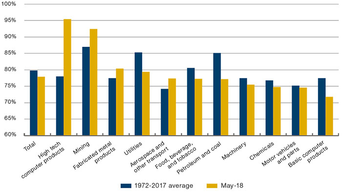
Source: Federal Reserve, Man GLG; as of May 2018
Figure 8 suggests that we are yet to see any real productivity impact from the rise of the social network, the smartphone, VR and AI. As we have already alluded to, we do not think that these inventions will ultimately have the promised productivity benefits when the timesaving potential is considered in aggregate with the timewasting potential. We do believe, however, that at the current historically low levels of productivity, there must be some low hanging fruit which these innovations can harvest.
Figure 7. US Tech CAPEX as % of Total CAPEX
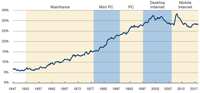
Source: Bureau of Economic Analysis, FRED, Morgan Stanley, Man GLG; as of July 2018.
Figure 8. US Productivity Growth, Quarter on Quarter Annualised, 5-Year Moving Average
Source: Morgan Stanley, Bloomberg, Man GLG; as of 2 July 2018.
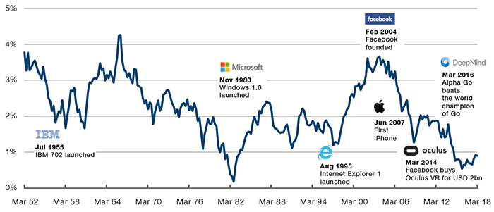
Figure 9 shows the San Francisco Fed’s estimate for TFP growth which gives some sense of the development over time. We can see a mild downtrend since WW2, consistent with Gordon’s thesis that innovation has been adding incrementally less value since 1970. But we can also see that current TFP growth is muted and running below the level implied by our crude trend line (about 2%), which we would expect it to move towards.
Figure 9. San Francisco Fed Estimate of TFP Growth
Source: Source: San Francisco Fed and Man GLG; as of July 2018. For details on methodology see https://www.frbsf.org/economic-research/files/wp12-19bk.pdf.
Bringing It All Together
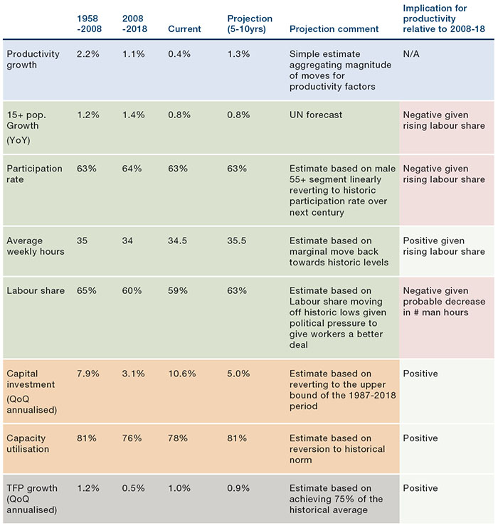
In Figure 10 we list our quantitative estimates for each of the productivity components – Labour, Capital and TFP – based on the analysis above. The colours follow the same categorisation as per Figure 2, albeit we don’t decompose TFP into its sub-categories.
In the first row we give a forecast as to one path for productivity growth over the next 5-10 years. This is based on comparing our projections with the realised values over the last 10 years (please get in touch for further information around our methodology). For us this fits with our qualitative assessment: whilst we don’t expect productivity to go back to its long term highs, at these low levels, the potential for ‘easy wins’ is not insignificant.
Figure 10. Component Parts of Productivity
Source: Man GLG database; as of July 2018.
Conclusion: So What?
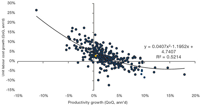
Productivity is disinflationary, and good for earnings. Figure 11 shows a scatter of productivity growth and unit labour costs (current reading coloured orange). As one would instinctively expect, we see a good fit between the two: when productivity is high companies can pay higher wages but still produce enough to keep unit costs down, and vice versa. The line is polynomial reflecting the fact that, at very high levels of productivity growth, unit labour costs will not be able to fall further as the market for the product will be saturated.
According to the interpolation, if productivity were to reach our 1.3% estimate, we would expect unit labour cost growth to fall from 2.9% to 2.2%. If we put that together with the linear relationship we found in our last quarterly letter between unit labour costs and core personal consumption expenditure (‘PCE’)6 it would imply that core PCE could drop from 1.8% currently to 0.8%.
Qualitatively, we find this to be unlikely (core PCE has rarely been below 1% in the last 30 years), but it does illustrate that even a modest uptick in productivity could have significant disinflationary implications. So long as this disinflation did not move too far and hit the ‘Ice’ segment of our Fire and Ice framework7, this would likely be positive for both equities and bonds, and the cycle would be extended as companies were able to maintain earnings growth.
Figure 11. US Productivity and Unit Labour Costs – Quarterly Data, 1947 to July 2018.
Source: Bloomberg, Man GLG; as of July 2018.
1. See, for example, McKinsey Global Institute, Solving the Productivity Puzzle, 2018.
2. US Labour Productivity Output per Hour, Nonfarm Business Sector, Quarter on Quarter SA.
3. Christian Morrisson and Wayne Snyder, (2000), ‘The Income Inequality of France in Historical Perspective’.
4. For example: https://www.cnbc.com/2017/09/13/how-much-americans-at-have-in-their-savings-accounts.html.
5. See Robert Gordon, (2016 ) ‘The Rise and Fall of American Growth’.
6. Ben Funnell and Henry Neville, What if inflation returns?, 2018.
7. Ibid.
You are now leaving Man Group’s website
You are leaving Man Group’s website and entering a third-party website that is not controlled, maintained, or monitored by Man Group. Man Group is not responsible for the content or availability of the third-party website. By leaving Man Group’s website, you will be subject to the third-party website’s terms, policies and/or notices, including those related to privacy and security, as applicable.