Historically, one common qualitative sign of a market peak has been the inflation and bursting of bubbles in financial assets. We have therefore carried out a broad survey of the great bubbles of history to give some picture of where Bitcoin – which we suggest may well be a current example – fits in.
But first, there are a number of metrics which suggest that US equities are valued very highly relative to history. Since the Federal Reserve began collecting data1:
- At 32.5x, Shiller’s PE (price over trend earnings) has only ever been higher prior to the Great Depression and the DotCom crash.
- At 32%, the proportion of US household financial assets invested in the stock market, has only ever been higher before the DotCom crash.
- At 109%, Tobin’s Q ratio (price over replacement cost) has only ever been higher prior to the DotCom crash.
Now these numbers alone do not mean a significant correction is immediately imminent. Take the DotCom bubble, for example. Our three indicators reached an equivalent position in July 1997, December 1998 and June 1996 respectively. If you had obeyed the signal and cut the US to zero within your portfolio, you would have correspondingly lost out on 59, 23 and 126 percentage points of performance up to the S&P 500 Index’s peak in April 2000. The subsequent crash, by comparison, was ‘just’ 49%.
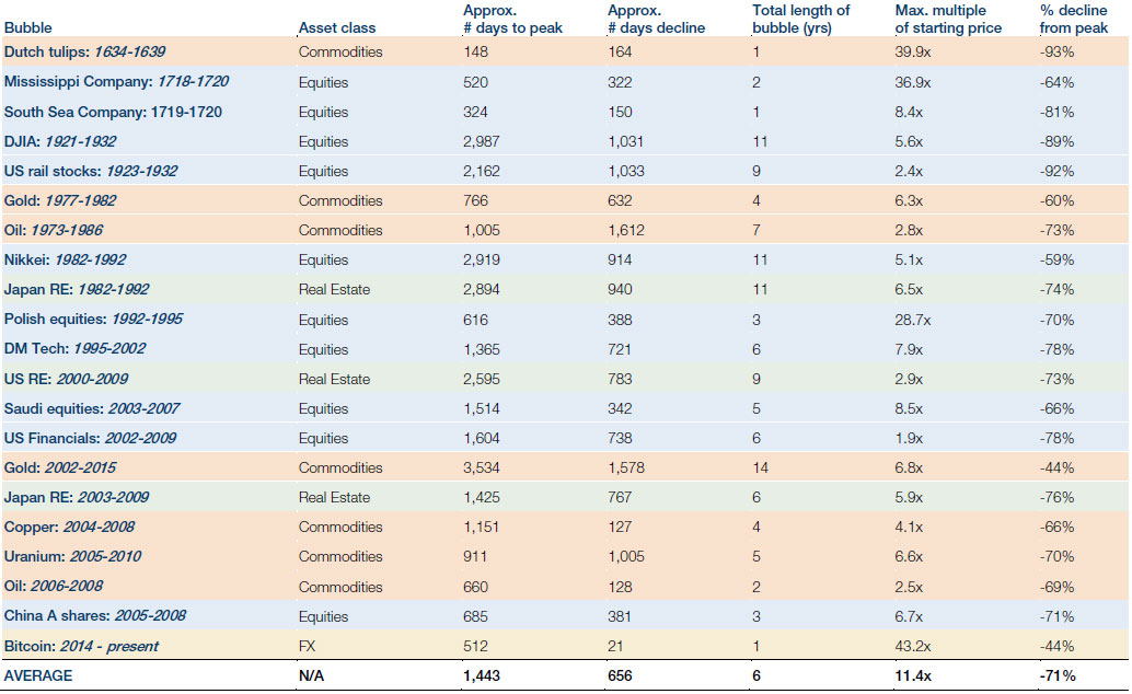
In this context we make the following observations from our study of the great bubbles of the past, the results of which can be seen in Figure 1:
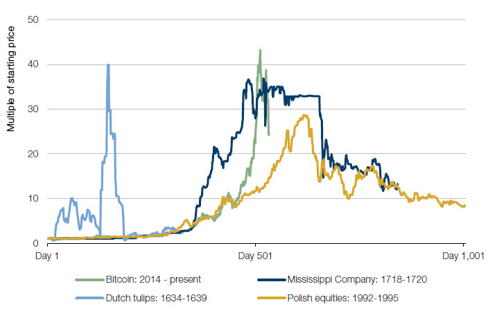
- Bubbles are longer than they are instinctively perceived to be. We tend to think of a bubble as being a matter of months, but in actuality our historical examples are never less than a year in duration, and are usually about six years. It should be noted, however, that there is a very wide dispersion of durations
- The way down is faster than the way up. This is the case in all of our examples save for the Tulipmania and, even in this instance, it is likely that this rule did actually hold, given the data difficulties discussed below. On average a bubble bursts in well under half the time it took to inflate
- Those who invest at the bubble’s peak will lose most, if not all of their value, and will require decades to make back what they lost. If you had bought the Dow Jones in February 1931, for example, you would have had to wait two decades before the index was consistently trading above your purchase price
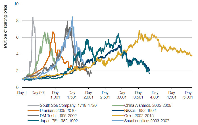
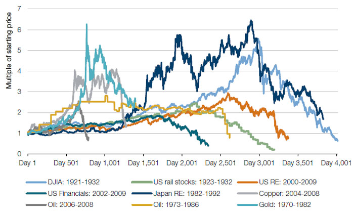
- There is little discernible pattern that allows accurate prediction as to the bubble’s peak. Whilst the South Sea Bubble, Uranium, and Oil in the noughties all display stereotypical, triangular bubble shapes, others such as Japanese Real Estate in the 1980s and Copper in the noughties, are more complex, multi-peaked structures
- This having been said there is often a period where the shape of the line looks exponential, within the bubble’s inflation
- The S&P 500 is at present not in bubble territory. At least not yet, and not in comparison to the historical bubbles we have selected. From the end of the 2016 sell-off to today the market is little more than 1.5x its trough, a level that would barely register on our charts
- Bitcoin, on the other hand, probably is. Logistical problems are mounting around the mechanics of actually using the asset as a medium of exchange: transaction costs are said to be as high as $30 per coin, whilst many of the online wallets that hold it are struggling to convince the market that they are structurally sound. Moreover its ability to be a store of value continues to be brought into question by its volatility, which is currently over 100% on a 100 day view. If the market loses faith that these two criteria can be met, then the extent to which it can hold value as a currency will be limited. Bitcoin miners can produce a coin for USD1,200-1,400, so if the asset reverts to cost of production then, at USD11,800 at time of writing, there could be much more to come on the downside, and Bitcoin could end up being the biggest bubble of all time. The lure of getting rich quick is still alive and well, it seems
So Bitcoin may perhaps be an early warning sign that the peak may not be too far away. It is arguably the most pronounced bubble in history, and certainly is far greater than the average statistics. So as warning signs go it’s potentially quite a big one. This is another reason why, although we are maintaining our equity exposure for the present as we do not think that the peak is imminent, we are certainly not adding to it, and stand ready to rapidly reduce should our quantitative and qualitative indicators start to be more unanimous in their ‘sell’ recommendations.
Figure 1. Selected Financial Bubbles Throughout History
Source: Bloomberg, Federal Reserve Bank of St Louis, Yale School of Management – International Centre for Finance; as of 24 January 2018. Tulipmania data collated from primary sources collated by A Maurits van der Veen in the The Dutch Tulip Mania: The Social Foundations of a Financial Bubble. This dataset is sporadic and inconsistent – we have taken a 20 year price moving average in order to smooth the data, and focussed only on the period at the centre of the bubble, due to data availability and quality. The periods selected are exceptional and the results do not reflect typical performance. The start and end dates of such events are subjective and different sources may suggest different date ranges, leading to different performance figures.
Figure 2. Financial Bubbles
Source: Same as for Figure 1; as of 24 January 2018. The periods selected are exceptional and the results do not reflect typical performance. The start and end dates of such events are subjective and different sources may suggest different date ranges, leading to different performance figures. The value of an investment and any income derived from it can go down as well as up and investors may not get back their original amount invested. Alternative investments can involve significant additional risks.
The value of an investment and any income derived from it can go down as well as up and investors may not get back their original amount invested. Alternative investments can involve significant additional risks.
1. 1881 for Shiller’s PE and 1945 for household asset composition and Tobin’s Q.
You are now leaving Man Group’s website
You are leaving Man Group’s website and entering a third-party website that is not controlled, maintained, or monitored by Man Group. Man Group is not responsible for the content or availability of the third-party website. By leaving Man Group’s website, you will be subject to the third-party website’s terms, policies and/or notices, including those related to privacy and security, as applicable.