Asset allocation targeting risk
How to keep risk on in the good markets without having too much risk on in the bad markets, and keeping that balance right? This is a central problem for most asset allocators and CIOs, and it is a particularly pressing question when valuations are high and policy is changing.
In this paper we discuss an approach to asset allocation which is based on actively targeting risk rather than forecasting returns. While by no means original in concept, advances in technology have made the implementation of such an approach significantly more practical in our view.
Our simulations show that by applying techniques used by alternative managers to long only portfolios, the risk / return characteristics of the overall portfolio can potentially be improved by over 500bps.
Risk targeting: The basic principle
How to keep risk on in the good markets without having too much risk on in the bad markets? The key point, we are suggesting, is to focus on forecasting risk rather than return.
To illustrate the basic issues let’s look at a common way of building a portfolio. In this approach, an analysis of historical returns leads to portfolio weights which would meet the portfolio performance objectives in terms of both risk and return. The portfolio is then rebalanced back to these weights periodically (e.g. quarterly).
Take the example of a portfolio which is designed to target roughly 10% volatility. Assume it has about a third of the cash in equities and and two thirds in bonds1. This roughly equates to 60% of the risk in equities and 40% of the risk in bonds (for the sake of continuity, we will work with this asset allocation through the rest of the paper, but as long as the assets in the portfolio are freely trading, nothing in the argument hinges on these particular allocations). Common as this may be, we believe it is a pretty ugly approach because even though the long term average risk level is on target, in shorter time frames the portfolio is often significantly away from this target, and worse still, the portfolio could mostly be under-risked in the good markets and over-risked in the bad ones. This familiar and unhappy experience is exhibited in Figure 1 below.
Figure 1: Comparing long and short term levels of risk
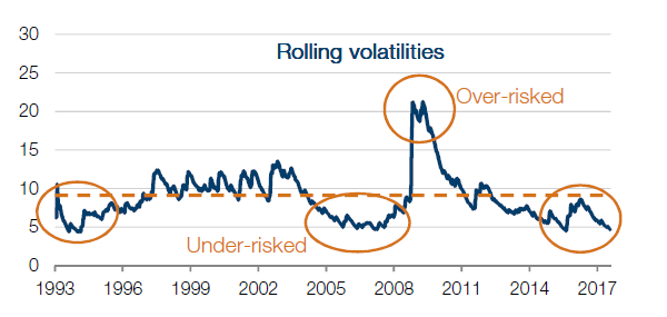
In the long bull market leading into 2008, the risk level (and therefore the return also) is half the target. In the crisis itself, the risk level is about twice the target, so it could have delivered about twice the loss for which the portfolio was designed.
We believe the problems with this conventional approach are first that the portfolio is rebalanced to notional weights as opposed to risk weights. Secondly, this rebalancing process operates in effect only retroactively as it simply leads to a re-allocation of capital that has already been made or lost.
We believe we can address this problem through an ability to measure risk and then use our understanding of the persistence of those risk conditions to make active adjustments to the exposure levels in the portfolio.
Forecasting risk and risk persistence
Forecasting return is notoriously difficult, but there is increasingly more supportive documentation on risk: the insight here is that risk levels tend to have some persistence2. That is, periods of high risk historically have tended to be followed by periods where risk levels remained high. Similarly less risky periods historically tended to be followed by less risky periods: in other words, they tended to persist.
This valuable observation has been used for many years by alternatives managers to stabilise their portfolio risk levels through time. By analysing the risk levels in individual instruments and understanding how groups of these instruments are trading together, position sizes can be adjusted (or ‘re-balanced’) with a view of improving on the accuracy with which a portfolio performance meets its risk objectives. When risk in a group of markets gets too high they trade to reduce the overall portfolio level of risk to the desired value; when too low, they actively trade to increase overall risk levels.
Substantial advances in execution technology have so greatly reduced the cost of transactions that portfolios can be adjusted much more quickly and cheaply to changes in risk conditions, and therefore potentially benefit from the tendency for new conditions to persist. We believe the combination of risk forecasting and high quality execution can lead to valuable improvements in portfolio management, as we seek to illustrate with the following case study.
Case study
Creating a benchmark
In the case study that follows we build out the equity/bond portfolio used in Figure 1 as a benchmark and then look at the simulated performance as we add the layers of active risk management. We implement these portfolios using futures – which brings the benefits of lower cost execution and a more efficient use of cash.
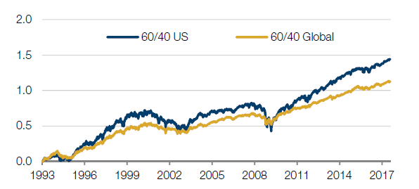
To establish a benchmark we look at the approach we used in Figure 1 and rebalance back to our asset allocation on a quarterly basis. But rather than think in terms of notional allocations we use risk weightings. On average these look similar to the notional weightings, but as a method it is more consistent with the successive steps of the case study.
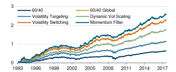
Next, to create a more realistic portfolio we show a more diversified list of instruments. The portfolio split remains 60/40 equities versus bonds by risk, but here we include a total of 18 global fixed income markets and 25 global equity markets, all of which are accessed via liquid futures. The weightings reflect the size and liquidity of the respective markets. This is our 60/40 ‘Global’ portfolio. Note in the second line of the table in Figure 2 that the return of this portfolio would have been lower (as there are securities included here that underperformed the US instruments in the first step) but that the volatility is also lower, so the Sharpe ratio increases to 0.9 and the worst drawdown is significantly reduced as a result of the diversification.
Figure 2: Benchmark performance
| Portfolio | Return | Volatility | Sharpe | Return / Max DD | Max DD | Worst month |
|---|---|---|---|---|---|---|
| 60/40 US | 5.8% | 9.0% | 0.7 | 15% | -40% | -21.5% |
| 60/40 Global | 4.6% | 5.1% | 0.9 | 29% | -16% | -9.4% |
Technique 1: Using futures
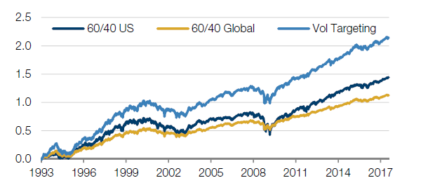
In the above section we commented that the Sharpe ratio had increased in our more diversified portfolio, even though the return had decreased. This indicates that the return per unit of risk has increased (here we are defining risk as the volatility of the portfolio). We can take a step further to try and make a more rational use of this diversification benefit, and introduce a volatility target, or ‘risk budget’ for the portfolio. This means that we plan to adjust the level of exposures in the portfolio to target a constant level of volatility, or risk. This is straightforward because we have implemented the investments through cash efficient derivatives: for each $100 of exposure we may only need to post a few dollars of margin.
For this and the next two steps the risk level we chose to target was 10%. We could target other levels, but we use this as it is conveniently close to our original portfolio. Scaling the diversified portfolio that we created above to a volatility of 10%, the Sharpe ratio remains unchanged (as risk and return are scaled by the same amount). The results are shown in the third line of the table below. To be clear though, it is not until the next step that we start to manage the portfolio more actively.
Figure 3: Impact of volatility targeting
| Portfolio | Return | Volatility | Sharpe | Return / Max DD | Max DD | Worst month |
|---|---|---|---|---|---|---|
| 60/40 US | 5.8% | 9.0% | 0.7 | 15% | -40% | -21.5% |
| 60/40 Global | 4.6% | 5.1% | 0.9 | 29% | -16% | -9.4% |
| Volatility Targeting | 8.7% | 9.7% | 0.9 | 29% | -31% | -18.1% |
Technique 2: Dynamic volatility scaling
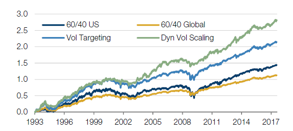
In this first ‘Dynamic Volatility Scaling’ step, we adjust the level of exposures to more consistently target our volatility target of 10% through time.
To do this we calculate the volatility of each instrument using longer term data (with a ‘half-life’ of about one year) and we use similarly long term correlation estimates to assess the degree to which they trade as a group. As the volatility of an instrument goes up, we reduce its exposure. As volatility falls, we increase. Using this approach, we may expect each instrument to have a more stable standalone risk contribution over time, provided that the historically derived risk estimate provides some guide to the future risk, as suggested earlier in the paper. Similarly as correlation between the instruments and asset classes goes up, we reduce the overall exposure, and as it falls we increase. We thus scale these standalone risk allocations up and down, in order to target a more stable overall risk exposure. This way, any change in the market behaviour impacts the exposure levels of the portfolio on a daily basis.
The volatility result we get from these daily adjustments is 10.9%, so it is a bit high. The reason we overshoot the required volatility in this step is that the measure of volatility we are using changes quite slowly as conditions change…too slowly, in fact, to cope with sudden violent changes in market conditions, such as occurred in 2008.
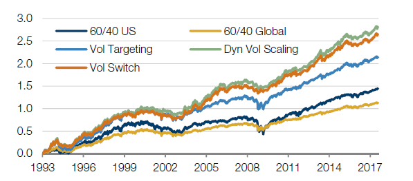
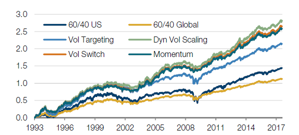
These sudden changes have historically occurred in down markets, so the delayed response is unattractive. However, note in Figure 4 below the more general impact of this step on the performance figures. After transaction costs, we now have a return of 11.4%, more than 500bps over the initial benchmark. The Sharpe is up 40%. In addition, the maximum drawdown that this portfolio suffers at the same volatility has reduced from 40% to 25%, so we have also subdued the left tail somewhat. We can summarise these developments by tracking the ratio of average return to maximum drawdown which has gone from 15% in the initial benchmark to 46% after this step in the simulation.
Figure 4: Impact of dynamic volatility scaling
| Portfolio | Return | Volatility | Sharpe | Return / Max DD | Max DD | Worst month |
|---|---|---|---|---|---|---|
| 60/40 US | 5.8% | 9.0% | 0.7 | 15% | -40% | -21.5% |
| 60/40 Global | 4.6% | 5.1% | 0.9 | 29% | -16% | -9.4% |
| Volatility Targeting | 8.7% | 9.7% | 0.9 | 29% | -31% | -18.1% |
| Dynamic Volatility Scaling | 11.4% | 10.9% | 1.0 | 46% | -25% | -15.2% |
Technique 3: Volatility switching
We have seen the effect of reacting too slowly to regime changes: we tend to be over-risked for too long. But if we react much faster there is a danger that, conversely, we end up unproductively churning the portfolio3.
In this second layer of risk sizing, we look to improve on the first layer by introducing a faster measure of volatility (with a half-life of just 12 days). We don’t actually use this faster measure unless it starts to diverge materially from the slower measure and this will typically only happen when market conditions are going through material change. In those scenarios, we use the faster measure, and de-risk much faster.
The results of using this additional technique are shown below. Note that the Sharpe stays pretty much the same: we don’t make any more return per unit of risk by doing this. However we have now reduced the Maximum Drawdown by half, (as the fifth row in the table below shows). The inference here is that by scaling exposure back more quickly when volatility starts to rise rapidly, we reduce the losses: ‘enough risk in the good markets, without having too much in the bad ones’.
Figure 5: Impact of volatility switching
| Portfolio | Return | Volatility | Sharpe | Return / Max DD | Max DD | Worst month |
|---|---|---|---|---|---|---|
| 60/40 US | 5.8% | 9.0% | 0.7 | 15% | -40% | -21.5% |
| 60/40 Global | 4.6% | 5.1% | 0.9 | 29% | -16% | -9.4% |
| Volatility Targeting | 8.7% | 9.7% | 0.9 | 29% | -31% | -18.1% |
| Dynamic Volatility Scaling | 11.4% | 10.9% | 1.0 | 46% | -25% | -15.2% |
| Volatility Switching | 10.7% | 10.1% | 1.1 | 51% | -21% | -11.1% |
So what is really going on here? How have we managed to improve the characteristics of this portfolio purely by targeting a constant volatility?
In the period from 2003 up to 2008, the simple 60/40 US portfolio would have performed well. But over this period we are taking as little as half the risk in our original portfolio compared to our 10% volatility target and this has the straight forward consequence that we are making much less (also about half) than we should given our risk budget.
Moreover, the original portfolio takes far more risk (about twice) than our new actively managed portfolio in 2008/9. We are taking too much risk in the bad times, and this leads directly to greater losses in the periods tested.
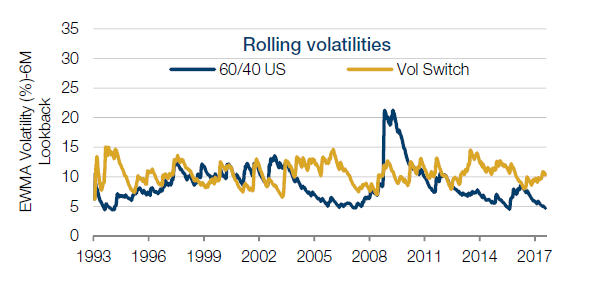
So, while our original portfolio operates at a target volatility over long time periods, it does this by taking less risk in good times, and more risk in bad times. In other words, it does the exact opposite of what we would have wanted the portfolio to have done. By sticking much closer to our 10% volatility target we have improved the portfolio performance without making any predictions of market direction – and without introducing the concept of ‘alpha’. Figure 6 below shows the improved portfolio volatility in yellow, as compared with the original portfolio in blue.
Figure 6: Before and after volatility scaling
Technique 4: Adding a momentum filter
The first two steps that we introduced were purely about more accurately maintaining the desired risk levels. The next step aims to limit losses by actually reducing risk levels in adverse markets.
This step depends on another observation about persistence in markets. In this case, as prices start to fall, they have historically been slightly more likely to continue to fall than recover. These are long only assets and we prefer to own less of markets that are falling!
The volatility scaling in the two previous steps has tended to reduce exposure when markets are falling due to the negative correlation between price returns and volatility. But the reduction was to maintain the same level of risk as before. The momentum filter goes one step further, and reduces exposures with a view to delivering below target risk for as long as prices as falling.
Clearly this may result in the strategy missing out on some positive return when markets switch from a negative trend to positive trends. But, we find that over the periods tested, we were better served by missing these turning points and reducing exposure to falling markets than sitting through the turmoil.
The table below shows that the impact of this step has been fairly modest recently (though it again reduces maximum drawdown). The fact that this ten year period has largely been a bull market provides some explanation to this. Over longer time periods the potential benefit may be more tangible.
Figure 7: Impact of adding a momentum filter
| Portfolio | Return | Volatility | Sharpe | Return / Max DD | Max DD | Worst month |
|---|---|---|---|---|---|---|
| 60/40 US | 5.8% | 9.0% | 0.7 | 15% | -40% | -21.5% |
| 60/40 Global | 4.6% | 5.1% | 0.9 | 29% | -16% | -9.4% |
| Volatility Targeting | 8.7% | 9.7% | 0.9 | 29% | -31% | -18.1% |
| Dynamic Volatility Scaling | 11.4% | 10.9% | 1.0 | 46% | -25% | -15.2% |
| Volatility Switching | 10.7% | 10.1% | 1.1 | 51% | -21% | -11.1% |
| Momentum Filter | 10.5% | 9.7% | 1.1 | 55% | -19% | -9.6% |
Reviewing the new portfolio dynamics
It is time to step back and review these layers of active management together.
Regarding the investment returns, the excess return of the last portfolio over the first one is about 400bps, while the level of risk is basically the same throughout.
Note in the table below (Figure 8) that this has been achieved at the expense of much higher portfolio turnover. The big increases come from the Step 2, with the initial daily volatility scaling which turns the portfolio 2.4x and Step 3 which almost doubles that (4.4x). But note from the last column which estimates the transaction costs to be no more than 8bps per annum, which set against the improvements in risk and return, are clearly negligible.
Figure 8: Accuracy, exposures, turnover and costs
| Portfolio | Return | Tracking Error | % Inside Vol Range 7-13% | Mean Gross | Max Gross | Turnover | Cost (bps) |
|---|---|---|---|---|---|---|---|
| 60/40 US | 5.8% | 3.4% | 61% | 100% | |||
| Volatility Targeting | 8.7% | 2.8% | 80% | 190% | |||
| Dynamic Volatility Scaling | 11.4% | 2.5% | 78% | 238% | 334% | 249% | 5 |
| Volatility Switching | 10.7% | 1.8% | 91% | 226% | 333% | 448% | 7 |
| Momentum Filter | 10.5% | 1.9% | 91% | 220% | 333% | 459% | 7 |
About 300bps of the excess return is coming from the 1.9x leverage which we can apply as we scale the risk in the Global portfolio to 10%, given the introduction of the more diversified markets as reflected in the second and third rows of the table.
The Volatility Scaling steps account for another 200bps (from 9% to 11%). Since mean leverage is 10% or so higher, about half of this extra return is attributable to the same type of explanation: the improvement in the risk management allows us to run a little more exposure.
The other c.100bps is attributable to the fact that the active measures are forcing us out of risk exposure in volatile markets, so we are avoiding losses rather than making more return.
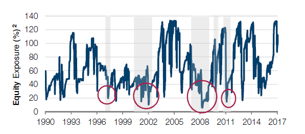
The chart below, by way of example, shows just the equity exposures over the period. Drawdowns in the S&P500 of more than 15% are represented by the grey shaded areas. Note that typically exposures are reduced early in these bear markets.
It appears that the Momentum Filter has cost return in this study, but the further improvement in the risk characteristics has offsetting value which we explore next.
Figure 9: Equity exposure with all layers of risk management is low through big equity drawdowns
In addition to the implied benefits to return, in simulation, the layers of risk management have reduced the maximum drawdown with each step. One way of showing the importance of the reduction of the worst loss (“reducing the tail” as it is sometimes described) together with the increase in the return, is to show a version in which we rescale the exposures in each of the steps so as to produce an equal worst monthly loss (maximum drawdown would have a very similar effect). Approaching it this way, we reach a genuine ‘apples to apples’ comparison of the steps.
In the next chart we show all the steps re-scaled so that they are constrained in the exposure they run such that the Worst Monthly returns are the same4.
Figure 10: Adjusting exposure levels to deliver a constant loss
| Portfolio | Return | Volatility | Sharpe | Return / Max DD | Max DD | Worst month |
|---|---|---|---|---|---|---|
| 60/40 US | 2.6% | 4.0% | 0.7 | 15% | -18% | -9.6% |
| 60/40 Global | 4.6% | 5.2% | 0.9 | 29% | -16% | -9.6% |
| Volatility Targeting | 4.6% | 5.2% | 0.9 | 29% | -16% | -9.6% |
| Dynamic Volatility Scaling | 7.2% | 6.9% | 1.0 | 46% | -16% | -9.6% |
| Volatility Switching | 9.2% | 8.6% | 1.1 | 51% | -18% | -9.6% |
| Momentum Filter | 10.5% | 9.7% | 1.1 | 55% | -19% | -9.6% |
Finally, in this example, we are taking seriously the idea that the amount of risk, or exposure a portfolio may take is determined by the loss tolerance. The excess return over the original passive diversified portfolio scaled to 10% volatility (third row of the table in Figure 6) is now c.500bps over the periods tested. Why isn’t this approach more widespread?
We have shown a series of risk management techniques developed in the context of alternatives portfolio management which have here been applied to long only portfolios. The objective has been to keep enough risk on in the good markets without having too much risk on in the bad markets. Why don’t all long only asset managers already do this?
The trade-offs between speed of portfolio adjustment and cost of execution are very important. The turnover, as we have shown, is quite high by the standards of traditional long only management. High quality, fast, automated execution is essential. Typically, this trading ability has been directed at either high turnover, high fee approaches; or at very high capacity low fee approaches. This bifurcation has been driven by the profit motive, but it is also fair to say that the execution capability requires very significant investment which may not be viable outside the context of a broader business.
In some cases, long only providers have adopted similar approaches to the ones we describe above (for example in the ‘risk parity’ funds) but they have concentrated on approaches which are slower acting to cater to very large mandates. The benefits of trading slower in very large size have so far been correspondingly less impressive.
1. As we discuss later this comes to around 60% of the risk in equities and 40% in bonds. In this example we represent equities by the S&P 500 and bonds by US 10Y T-Notes.
2. Mandlebrot, The variation of certain speculative prices, Journal of Business, XXXVI (1963).
3. For example, markets sometimes mean revert, so reducing positions too quickly can lead to losses on the downside, but not capturing sufficient amounts of the rebound, but also additional trading costs as the measure will quickly revert to more normal levels.
4. We could equally have used other measures of loss, such as Maximum Drawdown, for example, with similar results.
You are now leaving Man Group’s website
You are leaving Man Group’s website and entering a third-party website that is not controlled, maintained, or monitored by Man Group. Man Group is not responsible for the content or availability of the third-party website. By leaving Man Group’s website, you will be subject to the third-party website’s terms, policies and/or notices, including those related to privacy and security, as applicable.