With contribution from: Ziang Fang, Senior Portfolio Analyst, Man Numeric.
Introduction
It is accepted wisdom that the more efficient an asset class, the greater the potential for passive funds to take market share versus active funds. After all, the more symmetrically and efficiently asset prices reflect new information, the lower the scope for alpha, such that the rational long-only investor will opt for beta with the lowest possible fee burden, in our view.
While there is a spectrum of efficiency, it is clear that nothing is perfectly efficient: even the biggest, most heavily-scrutinised companies have the capacity to surprise on earnings and to exhibit pronounced volatility for prolonged periods.
It is little surprise, therefore, that passive market share in the US accounted for approximately half of total assets at the end of 2018, according to data provider eVestment (Figure 1) and that the net inflows since the start of the century have been overwhelmingly positive on a quarterly basis (Figure 2).
Problems loading this infographic? - Please click here
Source: eVestment; As of 31 December, 2018.
More surprising is that the passive share in emerging markets (‘EM’) already accounts for a quarter of total AUM (Figure 3). This is remarkable to us because unlike the US, where 10-year annualised Russell 2000 returns of almost 13% have made beta strategies irresistible, EM’s 10-year compounded average growth rate (‘CAGR’) of only 5%1, elevated volatility and greater inefficiencies have made the beta approach a less palatable proposition. Much of the growth in recent years of passive AUM has come at the expense of discretionary managers who experienced staggering growth in previous years and arguably overgrew their investment capabilities.
Problems loading this infographic? - Please click here
Source: Man Numeric, 13F Holdings, FTSE Russell; As of 31 December, 2018. Aggregate active share is calculated as the asset-weighted active share among asset managers in Russell 1000® and Russell 2000® Indices’ equities.
Problems loading this infographic? - Please click here
Source: eVestment; As of 31 March, 2019.
Our aim in this paper is to shed some light on the implications of the rapid growth of passive strategies in EM equities: how breadth has narrowed meaningfully, turning the precepts of the size premium on its head; how index concentration has evolved, and resulted in a more concentrated index construction than in the US; what impact this has had on sector and factor exposures for passive investors; and the impact on the value proposition for the EM index versus an actively managed fund.
Size Isn’t Everything
The risk premium for smaller companies in EM has typically worked pretty well: since 2000, MSCI’s EM SMID Cap index has outperformed the Large Cap index by approximately 95 basis points annualised, and at the peak in early 2016, had managed an annualised outperformance of 220bp. On average, active manager portfolios are smaller than the benchmark and as such, the recent large-cap outperformance has been a headwind to active management.
Problems loading this infographic? - Please click here
Source: Bloomberg, Man Group; As of 17 May, 2019.
Until 2016, there have been three periods of this size factor not delivering excess returns, two of which, logically, occurred during periods of extreme risk-off:
Figure 5. Emerging Equity Holdings Indicator (Portfolio Weights)
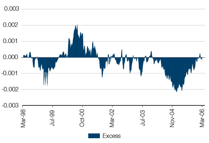
Source: State Street Global Markets Research; Between March 1998 and March 2006.
Since mid-2016, size premia has been under considerable pressure, the longest period in the data we have. The experience of 2005 – covering underweights at the start of a new bull market – could explain a short-lived period of smaller capitalisation underperformance. But after nearly three years, it is clear there are other factors at work.
Our first instinct is that this must be about earnings – large-cap stocks are outperforming because industry consolidation everywhere is driving earnings power higher in winner-takes-all markets, right? In fact, looking at the relative forward EPS estimates for MSCI EM large cap versus MSCI small & mid-cap, the opposite is true. Figure 6 shows the relative forward EPS for these MSCI indices. Since early 2016, large-cap EPS has actually underperformed. In forward PE terms, large cap has re-rated by almost 25% relative to SMID since early 2016.
Problems loading this infographic? - Please click here
Source: Bloomberg, Man Group; As of 22 May, 2019.
If we cannot explain performance by recourse to fundamentals, the other likely explanation is flows. Here, the meaningful change, as mentioned in the introduction, is the growth of passive assets. Figure 7 shows the assets under management of the top 10 global EM ETFs in USD as a percentage of the total market capitalisation of MSCI EM from 2014, when the full cohort of these ETFs was in existence. At approximately USD200 billion of AUM, these 10 ETFs constitute roughly 15% of EM AUM, and a little less than 4% of MSCI EM market capitalisation.
Figure 7. Top 10 Global EM ETFs
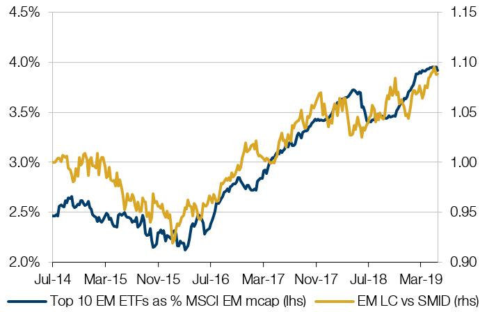
Source: Bloomberg, Man Group; As of 17 May, 2019.
Visually, there is a reasonable relationship between narrowing breadth (large-cap outperformance) and increasing passive penetration. When the delta in passive penetration over one year is plotted against relative large versus SMID cap performance over one year, this relationship is even clearer.
Figure 8. Relationship Between Narrowing Breadth and Increasing Passive Penetration
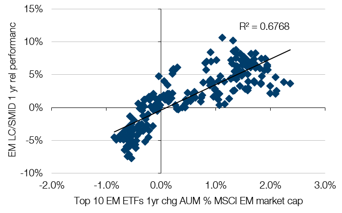
Source: Bloomberg, Man Group; Between July 2014 and May 2019.
Qualitatively, this makes some sense: as passive funds take share, a greater share of available capital goes to index heavyweights. And as more capital goes into the index than into active managers’ holdings, the tendency for active managers to underperform increases. Mindful of career risk, active managers will be prone to selling their losers, and closing their underweights in big index constituents to stem underperformance, taking yet more capital into big index constituents relative to smaller caps.
Too Much Concentration
One impact of this flight to large cap has been an extraordinary concentration in the EM index, where the top 10 stocks by index weight constitute c25% of the overall index, substantially larger than the top 10 in the S&P500 Index at c21%.
Problems loading this infographic? - Please click here
Source: Man Numeric, MSCI; As of 29 March, 2019.
EM and the S&P both have platform tech in common; clear winner-takes-all industries that are absent from European and Japanese indices. From a sector composition perspective, both indexes have comparable exposure to mega-cap tech in their top 10 constituents: Tencent, Alibaba, TSMC, Samsung Electronics and Naspers for EM, and Microsoft, Apple, Amazon, Facebook and Google for the S&P.
Following the Global Industry Classification Standard (‘GICS’) decision to reclassify many tech internet platforms as communications, we have combined these sectors to gauge the progression of their size over time. At a headline index level, the concentration in tech and communications reached almost 35% of the index in late 2017 (Figure 10). There is nothing magical about this level, and we have no empirical grounds to assume that there is a natural limit to how big a sector can become. However, we do note that in the last major thematic bull market, the pre-Lehman China fixed-asset investment boom, commodities (materials and energy combined) peaked at c37%, and now languish at less than half that weight in aggregate.
Problems loading this infographic? - Please click here
Source: MSCI; As of 25 April, 2019.
The question is, does index concentration matter? In our opinion, yes: in part because it exposes the passive investor to the historical winners, and consequently to the biggest crowding risk at the peak of hype cycles; and in part, and more importantly for managers who use a multi-factor approach, because there is a material skewing of factor exposures and potential for elevated correlation risk when a single industry or sector dominates. It is this latter point that we want to examine, to shed light on the unintended factor exposures that passive investors, and indeed active investors with strong benchmark-hugging characteristics among the top 10 index weights, embed into their portfolios.
What Happened to Value?
The EM sell-off of 2014/15 and the narrow rally led by tech has had a profound impact on the factor anatomy of EM, most notably in the effect on value. Figure 11 shows the Barra risk model exposure to value in the MSCI EM index and the steep decline in the exposure to the value factor, such that the index in aggregate has been modestly short value since early 2016.
Another way to look at the material change in index value is to disaggregate the forward PE ratio of the top 10 stocks from the rest of the index. Outside of the financial crisis, the forward PE multiple of the rest has been exceptionally stable over time. The top 10, however, has gone from a meaningful discount over the last five years, to a premium. This reflects, of course, the changing the sector composition of the top 10, and the remarkable re-rating of larger cap stocks that we highlighted above (despite inferior EPS momentum).
Problems loading this infographic? - Please click here
Source: Barra; As of 25 April, 2019.
Problems loading this infographic? - Please click here
Source: MSCI, IBES; As of 25 April, 2019.
To remain unconcerned by this development requires two assumptions:
- The size premium is dead;
- The value premium is dead.
On size, we offer two reasons to consider that it should remain a valid risk premium.
First, larger companies find it harder to sustain high growth rates. This point is easily forgotten in the era of winner-takes-all platform businesses and consolidating industries. But Michael Mauboussin’s superb work on the subject2, with a data set covering US companies from 1950 to 2015, makes the point very clearly: smaller companies consistently grow faster.
Second, we again highlight that even through this very recent period of mega-cap dominance in EM markets, when a consensus has solidified that champions in their industries are unassailable, the growth rates of smaller companies have eclipsed those of larger cap companies.
So if not now, during the heyday of oligopolism, then when?
Figure 13. Growth Rates and Standard Deviations Decline With Size
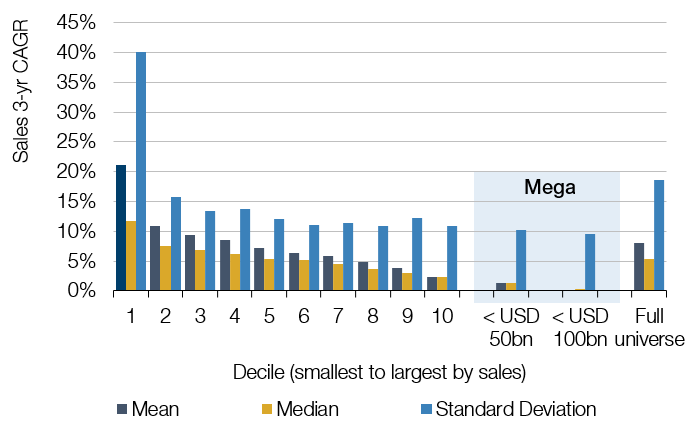
Source: Credit Suisse3. Note: Growth rates are annualised over three years.
On the value premium, we have written extensively on the merits of value, and rather than rehash the subject here, we would offer two observations.
First, despite the general impression that value has been a disaster, the first quintile versus fifth quintile returns from value in EM have been strong on a country and sector neutral basis (Figure 14). So, while it might be the case that growth has outperformed materially over the last 10 years on a standalone factor basis (over 3% annualised outperformance), it is also the case that assiduously picking cheap over expensive has delivered excess returns, to the tune of 140bp annualised over the same period.
Problems loading this infographic? - Please click here
Source: Barra; As of April 2019.
Second, it is critical to remember that seemingly permanent market regimes can change abruptly. The conditions that have favoured the growth factor over the last 10 years (and indeed for much longer) could not have been more perfect: abundant access to capital, low inflation and interest rates, stagnating GDP growth. These conditions have contributed to outperformance of the MSCI EM Growth Index in recent years, pushing the Growth Index PE premium relative to the Value Index to near all-time highs.
Figure 15. MSCI Growth PE at Highs Versus MSCI Value PE
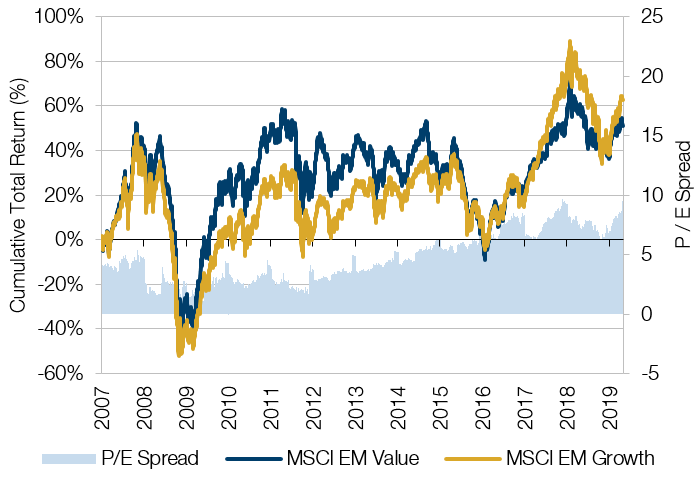
Source: Bloomberg; As of April 2019.
It is at least conceivable that the next 10 years will not be as friendly, as the potential grows for fiscal tools to supplant (or at least complement) monetary tools in tackling cycles, and as central banks (chiefly the Federal Reserve) contemplate new approaches to inflation targeting. Figure 16 shows the meaningful positive correlation between the 5-year excess return of value and the 5-year change in inflation.
Figure 16. Correlation Between 5-Year Excess Return of Value and 5-Year Change in Inflation
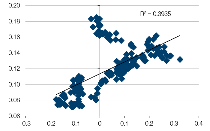
Source: Bloomberg, Man Group; As of April 2019.
Conclusion
The growing influence of passive investing in EM has so far merited little fanfare in the investment community, particularly in comparison to developed markets. We believe the growth in passive in emerging markets has contributed to market distortions that may temporarily hinder the abilities of active managers but produce future opportunities. To us, given the inherently unpredictable nature of major macroeconomic regimes, a balanced, diversified, multi-factor approach to stock selection remains the most prudent approach. To think otherwise requires conviction that value and size are dead forever and that passive will grow to US levels even in a historically inefficient universe such as EM.
1. Source: Bloomberg, Man Group calculations; As of 31 May, 2019.
2. Michael Mauboussin, The Base Rate Book: Integrating the Past to Better Anticipate the Future, Credit Suisse Global Financial Strategies, September 2016.
3. The Base Rate Book: Integrating the Past to Better Anticipate the Future, published 26 September, 2016.
You are now leaving Man Group’s website
You are leaving Man Group’s website and entering a third-party website that is not controlled, maintained, or monitored by Man Group. Man Group is not responsible for the content or availability of the third-party website. By leaving Man Group’s website, you will be subject to the third-party website’s terms, policies and/or notices, including those related to privacy and security, as applicable.