Introduction
2020 has been a year of turmoil. The spread of Covid-19 caused economic activity to be put on hold around the world. World equity markets fell between 20%-40% over the course of a few days, with the US stock market halting trading multiple times due to ‘circuit breaker’ safety mechanisms. Volatility and inter-asset correlations spiked. In such a scenario, it is unsurprising that most investors are looking to re-assess how they manage their portfolios during times of stress.
In this article, we show how sharp changes in both volatility and correlation affected risk forecasts. We first examine the size of market moves during the Corona Crash, and then define the commonly used Value-at-Risk (‘VaR’) measure of portfolio risk. We then use a simple example to illustrate how VaR was impacted by the crash.
The Corona Crash
Figure 1 shows how the Corona Crash compares to some of the great bear markets and stress periods in history. As can be seen, whilst the current plunge is still a long way off the overall magnitude of its predecessors, its speed has been unprecedented. Never has -30% been breached so quickly.
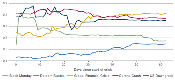
Figure 1. S&P500 Returns
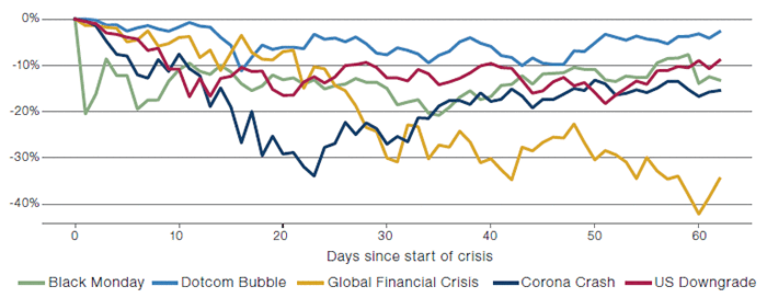
Source: Bloomberg. Start dates of the crises used in this paper are Black Monday: 16 October 1987, Dotcom Bubble: 10 March 2000, Global Financial Crisis: 28 August 2008, US Downgrade: 22 July 2011, Corona Crash: 19 February 2020. These dates have been selected as they represent the peak of the S&P500 index before the onset of the crisis when there isn’t a clear crisis start date. X-axis shows number of business days since crisis start.
Within a few weeks of the S&P500 Index’s peak on 19 February 2020, signs of stress were visible across markets and trading strategies, with dislocations impacting US Treasury – bond futures basis, equity arbitrage and structured credit, to name just three. Alongside the rapid selloff in global equities, there was a simultaneous sharp increase in equity market volatility (Figure 2).
Figure 2. VIX
Source: Bloomberg. Start dates of the crises used are Global Financial Crisis: 28 August 2008, US Downgrade: 22 July 2011, Corona Crash: 19 February 2020. Black Monday and Dotcom Bubble not plotted as VIX was not traded then.
The turmoil of the Corona Crash (and indeed most major market crises) was not, however, quarantined within equity markets. Indeed, it is rare that an investor would hold only one asset, which means that increased equity volatility is only part of the story. An often-overlooked question relates to the impact on the return distribution of a portfolio of changes in correlation amongst portfolio holdings, and the subsequent effect on various risk measures. In order to address that, we first recap a commonly used measure of portfolio risk: Value at Risk.
Value at Risk
Value at Risk (‘VaR’) is defined as the loss that a portfolio would expect to exceed with a given probability over a particular time period. For example, if a loss of X or greater has a 1% chance of occurring over a 1-day period, it would be denoted as 99% 1-day VaR (as 100% - 1% = 99%). VaR offers the advantages of describing an aspect of tail risk using one number and being somewhat comparable across different asset classes. It is widely used for a variety of purposes within the financial industry, from determining capital requirements for financial institutions to setting risk limits and monitoring risk levels for investment portfolios.
As an illustrative example, we fit a normal distribution to the daily returns of the S&P500 Index using historical data from the past year, and plot the returns distribution function in Figure 3. The left 1-percentile tail of losses is highlighted.
Figure 3. S&P500 Index Return Distribution and VaR
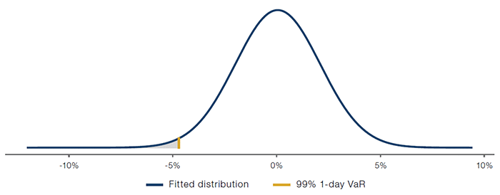
Source: Man Group. For illustrative purposes.
Another way of calculating VaR is the historical method, which is calculated directly from past returns, effectively assuming the returns follow the empirical distribution. Figure 3 shows how, throughout the different crises, the VaR of the S&P500 Index increased over time when using this method and updated on a daily basis.
Figure 4. S&P500 Index 99% 1-Day VaR — HIstorical Method
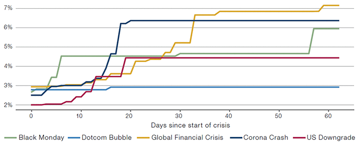
Source: Bloomberg. Start dates of the crises used in this paper are Black Monday: 16 October 1987, Dotcom Bubble: 10 March 2000, Global Financial Crisis: 28 August 2008, US Downgrade: 22 July 2011, Corona Crash: 19 February 2020.
In either approach, there are two key elements affecting the VaR for a portfolio: the assumed volatility of the constituent investments and their modelled correlations. Even though VaR is an ex-ante risk measure used to quantify future losses, it is calculated based – at some level – on historical data. As market conditions evolve, VaR also tends to vary over time, as changes in the volatility and correlation structure are incorporated into the model. The above example is a single-asset portfolio, and as such it emphasises the impact of spikes in volatility on VaR.
Measuring Correlation
The other factor governing VaR is the correlation among different assets as they fluctuate in value. In a long-only portfolio, a simple heuristic is that the higher the correlation of assets held, the higher the VaR of the portfolio as a whole will be. While volatility is easily observable, the behaviour of inter-asset correlation is less obvious.
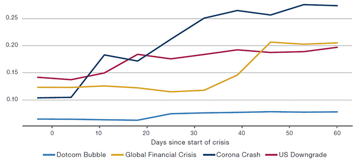
Despite this caveat, correlation can still be quantified. One of the simplest and most common approaches is to use the Pearson correlation coefficient, which measures the linear relationship between two variables. Figure 5 shows the correlation coefficient between the S&P500 and EuroStoxx50 equity indices throughout our stress periods. What made the Corona Crash so unique (and difficult to manage) was the magnitude and the pace of the changes in inter-asset correlation. (The correlations are calculated using overlapping 2-day returns to mitigate the issue of synchronicity, updated daily and using exponential smoothing.)
Figure 5. S&P500 and EuroStoxx50 Correlation
Source: Bloomberg. Start dates of the crises used in this paper are Black Monday: 16 October 1987, Dotcom Bubble: 10 March 2000, Global Financial Crisis: 28 August 2008, US Downgrade: 22 July 2011, Corona Crash: 19 February 2020.
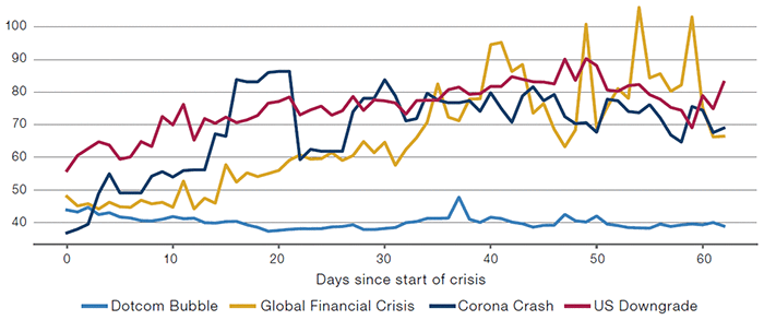
Perhaps unsurprisingly, we see a similar pattern with single stocks, which tend to become more correlated during major selloffs. Figure 6 shows the average pairwise correlations of S&P500 stocks, which increased substantially during both the Global Financial Crisis (‘GFC’) and the Corona Crash. During the dotcom bubble, the correlation did not increase as the stress was concentrated in fewer companies (Figures 6-7).
Figure 6. S&P500 Stocks’ Average Correlation
Source: Man Group. Start dates of the crises used in this paper are Dotcom Bubble: 10 March 2000, Global Financial Crisis: 28 August 2008, US Downgrade: 22 July 2011, Corona Crash: 19 February 2020. Black Monday not plotted due to lack of data.
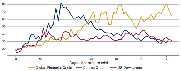
An observable measure of correlation is the CBOE S&P500 Implied Correlation Index (‘KCJ Index’), which is a market-based estimate of the average correlation of the S&P500 Index constituent stocks, calculated from the option prices of the index and of the constituent stocks. The peak of the index during the Corona Crash is lower than that during the GFC, but the speed of the increase is much faster (Figure 7). This intuitively makes sense: unlike the GFC, where it took a long time to figure out who exactly was exposed to low-quality mortgage bonds (and who would consequently go bust), it became pretty clear pretty quickly that Covid-19 wasn’t stopping in China and that global economic activity would grind to a halt as governments took steps to reduce the spread of the virus. Global stocks sold off accordingly.
Figure 7. KCJ Index
Source: Bloomberg. Start dates of the crises used in this paper are Dotcom Bubble: 10 March 2000, Global Financial Crisis: 28 August 2008, US Downgrade: 22 July 2011, Corona Crash: 19 February 2020. Black Monday not included due to lack of data.
Another way to visualise the correlation is by use of a scatter plot and confidence ellipse. Figure 8 shows a scatter plot of overlapping 2-day, rolling-normalised returns of the S&P500 Index versus the EuroStoxx50 Index. There is generally a positive correlation: when the S&P500 goes up, so does the EuroStoxx50. The inner ellipse in the chart shows the 2-sigma confidence ellipse using the long-term sample covariance (1987 to date), while the outer ellipse shows the covariance during the four stress years to highlight the region within which 95% of all the observations fall. The other 5% of the time, we observe some unusual market moves, illustrated by the distance between the points and the ellipse. Indeed, it is striking how many unusual days occur, demonstrating that the market does indeed have a different correlation structure during crises when compared with ‘normal’ times.
Figure 8. S&P500 Versus EuroStoxx50 and 2-Sigma Confidence Ellipse
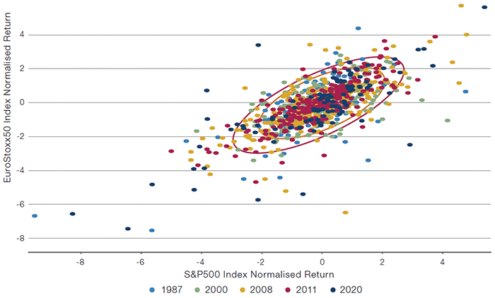
Source: Bloomberg.
The Impact of the Correlation Spike
So, correlation has been unusual, to say the least, during the Corona Crash. The question now is: how much does it affect risk estimates, such as VaR?
As a starter, we look at a simple portfolio with equal weights in two assets whose daily returns follow a bivariate normal distribution, each with a standard deviation of 1. Figure 9 shows the distribution of the portfolio return and the VaR under different correlation assumptions: the VaR increases from 1.64 to 2.33 as the correlation increases from 0 to 1.
Figure 9. Example Portfolio Return Distribution and 99% 1-Day VaR
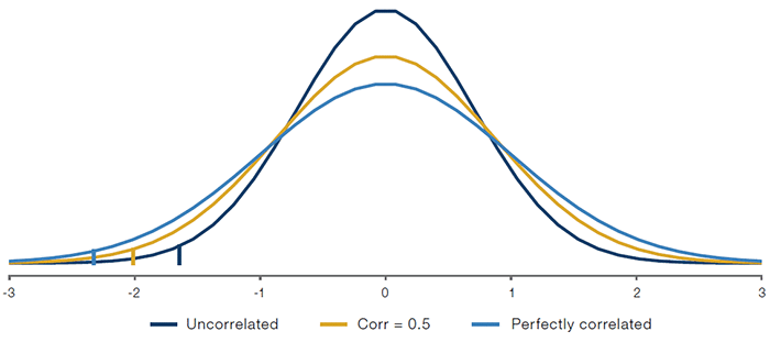
Source: Man Group; for illustrative purposes only.
Now let’s look at a more realistic scenario: assume we have a portfolio that is equally weighted between the S&P500 and EuroStoxx50 indices. Figure 10 shows the portfolio VaR based on two scenarios: one with static correlation based on the long-term sample correlation up to the start of the crash, and one using time-varying correlation with a rolling window. As illustrated, failure to take into account the varying nature of correlation leads to understating the risk of the portfolio by up to 7% relative to the benchmark method (2.3% versus 2.5%). This understatement of risk for a broader portfolio could lead to a portfolio becoming unbalanced or suffering losses that are larger or more frequent than expected, and therefore ultimately become unsuitable for investors.
Figure 10. Portfolio VaR Under Different Correlation Assumptions
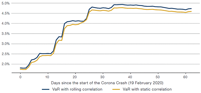
Source: Bloomberg. For illustrative purposes only.
The impact of changes in correlation on VaR is more significant for portfolios employing leverage. To illustrate this, we now consider a 2x levered market-neutral long-short portfolio that aims to capture the relative performance of the two indices. As illustrated in Figure 11, this portfolio is more dependent on the correlation diversification effect and the impact of time-varying correlation is even more significant – up to 71% (2.2% versus 1.3%).
Figure 11. Portfolio VaR Under Different Correlation Assumptions — With Leverage
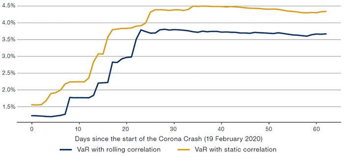
Source: Bloomberg. For illustrative purposes only.
In general, those leveraged strategies that rely heavily on diversification and relative performance are more sensitive to changes in correlation and will thus need particular care in times of market stress when the correlation structure could change drastically. These strategies also tend to be more dependent on the availability of leverage and so are vulnerable if, for example, stress in funding markets leads to a cycle of deleveraging, which can itself drive further correlation changes that are disadvantageous to the particular strategy.
It should be noted that the figures in this paper have assumed a static portfolio throughout the crisis period. In reality, those portfolios with more reactive risk models and shorter investment horizons are more likely to be able to adapt to the changing market condition and better manage their risks. We should also bear in mind that the joint normality assumption has been used due to its simplicity. In fact, the use of the normal assumption and linear correlation coefficient will tend to understate the risk of a portfolio. The ability to model fat-tailed returns, clustering of volatilities and tail dependence is essential to building an accurate risk model.
Conclusion
Like generals, risk managers usually get at least one ‘big war’ in their careers. Particularly lucky risk managers have had plenty to pick from in the last 35 years, but even by the standards of prior crises, many aspects of the Corona Crash of 2020 have been unprecedented, not only in terms of the speed and scale of the economic event, but also in terms of the speed and scale of moves in volatility and correlation – the two key components of many VaR models. Estimating the level of risk in a portfolio has therefore been particularly challenging during this crisis. This article shows how changes in both volatility and correlation during the Corona Crash affected VaR by changing the tails of the loss distribution.
You are now leaving Man Group’s website
You are leaving Man Group’s website and entering a third-party website that is not controlled, maintained, or monitored by Man Group. Man Group is not responsible for the content or availability of the third-party website. By leaving Man Group’s website, you will be subject to the third-party website’s terms, policies and/or notices, including those related to privacy and security, as applicable.