What can the Y2K bug teach us about the moves in the financial market if and when the Fed decides that liquidity injection is no longer needed?
What can the Y2K bug teach us about the moves in the financial market if and when the Fed decides that liquidity injection is no longer needed?
January 28 2020
Y2K, Y2K20: Spot the Difference
Since September, we’ve spent some time musing on the repo rate blowout, the Federal Reserve’s reaction and what the massive injection of liquidity might mean (our consistent conclusion has been ‘less trouble from the repo rate’).
But what happens if and when the Fed decides that the liquidity injection is no longer needed? Our attention has been drawn to the subject by two charts supplied by Bianco Research (Figures 1, 2).
Figure 1 shows the expansion of the Fed’s balance sheet in the run up to the new millennium. With fears about Y2K rife, the Fed supplied USD120 billion to the overnight repo market ahead of the New Year, between 7 October, 1999, and 7 April, 2000. In response, the NASDAQ started its uphill trek on the day the Fed opened its lending facility and plunged by about a quarter in the week after the facility closed.
We are currently seeing a similar expansion of the Fed balance sheet (Figure 3). Total Fed assets are up around USD407 billion since the September 2019 low.1 This is made up of around USD261 billion in US Treasuries and about USD224 billion of repo agreements. With the Fed buying Treasuries, that’s paper that is no longer available to market participants, forcing them to buy other assets – as we have seen in the stock market moves recently.
The Fed also said that it would continue buying the T-bills into the second quarter of 2020.2 However, the secured overnight financing rate (‘SOFR’) is behaving again, increasing the potential for the Fed to step back sooner. This may coincide with the ECB stopping its bond-buying programme, resulting in a massive withdrawal of liquidity from the financial markets.
Is history about to repeat itself?
Figure 1. Fed Supplied Repo During Y2K Fears
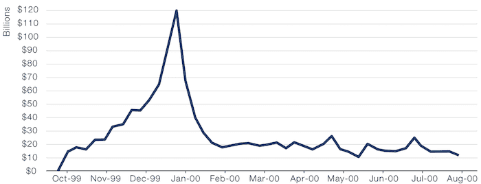
Source: Bianco Research, Bloomberg, Federal Reserve; as of 21 January 2020.
Problems loading this infographic? - Please click here
As of 29 December 2000.
| In USD billion | Week ended 11/9/19 |
Week ended 15/1/20 |
Difference |
|---|---|---|---|
| US Treasuries | 2098 | 2359 | 261 |
| Agency debt | 2 | 2 | 0 |
| Mortgage-backed Securities | 1489 | 1408 | -81 |
| Unamortised | 128 | 124 | -4 |
| Unamortised | -13 | -13 | 0 |
| Repo | 0 | 224 | 224 |
| S/T | 3704 | 4104 | 400 |
| Other | 22 | 29 | 7 |
| Reserve Bank Credit | 3726 | 4133 | 407 |
| Foreign currency assets | 21 | 21 | 0 |
| Gold | 11 | 11 | 0 |
| SDR | 5 | 5 | 0 |
| Treasury currency | 50 | 50 | 0 |
| Total factors supplying reserves | 3813 | 4220 | 407 |
Source: Bloomberg, Federal Reserve; as of 22 January 2020.
Palladium and the Cycle…
Palladium prices reached an all-time high of more than USD2,500 an ounce on 24 January, extending a 4-year rally.
The recent rally has been driven not only by increasing demand (especially by carmakers, which has increased its usage in auto catalysts to meet stricter emissions rules) but also by a chronic shortage of supplies. Palladium is produced alongside platinum and nickel, which have suffered from a dearth of new projects.
This isn’t the first time palladium has been on a tear; similar moves happened during the late 1990s toward a then-record in 2001, driven again by a surge in demand for catalytic converters and amid concerns about slowing sales from key supplier Russia. And in 2008, closure of mines in South Africa caused the metal prices to soar.
While it is probably a stretch to think that palladium is dethroning copper or the yield curve as a leading indicator for the global cycle, the similarities with the 2000 end of cycle are notable to us: this is a marginal metal, with limited tradeable liquidity. And illiquid assets with compelling narratives have a tendency to get caught up in speculative excess in the late stages of a bull market, particularly when the provision of liquidity by central banks is profound.
Paladium as a Leading Indicator?
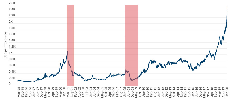
As of 24 January 2020.
Red shaded areas depict NBER recessions.
Momentum: This Time It’s … Not Different
Momentum is so... August 2019. Right?
While crowded trades are working in Europe, the correlation to European momentum has collapsed since the fourth quarter of 2019. The 63-day correlation is currently hovering around 0.1, while the noisier 21-day correlation is at its most negative since the data for popular trades became available in 2010 (Figure 5).
Since the violent rotation away from momentum towards value in September 2019, factor returns have been patchy: value has given back its gains everywhere in the world, while momentum has remained weak, particularly in Europe. But history has shown us that when the correlation of popular trades to momentum has reached such low levels in the past, momentum has, in fact, outperformed in subsequent periods (Figure 6).
Figure 5. Correlation of Popular Trades to Momentum Has Collapsed
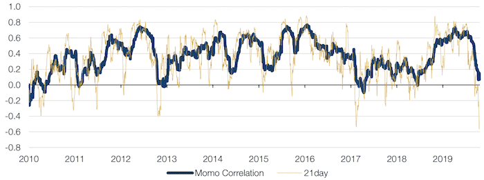
Source: Man Group; as of 17 January 2020.
Figure 6. European Momentum Post Triggers
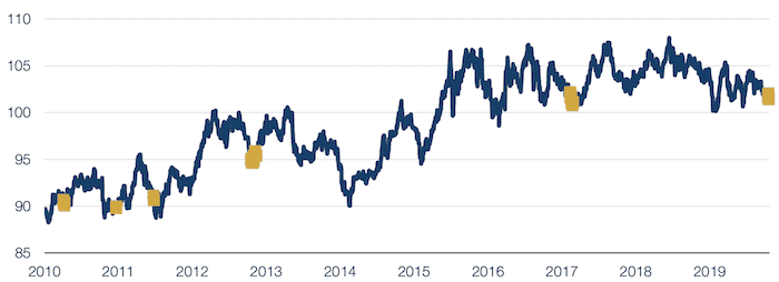
Source: Man Group; as of 20 January 2020.
With contribution from: Ben Funnell (Man Solutions, Portfolio Manager) and Ed Cole (Man GLG, Managing Director – Equities).
1. Between 4 September 2019 and 22 January 2020.
You are now exiting our website
Please be aware that you are now exiting the Man Institute | Man Group website. Links to our social media pages are provided only as a reference and courtesy to our users. Man Institute | Man Group has no control over such pages, does not recommend or endorse any opinions or non-Man Institute | Man Group related information or content of such sites and makes no warranties as to their content. Man Institute | Man Group assumes no liability for non Man Institute | Man Group related information contained in social media pages. Please note that the social media sites may have different terms of use, privacy and/or security policy from Man Institute | Man Group.