The 1940s may provide a blueprint of what to expect in the coming months; and a look at liquidity in the financial markets since the advent of the coronacrisis.
The 1940s may provide a blueprint of what to expect in the coming months; and a look at liquidity in the financial markets since the advent of the coronacrisis.
April 14 2020
Quote of the Week:
"I don’t think at the moment we’re facing an inability of the [UK] government to fund itself, so, yes, [the Ways and Means facility is] there, but it’s not a frontline tool."
Back to the Future: the 1940s and the Road to Inflation
Near-zero interest rates. Unprecedented monetary policy. A gargantuan fiscal expansion.
We’ve been here before.
Indeed, the similarities between the 1940s and now are striking: policy rates in the US have been at the effective lower bound for most of the last decade, much as they were for the 1930s and 1940s; then, as now, the Federal Reserve hugely expanded its balance sheet by buying government securities. The Fed’s key success in the 1940s was to engineer inflation, as the only-socially acceptable remedy to ballooning government debt for a population that had suffered materially through the war. US government debt spiked to well over 100% of GDP in the 1940s as a result of increased government spending to fund WWII. The ‘war’ this time could be thought of as Covid-19, and the resulting overnight cessation of economic activity.
The key policy tool in the 1940s was yield curve control (among other command- economy control measures), in which the Fed committed to maintaining a steep yield curve (buying short-dated US Treasuries to drive private capital into longer duration government bonds, thus making it profitable for banks to borrow short and lend long). It is not a coincidence, we would argue, that the Fed started blogging this week about monetary policy in the 1940s, specifically about the mechanics of yield curve control.
For financial assets, factor returns in the 1940s were almost the perfect mirror image of the 2010s:
- A collapse of the 5-year real compound aggregate growth rate (‘CAGR’) for US equities (Figure 2)
- Outperformance of value stocks over growth stocks, as defined by the High Minus Low (‘HML’) component of the Fama-French three-factor model (Figure 3)
- Outperformance for the Small Minus Big (‘SMB’) component of the Fama-French three-factor model (Figure 4);
- Outperformance of the long-term reversal factor (the losers of the last five years beating the winners of the last five years, Figure 5).
So, we believe it’s important to keep learning about financial history in the 1940s. Then, as now, the only socially-acceptable way to approach the management of record-high deficits and debt stocks was to create inflation. If policymakers follow the same path this time and succeed, the investment regime we have become so accustomed to will be gone forever.
Figure 1. US Debt-to-GDP Ratio
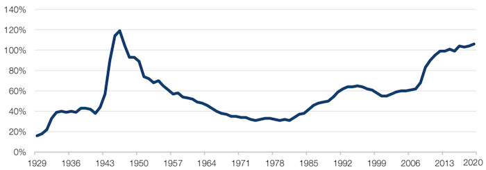
Source: The Balance; as of 2 April 2020.
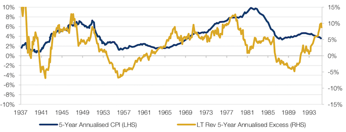
Figure 2. 5-Year Annualised US CPI Versus 5-Year Annualised US Equity CAGR
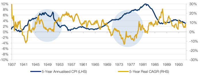
Source: Source: Kenneth R. French, Bureau of Labor Statistics; between July 1937 and December 1994.
Figure 3. 5-Year Annualised US CPI Versus 5-Year HML Excess Returns
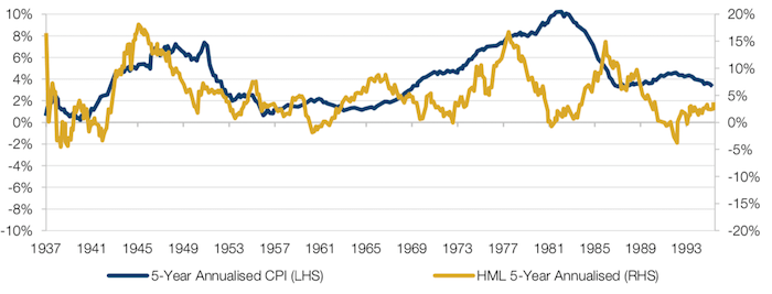
Source: Kenneth R. French, Bureau of Labor Statistics; between July 1937 and December 1994.
Figure 4. 5-Year Annualised US CPI Versus 5-Year SMB Excess Returns
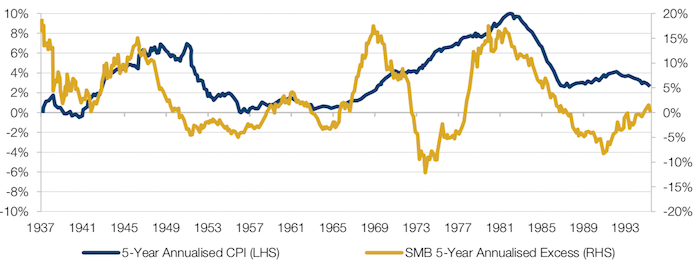
Source: Kenneth R. French, Bureau of Labor Statistics; between July 1937 and December 1994.
Figure 5. 5-Year Annualised US CPI Versus 5-Year Long-Term Reversal Excess Returns
Source: Kenneth R. French, Bureau of Labor Statistics; between July 1937 and December 1994.
Drying Up: Liquidity During the Coronacrisis
Since the advent of the coronacrisis, the deterioration in liquidity across financial markets has been hard to miss. To put some flesh on the bones of anecdotal observation:
- Daily mean normalised spreads in the G10 FX markets widened, which is pretty impressive given the liquidity of the FX markets (Figure 6; note that a reading of 2 implies that the spread is double the spread at the beginning of the year). In particular, spreads in the Swedish krona and the Norwegian krone skyrocketed. Stresses in emerging-market (‘EM’) currencies were similar to those experienced in the G10, but with a slower return to normal;
- The story is similar in fixed income futures, which is again typically a very liquid market. Spreads in financial fixed income futures spiked, with Italian bonds the worst affected (Figure 7), while those of the energy sector proved to be quite resilient;
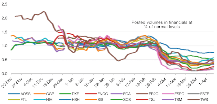
- Posted volumes of futures in both bonds and equities are languishing at about a quarter of normal levels (Figures 8-9).
This, in part, explains the persistent volatility we have observed across asset classes: with an ever smaller number of trades, each trade now has a much bigger effect on pricing. Until we see volumes return to normal, we would expect volatility in liquidity and pricing to continue.
Figure 6. Spreads in G10 FX
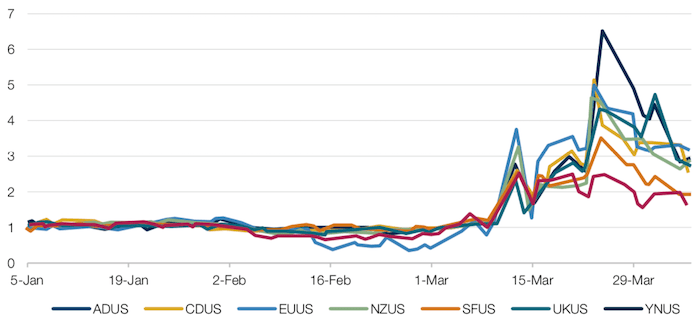
Source: Man AHL; as of 6 April 2020.
Spread compared to the average at the beginning of the year.
Figure 7. Spreads in Financial Fixed Income Futures
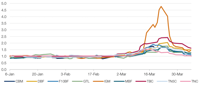
Source: Man AHL; as of 6 April 2020.
Figure 8. Posted Volumes in Bonds; Rolling 5-Day Medians
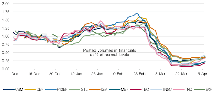
Source: Man AHL; as of 6 April 2020.
Figure 9. Posted Volumes in Equity Index Futures; Rolling 5-Day Median
Source: Man AHL; as of 6 April 2020.
Assets in Growth ETFs Surpass Value
Smart beta ETFs saw net inflows during the first quarter, despite the dramatic market selloff. Environmental, social and governance (‘ESG’) funds saw the strongest flows, while Size saw the largest outflows (Figure 10). Interestingly, Value ETFs saw twice the inflows as Growth ETFs in March, despite extremely poor returns for value-based models.
Still, Growth ETFs are now the largest ETF category, surpassing Value, the perennial leader (Figure 11). However, this position may be under threat – Value has traditionally outperformed during downturns, which could result in Value taking the crown back again. ESG is the second-smallest category despite the hype surrounding responsible investing.
In terms of performance, defensive strategies led in the quarter, with Yield, Low Vol and ESG strategies most resilient (Figure 12).
Figure 10. US Smart Beta ETF Flows
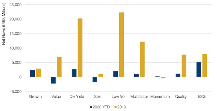
Source: Bloomberg; as of 31 March 2020.
Note: Not all Smart Beta categories are shown.
Figure 11. US Smart Beta AUM (USD, Millions)
| 31-Mar-20 | 31-Dec-19 | |
|---|---|---|
| Total Smart Beta * | 764,994 | 984,852 |
| Growth | 191,223 | 225,886 |
| Value | 163,399 | 226,673 |
| Div Yield | 160,282 | 209,891 |
| Size | 40,874 | 57,505 |
| Low Vol | 68,775 | 86,229 |
| Multifactor | 79,131 | 110,310 |
| Momentum | 11,254 | 14,327 |
| Quality | 20,374 | 23,570 |
| ESG | 19,174 | 17,143 |
Source: Bloomberg; as of 31 March 2020.
* Not all Smart Beta categories are shown.
Figure 12. US Smart Beta Performance
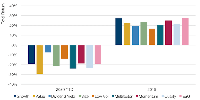
Source: Bloomberg; as of 31 March 2020.
Note: Equal-weighted within each category; not all Smart Beta categories are shown.
Credit Portfolio Allocation and Security Selection in a World of Uncertainty
While we believe that it is impossible to identify the bottom of the market selloff due to the rapidly evolving coronavirus situation, we believe that credit markets have repriced to a level that could present attractive opportunities for allocators.
In Figure 13, based on different ranges of high yield (‘HY’) market option-adjust spreads (‘OAS’), we use a monthly analysis to show the 1-year forward return versus risk if one had the ability to capture the ICE BAML HY index. More specifically, for each month end, we calculate the subsequent 12-month total return, and group those overlapping time series into initial month end groups of tight (0-500 basis points), moderate (500-750 bp) and wide (750+ bp) OAS levels. The figure shows the average return and volatility over the next year for those different HY OAS ranges. As an example, if you were to deploy when the month-end HY OAS levels are wider than 750bp, the ICE BAML HY index has an average cumulative return of 27% over the following year.
Figure 13. Average 1-Year Forward Return and Risk ICE BAML at Different HY OAS Bands
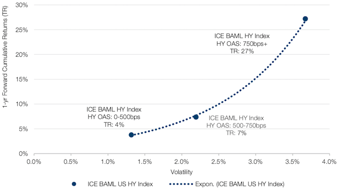
Source: Bloomberg; between January 2005 and September 2018.
With contribution from: Ed Cole (Man GLG, Managing Director – Equities), Emidio Sciulli (Man AHL, Head of Short-Term Research), Rob Furdak (Man Group, CIO of ESG), Paul Kamenski (Man Numeric, Portfolio Manager) and Robert Lam (Man Numeric, Portfolio Manager).
You are now exiting our website
Please be aware that you are now exiting the Man Institute | Man Group website. Links to our social media pages are provided only as a reference and courtesy to our users. Man Institute | Man Group has no control over such pages, does not recommend or endorse any opinions or non-Man Institute | Man Group related information or content of such sites and makes no warranties as to their content. Man Institute | Man Group assumes no liability for non Man Institute | Man Group related information contained in social media pages. Please note that the social media sites may have different terms of use, privacy and/or security policy from Man Institute | Man Group.