There may yet be life in the current US economic cycle; and an analysis of volatility before and after yield curve inversions.
There may yet be life in the current US economic cycle; and an analysis of volatility before and after yield curve inversions.
October 15 2019
Life in the Old Dog Yet
In March, we discussed our US leading indicator model and its implications for the US economic cycle. The model leads the Institute for Supply Management (‘ISM’) by nine months, incorporating a variety of metrics designed to reflect companies’ cost of component parts, cost of capital and the major consumer trends.
At the time, we suggested the indicator would fall to around 49 as early as May, but more realistically, later on in 2019 or early 2020. Our analysis proved correct: the ISM Manufacturing PMI in the US dropped to 47.8 in September from 49.1 in August, pointing to the steepest contraction in the manufacturing sector since June 2009.
However, we do believe that the recent PMI numbers are the trough of a mini-cycle, not the end of the US economic expansion: our US leading indicator model has moved up to 55, driven by soft inflation, easing capacity utilisation, falling short-term funding costs and the outperformance of early-cycle businesses.
Figure 1. US Leading Indicator Model
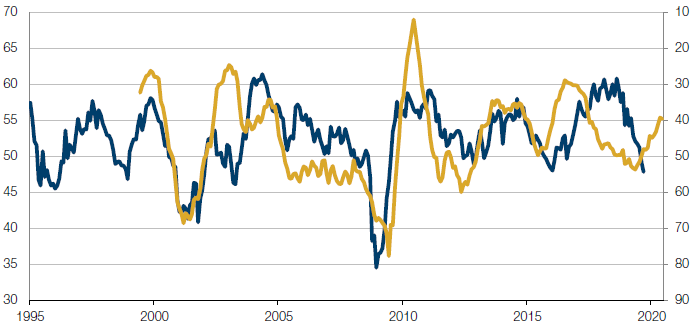
Source: Man Solutions; as of 8 October 2019.
Higher Volatility Does Follow Yield Curve Inversions
Building on the recent analysis Man Group has done on stock returns post inversions of the yield curve, we looked at whether inversions might be a sign of higher volatility in markets to come.
While an inversion by itself is not particularly helpful in predicting equity returns on a 12-month horizon, the story is very different with respect to volatility, with both realised volatility and implied volatility showing marked increases. Of course, the data can be affected by the occasional war and unforeseen events; however, as a signal to own volatility, the inversion seems a robust indicator.
Figure 2 shows realised volatility on both a 1-year and 30-day basis, pre-inversion and 12 months post inversion. (We used realised volatility data as no options markets existed for much of the history. We also include CBOE Volatility Index data for the time period it has been in existence.)
Figure 2. Realised Volatility
| Industry | Average volatility at time of inversion | Average post inversion | Increase | Average of highest levels after inversion | Increase |
|---|---|---|---|---|---|
| 1-year realised volatility | 14.3 | 18.0 | 26% | 18.6 | 30% |
| 30-day realised volatility | 14.1 | 18.2 | 29% | 29.1 | 106% |
| VIX (since 1988) | 18.0 | 21.0 | 17% | 33.5 | 86% |
Source: Man Solutions; as of 10 October 2019.
Excludes 1987 crash /1988 inversion.
Our analysis showed that:
- 1-year realised volatility increases from 14.3 to 18 (we exclude 1987 crash due to noise);
- Out of 15 inversions (again ex-1987), 1-year realised volatility was only lower twice, showing an average decline of 1.4 vols;
- Average rolling 30-day realised volatility was never lower in the subsequent 12- month period than it was immediately prior to the inversion;
- Perhaps even more surprising was the magnitude of spikes in short-dated volatility during the 12 months following the inversion. On average, markets showed a 30-day realised volatility of 14.1 prior to the inversion; however, the average highest 30-day realised more than doubled to 29.1;
- If we discard war in 1914, we still find an increase from 14.4 to a high of 25.6;
- Since the advent of the VIX, we have fewer observations; however, once again, the average VIX at inversion of 18 increases to 21, with an average high of 33.5.
For investors, the implication is that higher volatility and thus potentially lower quality of returns typically follows a yield curve inversion. Severe spikes in volatility suggest difficult portfolio managements may lie ahead.
The Factor Rollercoaster
August and September 2019 saw extreme factor performance in the US, with a sharp style rotation out of Momentum and into Value in early September. Whilst we have seen style rotations in the past, it is worth understanding the size and scope of the rotation that has taken place.
To assess this, we analysed the largest 600 US stocks by market cap between January 2012 and September 2019, which showed August and September were the best and the worst months, respectively, for Momentum performance – a remarkable turnaround in two consecutive months (Figure 3).
Value also saw similar moves, with September the best-performing month since 2012, immediately after its fourth-worst performing month in August (Figure 4). Unsurprisingly, the rolling annualised volatilities of both Value and Momentum returns also spiked, exceeding their 2012 peaks.
Problems loading this infographic? - Please click here
Source: Barra, Man Numeric; as of 3 January, 2012 – September 30, 2019.
Problems loading this infographic? - Please click here
Source: Barra, Man Numeric; as of 3 January, 2012 – September 30, 2019.
Problems loading this infographic? - Please click here
Source: Barra, Man Numeric; as of 3 January, 2012 – September 30, 2019.
With contribution from: Henry Neville (Man Solutions, Analyst), Peter van Dooijeweert (Man Solutions, Head of Institutional Hedging) and Rob Furdak (Man Numeric, Co-CIO).
You are now exiting our website
Please be aware that you are now exiting the Man Institute | Man Group website. Links to our social media pages are provided only as a reference and courtesy to our users. Man Institute | Man Group has no control over such pages, does not recommend or endorse any opinions or non-Man Institute | Man Group related information or content of such sites and makes no warranties as to their content. Man Institute | Man Group assumes no liability for non Man Institute | Man Group related information contained in social media pages. Please note that the social media sites may have different terms of use, privacy and/or security policy from Man Institute | Man Group.