In this week’s edition: preparing a portfolio for Brexit; and why we believe the 10-year/3-month inversion is no new news.
In this week’s edition: preparing a portfolio for Brexit; and why we believe the 10-year/3-month inversion is no new news.
March 26 2019
A Place of Greater Safety
How do you prepare a portfolio for Brexit? We believe some of the answers can be found in analysing market moves which have previously occurred in response to key Brexit events.
Figure 1 shows the movement of different asset classes in the two weeks after the Brexit vote, from 23 June, 2016 to 7 July, 2016. The key theme that emerges is that traditional safe havens performed strongly– bond prices rose, the Japanese yen strengthened and precious metals gained.
We also note the performance of UK gilts, whose yields fell 59 basis points during that time period. If we believe forecasts such as those of the Bank of England, any form of Brexit would weaken UK economic performance, ultimately making the UK government a worse prospect as a debtor. However, in the eyes of the market, the safety of gilts outweighed any concerns about Brexit’s implications for UK creditworthiness. Counter-intuitively, the FTSE 100 Index also gained. In our view, this was due to the exposure of the index to exporters which benefit from a weaker pound.
If we do see an inadvertent ‘no deal’ over the coming weeks, history would imply that a panicked fight to safety could ensue again.
Figure 1: Asset Class Performance After Brexit
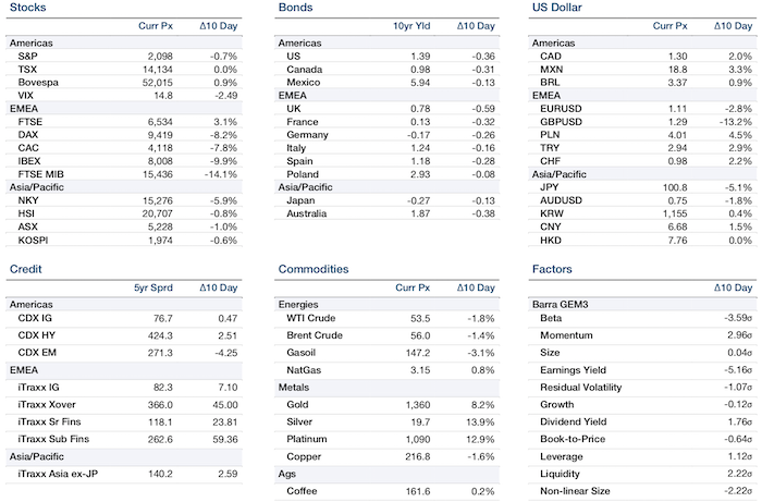
Source: Man Group; Between 23 June, 2016 to 7 July, 2016
Inverted 10-Year/3-Month Yield Curve: No New News
On 22 March, for the first time since 2007, the yield on 10-year US Treasuries dipped below that of 3-month Treasuries; typically an indicator of a possible recession.
Man Group academic adviser Professor Campbell R. Harvey, who has published research on inversions since the 1980s1, has concluded that the 10-year/3-month needs to be inverted, on average, for more than a quarter to provide a solid signal, not just for a few days.
Indeed, we believe that the 10-year/2-year curve is really the one to watch, but even then, there is typically about 10 months between the curve inverting and the peak of the S&P 500 Index (since 1967, covering the last seven cycles).
All in all, we are keeping a close eye on the inversion as a potential early indicator of the end of the bull market. However, we do not believe it is an immediate sell signal.
No One Is Picking Up the Trash
After the nadir of late 2018, CCC bonds have failed to recover to the same extent as other higher-rated debt (Figure 2).
Since the beginning of the year, the spread between BBs and BBBs has fallen back towards the levels of September 2018 – before the market sell-off (Figure 3). However, the CCC-B spread has barely budged. So, what is driving the lack of investor interest in CCCs?
We believe there are three reasons for this: CCCs remain relatively illiquid; end-of-cycle fears are widespread; and the downside risk of owning these bonds can be enormous –recently, CCC issuers disappointing investors have been subject to drawdowns greater than their historic volatility.
Without a compelling reason to own CCCs, we believe these bonds will struggle to rally much further.
Figure 2: CCC Bonds Have Failed to Recover to the Same Extent as Other Higher-Rated Debt
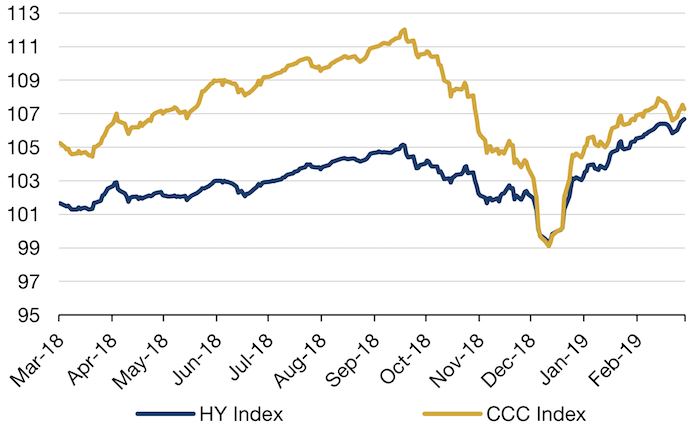
Source: Bloomberg, Bank of America; As of 28 February, 2019 Normalised. to 100 on 31 December, 2018
Figure 3: High Quality Versus Low Quality in Credit
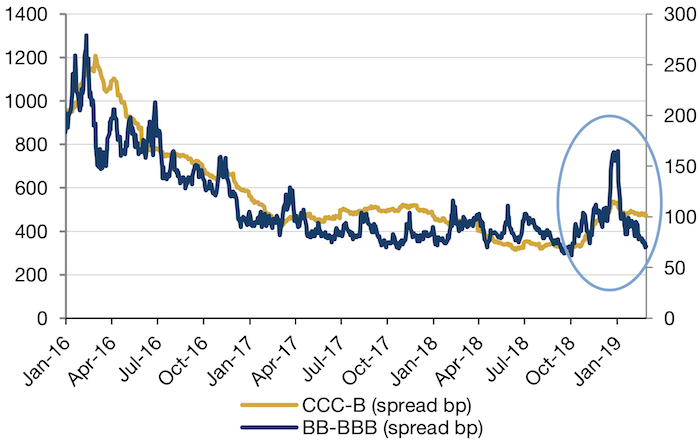
Source: Bloomberg, Bank of America; As of 28 February, 2019
Earnings-Day Volatility Increases
Single-stock volatility has become more concentrated around earnings, according to research by Goldman Sachs.
Earnings-day moves are now larger than the average earnings-days volatility, calculated as earnings-day volatility over average daily volatility in the month before and after earnings announcements. Examining the S&P 500 Index between 1996 and 2018, the research showed that earnings-day moves were 3.3 times bigger than an average daily move, compared with a 20-year average of 2.5 (Figure 4).
Figure 4: Earnings-Day Moves Are Elevated
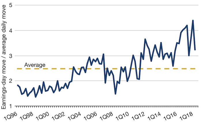
Source: Bloomberg, Goldman Sachs Investment Research; As of 13 January, 2019
With contribution from: Otto Van Hemert (Man AHL, Head of Macro Research), Teun Draaisma (Man Solutions, Portfolio Manager), Professor Campbell R. Harvey (Man Group Academic Advisor), Henry Neville (Man Solutions, Analyst), Rob Alloway (Man GLG, Portfolio Manager) and Ikitsa Anastasov (Man GLG, Deputy Portfolio Manager).
1. http://people.duke.edu/~charvey/research_term_structure.htm
You are now exiting our website
Please be aware that you are now exiting the Man Institute | Man Group website. Links to our social media pages are provided only as a reference and courtesy to our users. Man Institute | Man Group has no control over such pages, does not recommend or endorse any opinions or non-Man Institute | Man Group related information or content of such sites and makes no warranties as to their content. Man Institute | Man Group assumes no liability for non Man Institute | Man Group related information contained in social media pages. Please note that the social media sites may have different terms of use, privacy and/or security policy from Man Institute | Man Group.