If we’d known at the start of 2018 what we know now, would we have expected to end the year where we did?
If we’d known at the start of 2018 what we know now, would we have expected to end the year where we did?
February 2019

Introduction
If we’d known at the start of 2018 what we know now, would we have expected to end up here? ‘Here’ is the MSCI All Country World equity index down 11% within which emerging-market (‘EM’) equity was down 17%, Europe down 17% and the US down 6%. The Bloomberg Barclays Treasury Aggregate was also down by year-end, if only by 30 basis points; and gold was down 3%, oil down 19%, silver down 10% and copper down 17%.
Well, if earnings were the only thing that mattered, the short answer would be “no”. We would have been profoundly surprised. In our framework, the directions of inflation and earnings are the two things that matter most. So, given both should have been sending a positive signal for risk assets, we are experiencing a good deal of cognitive dissonance in watching markets go down rather than up.
As of December 31, 2018, the consensus for the MSCI ACWI index earnings estimates for the full year were up 5.5% compared with January 1, 2018, and the market expects year-to-year growth thereafter of close to 5.2%.1 True, the risk-free US 10-year interest rate is up about 45 bp, but is still rising from a low level. So, within our ‘Fire & Ice’ framework, we are still in ‘Reflation’ mode, where higher bond yields are still supposed to be good for equity prices.2
Warning Signals Aren’t Flashing
Clearly, other factors are at work. There is a longish list of candidates for what those factors might be, including, but not restricted, to:
- The Federal Reserve’s interest-rate and balance-sheet normalization process;
- The US/China trade standoff;
- The flattening/inverting US yield curve;
- The deceleration in monetary aggregates e.g. China M1, global real M1;
- Europe’s politics, being Brexit/rioting gilets jaunes /intransigent Italy;
- The rollover in growth rates in earnings (rather than any rollover in earnings themselves);
- The weakness in US housing after the rise in mortgage rates;
- The weakness in oil and other commodities allied to the deceleration in core US inflation.
We have listed these in order, from what we view as most important to least important. Indeed, we think the first item on the list is far more important than all the others, because it speaks directly to the provision of liquidity to world markets.
It’s not that we have ignored the roll-off in the central bank balance sheets, either. On the contrary, we first published our estimate of the ‘private sector step-up’ over a year ago, in October 2017, which detailed the annual quantum of bonds the central banks would forego purchasing as they shrank balance sheets and would have to be bought by the private sector.
Back then, we thought the step-up would be about USD1.8 trillion over the ensuing year – it turned out to be USD1.3 trillion. However, that’s still USD1.3 trillion diverted into the government-bond markets and away from investment-grade (‘IG’), high-yield (‘HY’), EM fixed income, collateralized loans obligations (‘CLOs’) and other asset-backed securities or more exotic instruments. We thought this would put pressure on all of these latter groups and generally act to raise the cost of capital. This would eventually mean being bearish, but that warning signs of tightening would first show up in a range of dollar liquidity indicators. This logic would dictate remaining fully invested (if not overweight risk) because earnings were still growing and inflation was still low – until such time as the liquidity indicators flashed red.
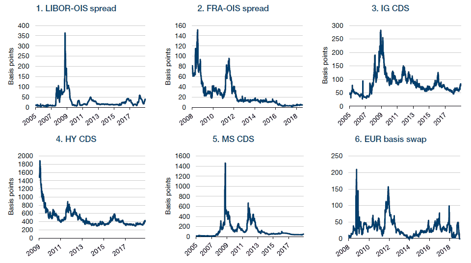
The snag is that most, or all, of them simply never flashed warning signals. As of January 9, 2019, they still aren’t flashing. To recap some of the main indicators we have been watching (see Figure 1):
- US bank funding costs via LIBOR-OIS (3-month dollar interbank interest rate spread to overnight rate): This spiked to 365 bp in 2008 and was at 40 bp as at January 9, 2019. A bit of a warning signal, but nothing urgent in our view.
- Eurozone bank funding costs via FRA/OIS (floating rate to overnight rate spread): This spiked to 153 bp in 2008, nearly 100 bp in the Greece crisis of 2011 and is now at 7 bp. No signal.
- Investment grade corporate funding costs via CDS on Euro IG index (the cost of insuring an investment grade bond in Europe): This spiked to 283 bp in 2008, was 150 bp in 2011, hit a post-GFC low of under 50 bp in January 2018 and is still only 81 bp. No signal.
- Non-investment grade corporate funding costs via CDS on Euro HY index (the cost of insuring a non-investment grade bond in Europe): This spiked to 1,888 bp in 2008, 892 bp in 2011 and 600 bp in 2015 on the oil price collapse. It is now at 416 bp, up from its low of 290 bp in July 2014, but still not really flashing in our view.
- Investment bank funding costs via CDS on Morgan Stanley or Goldman Sachs – MS CDS spiked to 1,462 bp in 2008, 260 bp in 2010, 669 bp in 2011, 449 bp in 2012 and is now at 55 bp. No signal.
- Dollar liquidity via the euro basis swap (the cost of swapping local currency into dollars for Eurozone investors): This spiked to 300 bp in 2008, 155 bp in 2011 and is now at -2 bp. No signal.
Figure 1. Six Main Liquidity Indicators

Source: Bloomberg, as of January 9, 2019.
So, it’s a mystery. Liquidity is tightening, by all accounts. It’s harder to trade the more exotic end of the credit markets, so we hear, and even some G7 bond markets have virtually no liquidity in cash bonds, with all liquidity going through futures markets. However, these complaints simply don’t show up in the conventional measures we watch. We believe there is a good chance that any liquidity tightening has actually been driven more by hedge-fund deleveraging on the back of a poor year for alpha generation, than on any technical situation in the interbank or corporate funding markets. This would be good news for risk assets as it would signal it’s just been market indigestion more than anything more sinister.
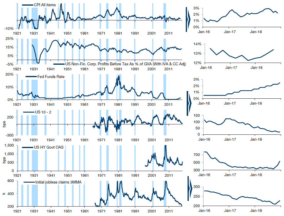
In the meantime, our cycle tracker (Figure 2) is still some way from indicating an end to the cycle. Inflation has not accelerated sufficiently to worry the Fed. Unit labour costs have therefore remained benign, meaning margins have held up. Corporates have therefore continued to hire and weekly initial unemployment claims have remained quiescent. Credit spreads remain near cycle lows.
The only slight cause for concern in our view is the flat yield curve. However, as we never tire of pointing out, since the 1960s, the average time from curve inversion to recession has been 15 months, with the range being 9-25 months. Furthermore, the average time from first inversion to peak in the S&P 500 Index (which may be the more relevant measure) is 10 months, with the range being 3-19 months.
We should point out that although recession is still not our base case, our cycle tracker is indicating that the risk has risen over the last three months. This is driven not only by the 10-2 yield curve, but also by HY spreads and jobless claims, which (as per the magnified portion of Figure 2), have risen by 205 bp and 17,000 claimants, respectively, over the fourth quarter of 2018. This has driven the end of cycle risk up, from 5% to closer to 20%.
Figure 2. Cycle Tracker

Source: Bloomberg, Man Group. Magnified portion on the right shows the last 3 years’ data. As at end December 2018.
We should also mention the US domestic political machinations. The newly Democrat-controlled House’s practically unlimited subpoena power came into force January 3. Leading Democrats are already falling over themselves in their promises of how they will wield this power to support the Mueller investigation. For instance, Chair of the Financial Services Committee Maxine Waters has said she will subpoena every single transaction ever made between Deutsche Bank and the Trump organization. Any revelations could be a short-term catalyst for further market volatility.
Conclusion
We were wrong to argue for being fully invested in 2018. In hindsight, owning less equity and more bonds would have been preferable, despite the fact that both asset classes have lost money. However, we are still of the view that fundamentals are reasonably attractive for equity, the more so from this lower starting point, and not great for bonds. Furthermore, we believe the cycle should not prevent further equity upside.
1. Source: Bloomberg/IBES.
2. See Ben Funnell and Henry Neville, “What if inflation returns?”, April 2018.
You are now exiting our website
Please be aware that you are now exiting the Man Institute | Man Group website. Links to our social media pages are provided only as a reference and courtesy to our users. Man Institute | Man Group has no control over such pages, does not recommend or endorse any opinions or non-Man Institute | Man Group related information or content of such sites and makes no warranties as to their content. Man Institute | Man Group assumes no liability for non Man Institute | Man Group related information contained in social media pages. Please note that the social media sites may have different terms of use, privacy and/or security policy from Man Institute | Man Group.